Key Takeaways
- Allowing “Guest Checkout” is key to avoiding unnecessary abandonments
- Yet 47% of sites that allow “Guest Checkout” don’t make it prominent enough
- Avoiding the 4 pitfalls described in the article will help ensure “Guest Checkout” isn’t overlooked
Allowing users to check out as a “guest” is key to avoiding unnecessary abandonments, as many users will refuse to create an account simply to check out.
Yet providing a “Guest Checkout” is much less useful to users if it’s difficult to spot on the account-selection step of checkout.
Indeed, if a user fails to see the “Guest Checkout” option, it’s as bad as if it wasn’t offered at all.
Yet our e-commerce UX benchmark reveals that 47% of sites fail to make “Guest Checkout” the most prominent option.
As a result, our Premium research findings from large-scale testing indicate that many users will come to a stop at the account-selection step of checkout as they hunt for the “Guest Checkout” option — while a subgroup, moving quickly, will never find it, increasing the risk of abandonment.
4 “Guest Checkout” Pitfalls to Avoid
Below we’ll discuss 4 ways sites fail when it comes to highlighting “Guest Checkout” for desktop and mobile users, as well as how to present “Guest Checkout” so that it’s highly visible:
- “Guest Checkout” isn’t clearly labeled
- “Guest Checkout” is a plain text link
- “Guest Checkout” appears below “account sign in” or other options
- “Guest Checkout” is only offered after users input their email
1) “Guest Checkout” Isn’t Clearly Labeled
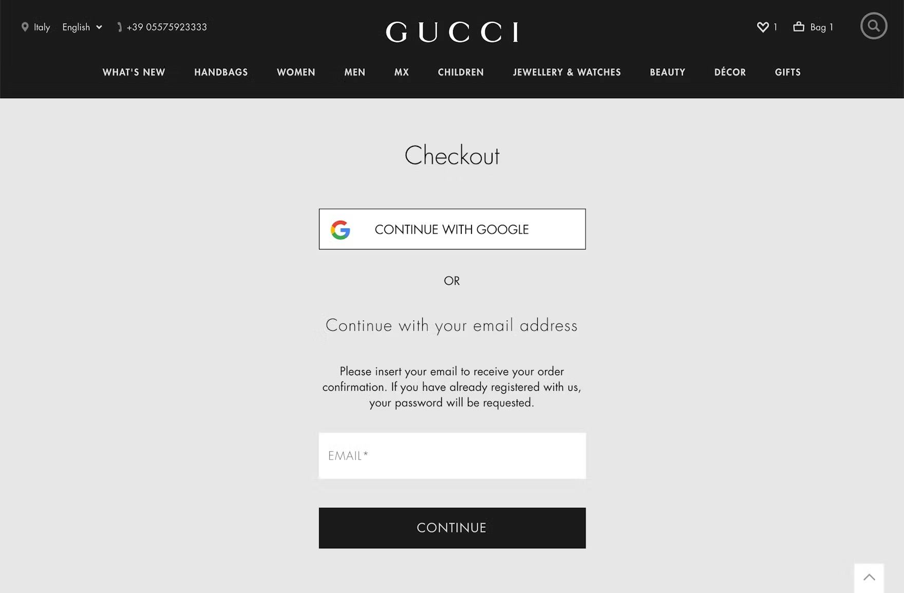
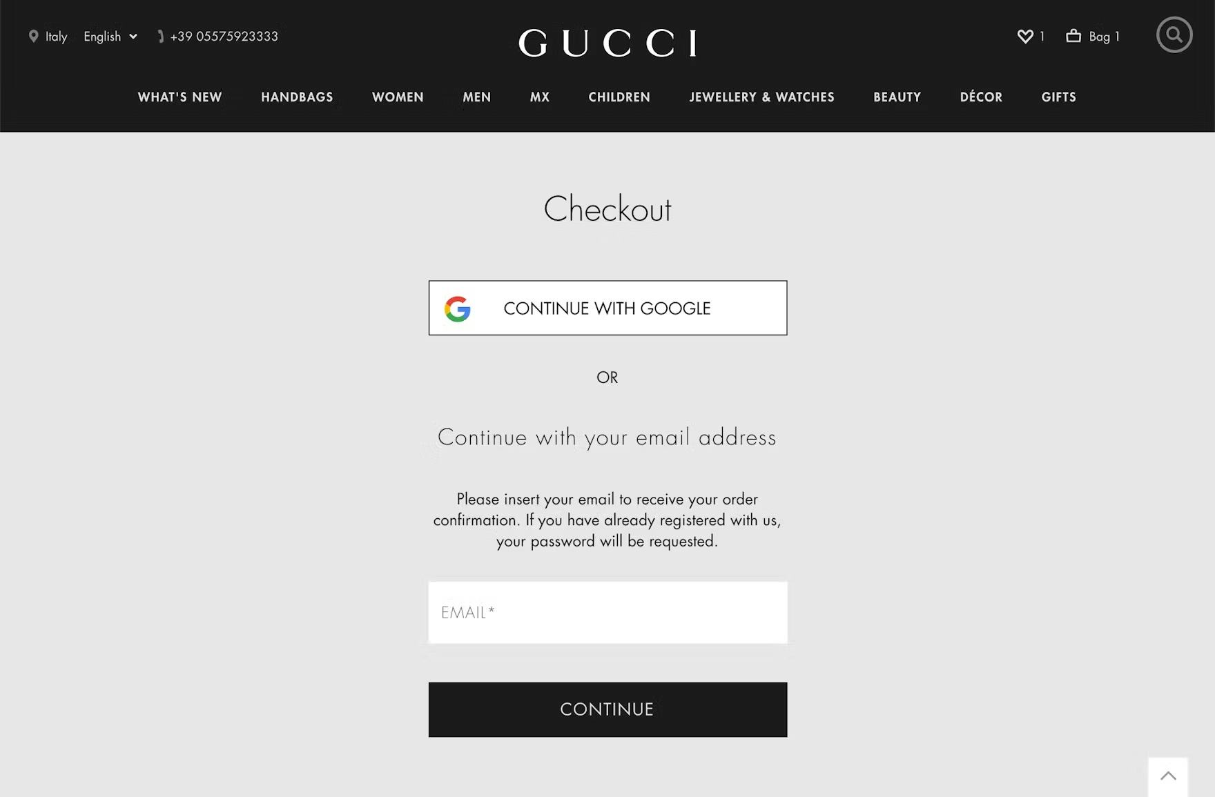
At Gucci, the option for “Guest Checkout” is labeled as “Continue with your email address”, which doesn’t reassure users that they don’t need to register with the site in order to check out.
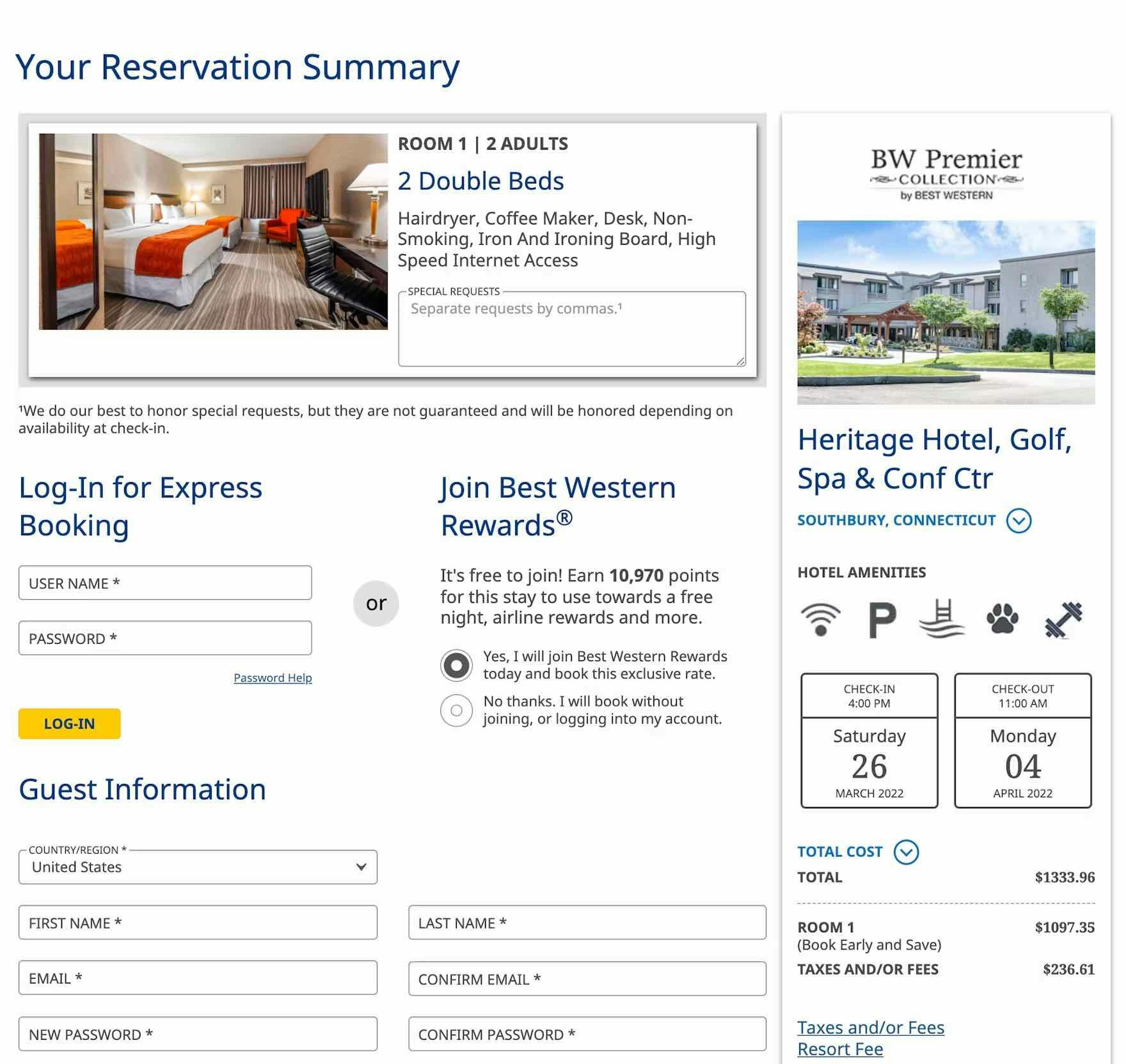
Users checking out at Best Western may struggle to locate the option for “Guest Checkout”, as it’s presented as a subdued radio button selection with lengthy, indirect microcopy rather than a clear and direct label.
Across multiple rounds of testing, we’ve observed participants often struggled to locate “Guest Checkout” options that had vague labels or complicated microcopy.
For those seeking “Guest Checkout”, generic headings or button labels such as “Check Out Now” or simply “Continue” slow users’ progress as they initially scan the page and weigh their options, necessitating that they pause to consider whether or not this option is for “Guest Checkout”.
Likewise, participants in testing often quickly scanned headings and labels rather than reading them in-depth, overlooking “Guest Checkout” options that were not clearly and concisely labeled.
In practice, such vague or indirect labels fail to clarify that they represent the path that will lead to the “Guest Checkout” flow.
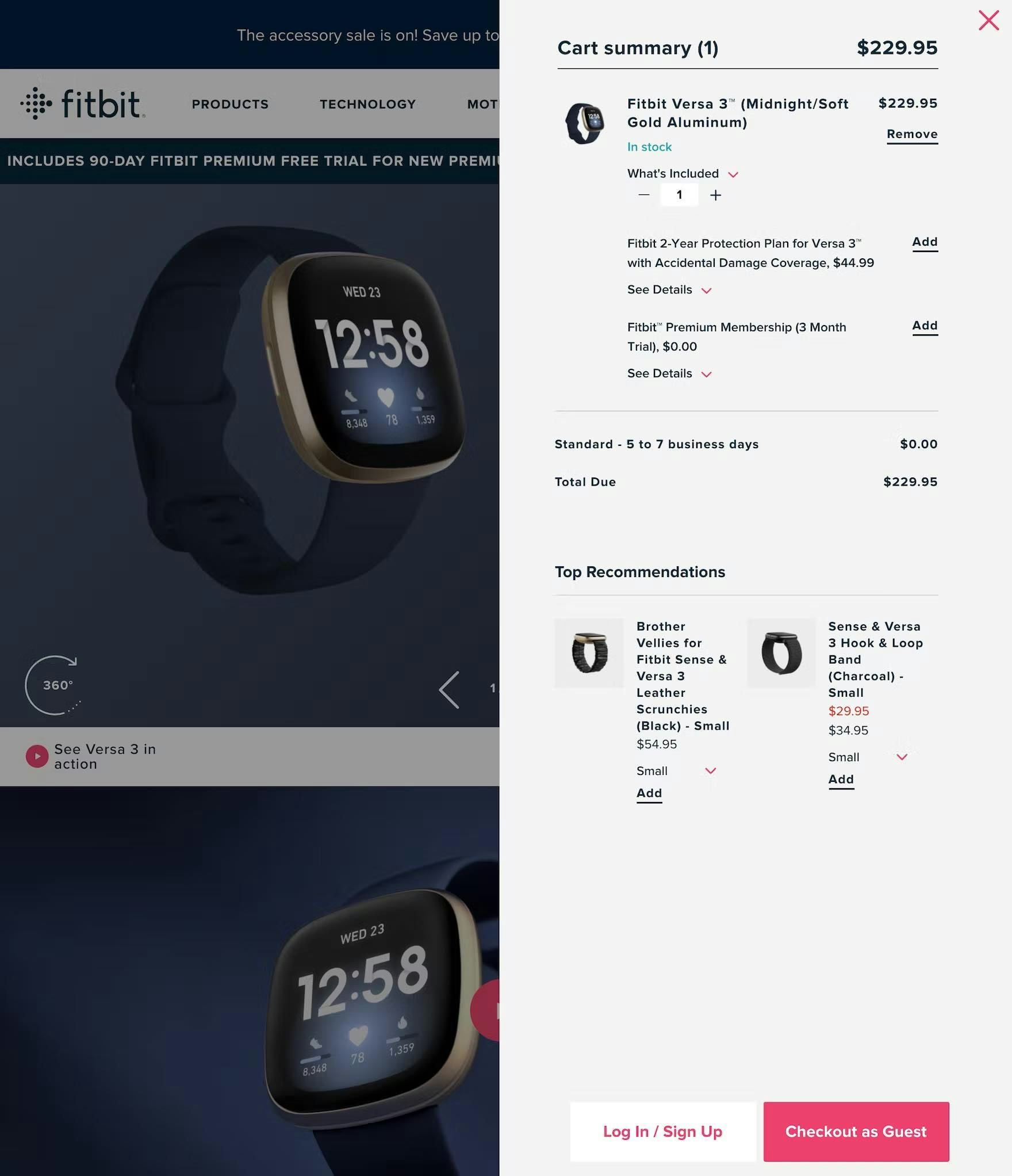
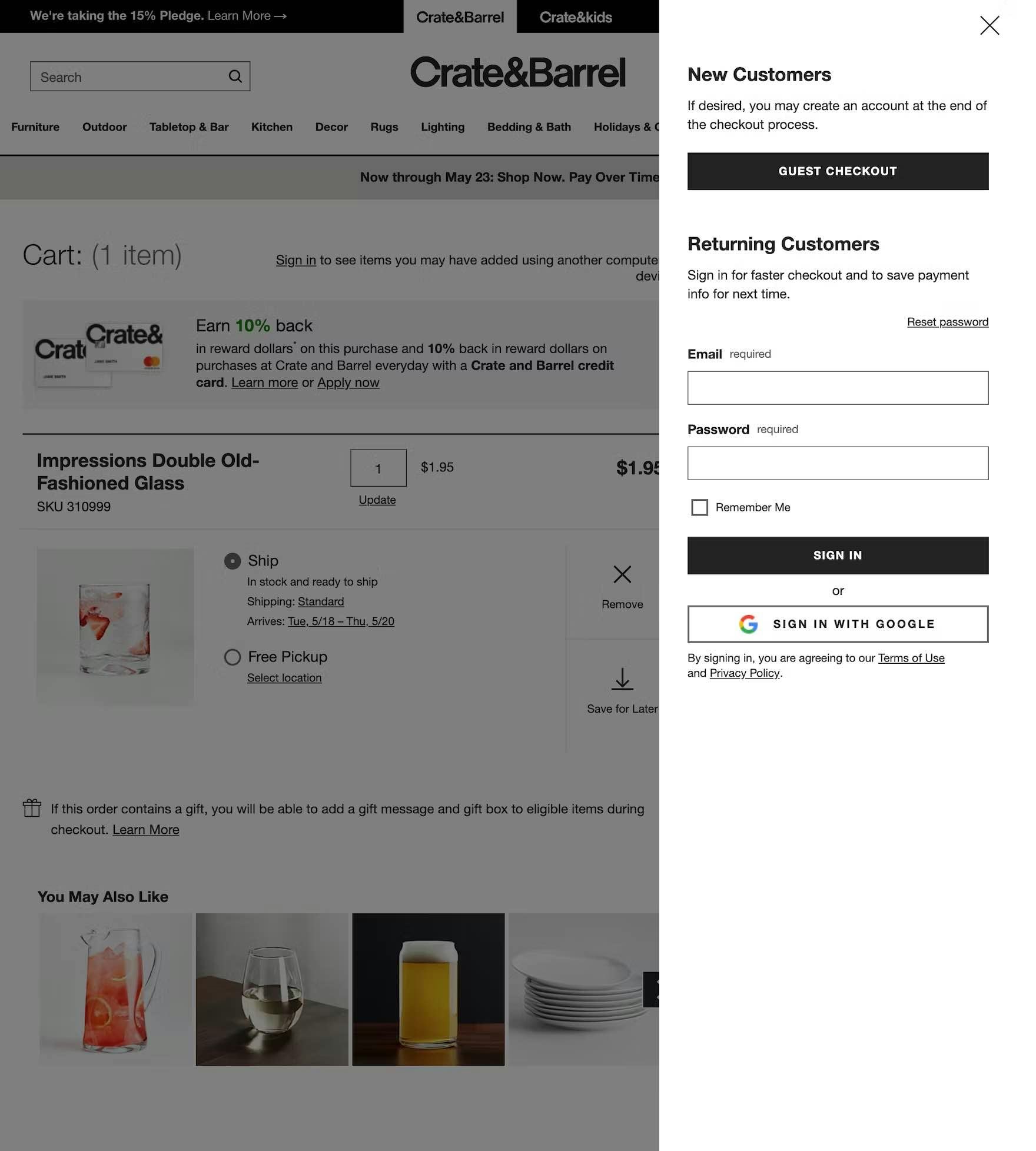
On Fitbit (first image) and Crate & Barrel (second image), the clear labeling of the “Guest Checkout” option gives users who don’t want to sign in or register a clear path forward.
In testing, we observed that participants who wanted to continue without signing in or creating an account tended to be drawn to options that explicitly used the term “Guest”, including “Guest Checkout” or “Checkout as Guest”, in the label.
In practice, users with experience shopping online are likely familiar with this terminology and therefore actively scan the page in search of this option.
Using the term “Guest” in the header, button microcopy, or both clearly signals to users how to move forward without needing to create an account.
2) “Guest Checkout” Is a Plain Text Link
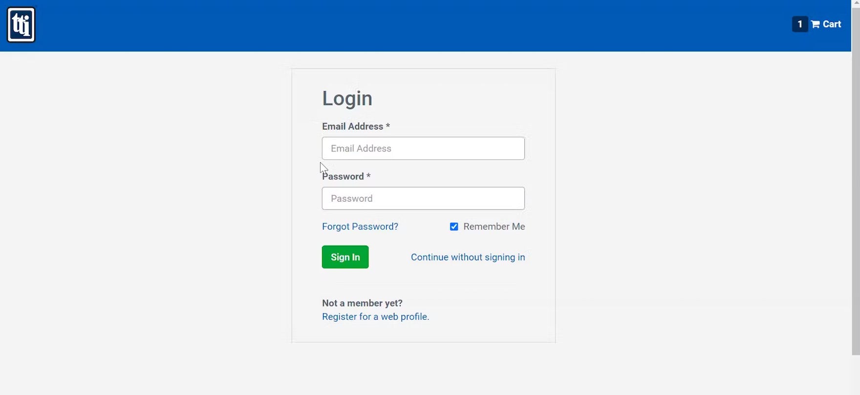
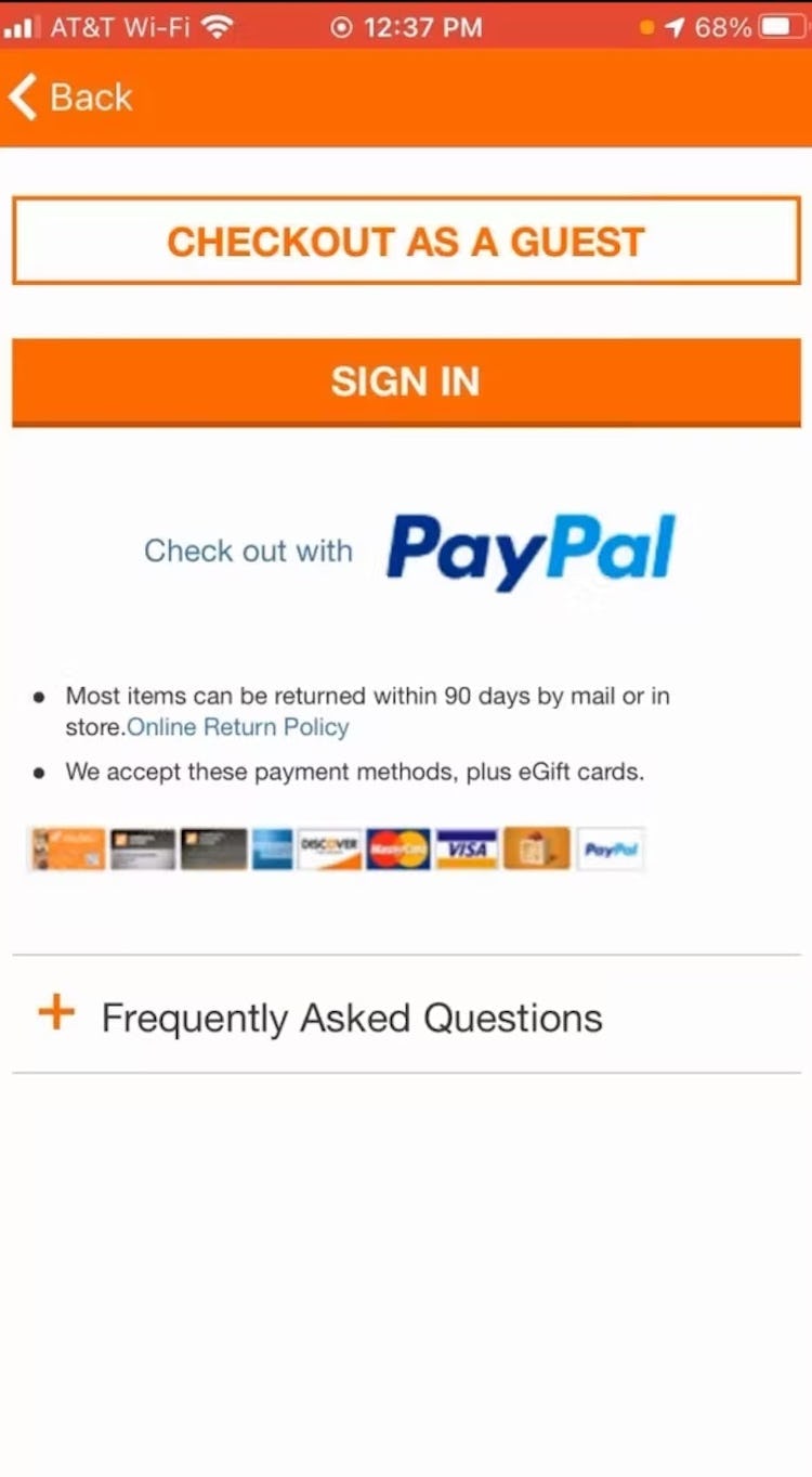
“So, this would actually be a really bad turn off for me where I would have to log in just to see what the shipping price is. I would not enjoy that…At this point…unless this is the only website that has my component, I would just go to a different supplier.” Proceeding to checkout to see a summary of shipping costs, this participant on TTI overlooked the option for “Continue without signing in”, presented as a subdued text link on a page prominently labeled “Login”.
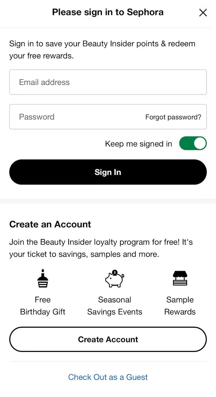
On Sephora’s mobile site, the “Guest Checkout” option is presented as a text link at the very bottom of the account-selection page, risking users overlook it.
Next, in both desktop and mobile testing we observed participants were much more likely to overlook the option for “Guest Checkout” when it was implemented as a simple text link, rendering it visually subdued compared to other more eye-catching page elements.
In general, users arriving on a page tend to focus their initial attention on open form fields, which imply a need for users’ input even when those fields are optional or irrelevant (for example, see our article on “Address Line 2”), as well as on prominent buttons that are likely to represent the primary calls to action.
When “Guest Checkout” is visually diminished, users will have to spend additional time and effort carefully scanning for this option, risking they overlook it and abandon their cart rather than create an account.
On Bass Pro Shops’s mobile site, the prominent button for “Continue as Guest” provides a clear call to action for users who want to move forward without signing in.
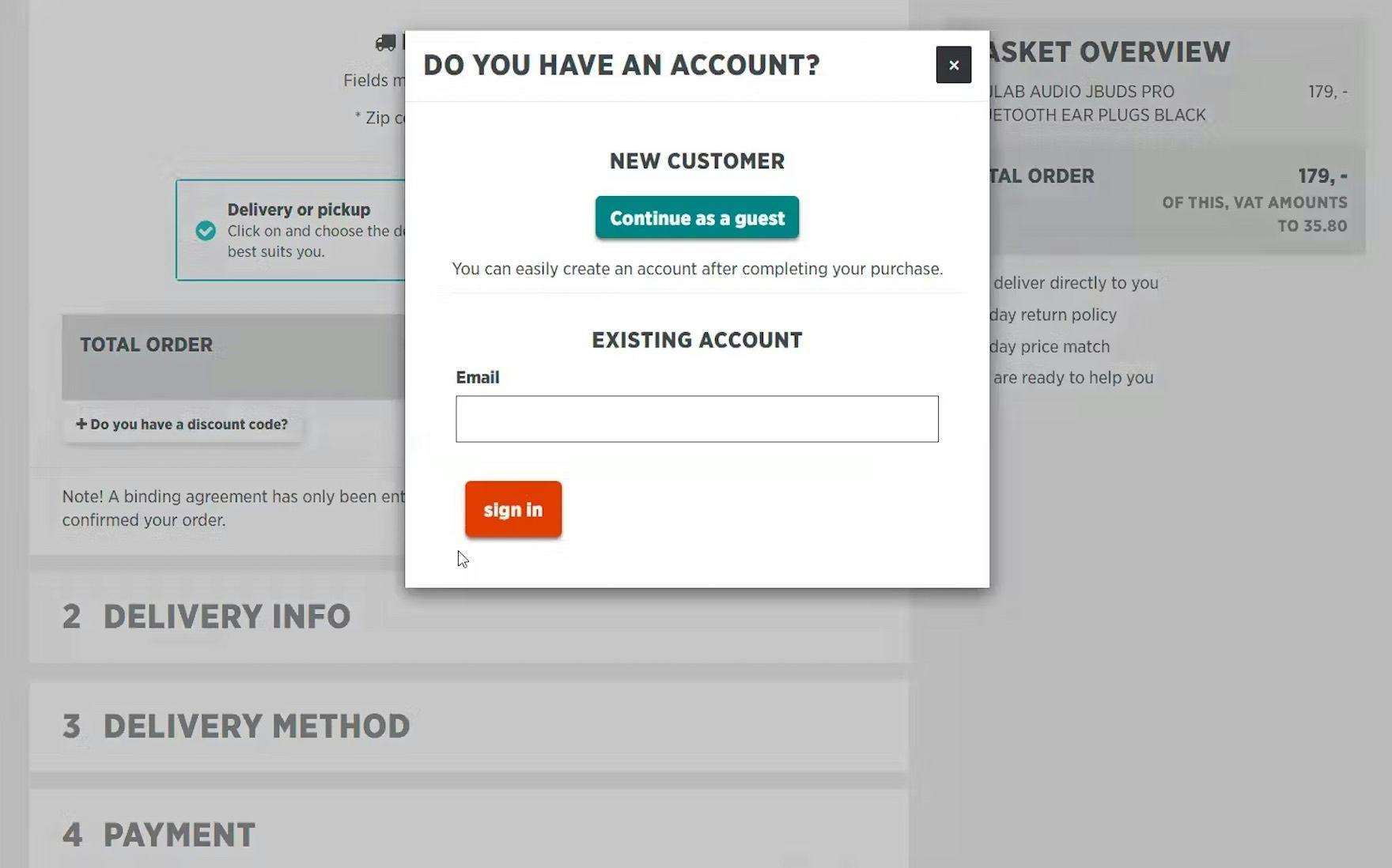
Test participants on Power.dk found it very easy to locate the “Guest Checkout” option since it was presented as a prominent button and the first item in the overlay that appeared once users proceeded from the cart.
To draw adequate attention to this important checkout option, “Guest Checkout” should always be presented as a button rather than a text link.
In practice, implementing this path as a button helps users locate “Guest Checkout” while also making it easier to target — especially on touch interfaces like mobile devices.
3) “Guest Checkout” Appears below “Account Sign In” or Other Options
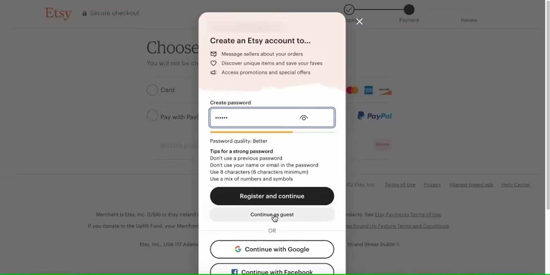
Presented with an invitation to create an account halfway through the checkout process on Etsy, this participant reluctantly began crafting a password, misbelieving that it was required in order to move forward with checkout. She eventually noticed the visually subdued option to “Continue as guest” located below the much more prominent option to “Register and continue”.
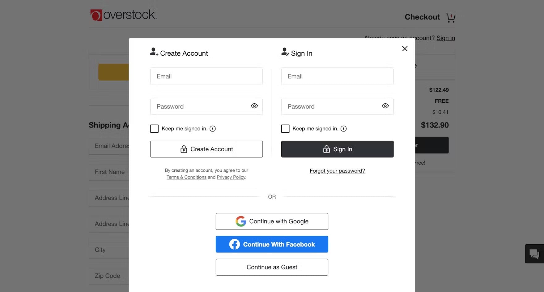
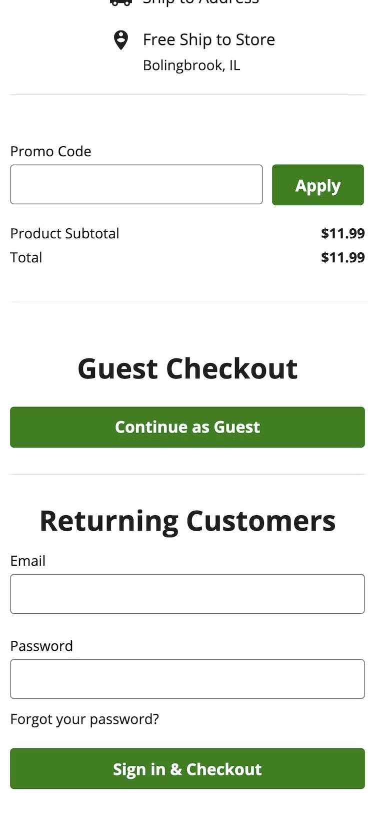
On Overstock, users searching for the “Guest Checkout” option are likely to devote undue attention to the open fields for “Create Account” and “Sign In”, presented prominently at the top of the account step at the beginning of checkout, rather than the more subdued option presented at the very bottom of the overlay.
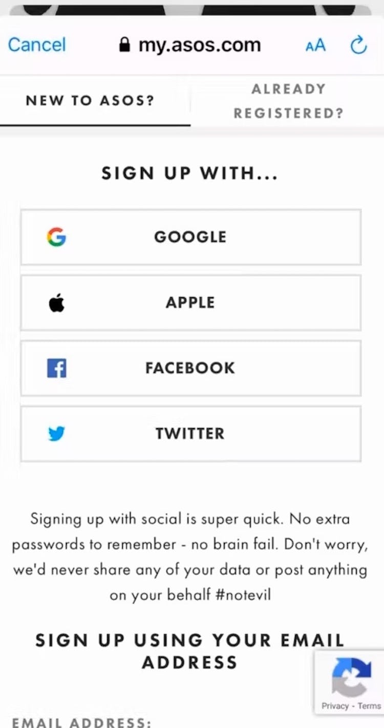
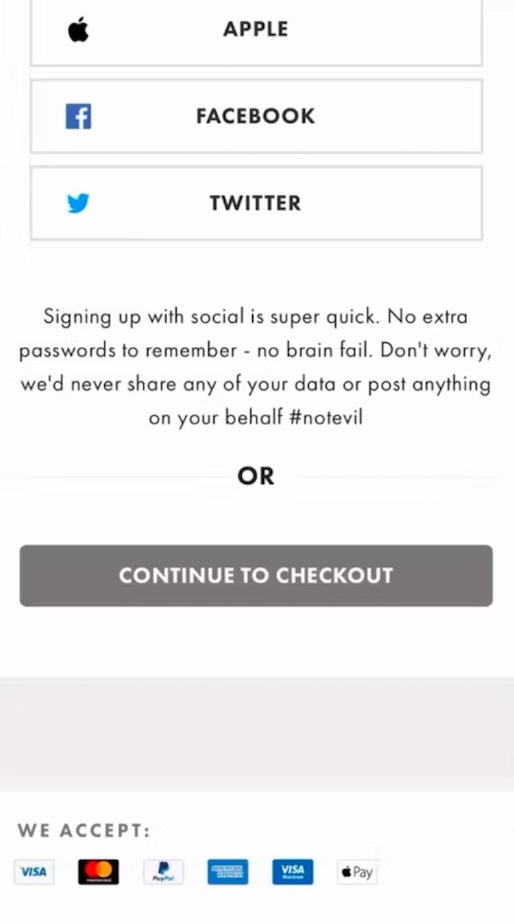
“So yeah, this won’t let me get in as a guest.” Checking out using ASOS’s mobile app, this participant assumed based on the display of account sign-in options that she would have to make an account in order to continue (first image). Had she scrolled further, she would have discovered the option to continue as a guest (second image). The “Guest Checkout” option here was also poorly labeled.
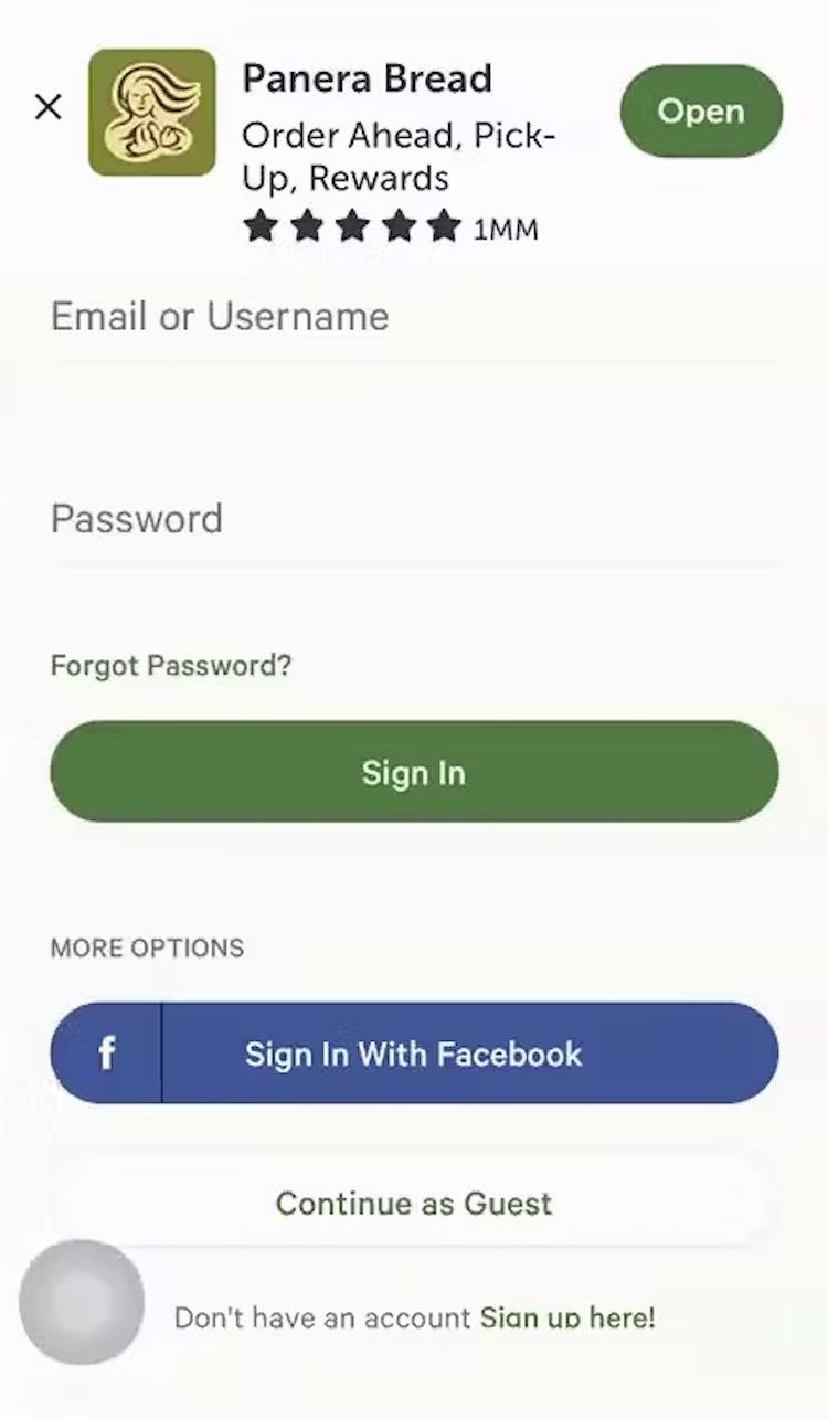
“Okay…” This participant checking out on Panera Bread’s mobile site hesitated to move forward with checkout, at first overlooking the option for “Guest Checkout”, located beneath two much more prominent calls-to-action. After several moments of scanning she finally noticed it: “Oh yeah, ‘Continue as Guest’. Great”.
We also observed that participants during large-scale testing, across both desktop and mobile, had a more difficult time finding the option for “Guest Checkout” when it was located below other options for sign-in or creating an account.
From our earliest large-scale UX studies, we’ve observed that users tend to focus their attention on page elements that appear at the top of the page, often spending a disproportionate amount of time reviewing them before moving on to elements and options appearing further down.
At best, “Guest Checkout” options appearing towards the bottom of the account sign-in page result “only” in a sizable delay in moving forward with checkout for those who desire this option.
At worst, users never locate the “Guest Checkout” option and subsequently abandon their cart rather than create an account, mistaking that it was required.
On mobile sites and apps, the limited screen size makes the placement of “Guest Checkout” options even more important.
In testing, when the placement of “Guest Checkout” was not located within the first viewport, many participants failed to scroll far enough to discover it, leading them to incorrectly assume “Guest Checkout” was not an option and increasing the risk of abandonment.

“Okay, I’m gonna continue as a guest. I don’t want to make an account right now.” Continuing to check out from the cart, this participant on Etsy easily located the option for “Guest Checkout” presented at the top of the account-selection overlay.
“It’s not asking me to create an account, that’s interesting. Alright, so let’s go ‘Check Out as Guest’.” “Checkout as a Guest” was a prominent option in the Home Depot app, encouraging this participant to proceed quickly to the next step without having to sign in.
To further prevent users from overlooking the “Guest Checkout” option, it should always be presented at the top of the account-selection step above other options for sign-in or account creation.
In practice, promoting “Guest Checkout” helps reassure users who are resistant to creating an account while still providing returning users easy access to sign in.
Additionally, limiting the account-selection step to only “Checkout as Guest” and “Sign In to My Account”, saving account creation for the confirmation step of checkout, further helps streamline the initial step of checkout and prevents further distraction by too-many competing options.
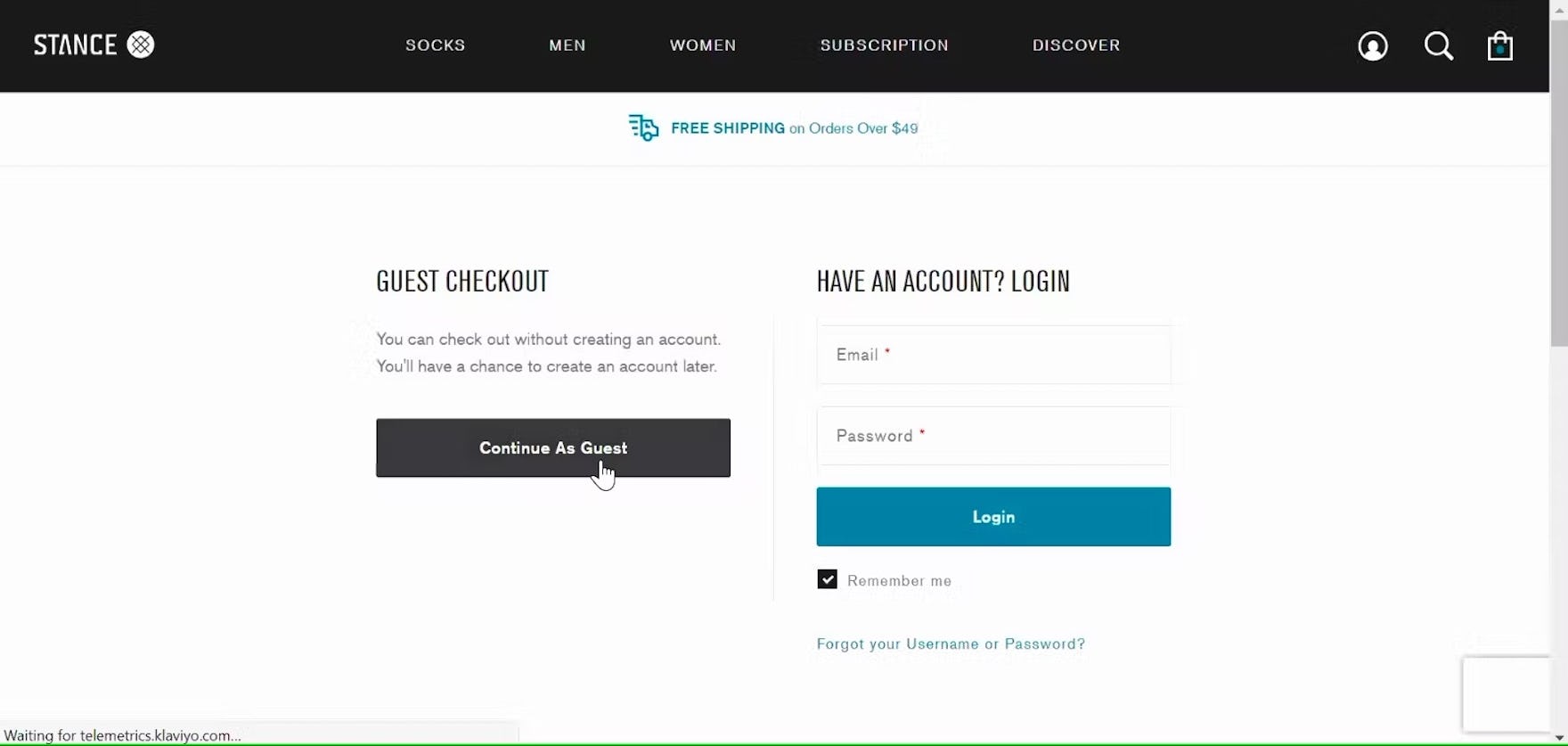
“So check out and ‘Continue as Guest’.” This participant on Stance immediately selected the prominent option for “Guest Checkout” presented in the left column of the account-selection step.
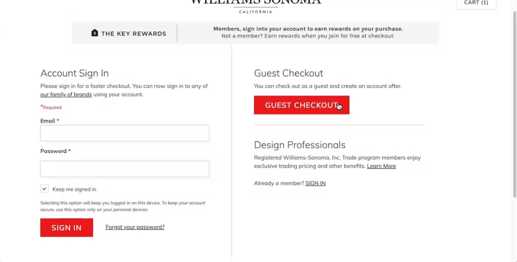
Likewise, this participant on Williams Sonoma easily found the “Guest Checkout” option in the upper-right column. The prominent button and clear labeling help draw attention.
On desktop, the additional width of the viewport allows sites to present sign-in options in side-by-side columns.
In desktop checkout testing, we observed that “Guest Checkout” can safely appear on either the left or right of the account sign-in page — so long as it appears at the top of its column with a clearly labeled and prominent button to continue.
Essentially, so long as the “Guest Checkout” option appears near the top of the account-selection interface, users are less likely to overlook this important option.
4) “Guest Checkout” Is Only Offered After Users Input Their Email
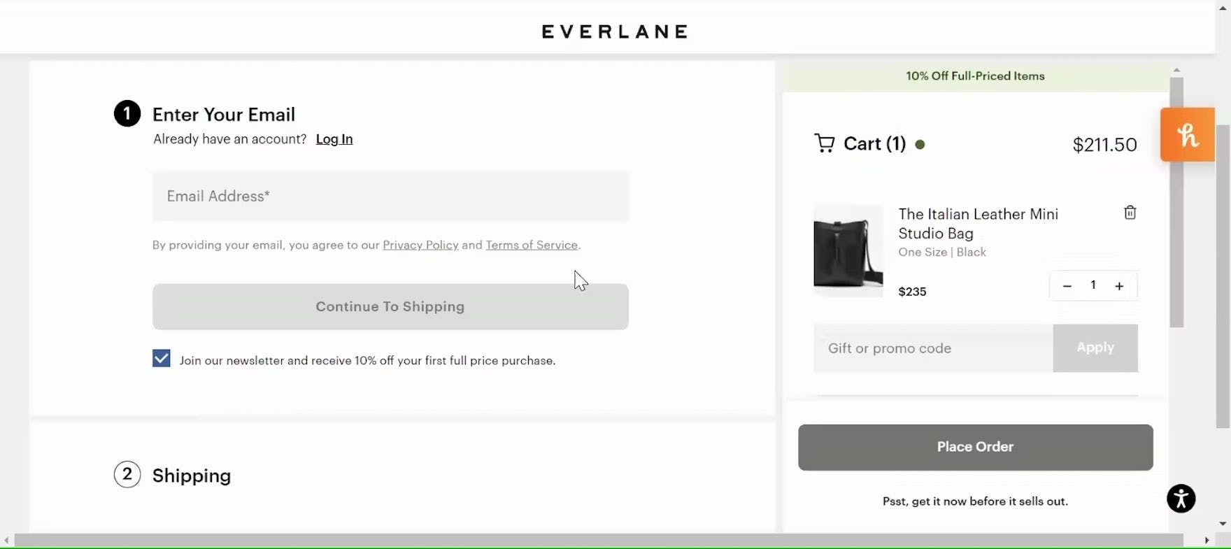
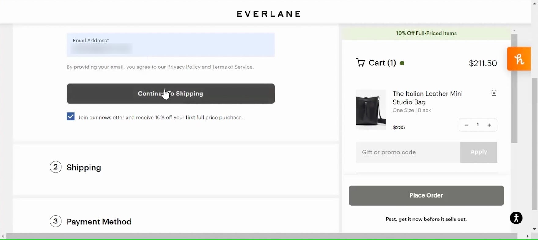
“I can log in or enter my email, but it doesn’t look like there’s an option for like a “Guest Checkout”.” On Everlane, this participant — a first-time user of the site — hesitated to check out because there was no explicit option for “Guest Checkout” (first image). In fact, the checkout defaults to “Guest Checkout” for new customers, cross-checking their email address with the existing customer database before offering the opportunity to sign in (for returning users) or to continue as a guest (for new users; second image). The lack of explicit choice may lead to abandonment for users who falsely assume the site does not offer “Guest Checkout”.
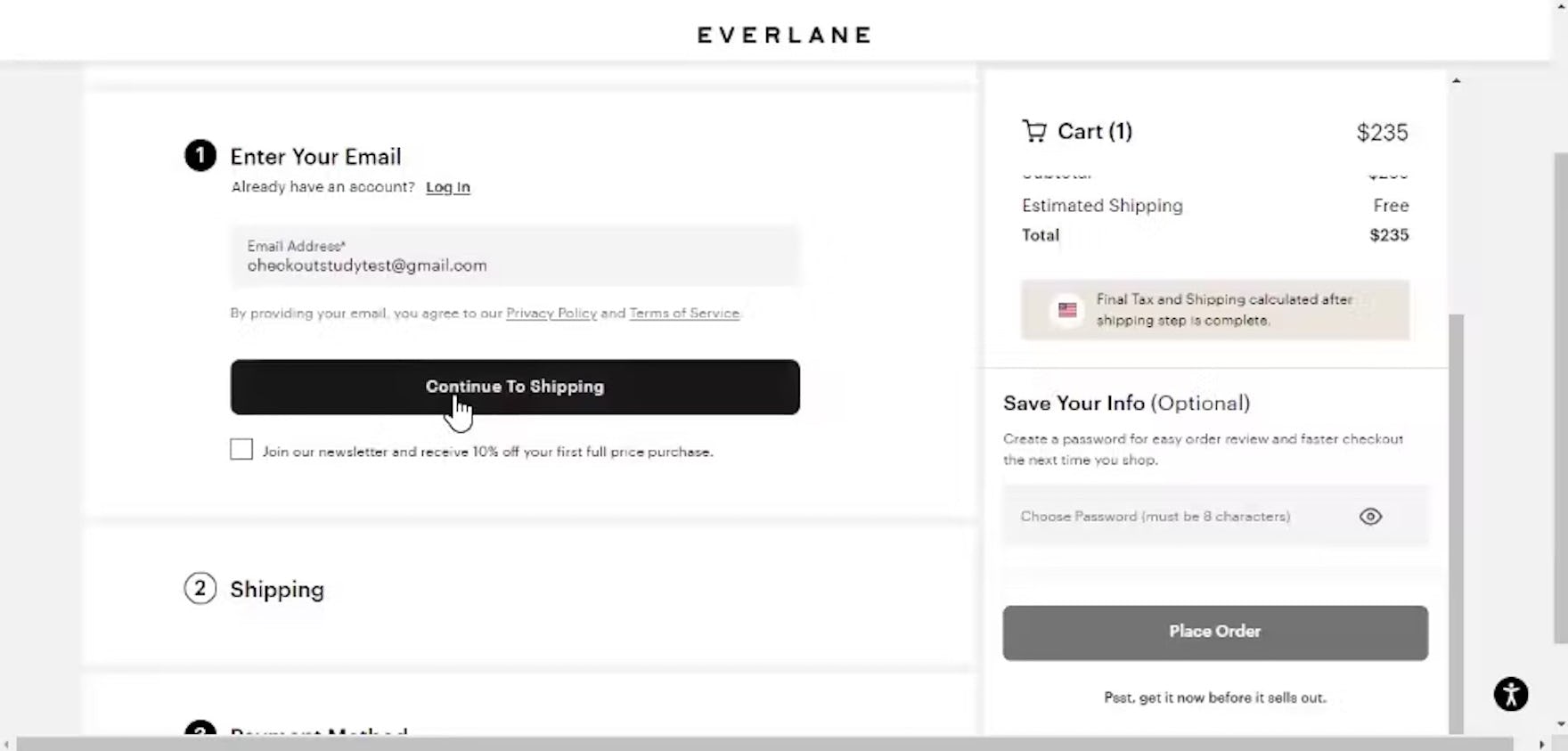
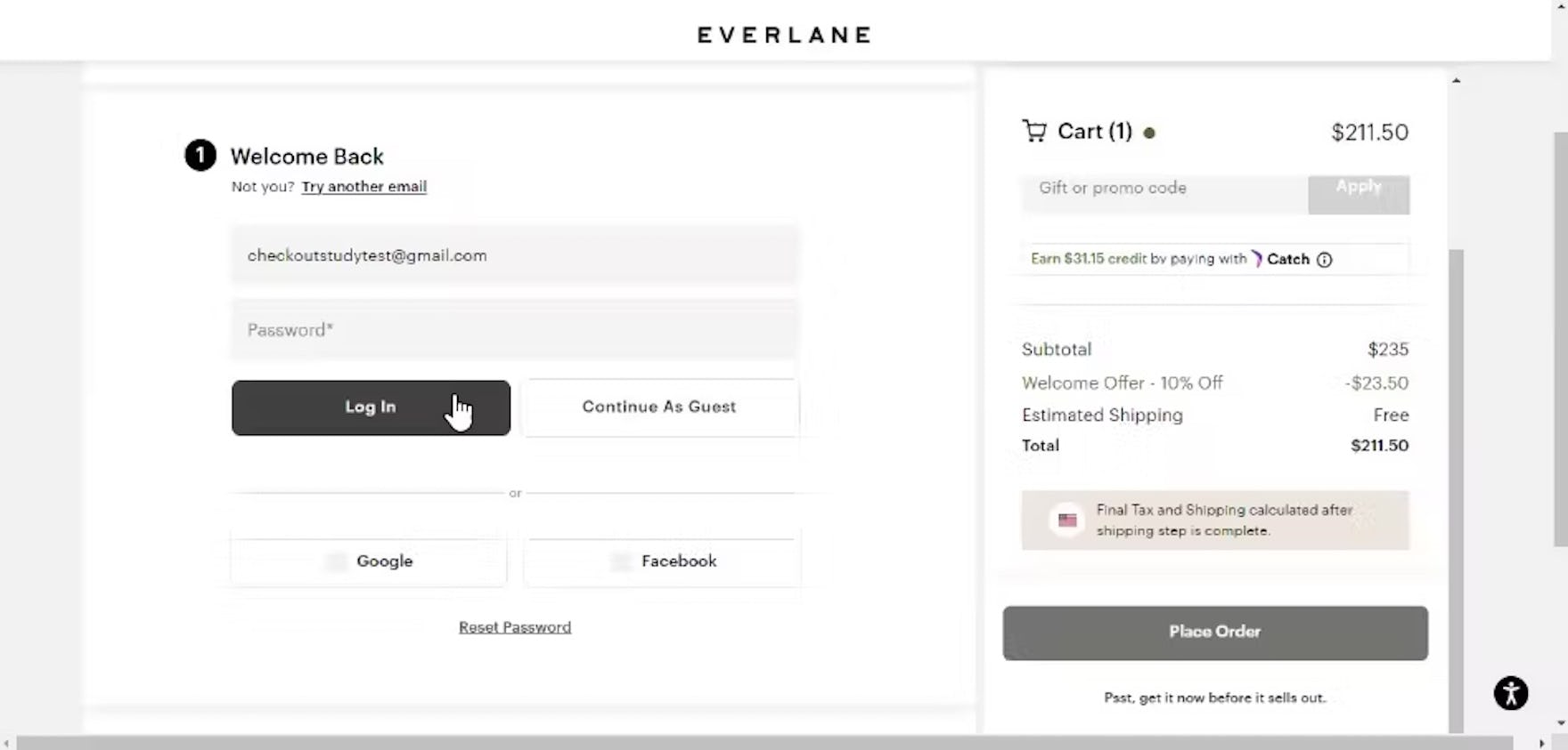
“Now they want me to do what?” Meanwhile, this participant with an existing account at Everlane was surprised that after inputting her email address and clicking the button to continue (first image) the site invited her to sign in or continue as a guest (second image). When these options aren’t presented up front, both new and returning users may be unsure how to continue.
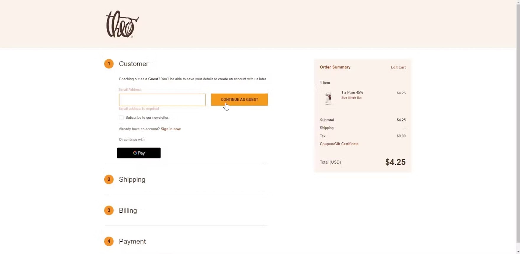
“I’ll just continue as a guest. Oh, ‘Email address is required’. Hmm, so they’re not leaving me a choice. I have to put in my email address to checkout?…My understanding [would be] I wouldn’t have to give them that information…That ‘Continue as a Guest’ button was a little misleading.” This participant checking out on Theo Chocolates was also misled by this design pattern, mistaking the requirement for an email address as indicating she needed to create an account with the site despite the button reading “Continue as Guest”.
Without an explicit indication of “Guest Checkout”, some users at Anine Bing (first image) and Adidas (second image) will hesitate to move forward with checkout, afraid of creating an unwanted account.
Finally, during testing some sites skipped the account-selection step altogether, sending participants straight from the shopping cart to the first step of the “Guest Checkout” flow, with “email address” as the first user form field.
Based on the user’s input, the site then performs a live lookup to see if an account already exists and, if it does, dynamically injects a password field or a call to action for signing in to the account.
While most participants were able to continue through and check out as a guest without issue, a small proportion hesitated to move forward, mistaking the lack of an explicit initial “Guest” option to mean that continuing would result in mandatory account creation.
Essentially, some users will expect to see an explicit option for “Guest Checkout” before moving forward with entering their personal information — risking abandonment when they cannot find this option immediately presented.
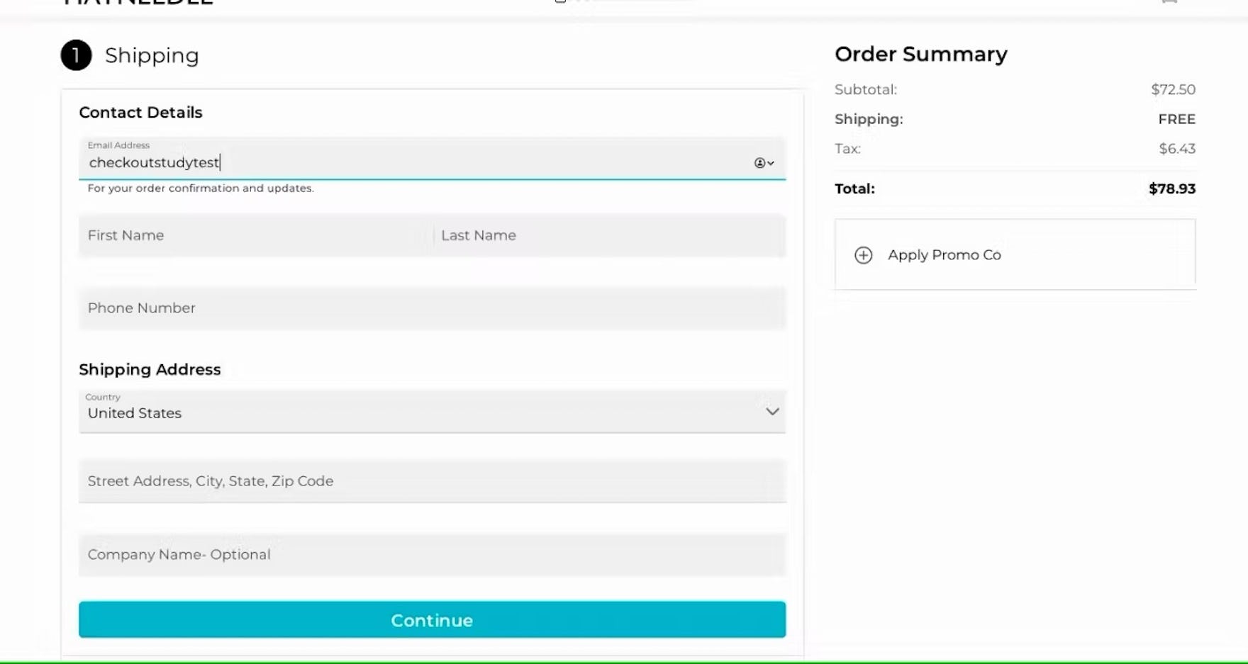
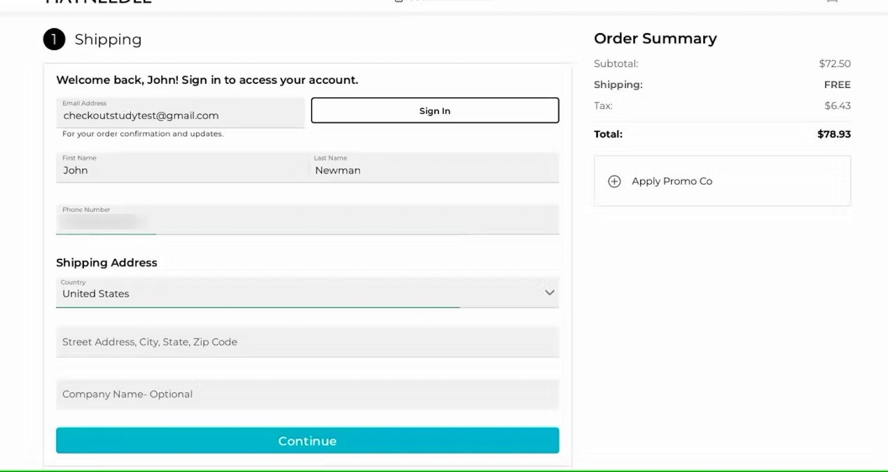
During testing at Hayneedle, participants with an existing account were not invited to sign in (first image) until after they had entered their email address (second image). Most participants overlooked this invitation and continued entering their information manually, missing out on a key benefit of using saved account information to streamline checkout.
Even users with an existing account may struggle without a more direct choice between “Guest Checkout” and signing in.
In testing, many participants with an existing account overlooked the dynamic option to sign in after entering their email address, especially when checkout form fields were already visible, drawing their attention further down the page (e.g., in a one-step checkout).
In practice, defaulting to “Guest Checkout” without providing an explicit choice can cause some users to overlook their intended option, leading to a suboptimal experience for both guest and returning users.
To keep users from mistaking that “Guest Checkout” is not offered — and subsequently hesitating or abandoning their cart — it should always be presented prominently at the beginning of checkout.
Allowing users to deliberately select “Guest Checkout” provides a sense of control and reassures users that their information will not be saved by the site.
If sites choose to skip the account-selection step and default all users to “Guest Checkout”, users who type an email that matches an existing account must still allowed to proceed as a guest, as we’ve observed that forgotten passwords and interruptions in the password-reset process can lead to site abandonment when sites force users to sign in to an existing account.
Ensure “Guest Checkout” Isn’t Overlooked

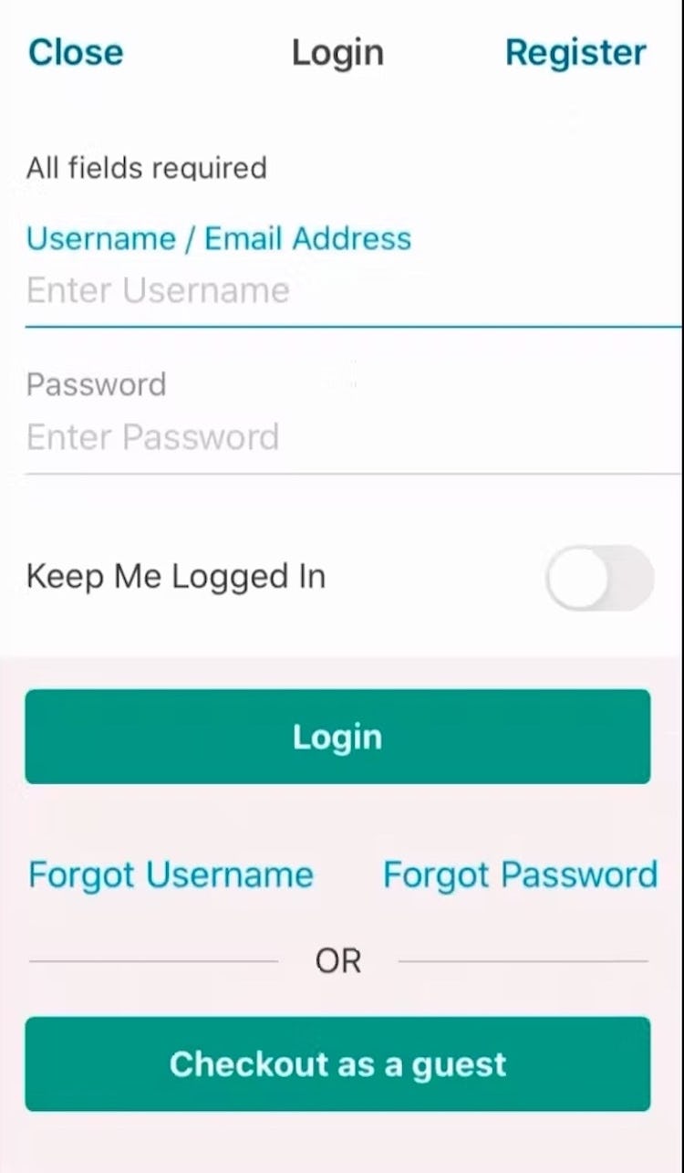
“I have to log in. That’s frustrating…I see no way around it.” During testing of Walgreens’s mobile app, several participants failed to find the “Guest Checkout” option, which was hidden by the keyboard UI invoked by the sign-in form (first image). Even when participants dismissed the keyboard, the “Guest Checkout” option remained subdued due to its location below the sign-in option (second image).
When “Guest Checkout” doesn’t appear to be available, many users will be hesitant to continue because they do not want to create an account with the site in order to check out.
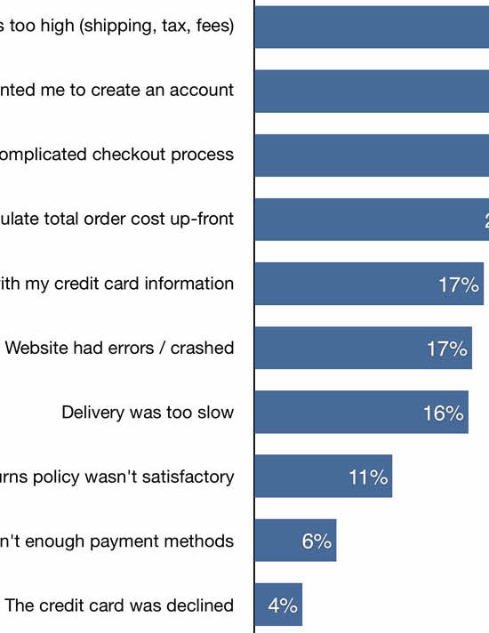
In fact, Baymard’s quantitative study on reasons for checkout abandonment shows that 24% of US internet shoppers have abandoned one or more shopping carts during the past quarter due solely to forced account creation (4,384 respondents, US adults, 2022).
Across multiple rounds of UX testing across desktop and mobile, we’ve observed 4 “Guest Checkout” implementations that users tend to struggle with:
- “Guest Checkout” not being clearly labeled
- “Guest Checkout” being presented as a plain text link
- “Guest Checkout” appearing below “Account Sign-in” or other options
- “Guest Checkout” only being offered after users input their email
Avoiding these 4 pitfalls will help ensure users are able to quickly spot and select the “Guest Checkout” option on the account-selection step, allowing them to avoid an unnecessary disruption at the very beginning of the checkout process.
This article presents the research findings from just 1 of the 650+ UX guidelines in Baymard Premium – get full access to learn how to create a “State of the Art” e-commerce user experience.
If you want to know how your website performs and compares, then learn more about getting Baymard to conduct a UX Audit of your site.