Key Takeaways
- Comparing multiple spec-driven items in product lists is inherently difficult due to the number of attributes these products have and how hard it is to compare items that are not adjacent to each other in the list
- During testing on spec-driven sites, 67% of participants used comparison features
- There are 2 implementation details that are important to get right in order to optimize the product selection process
Enabling users to compare products easily and efficiently is one of the primary purposes of product lists.
Users can of course compare product features by scanning list item information, but spec-driven product types often have differentiating specs that are too numerous to fit in list items.
At the same time, our large-scale testing of product lists during our large-scale Premium UX research reveals that visiting multiple product pages to compare specs can be time-consuming and troublesome (especially if users are not brought back to the same place in the product list on return).
As a result, many users will hesitate to visit multiple product pages and could therefore miss out on suitable items and spend too much time working out which items could be dismissed.
On the other hand, comparison features can help users by displaying many specs for multiple products side-by-side. During our testing on spec-driven sites, 67% of participants used comparison features – yet our e-commerce UX benchmark shows that 17% of sites with spec-driven products fail to offer comparison tool.
In this article, we’ll show you some of our Premium research findings, discussing:
- Why comparing spec-driven products in product lists is difficult
- How comparison features help users
- How to facilitate easy selection of products for comparison
- Comparison features on mobile
- Provide comparison features that are optimized for ease of use
Why Comparing Spec-Driven Products in Product Lists Is Difficult
Users on spec-driven sites are hindered by 2 issues when comparing items in product lists:
- Not all specs can be shown in list items
- It’s difficult to compare products that can’t be viewed together
1) Not All Specs Can be Shown in List Items
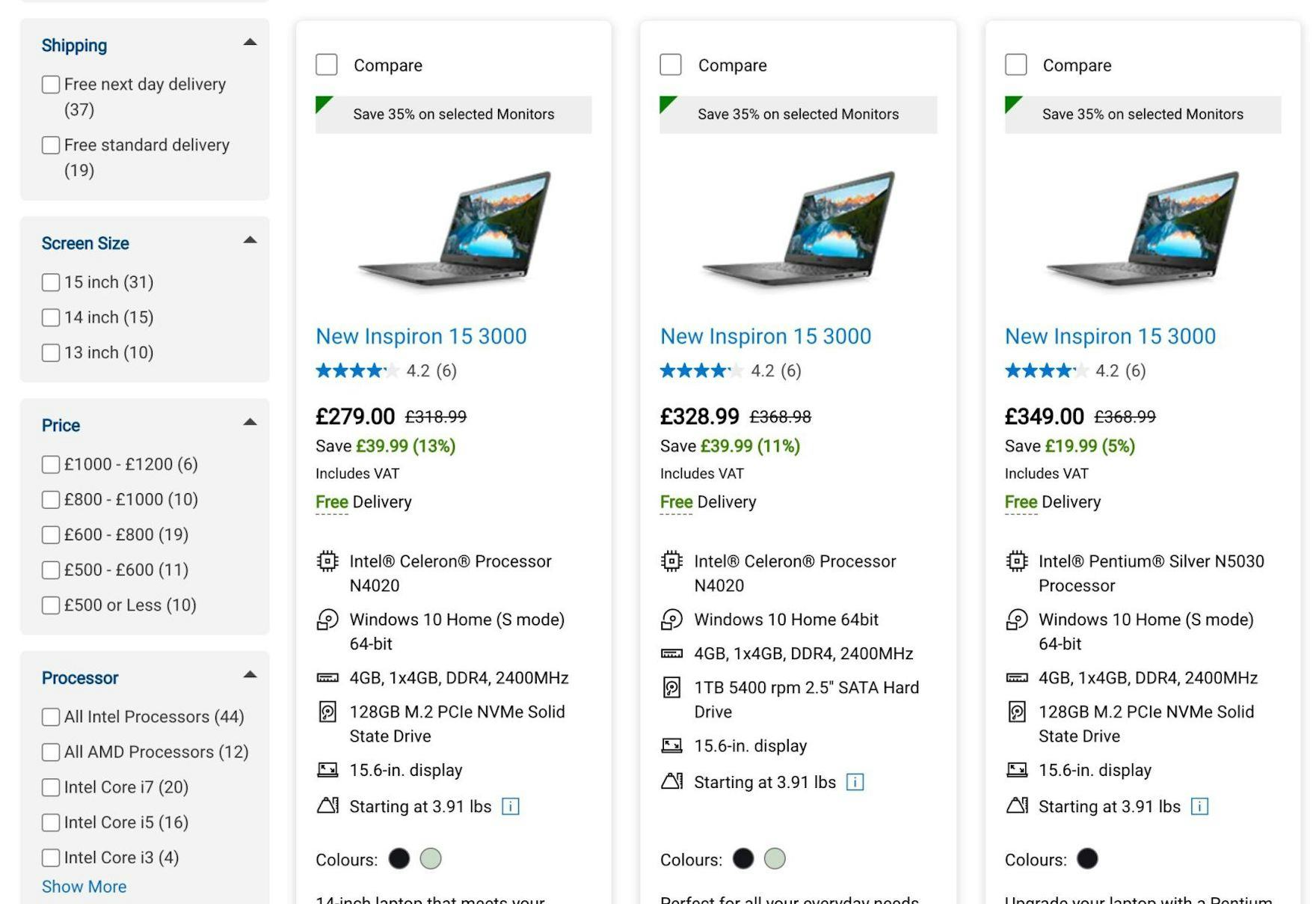
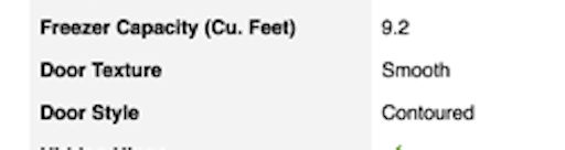
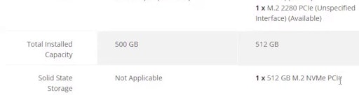
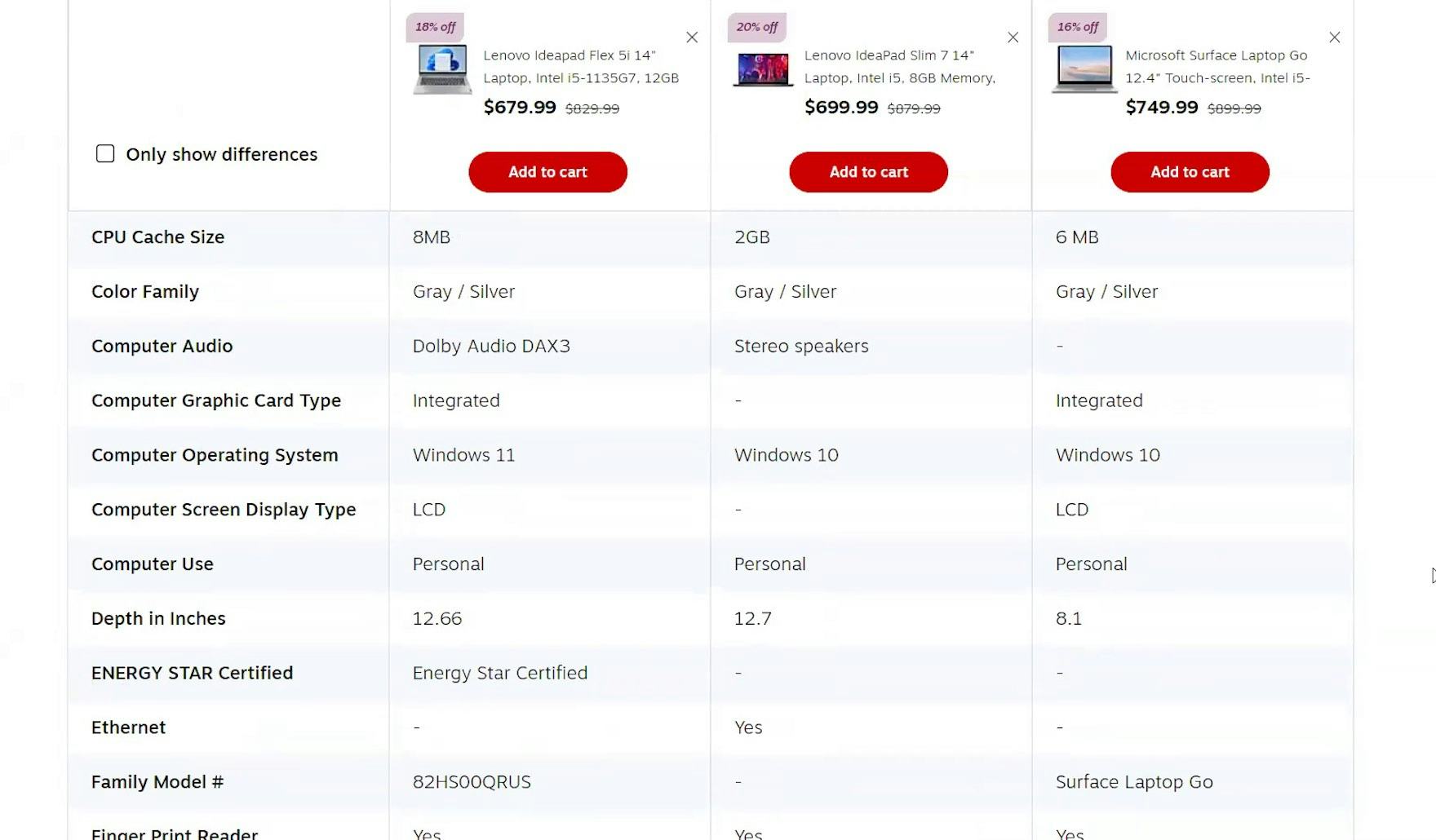
While Dell does a good job of displaying essential and category-specific attributes in list items, not every feature of interest to every user can be shown.
Spec-driven products typically have many features and attributes that factor into purchasing decisions.
During testing, while many users considering laptops sought out details on hard disk size, screen resolution, and the amount of RAM, other specs were critical to some and of no interest to others.
For example, while a backlit keyboard was of importance to one user, the version number of the Wi-Fi connection was important to another.
Neither of these specs would be considered key attributes to the majority but they might be deal-breakers to some.
With such specs not being important enough to the majority of users to appear in list item info, a subset of users would have to visit product pages to find out about them, with the potential of the troublesome back-and-forth between these pages and the product list.
2) It’s Difficult to Compare Products That Can’t Be Viewed Together
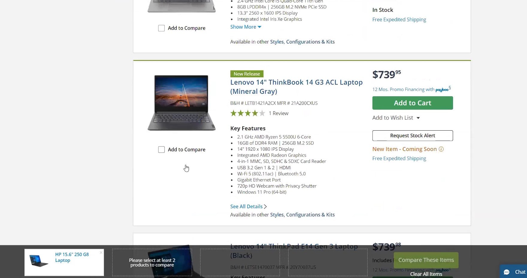
While users are able to assess many individual items when list item info is comprehensive, like here on B&H Photo, it would be difficult to compare every key spec across multiple products because so few items are visible in a single viewport.
Given the vertical space needed to display the essential and category-specific features in list items, no more than 2 or 3 products will be visible in a typical viewport.
Even if the key comparison criteria are shown in list items, users would find it very hard to weigh up multiple product attributes across many items while scrolling through product lists or search results if the items weren’t adjacent to each other.
For example, if the products of interest were located at different points in the list, users would have to memorize the key specs of one product, then scroll to find another that matches those, and scroll up and down to compare the specs.
This process would become very tiresome if there were multiple products to compare.
Of course users could try to use filters to reduce the number of items shown, and sorting to bring items closer to each other in the list, but with just a few items visible at once, comparison would still require significant scrolling and memorizing to compare the items.
One workaround is to open each item in a different tab (for desktop users; mobile users were observed to rarely use multiple tabs during browsing), but users would need to either separate the tabs into new windows so that all could be viewed at the same time, or memorize the specs from each product as they switch between the tabs.
How Comparison Features Help Users
“I never did this before. Okay, it gives you all the things you need to compare right there on your screen, at once, instead of having to click on multiple screens. That’s cool. That really worked. I think that’s very helpful.” A test user that hadn’t used comparison features before found that this one on B&H Photo made comparing products a whole lot easier than trying to compare the items in the product list.
“It’s got a lot of info and that’s what I like. The more info, the better it helps me understand what it is. For example, it mentions if it’s a 2-in-1, it has the battery life, graphic processor, hard drive size, what type of battery, and the weight. That’s a lot of info and that’s what I need. The more info, the better it helps make my decision.” This test user was keen to compare laptops across numerous features on Staples and was happy that the comparison feature made this easier.
To enable users to compare many specs of multiple products on a single page, sites with spec-driven product types should always provide comparison features.
During testing on spec-driven sites, 67% of participants used comparison features, with many positive comments; for example:
- “I do like that I can compare several laptops at once, which is pretty good because then I could kind of compare the features against all of them, especially if I’m looking for a variety of features.”
- “So, going to the page where you can just compare them side by side, you could really get the in-depth comparison.”
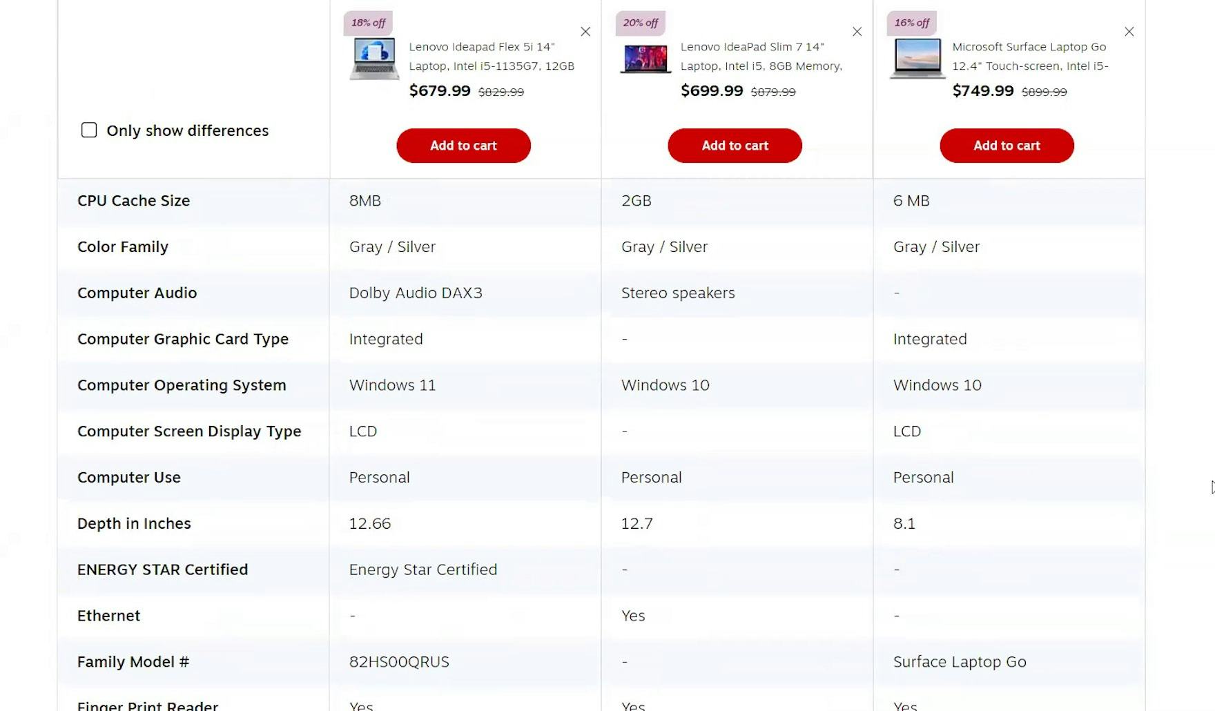
A well-implemented comparison feature allows users to see every product spec for up to 5 products at once.
In fact several test users felt comfortable enough during testing to add laptops or printers to the cart directly from comparison tables without ever viewing product pages.
Comparison features, therefore, can significantly speed up product finding on spec-driven sites.
How to Facilitate Easy Selection of Products for Comparison
2 implementation details observed during testing made the process of adding items to the comparison table easier:
- Provide persistent “compare” checkboxes in list items
- Provide a persistent reminder of what products have been chosen for comparison
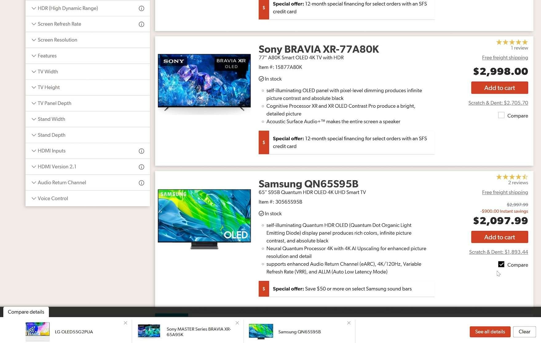
1) Provide Persistent “Compare” Checkboxes in List Items
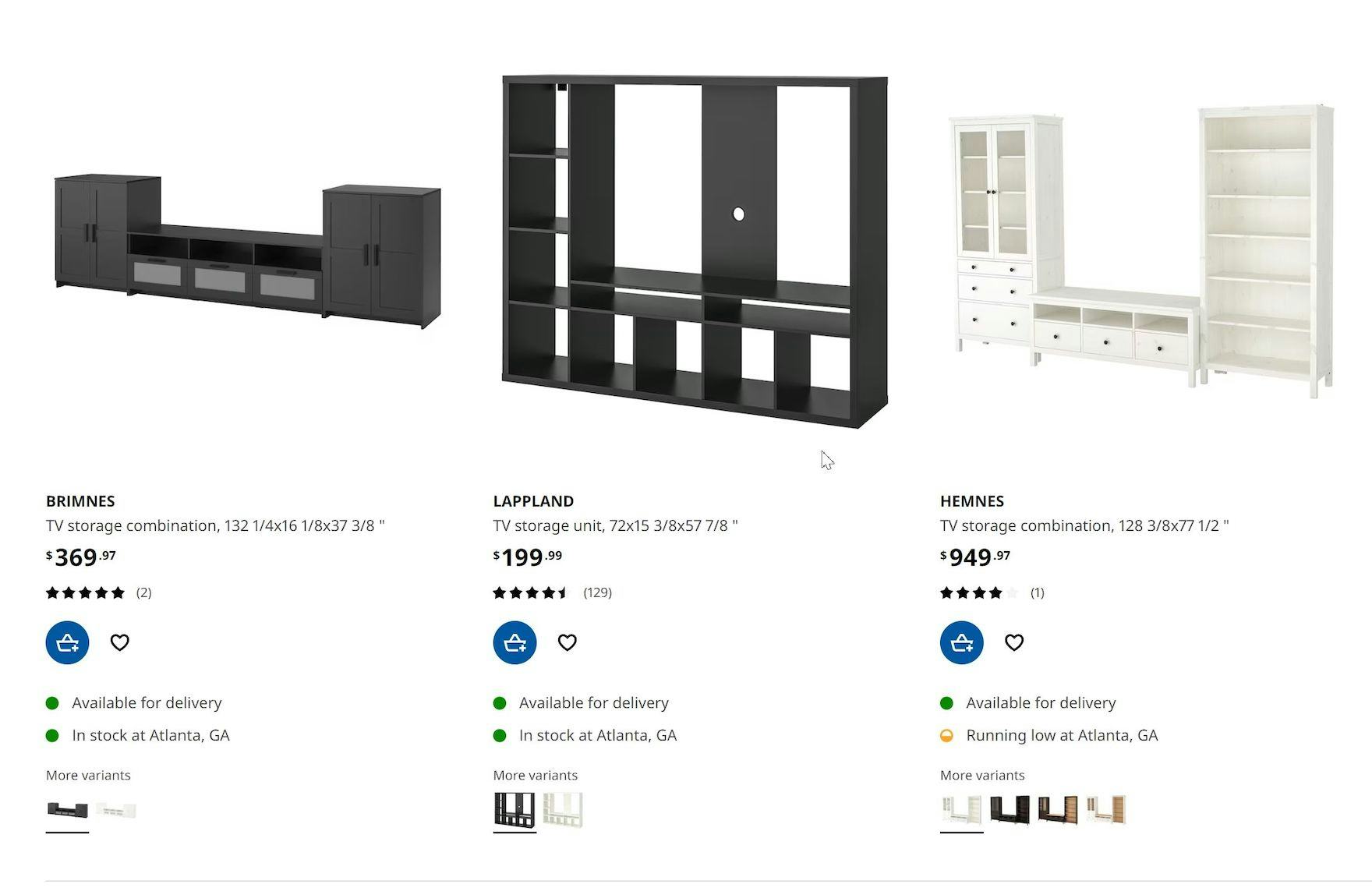
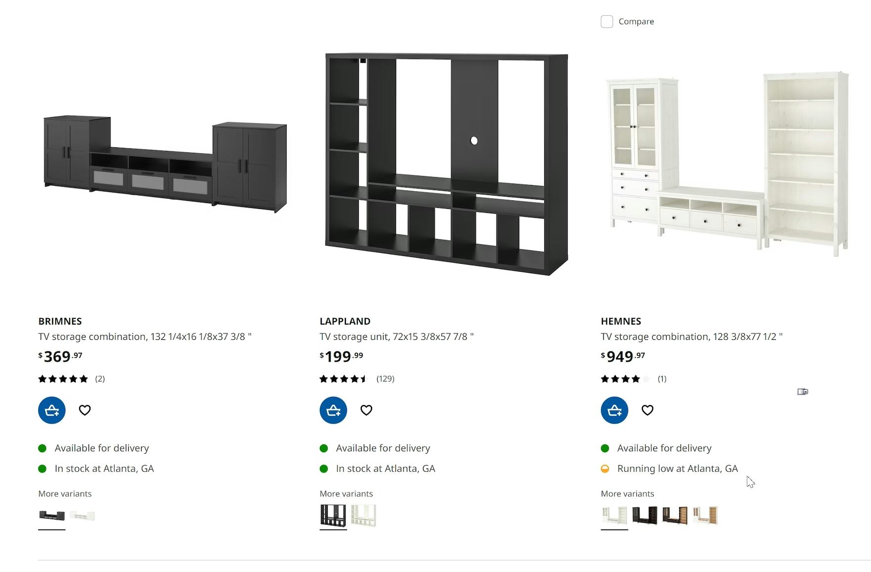
On IKEA, buttons to select items for comparison are hidden by default (first image). It’s only when users hover over an item that products can be selected for comparison by checking the “Compare” buttons that appear (second image; third item). As a result, some users may not realize that there is a comparison feature.
“Oh, yeah, they do have a compare feature. Okay, this one, this one.” Checkboxes that are always visible inform users that there is a comparison feature available, in this case on Office Depot.
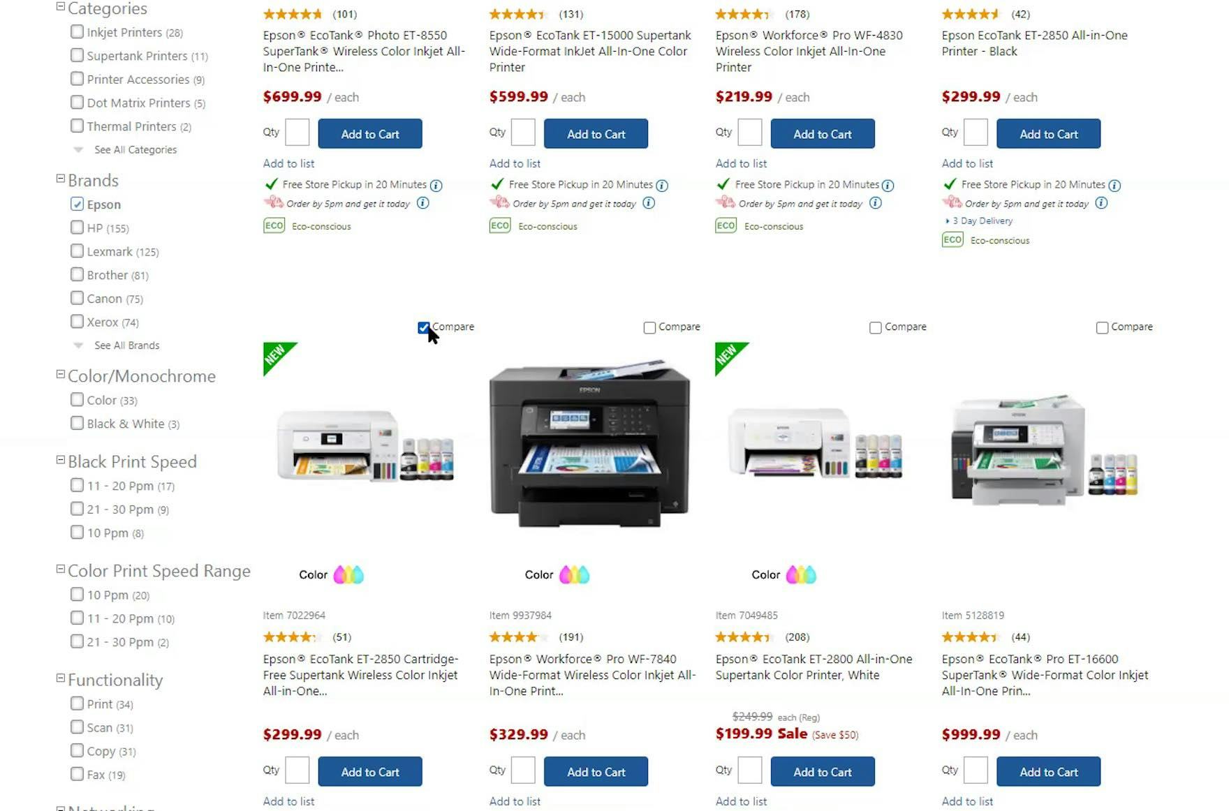
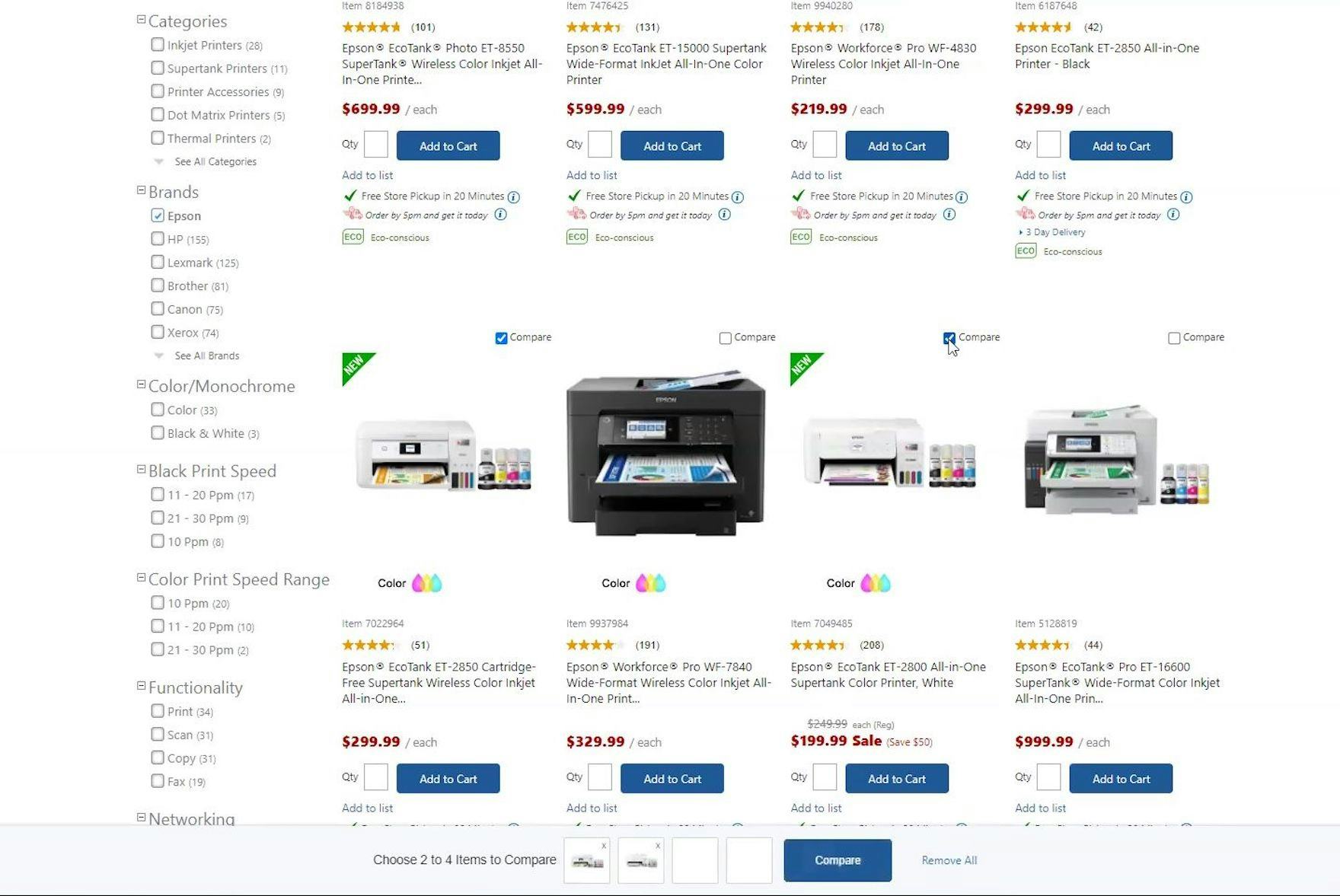
“It has the option right below each one where I can select them. I don’t know why I didn’t do this. But if they have the option like this, it’s a lot easier I assume.” Likewise, the prominent “Add to Compare” checkboxes on B&H Photo reminds users that they can compare items on a single page.
If “Compare” checkboxes aren’t visible without interaction from users, they may not know that the compare feature exists.
Not every user will be familiar with comparison features and, if they are only visible on hover, some may overlook them.
“Compare” checkboxes should therefore be visible by default within list items.
Note: previously, we recommended that “Compare” checkboxes should only appear on hover. Recent testing has shown, however, that they should appear without any action needed from users to advertise the presence of the comparison feature. In effect, the positive benefits of communicating the existence of comparison features via persistent checkboxes outweighed the negative consequences of additional list item “clutter”.
2) Provide a Persistent Reminder of What Products Have Been Chosen for Comparison
“And it’s easy to add it to the compare [feature]. Oh, and it even pops up at the bottom. I appreciate that. Just so I have a visual reference and I can even unselect them easily while I’m scrolling down and if there’s one I want to remove from the list, I can just deselect it right here on this little visual. That’s nice. I haven’t seen that before.” This overlay panel that appears once an item is selected on B&H Photo for comparison allows users to see what items have been added and how many more can be added, and allows users to get to the comparison table using the “Compare These Items” button.
Likewise, the overlay panel on Office Depot allows users to manage items for comparison with ease and has a clear path to the comparison table via the “Compare” button.
Sites generally have a limit of 3-to-5 items that can be added to comparison tables.
When users are adding multiple items for comparison, they’ll need to be able to see how many items have already been selected.
Also, they may need to amend the list as they are doing so; for example, to add a more suitable item and remove one that is less so.
To make this process as easy as possible, sites should provide a reminder of items that have been selected that stays in the viewport that also shows how many more can be added.
During testing, users found that a persistent overlay panel at the bottom of the viewport showing each item already selected, along with a clear indication of how many more could be added, worked very well.
Comparison Features on Mobile
During mobile testing, it was clear that comparison features were less useful to users than on desktop sites.
In fact, of 38 mobile testing participants that visited the 2 sites that had comparison features (Walgreens and B&H Photo), only 3 used the feature at Walgreens, while the feature at B&H Photo was not used at all — despite the fact that B&H Photo contains mostly spec-driven products, caters to highly knowledgeable users, and some users during mobile testing were actually seeking ways to compare products at B&H.
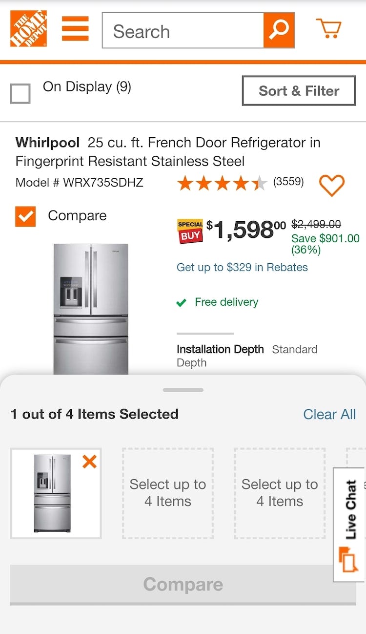
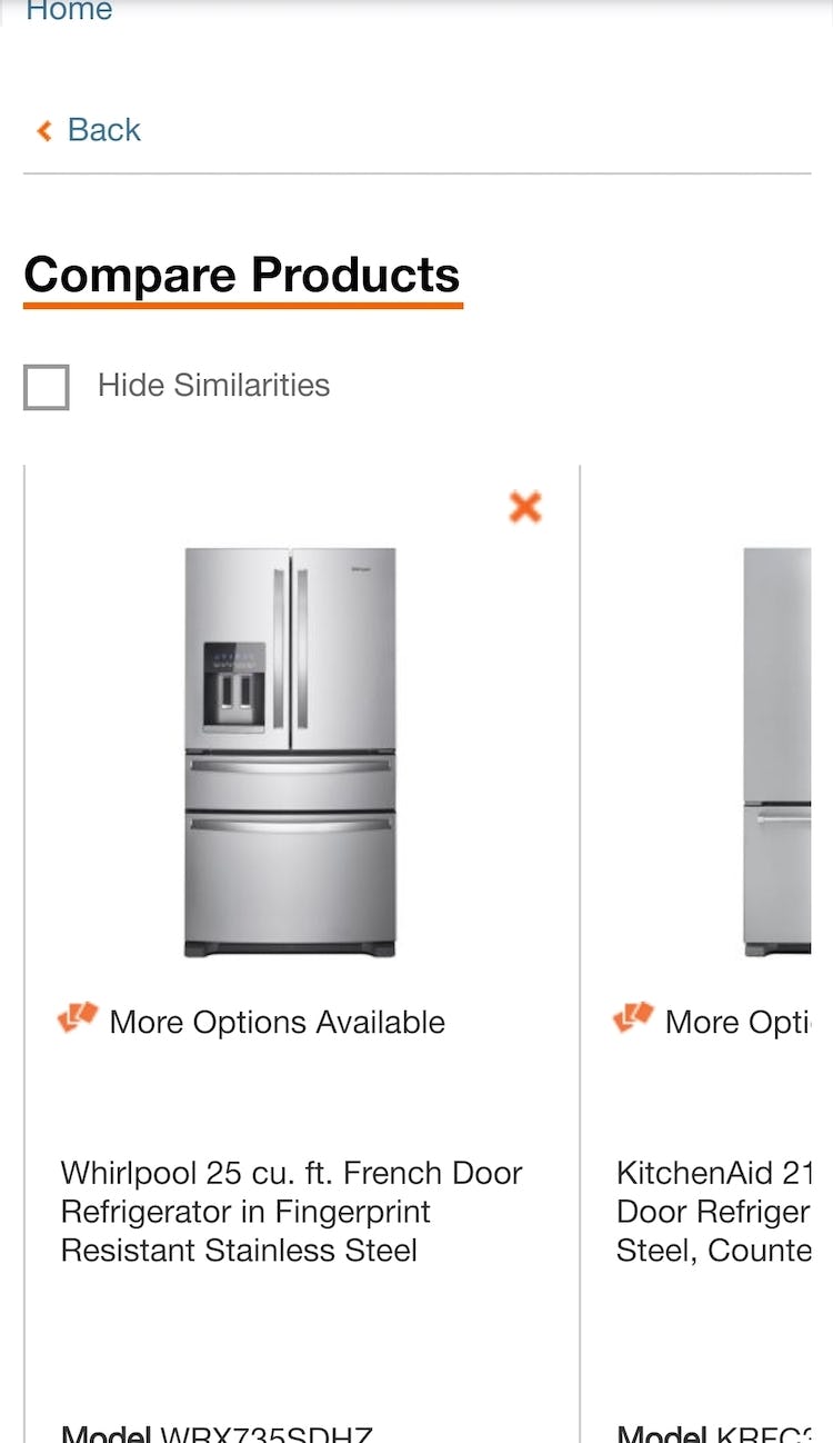
Even in a compare feature that makes it easy to select products and compare them on mobile, as shown here on Home Depot, the small viewport means that users can only view 1 product without having to scroll horizontally (second image), limiting the usefulness of the feature. Also, once an item is selected for comparison, this product list is partially obscured — in fact, the comparison panel at the end takes up 51% of the available viewport (first image).
A number of mobile-specific factors reduce the usefulness of comparison features.
“Compare” checkboxes could well add to the clutter of list items that have to fit in a small viewport, and which have to contain essential elements and selected nonessential elements, with the risk of adding height to list items.
Furthermore, because checkboxes can’t take up a disproportionate amount of space, they can’t be too large. This means that they are often difficult to tap, especially if they don’t meet the minimum required size of 7mm x 7mm.
Finally, and most critically, tables that allow easy comparison of specs on desktop do not lend themselves well to the small and narrow mobile viewports.
In portrait mode, only 1 full column would be visible at once so users would be unable to see the specs of 2 or more items together.
Even in landscape mode, where up to 3 columns might be visible at once, vertical space would be very limited, allowing users to see only 1 row at a time.
In either case users on mobile would be forced to scroll to view information about each item being compared, making it very difficult to see, understand, and maintain an overview of specs for multiple products at once — minimizing the usefulness of the feature.
Many sites have come to the conclusion that users don’t find comparison features helpful enough on mobile to justify the time and expense to develop them.
While there may be a number of reasons for sites not to offer comparison features on mobile, the lack of demand for them from users on mobile sites — as demonstrated by the very low usage of comparison features during testing — is likely to be foremost.
So, while well-implemented comparison features may be useful for users of some spec-driven mobile sites, the evidence doesn’t support designing and developing new comparison features for mobile sites (although keeping and maintaining an existing mobile-optimized comparison feature may be worthwhile).
In lieu of a comparison feature on a mobile site, resources are typically better spent optimizing the existing product list instead.
Also, sites should facilitate comparison in other ways such as by providing “Save” features for guest users so they can view items later, and enabling users to store items temporarily in the cart.
Provide Comparison Features for Spec-Driven Products
Users on Crutchfield can easily select items for comparison using the persistent “Compare” checkboxes, while the products already selected are shown in a persistent summary at the end of the page.
For spec-driven products, therefore, comparison features should be provided for desktop sites to allow users to comprehensively weigh up multiple attributes across products, enabling them to make informed purchasing decisions.
Despite the clear need for comparison features, it’s surprising our e-commerce UX benchmark shows that 17% of sites with spec-driven products fail to offer them.
Comparison features allow users to overcome the inherent difficulties associated with comparing spec-heavy items in product lists:
- Not all specs can be shown in list items
- It’s difficult to compare products that can’t be viewed together
To make it as easy as possible to select items for comparison, spec-driven sites should provide:
- Persistent checkboxes in list items
- A persistent reminder of what products have been chosen for comparison.
This article presents the research findings from just 1 of the 650+ UX guidelines in Baymard Premium – get full access to learn how to create a “State of the Art” e-commerce user experience.