Key Takeaways
- Intermediary category pages were observed during large-scale DTC testing to introduce a disorientating level of complexity to participants shopping on DTC sites
- Participants were observed to struggle to get an overview of the site’s products when intermediary category pages were provided
- Avoiding this unnecessary layer in favor of directing users to product lists instead is a better solution
For traditional multi-brand e-commerce sites, intermediary category pages help users better understand the full range of options within a particular category and highlight navigational paths and related content.
In practice, this additional hierarchical level provides a vital opportunity to guide users into a narrower — and more relevant — subcategory before they begin the often daunting task of evaluating hundreds or even thousands of product options on the listings page. We’ve consistently since 2013 observed how category pages improve site navigation for traditional e-commerce sites.
However, direct-to-consumer (DTC) and other small catalog sites, have fewer and less diverse products and a flattened category taxonomy, and simply have fewer potential navigational paths for users to decide among.
Indeed, in our large-scale testing of DTC sites, we observed intermediary category pages to impede, rather than enhance, the experience of browsing products.
As a result, some participants during DTC testing became severely disoriented — and had a much more difficult time beginning their product exploration.
In this article, we’ll discuss our Premium research findings for intermediary category pages on DTC sites:
- How intermediary category pages can disorient users on DTC sites
- What to do to avoid the issue
How Intermediary Category Pages Can Disorient Users on DTC Sites

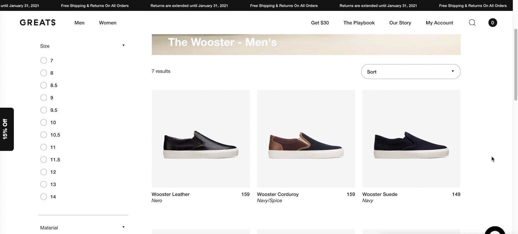
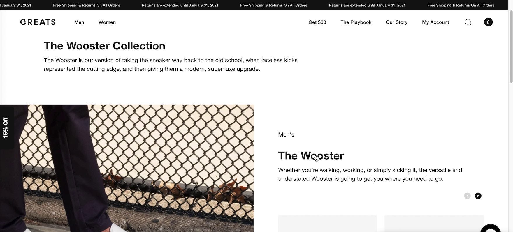
Selecting a subcategory from the main navigation menu, this participant on Greats was initially disoriented by the lack of visible product listings — he had, in fact, arrived on an unexpected intermediary category page (first image). Attempting to locate the product list, he shared, “I’m going to click on ‘The Wooster’ here to see where this goes”, and arrived finally on the anticipated product list (second image). “So that was like an introduction page to that model?” he queried, still confused about this interstitial page. For users wishing to browse available products, intermediary category pages on small catalog sites increase the number of clicks — and amount of effort — required to reach product lists.
Testing revealed that intermediary category pages on DTC sites frustrate users and fatigue them before they even begin the process of making their product selection.
For example, one participant from testing, having clicked no fewer than three times before arriving on the product list, stated, “I just need one product, click, and this page [the product list]. That’s all I need, just two clicks. They asked me to do five clicks to get to this product”. Or as another participant stated, similarly having taken multiple clicks before arriving on a product list, “I wish I had been brought here quicker than it took us to get here”.
In testing, 31% of participants on test sites with intermediary category pages struggled to reach the product list, with many initially misinterpreting the intermediary category page as the product list and missing out on functionality such as filters that they had not reached yet.
In general, sites require a minimum number of products before the value of intermediary category pages outweighs the cost of the additional navigational click.
Indeed, even on mass-merchant sites our testing has shown that overcategorization can be an issue that causes users to have trouble understanding the site hierarchy and leads to several “dead end” product categories with only a handful of products.
With a shallow and narrow product hierarchy, DTC and other small catalog sites lack the need to so finely segment users and direct them towards divergent paths, making intermediary category pages an unnecessary and burdensome step.
Avoid Intermediary Category Pages on DTC Sites
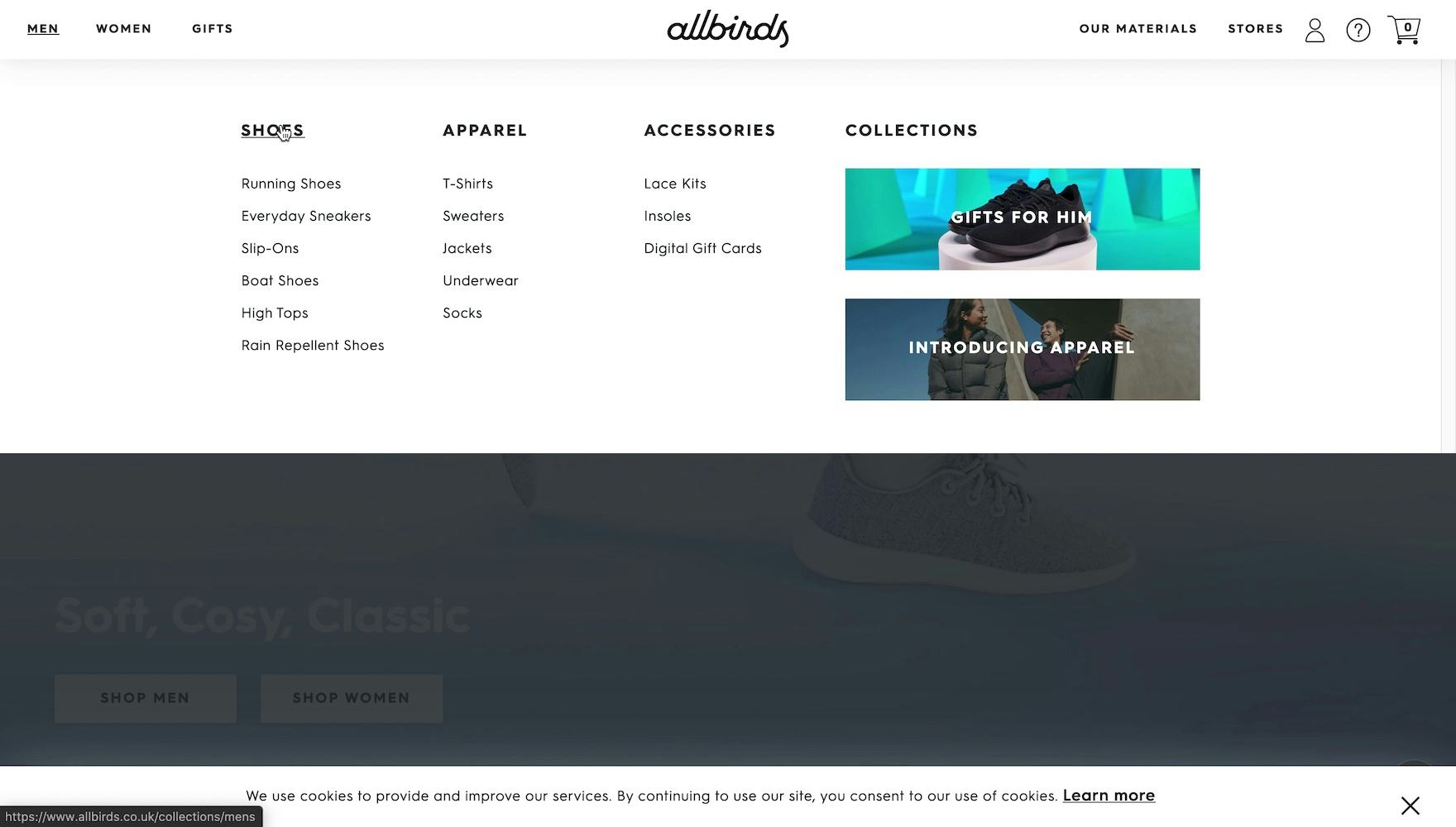
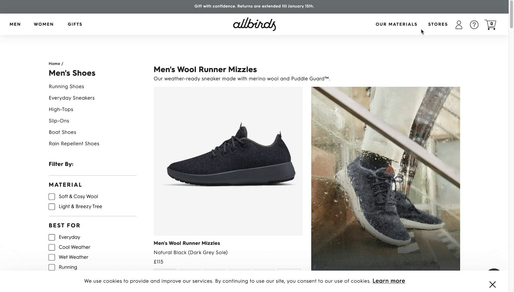
Another test site, Allbirds, could have implemented the “Men’s Shoes” top-level category as an intermediary category page (first image), requiring users to select a subcategory before reaching a product list. Instead, the browsing path is shortened, and the link opens a “View All” product list (second image). This implementation is effective because Allbirds only carries a dozen or so different men’s shoes, making it easier to scan a “View All” list than navigate through an additional layer of navigation.
Given the disorienting issues caused by intermediary category pages on DTC sites, they should be avoided on DTC, small catalog sites.
Almost all participants in testing were much more interested in learning details about individual products, or the larger brand, and were much less interested in being exposed to products more gradually through intermediary category pages.
Additionally, larger retailers utilize intermediary category pages not only for differentiating subcategory options, but also to highlight different kinds of auxiliary content, including inspirational lifestyle imagery, buying guides, and relevant cross-links.
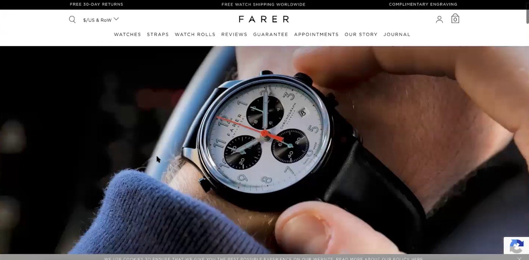
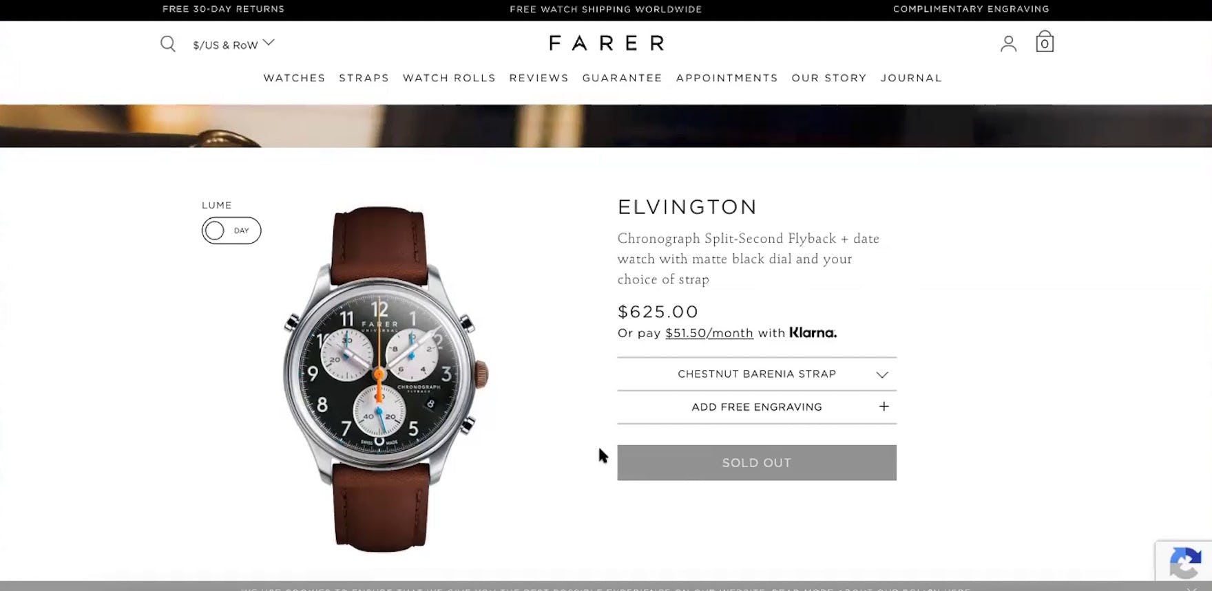
“This [video] is just irritating to me…it’s just preventing me from getting to what I want to get to.” The oversized video feature at the top of Farer’s product listing page (first image) distracted this subject from being able to quickly start exploring different products (second image). In the absence of traditional intermediary category pages, auxiliary content can be beneficial to include on product lists, but not at the expense of the product listings themselves.
Similarly, DTC and small retailers may use intermediary category pages as a way to compensate for the comparatively small selection of products and resources.
However, during testing, we observed that the slim catalog of DTC sites, allowing for a lighter navigation menu, provides an opportunity to effectively leverage and highlight this same information in a variety of other ways — for example, on the homepage and product details pages — as well as elevating inspirational and educational content to its own dedicated page or main navigation category for users to explore fully.
Help DTC Users Get an Overview of the Full Product Catalog
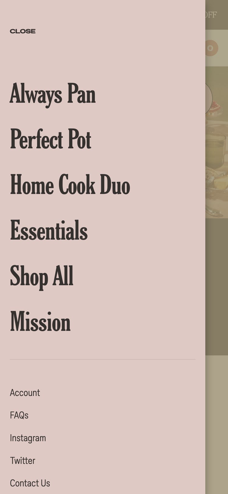
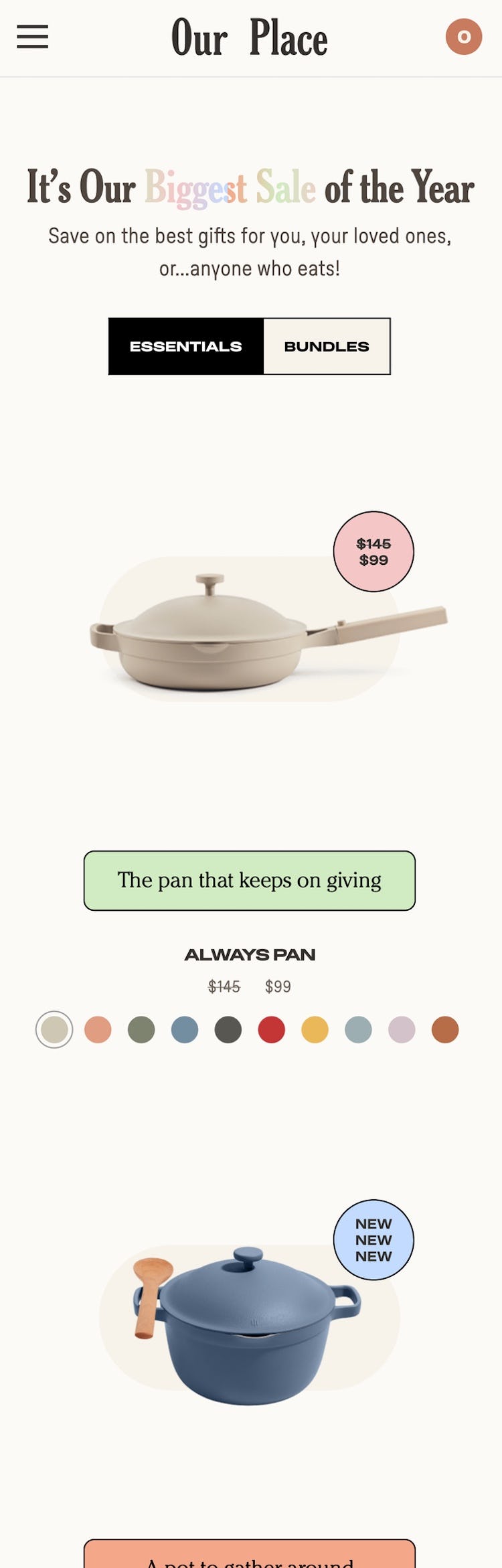
At Our Place, tapping “Essentials” in the main navigation (first image) leads directly to the “Essentials” product list. Avoiding intermediary category pages is even more important on mobile sites, given the challenges inherent to mobile e-commerce UX.
Our large-scale testing of DTC sites shows that many critical components of larger e-commerce retailers — for example, on-site search and user reviews — are much less necessary on DTC sites.
In fact, both DTC on-site search and DTC user reviews were observed to be negligible when it came to participants’ ability to find and evaluate products on DTC sites.
Similarly, DTC testing shows that another mainstay of traditional e-commerce sites — intermediary category pages — are also superfluous and can even be harmful when implemented on DTC sites.
Indeed, many DTC sites seem to have reached a similar conclusion, as our DTC benchmark shows that none have implemented intermediary category pages.
Thus, having an intermediary category page on a DTC site will be perceived by users as not only troublesome to navigate but outside the norm when compared to similar sites.
Therefore, rather than introducing unnecessary complexity to the DTC site in the form of intermediary category pages, resources are better spent elsewhere — for example, improving the homepage and product page — to ensure users have the information they need to make a purchase decision.
Getting access: all 422 DTC UX guidelines are available today via our Premium research findings. (If you already have an account open the DTC study.) (You may also want to see our DTC audit service for information on booking a UX audit of your DTC sales site.)