Key Takeaways
- Our large-scale testing of both desktop and mobile apparel sites shows that nearly all sites fail to provide sufficient sizing information for users (83% and 87%, respectively)
- This leaves many users without the information they need to make an apparel purchasing decision
- Apparel sites can support this user information need by implementing the 10 sizing information elements discussed in this article
Video Summary
For apparel products, selecting the correct size is a highly important aspect of the purchase.
During our large-scale testing of apparel e-commerce sites, we observed that users can be hesitant to purchase a product if they’re not confident in its sizing.
Furthermore, if the correct size is not easily discernible, users may leave the site to find more information, risking that they do not return.
Indeed, during both desktop and mobile UX apparel usability testing, uncertainty around sizing was a common cause for abandoning a product.
Moreover, a product that does not fit — whether it’s a t-shirt or an evening dress — will need to be returned, causing significant hassle and disappointment for the user and strain on the site’s customer support.
However, our Apparel UX benchmark shows that 83% of desktop apparel sites, and 87% of mobile apparel sites, fail to provide sufficient sizing information — putting themselves at risk of users abandoning the site.
In this article we’ll discuss the following from our Premium research findings of Apparel UX:
- Why size guides are so important to apparel users
- 10 best practices to ensure users have adequate sizing information on the product details page
Note: while this article focuses on apparel products, sizing information is also important for furniture e-commerce — see our furniture e-commerce page for furniture-specific details.
Why Size Guides Are So Important to Apparel Users
Many apparel brands have sizing schemas that aren’t intuitive, and sizing can vary greatly among brands, vendors, sites, and countries.
For the end user, the complexity of selecting a size can become overwhelming if sufficient information isn’t provided.
For example, a woman in her 20s might still wear odd-numbered junior sizes, but also even-numbered adult sizes. While shopping for denim, she might also land upon a brand that incorporates inch measurements instead of size. So, over the course of shopping, she could look at jeans in sizes 5, 6, and 28”.
Thus, for all but very savvy apparel shoppers and industry insiders, size ambiguity will be a concern and an issue.
Across countries, sizing also differs greatly for apparel, not only in terms of sizing systems but also with metric versus imperial measurements.
For sites with a large proportion of international users, users are likely to be unsure of the appropriate size and therefore will abandon pursuing the product without access to the right sizing information.
Indeed, sizing is an area where e-commerce suffers greatly in comparison to in-person shopping.
After all, a customer shopping in-store can select multiple sizes of the same product to try on, thereby arriving at the right size through trial-and-error.
On the other hand, e-commerce shoppers are taking a leap of faith when it comes to buying the right-sized product.
Thus, given the unavoidable issues introduced by not purchasing products in-person, e-commerce apparel sites need to make an extra effort to ensure users have all the size information they need to make a purchase decision.
10 Ways to Ensure Users Have Adequate Sizing Information on the Product Details Page
While nearly all apparel sites in our Apparel UX benchmark offer some information on sizing, only 17% of desktop sites, and 13% of mobile sites, provide sufficient information.
This leaves many end users without the information they need to make a purchasing decision.
Therefore, in order to ensure users have the information they need when it comes to sizing, it’s important to provide the following 10 components of size information.
1) Provide Conventional Sizing Information
The size guide at Zalando fails to include conventional sizing information, making it difficult for users who rely on that to understand the sizes available.
At Everlane, conventional sizing information is listed alongside numeric sizes and measurements, ensuring users have what they need to understand the sizes available.
Conventional sizing information — for example, “S”, “M”, “L” — is the first step for many users trying to zero in on the right size for a relevant product.
While conventional sizes often vary widely from brand to brand, failing to include it at all will leave many users without the basic sizing information they rely on to make a product selection.
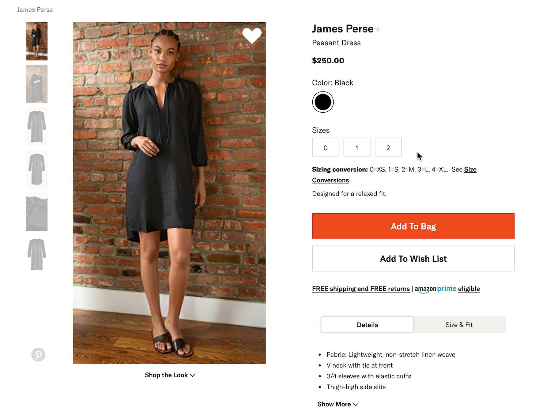
This apparel brand uses an unconventional sizing system. To help users understand the approximate conversion, Shopbop lists the equivalent conventional sizes directly on the page, alongside a link to further sizing details.
Therefore, it’s important to include conventional sizing information, or a conversion from the product’s size information to its equivalent conventional size (e.g., “0=XS”).
2) Provide Numeric Sizing Information
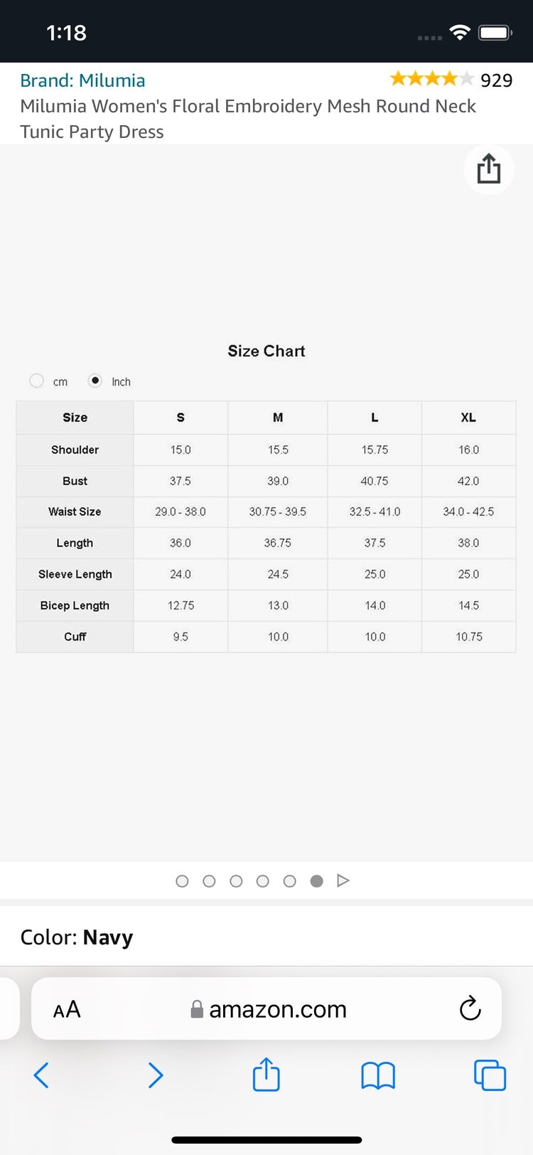
No numeric sizes are provided for this dress on Amazon. Numeric sizes are important to many users, who may be more familiar with their numeric size compared to their conventional size or measurements.
Numeric size information is also important to include, depending on the product type.
For many users numeric size information is a standard when it comes to products such as dresses, and is a familiar and crucial aspect of sizing.
Indeed, users will sometimes cross-check numeric sizes against other size information to ensure the information “adds up” when it comes to making a final decision.
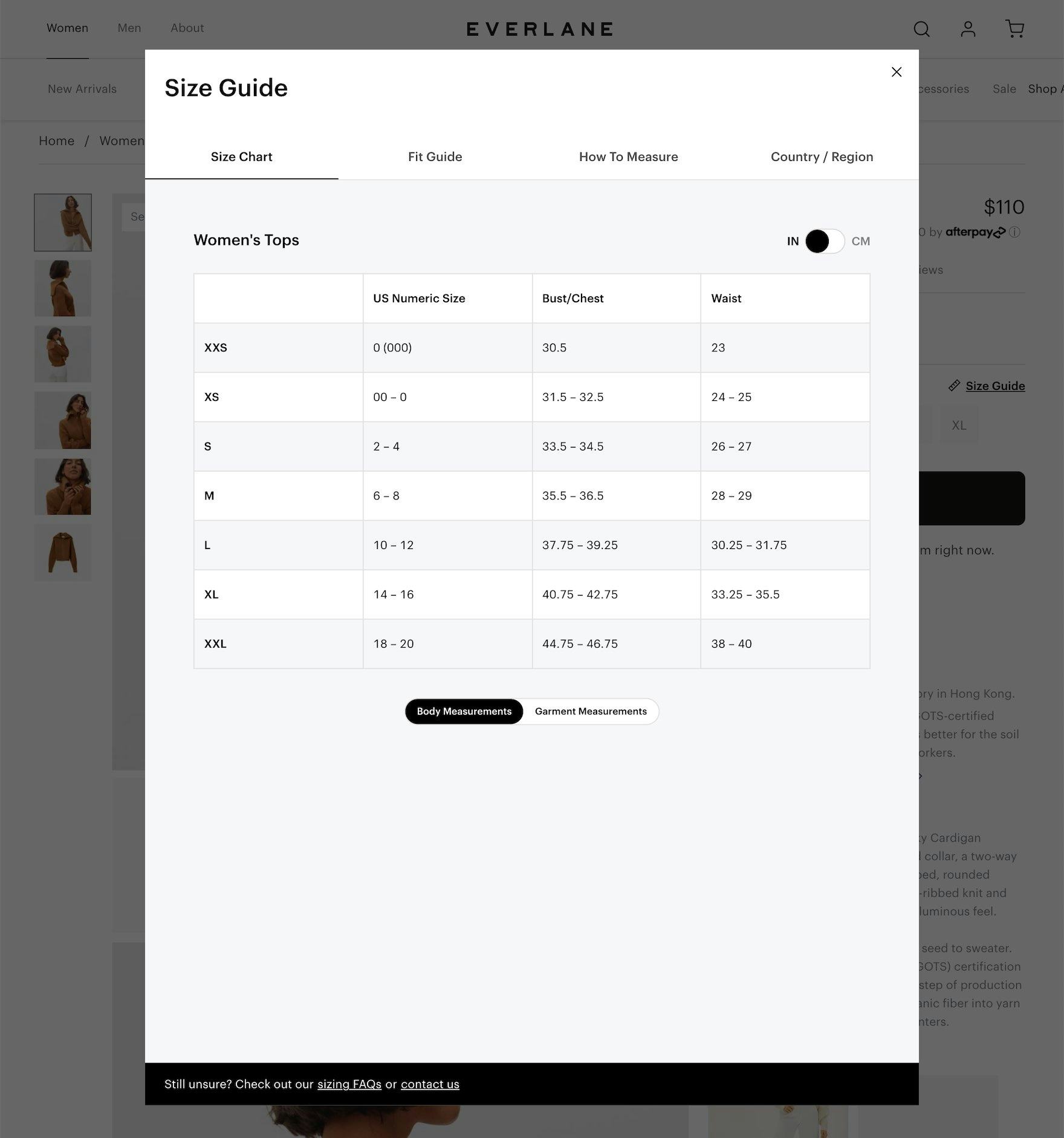
3) Provide Measurements in Both Inches and Centimeters
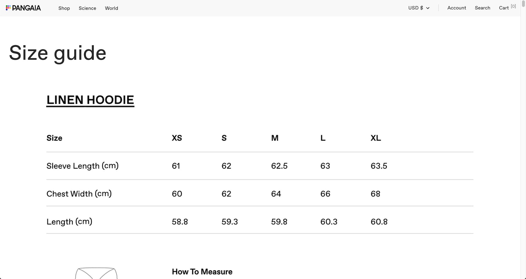
The “Size Guide” on Pangaia only lists product measurements in centimeters. Users more familiar with inches — as well as the likely majority of users who don’t know the measurements of their favorite garments — are likely to have a difficult time determining which size to purchase.
Measurements are another important piece of the sizing puzzle for users.
They allow users to be highly specific about which product size makes the most sense for them, depending on their various body measurements.
However, while some users will prefer to see the measurements in centimeters, others will prefer to see them in inches — and it’s unlikely that a user with a preference for one measurement system will know offhand what their equivalent measurements are for the alternative system.
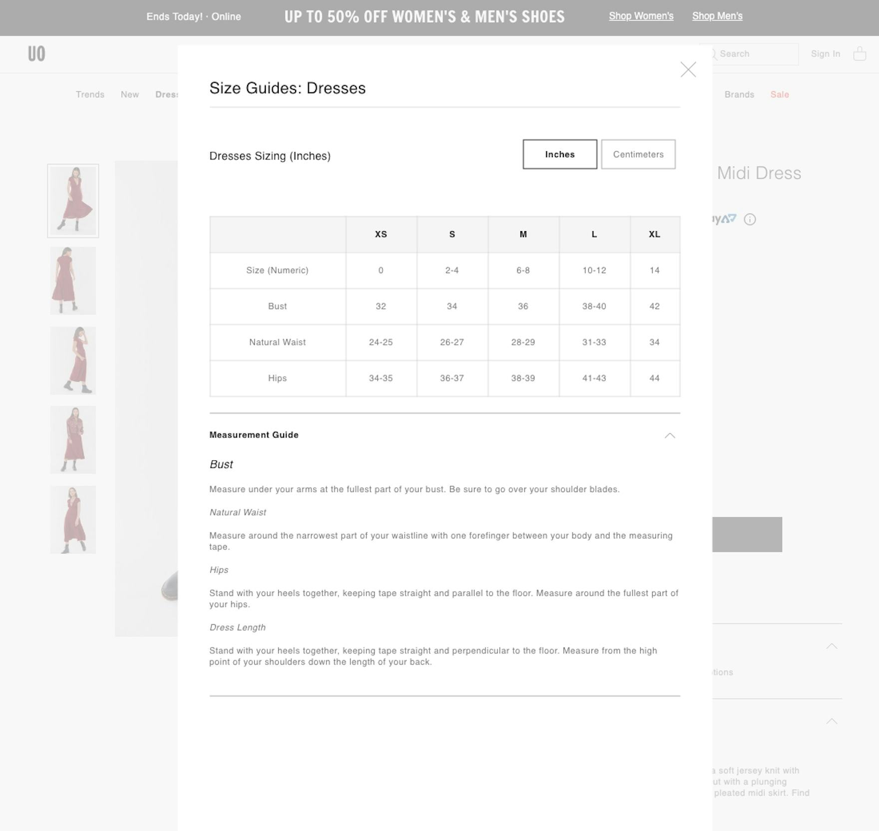
At Urban Outfitter’s measurement sizes are provided in either inches or centimeters, allowing users to choose the measurement system they’re most familiar with.
To ensure measurement information is useful to as many users as possible it’s therefore important to include measurements in both centimeters and inches.
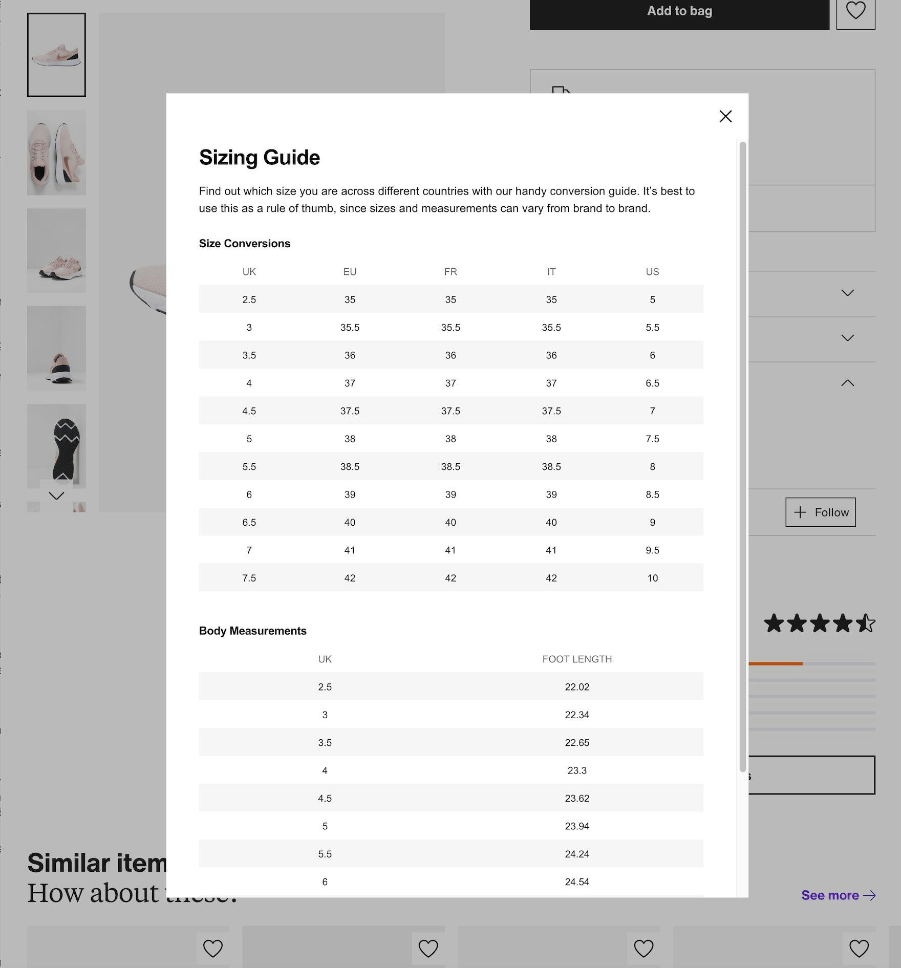
4) Provide International Size Conversions
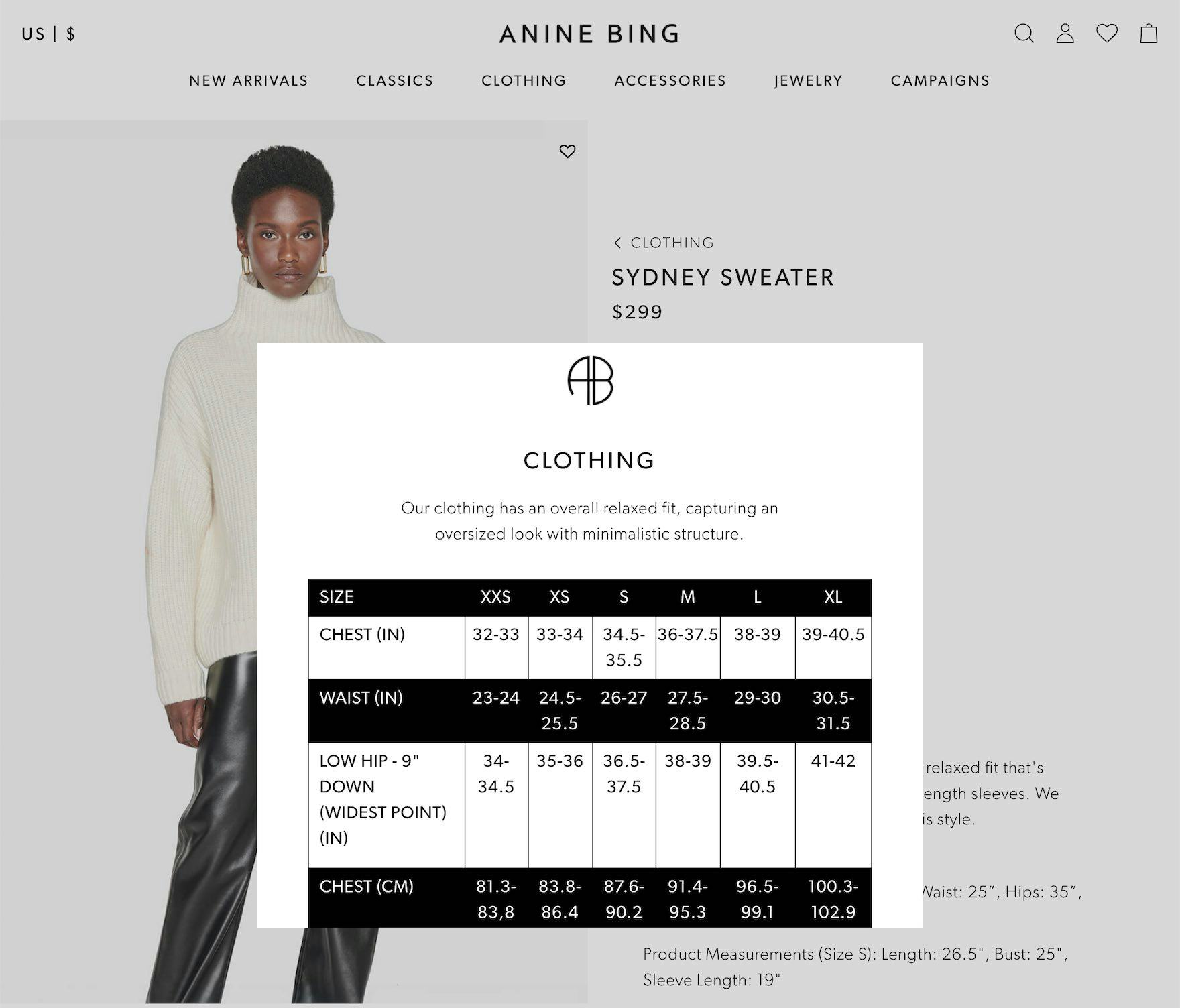
At Anine Bing there’s no international conversion available for the listed sizes. Users accustomed to a different measurement system will find it hard to get the size information they need on the site.
During testing, some sites failed to include international conversions for their size information.
This means that users from countries that don’t share the sizing conventions that are provided by the site are out of luck when it comes to determining their appropriate size.
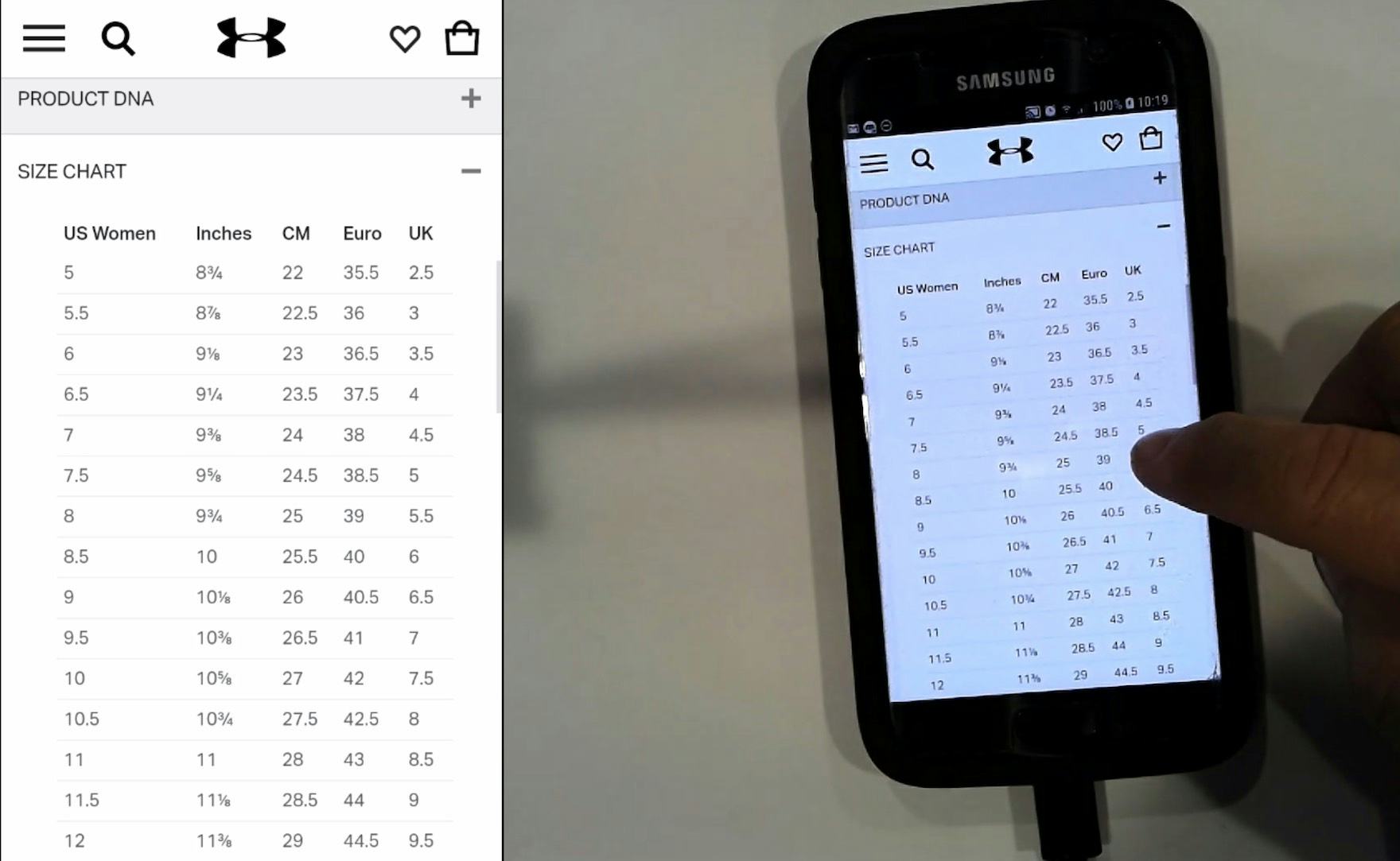
“I’ll just go to the size chart to definitely check…oh yeah, should have been a 7.” This European subject easily verified her US shoe size using the size chart provided on this product details page on Under Armour. Sites that ship internationally or have significant international traffic should ensure the size chart lists not only physical measurements, but conversions to other sizing systems.
Sites that anticipate having users from a variety of countries, which have different sizing conventions, should therefore provide international size conversion information to help ensure users aren’t forced to leave the site to find the information themselves.
5) Provide Instructions and Tips for Taking Accurate Measurements
Measuring oneself to determine the appropriate size to buy can be tricky, especially for users who aren’t regular purchasers of apparel items.
Indeed, while having measurements information is important, it’s more or less useless if users don’t know how to obtain those measurements on their own body.
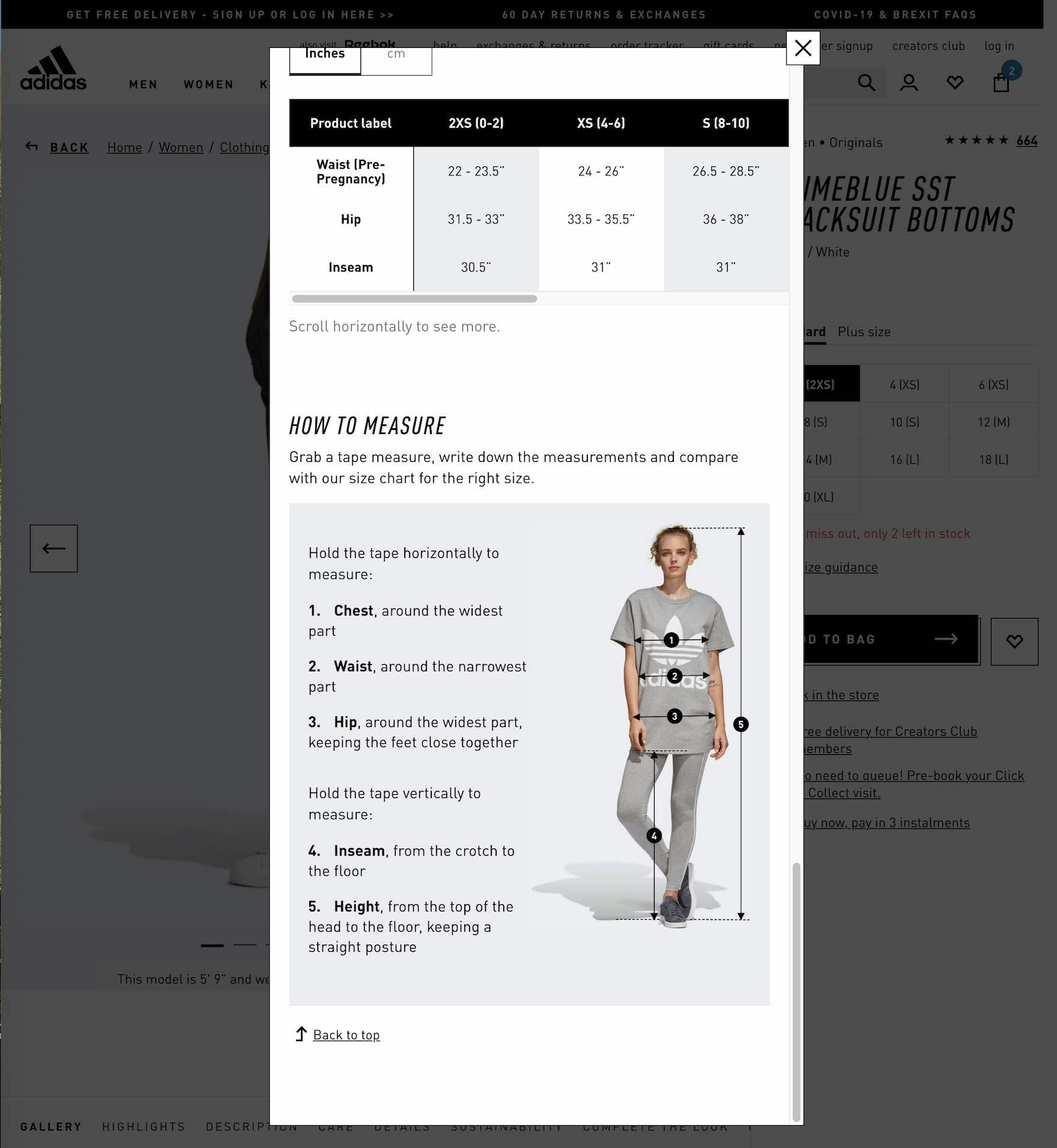
At Adidas, detailed measuring instructions are provided for users that explain how to measure various parts of the body to ensure an accurate size selection.
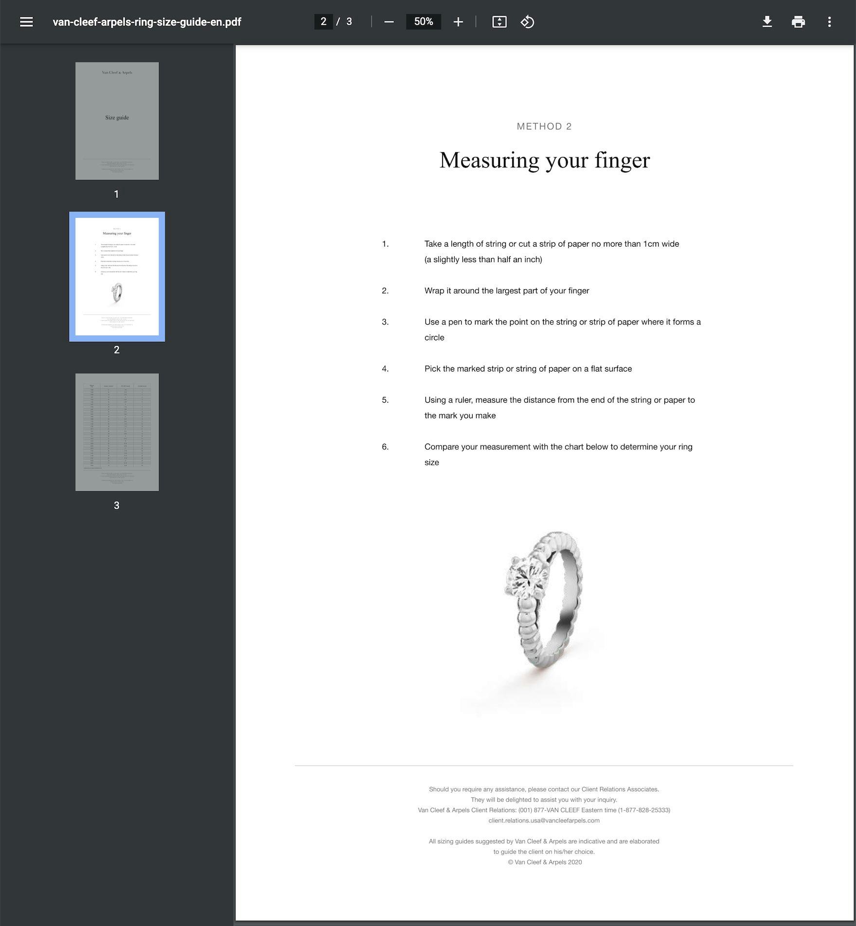
Measurement information should be included for any product that requires it — for example, this ring at Van Cleef & Arpels.
Therefore, along with measurement information users should also be provided with instructions on how to take measurements.
Ideally, these instructions will include not just text but also a “Human Model” image to help users visualize where exactly measurements should be taken.
6) Ensure Sizing and Measurement Information Matches the Product Type
Like many other product page features (e.g., product page descriptions), sizing information should not be universally applied across sites, but should instead be tailored to each product type — or, ideally, brand and product type.
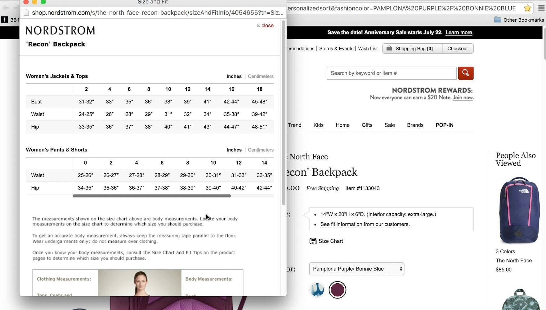
“‘Size chart…’” A test participant clicked on the size chart for a backpack on Nordstrom, and was disappointed with the results, as they weren’t for backpacks. “It doesn’t tell me anything because this is for clothing. Having that on here is almost just worse than nothing.” If the size chart doesn’t match the product type being considered it’s useless to users.
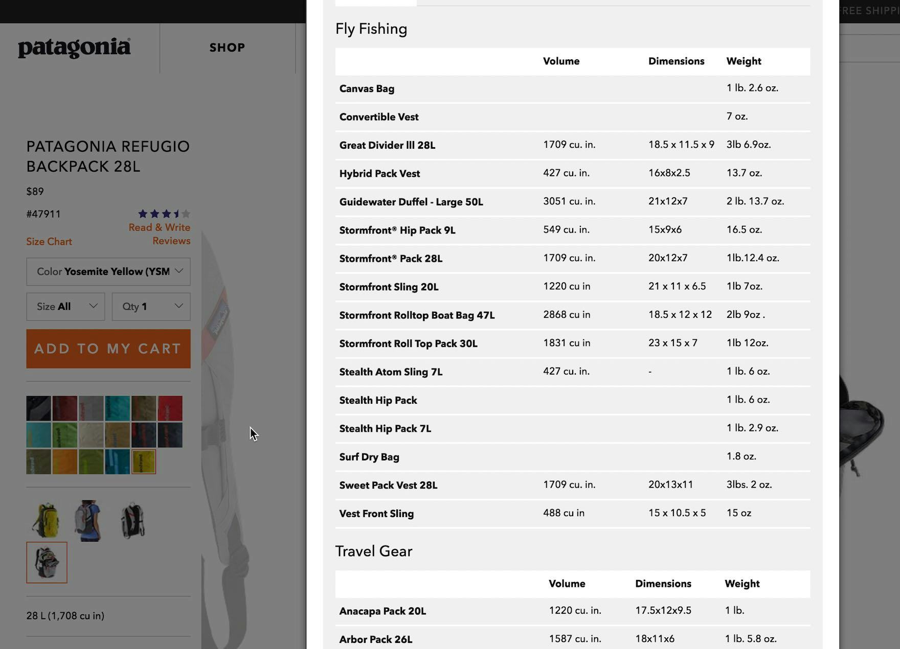
“I don’t see a lot of information about the product.” On Patagonia, a test participant sought size information for a backpack and found a “Size Chart” link. He assumed this was the information he was looking for, but became annoyed at having to find the current product type among a long list of other product types.
In desktop and mobile apparel testing, display of irrelevant sizing information to participants was observed to damage user perception of the product and the site.
Similarly, when relevant information was included but required additional scanning because the test site used one generic list of sizing information for several product types, the test participants often gave up before finding the information sought — rendering the information the site presented useless.
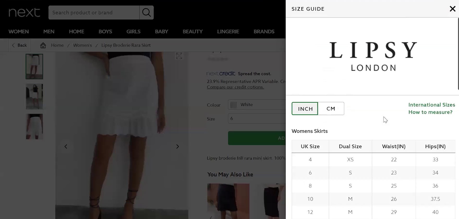
“This one has a size guide right here…It seems quite well organized.” The size guide on Next (UK) was specific to the brand of the dress the test participant was considering, making it much more useful for her.
Therefore, to ensure size guides are actually helpful to users, it’s important that size guides aren’t “one size fits all” but rather tailored to each individual product type.
7) Include a Link to the “Size Guide” Near the Size Selector
Of course, to be helpful to users a size guide has to be first found on the product page.
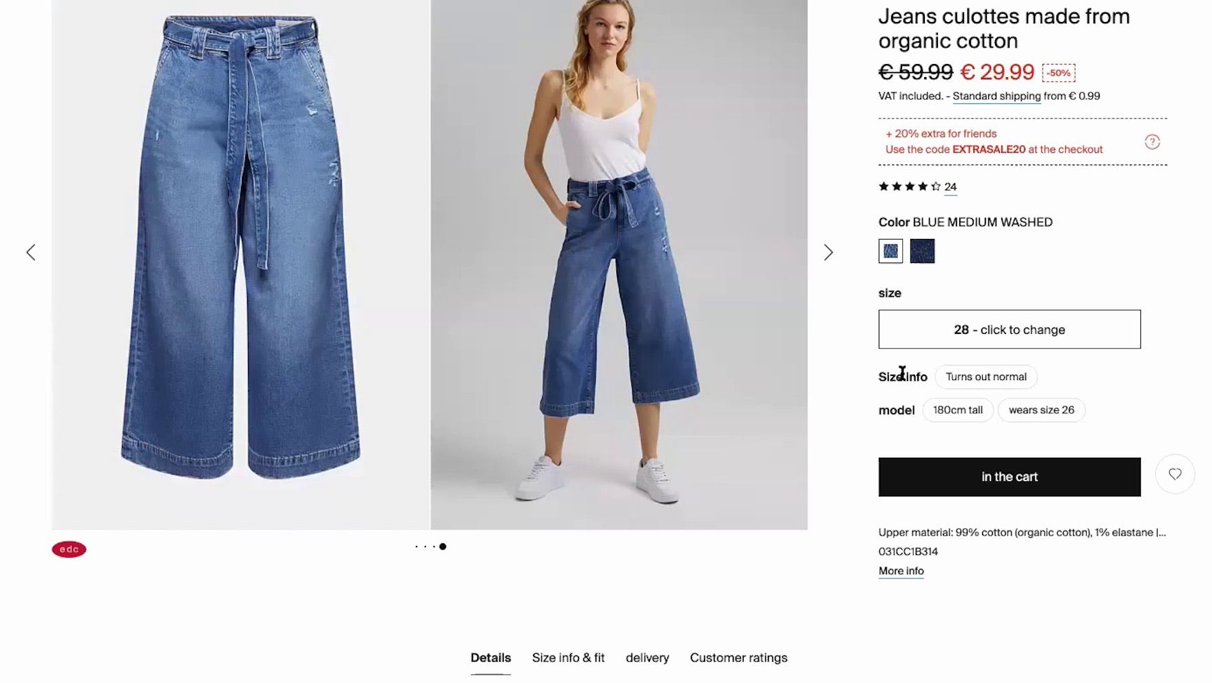
“And one thing that I miss here…size info, where you can see what the number ‘28’ corresponds to in terms of centimeters.” This participant in our large-scale European testing didn’t see the “Size info & fit” tab below the image gallery on Esprit (Germany), which contained a link to the size chart. If this link isn’t adjacent to size selectors many users will overlook it entirely.
While our Apparel UX benchmark shows that nearly all sites get this right, by placing the link near the size selectors, some sites make it unnecessarily difficult to find the link to the size guide by placing it too far from the size selectors or making the link too subdued.
Therefore, to ensure findability of the size guide link place it near the size selectors and make it prominent enough to find at a glance on the product page.
8) Ensure the Browser “Back” Button Returns Users to the Product Details Page
For both desktop and mobile e-commerce UX, size guides that open as an overlay should provide a clear and easily accessible “Close” mechanism.
Yet testing also shows that many users will instinctively reach for the browser “Back” button instead — and can be severely disappointed if they aren’t returned to where they thought they would be.
Therefore, clicking or tapping the browser “Back” button should close the size guide and return users to the product page (and not the product list).
9) Include a Link to Customer Service in the Size Guide
Even when provided with detailed measurement instructions, conversion information, and comprehensive size charts, some users may still feel unsure about which size to purchase.
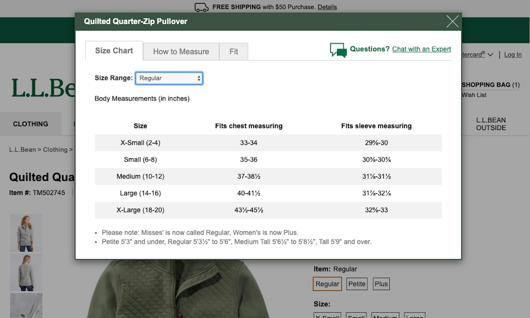
L.L. Bean provides a link to “Live Chat” within the sizing overlay. Users who have further sizing questions or are especially concerned about fit have clear and easy access to the site’s customer service.
Providing a link to the site’s customer service, contact information, or live chat from within the size guide gives these users a direct path for getting additional sizing questions answered, which can give them the confidence they need to move forward with purchasing.
What’s more, the site benefits by giving all customers who access the size guide an additional signal of trustworthiness, underscoring that the site is transparent and customer oriented.
10) Consider Including Measurements of Human Models
During testing on apparel sites, we observed participants reference “Human Model” images in conjunction with the size guide to better gauge the product’s overall fit and sizing.
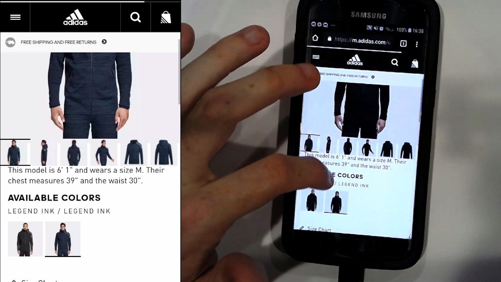
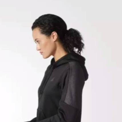
“6’ 1”. Okay, I’m not 6 foot 1 [laughs]…chest measures 39 and waist 30. Ok, so he’s a medium.” This participant on Adidas noticed the model measurements provided just under the image gallery. He compared the model measurements to his own, which he later referenced when selecting a size. Model measurements can provide valuable context to supplement the information provided by the size guide.
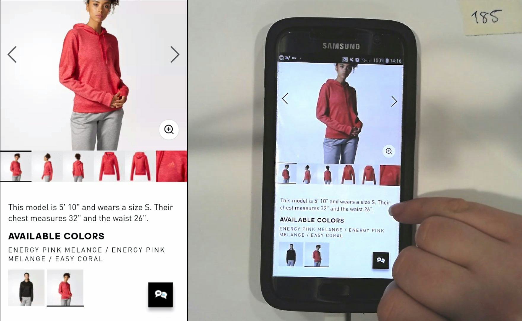
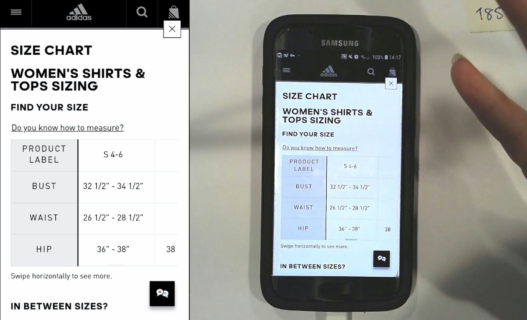
“It gives you clearly…her height, and her size. It gives her measurements. So you can see that she’s wearing the small…So then you can work off that with the size chart.” This participant referenced the provided model measurements (first image) when consulting the size guide on Adidas (second image). The model measurements provided a proxy to better understand the hoodie’s overall fit and sizing.
Providing the model’s measurements, and size worn, alongside the “Human Model” image gives users additional context that they can use to determine their most appropriate size.
Apparel UX: Help Ensure Users Can Confidently Select the Right Size
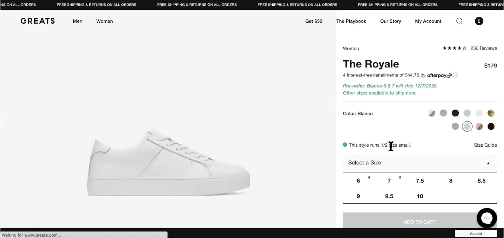
“Okay, they’re telling me this style runs half a size small. Thank you!” This participant on Greats appreciated the straightforward note on sizing. This level of detail can help users accurately determine which size will work best for them, along with additional details provided in the size guide.
For many users, the sizing information provided by the size guide is instrumental in making their purchase decision.
An ideal size guide therefore not only provides a simple chart of measurements, but also includes the following 10 components:
- Conventional sizing information
- Numeric sizing information
- Measurements in inches and centimeters
- International size conversions
- Instructions and tips for taking accurate measurements
- A match between sizing information and the product type being considered
- A link to the size guide located near the size selectors
- Support for users’ expectations for “Back” buttons
- A link to customer service in the size guide
- Measurements of the models shown wearing the products
Feeling confident about selecting a size variation is an important factor for users who are considering adding the product to the cart, and a comprehensive size guide gives users the detailed sizing and measuring information they need to make a confident choice.
Yet despite the importance of including all relevant size information, 83% of desktop apparel sites and 87% of mobile apparel sites fail to provide 1 or more of the above-listed size-information elements — leading to some unnecessary abandonments.
Getting access: all 500+ Apparel e-commerce UX guidelines are available today via our Premium research findings. (If you already have an account open the Apparel e-commerce study.) (You may also want to see our Apparel e-commerce audit service for information on booking a UX audit of your Apparel e-commerce sales site.)