Key Takeaways
- Visual elements can have either have one hit area leading to a single destination or many to multiple destinations
- If the number or destination of hit areas are unclear, as they are on 33% of sites, our large-scale testing has shown that users can experience unnecessary disruption or disorientation
- Issues with unclear hit areas in visual elements are observed to be more serious on mobile devices
Knowing what is clickable and what is tappable — and where these linked elements begin and end — is vital in ensuring that users feel in control when navigating a site.
Furthermore, knowing where these links lead to is equally important to users’ ability to navigate efficiently and with confidence.
However, our large-scale testing of homepages during our Premium UX research reveals that unclear hit areas lead to major uncertainty about whether visual elements consist of one large hit area leading to a single page, or multiple hit areas leading to different pages.
Typically, unclear or ambiguous hit areas are seen in clickable or tappable graphic elements, such as banner images or when text and graphics are combined in one element.
Surprisingly, our e-commerce UX benchmark shows that 33% of sites — 28% of mobile e-commerce sites and 43% of desktop sites — fail to convey the functionality and destination of links in visual elements.
The resultant uncertainty can lead to users inadvertently following unsuitable links that — at a minimum — slow down product finding and checkout, and at worst lead to disorientation and possible site abandonment.
In this article, we’ll discuss the following:
- How ambiguous hit areas cause users to miss links to desired destinations
- How ambiguous hit areas cause users to take unintended detours
- How mobile hit area ambiguity is worse than on desktop
- How to avoid unclear hit areas in visual elements on both desktop and mobile sites
1) How Ambiguous Hit Areas Cause Users to Miss Links to Desired Destinations
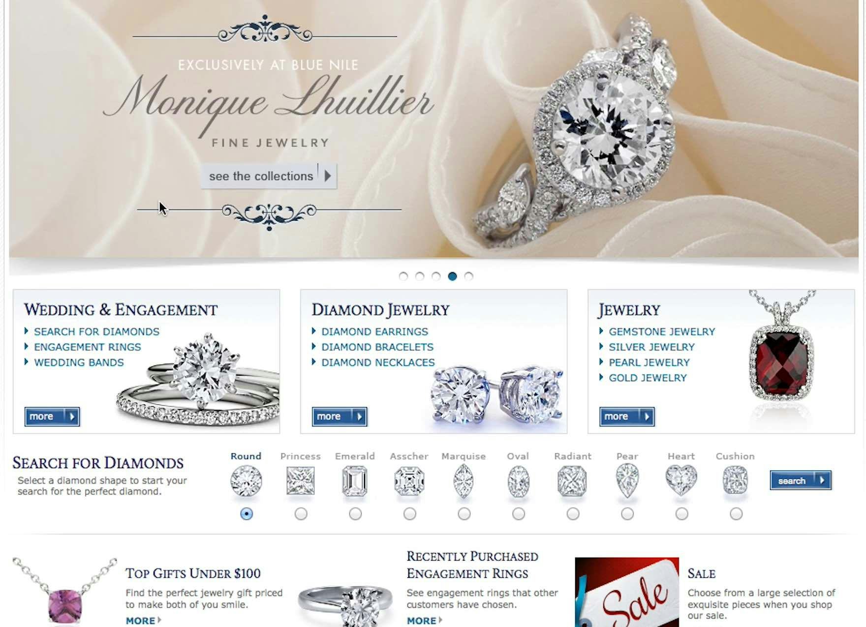
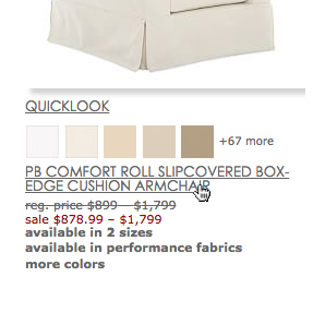
This test participant at Blue Nile first assumed that the “Wedding & Engagement” element was one large hit area leading to a single page, with the dark blue button being clickable and the text bullets being descriptions. In fact, there are four different paths. Notice how encapsulating the title, thumbnail, links, and button with a border and gradient background can make it look like a single, big visual element.

At Crutchfield it’s impossible to know if the product title, thumbnail, and review star rating all link to the same place. In fact the product title and thumbnail do, but clicking the review star rating takes users directly to the reviews section for the particular product.
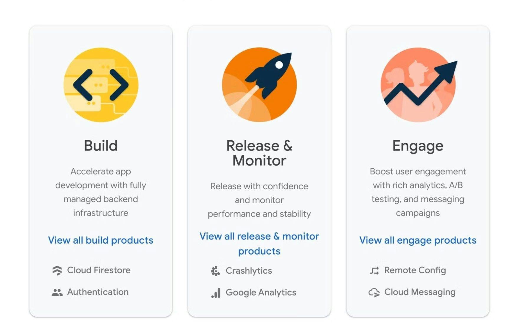
Likewise, it’s not clear on Firebase whether there is just one link per element — the blue “View all…” text — or whether the features below are also clickable. Users who wish to jump straight to view these features, which are in fact links, could well miss out on a shortcut.
There’s no way of knowing whether there are many hit areas in these visual elements on J.C. Penney’s mobile site or just one per element. Users will therefore have to hope for the best when tapping on them that the links lead to where they want to go.
The first issue occurs when users assume a linked element contains a single path when in fact it contains multiple paths.
For example, an image with multiple links could appear as one hit area if the links aren’t styled in a way that indicates their functionality (see section 4 below).
This means that some users have to spend more time than necessary getting to the page they need if they overlook a link that would have taken them directly there.
Other users may never find the desired location — testing has shown how users can easily become distracted and fail to complete a goal if it’s unnecessarily difficult.
Depending on the destination’s importance, this could result in users abandoning suitable products, or even a site, if they fail to reach the content they’re looking for.
2) How Ambiguous Hit Areas Cause Users to Take Unintended Detours
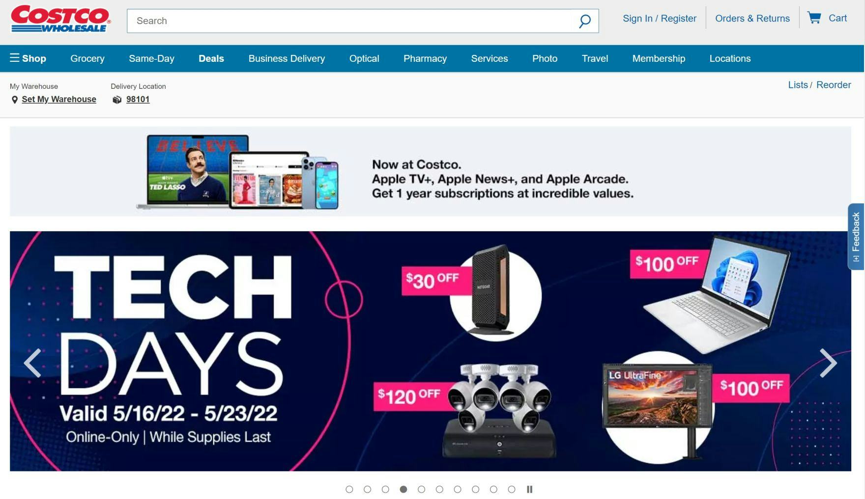
It’s unclear whether the sale offers — for example, ”$120 off” — are linked to the individual items or to a general sales page on Costco which is indeed the case. Users who wish to view the individual products — and click on the specific product image expecting to be taken to a product page — will be disappointed when they instead land on a general sales page.
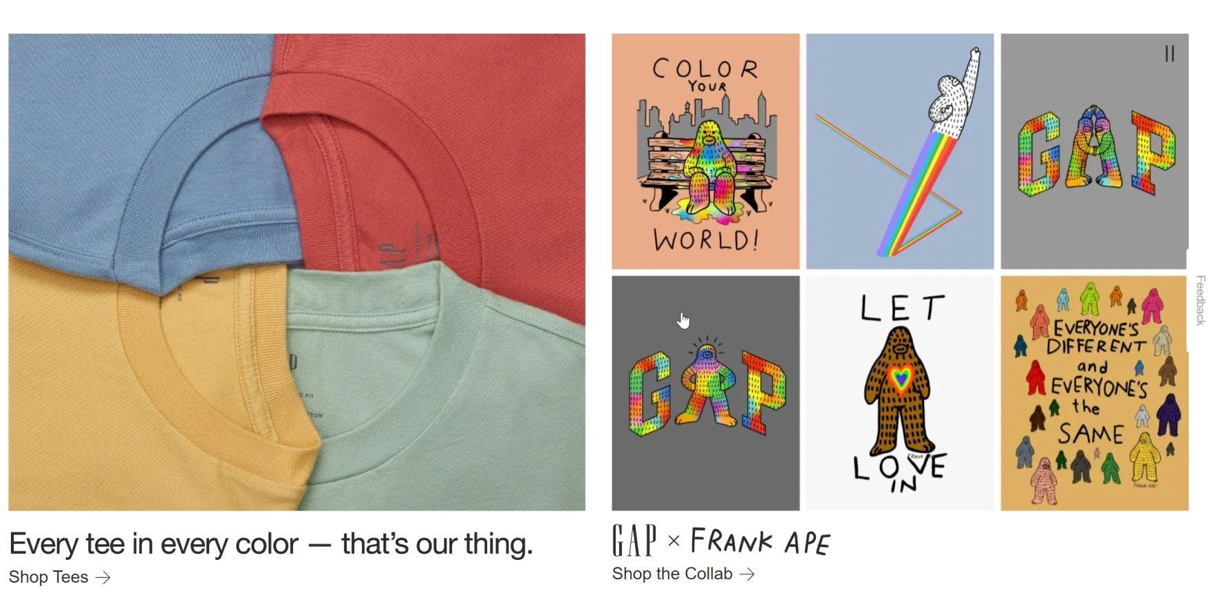
On Gap, users looking at the right-hand panel could assume that each image represents hit area linking to a specific style of t-shirt, whereas in fact the whole panel links to one page. So, if a user has a special interest in one t-shirt, they’ll have to spend a bit more time finding it once they reach a page with many t-shirts listed.
The second issue — in direct contrast to the first — is when users assume a visual element contains multiple paths when in fact it’s a single link.
A common example of this issue is when a banner image showcasing multiple products is linked to a single destination, and not to the individual products depicted in the graphic.
In this case, users will experience at least a minor interruption if they find themselves on a page with many products rather than the one they are interested in.
And if users find themselves off course, getting back on track could be difficult unless they are well supported by site attributes such as good navigation design and “Back” button performance.
3) Mobile Hit Area Ambiguity Is Worse than on Desktop
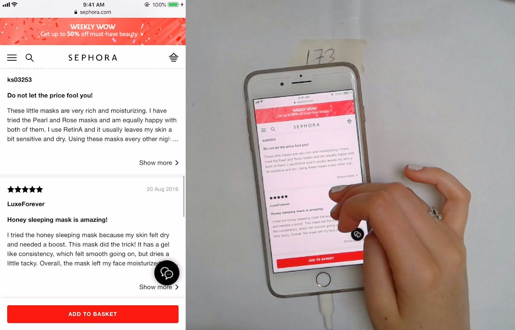
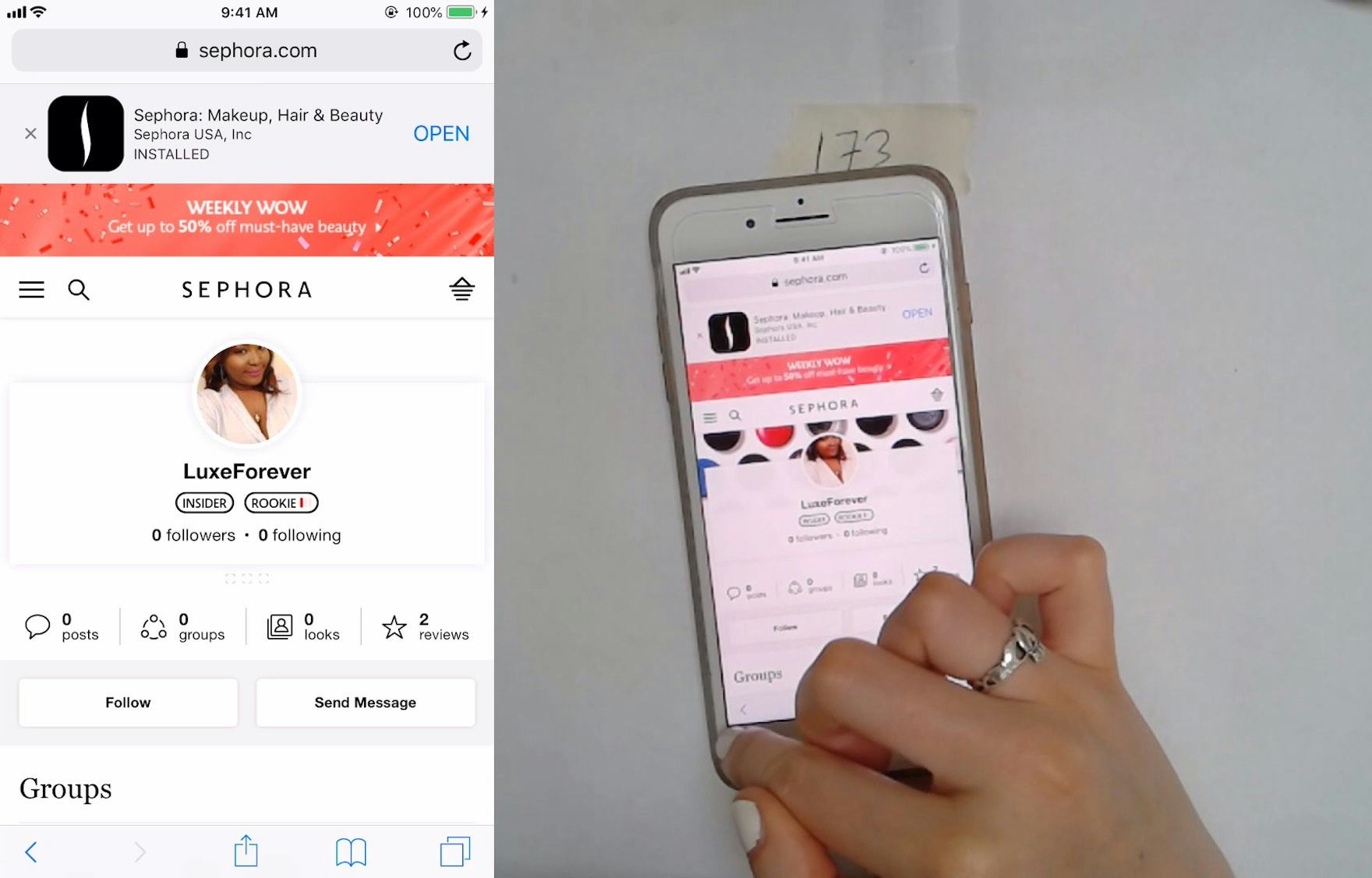
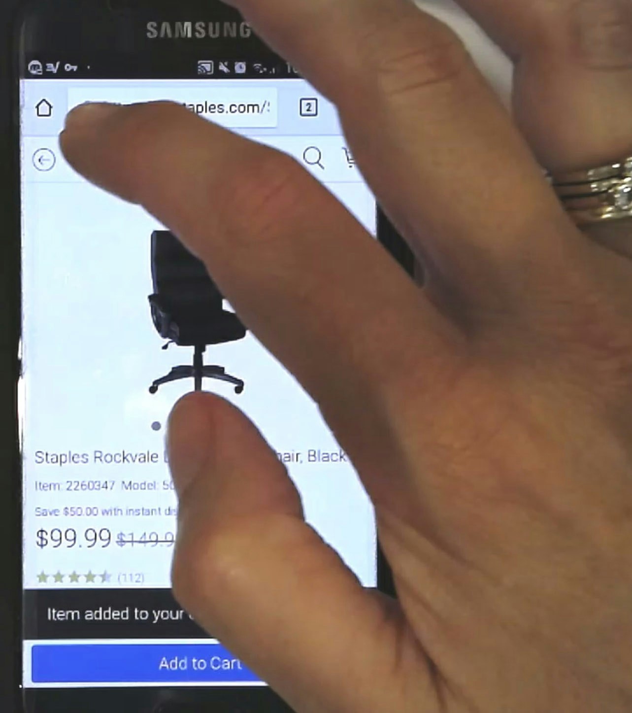
“I don’t care who that person is….”. A test participant at Sephora was scrolling user reviews and inadvertently tapped a link to a reviewer’s profile page. Note the position of her finger in the first image, which is far from the reviewer’s profile name. Yet the hit area was so wide — and unclear — that this participant wound up on an unintended detour (second image).
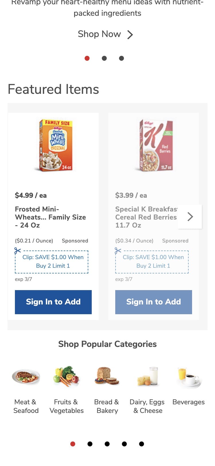
At a glance, it’s unclear if these “Featured Items” on Albertsons consist of just one hit area to “Sign In to Add” or, as is the case, two links with one leading directly to the product. With another possible link indicated by the styling of the coupons, users will only find out through trial and error where tapping on the visual elements leads them.
During testing of mobile UX the issue of unclear hit areas occurred more frequently and was often more severe than on desktop sites.
The severity of the issues on mobile were often due to the overarching mobile e-commerce UX issues, such as a lack of page overview and an increased sense of disorientation compared to desktop.
Such mobile-specific issues mean that it is harder for users to recover from unexpected detours caused by unclear links.
The higher frequency of issues on mobile can be partially attributed to the absence of hover effects that can help prevent link ambiguity on desktop (see next section).
Additionally, since mobile users are constantly physically interacting with the interface through scrolling with their fingers there’s an increased risk of tapping something inadvertently if hit areas for visual elements aren’t clear.
4) How to Avoid Unclear Hit Areas
Resolving the issue of ambiguous hit areas depends to some extent on whether the site is a desktop site or a mobile site.
However, there are some basic design aspects that apply to both, which can help users distinguish hit areas.
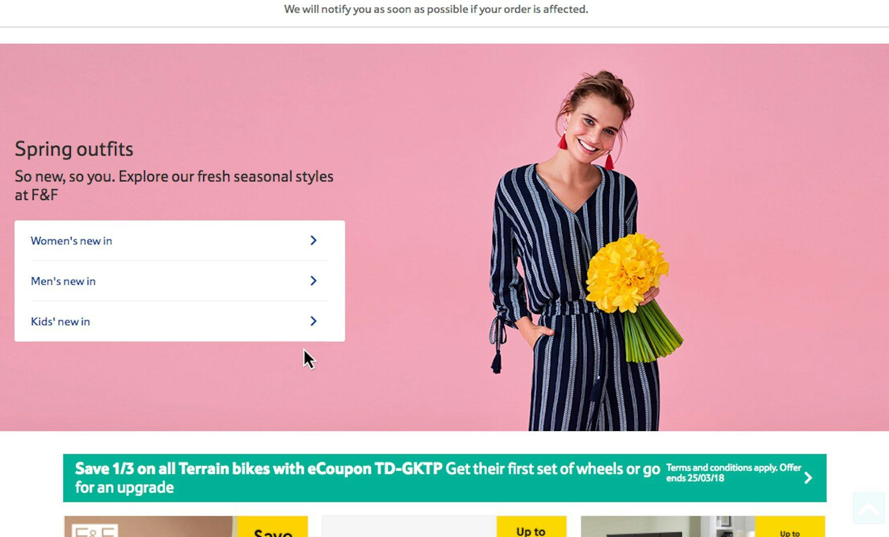
At Tesco it’s clear that the three “new in” links on the homepage all lead to separate locations even though they’re encapsulated in the same visual element. Specifically, horizontal lines separate each link, the labeling is clear, three separate arrows are provided, and the multiple paths are visually separated from the theme they have in common (“Spring Outfits”) by using a different background color (white vs. pink) — all of which contribute to making it clear that the links go to separate destinations.
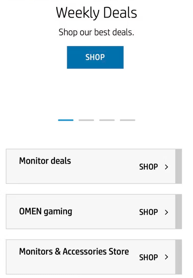
Hit areas are crystal clear on HP’s mobile homepage. The use of borders, background colors, and arrows help users to instantly discern them.
In particular, using borders, separators, arrows or other indicators, or background colors to clearly delineate hit areas — and doing so consistently throughout the site — will help users intuit the correct hit areas without having to spend time examining the interface.
How to Avoid Unclear Hit Areas on Desktop Sites
On desktop, users are helped by the numerous clues that are displayed on hover that indicate if an element is clickable and where the path leads:
- The cursor change when a link is hovered
- Styling — such as for links and buttons — that changes when hovered
- Displaying the destination’s title when the link is hovered
- The link paths displayed in the bottom of the viewport of most browsers when a link is hovered
Yet these “basics” are not enough — testing has revealed that many users move through sites very quickly and aren’t observant enough, or patient enough, to benefit from these subtle clues.

On Wayfair, it’s clear that both the titles and thumbnails of subcategory links lead to the same place because of a synchronized hover area.
To ensure hit areas are clear for desktop users, multiple hit areas leading to the same path should be clearly indicated by having a synchronized hover UX, where hovering one clickable element will invoke the hover style of all other elements leading to the same path.
In practice, this is done by wrapping the entire block of elements in a single link; for example, by wrapping the image, title, snippet, bullets, and buttons into a single unified link with one large hover area and effect.
How to Avoid Unclear Hit Areas on Mobile Sites
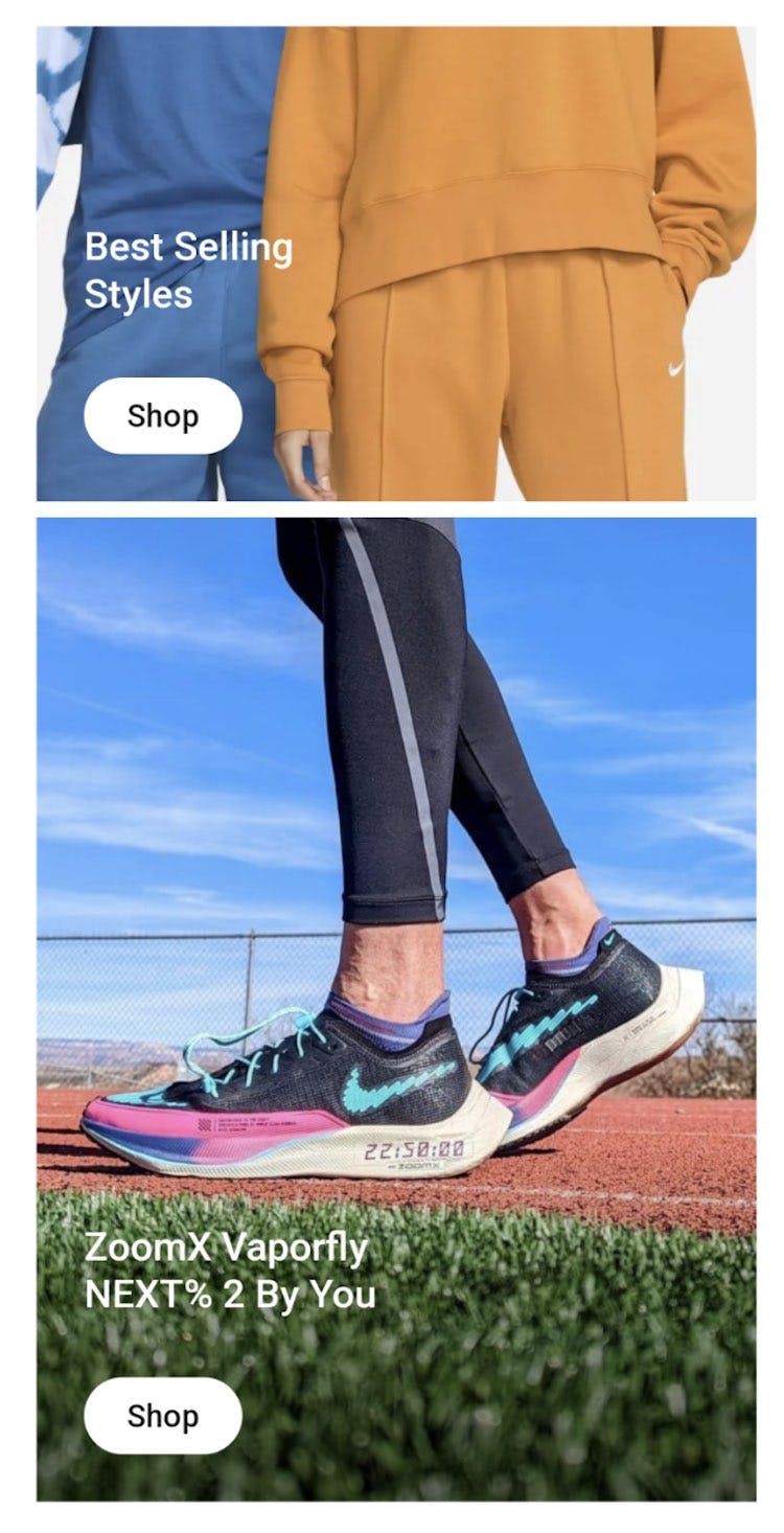
Nike opts for simplicity when it comes to visual hit areas on its mobile homepage. Each hit area is a single link to the product or selection depicted in the image, leaving no room for ambiguity.
On mobile, in the absence of hover effects, the solution is simply to avoid any ambiguity regarding hit areas.
Thus it’s typically best to avoid complicated visual elements that contain multiple hit areas.
Instead, a better-performing design is to encapsulate each item separately and make it a single hit area.
In addition, whenever hit areas could be misinterpreted, help users by making it clear what elements are links; for example, by using background shading or another form of encapsulation, and ensuring the size of the hit area matches the size of the visual element.
Clear Links in Visual Elements Speed Up Product Finding
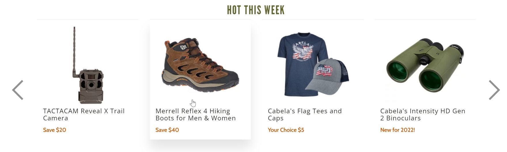
Users on Cabelas will be in no doubt that there is only a single link in each of these visual elements because of the unified hover effect displayed.
Without clarity around links in visual elements, users can end up badly off course in their product-finding journeys.
Surprisingly, our research in e-commerce UX shows that 28% of mobile e-commerce sites and 43% of desktop sites fail to convey the functionality and destination of links in visual elements.
Given the potential for unexpected time-consuming detours and longer than necessary paths to destinations, it’s critical to make it obvious to users
- what parts of visual elements are clickable or tappable,
- where those links are going to take them,
- and where the hit areas begin and end.
There are various ways to make it clear to users whether there is just one link in visual elements or many, and where those links lead to:
- On both desktop and mobile sites, use design elements such as borders, separators, and other visual cues to distinguish separate links.
- Also, make sure that the size of the hit areas exactly matches the size of the visual element.
- On desktop, use unified hover effects to indicate when visual elements with different subelements consist of one link rather than many.
- On mobile, opt for simplicity when it comes to visual hit areas: avoid any ambiguity regarding hit areas by ensuring all visual elements have single hit areas.
Clarity around links in visual elements will give users confidence by ensuring that each time they follow a link they are taken where they expect to go, making product finding a smoother process while bolstering the site’s e-commerce conversion rate optimization.
(Premium subscribers can view our guideline for more on hit areas.)
This article presents the research findings from just 1 of the 650+ UX guidelines in Baymard Premium – get full access to learn how to create a “State of the Art” e-commerce user experience.