Key Takeaways
- Baymard’s large-scale, desktop and mobile Product Page testing indicates that unclear pricing introduces uncertainty about one of the most important pieces of product information and can lead directly to abandonment
- Our usability testing revealed that location and visual treatment of pricing and related discounts were key to users’ understanding
- Avoiding ambiguous discount or promotional messaging ensures users can correctly interpret available offers and increases their likelihood of moving forward with the purchase
Baymard’s large-scale Product Page testing shows that the product price is one of the most important components of e-commerce UX for users evaluating a product. Indeed, for many users the product price will determine if they’ll even bother to investigate the product further.
Effectively, users may never explore a product’s images, description, or reviews if the price is either unsatisfactory or unclear.
Given the importance of price, it’s likewise no surprise that discounts and promotions can help sway users’ opinion on a product’s price, providing a strong incentive to consider a product more closely.
As a consequence, when a product’s price — or available discount — is unclear or difficult to locate on the product page, users lose access to one of the most vital pieces of information influencing their purchasing decision and, as observed in our large-scale UX testing, are likely to abandon the product.
Yet our research in e-commerce UX shows that 18%+ of e-commerce sites fall into 1 of the 4 pitfalls discussed below regarding showing price discounts on the product details page.
In this article we’ll discuss these Premium research findings from our product page testing; in particular, 4 pricing UI pitfalls that keep users from easily understanding pricing details:
1) Pricing and discounts blending in with other PDP elements
2) Locating discounts far away from the product price
3) Displaying promotions multiple times on the PDP
4) Failing to highlight percent or amount off
1) Pricing and Discounts Blending in with Other PDP Elements
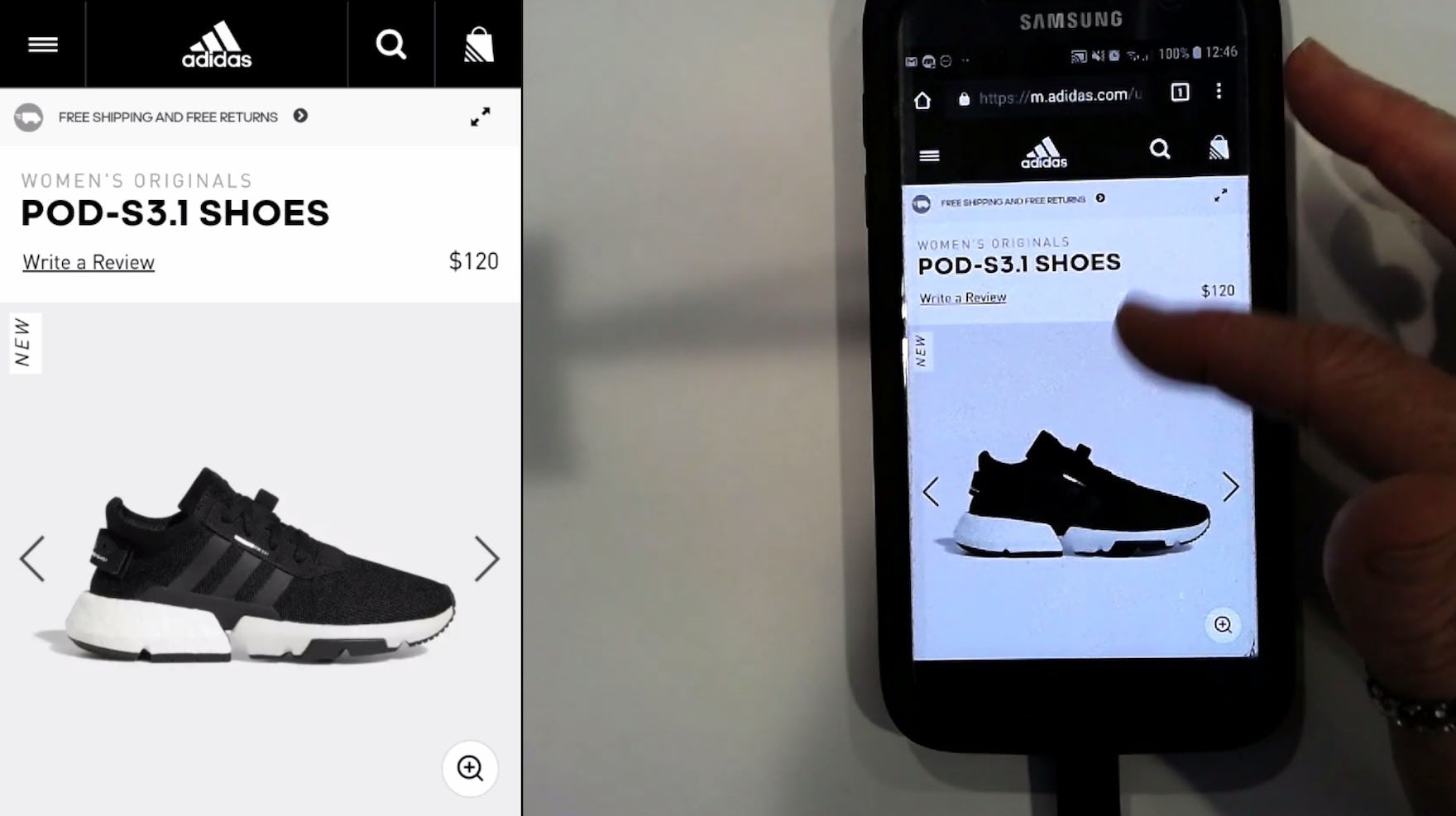
“[I was looking for] price and a little bit more detail”, explained this participant as she returned to the product list from a product page on Adidas. She hadn’t noticed the price on the product details page because its relatively subdued appearance failed to draw her attention.
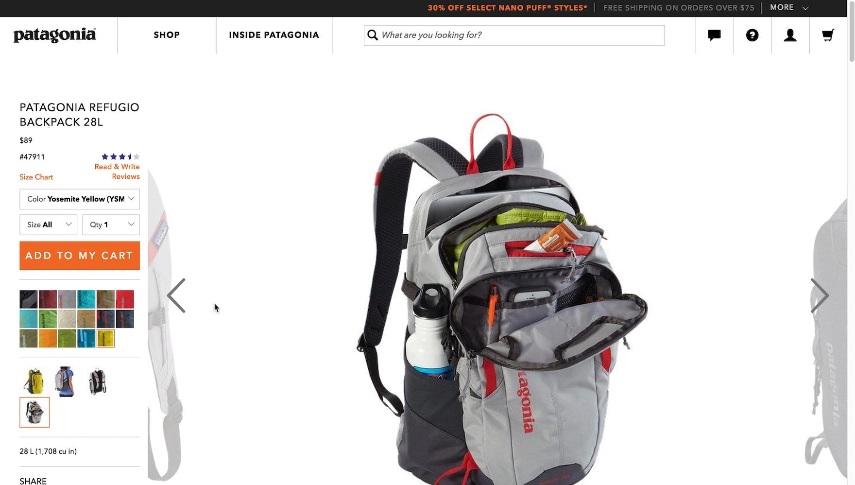
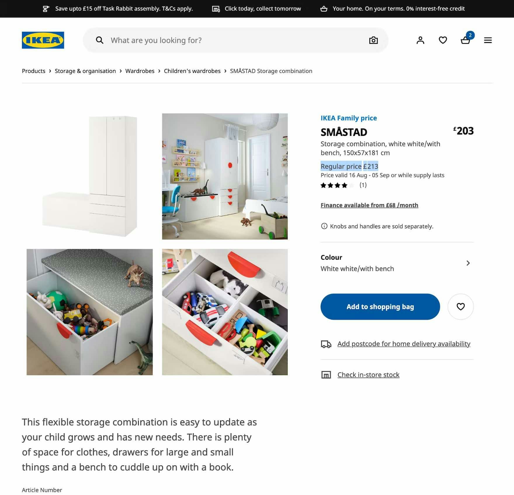
“I can’t see how much it costs…there’s no price, not that I can see…am I missing something? I really do not see a price anywhere…oh for fuck’s sake, it’s right there, Jesus Christ.” This participant scrolled up and down the product page, looking for the price, before finally spotting it underneath the product title. In fact, 67% of participants during testing at Patagonia had trouble finding the price.
First, the product price — whether indicating a discount or not — is key information that users expect to be immediately visible upon reaching a product page.
Indeed, during both mobile and desktop testing, participants reacted very strongly when the price wasn’t highly visible, to the extent where they began to view the entire site negatively.
The lack of a clear price can lead to distrust in the site, bolstering the perception that the site is hiding vital information on purpose.
As one user from testing said, “Where is the price? Now I’m annoyed…I don’t like this website.”
In practice, pricing information that fails to draw the eye or blends into surrounding page elements can be as detrimental as pricing that’s missing entirely.
It’s important to note that many users are quickly scanning product lists and product pages, and therefore are liable to miss the product price if it isn’t highly visible.
Additionally, the issue of a hard-to-find product price can compound with other UX issues a user has experienced on a site, leading some to abandon out of a general feeling that the site is hard to navigate.
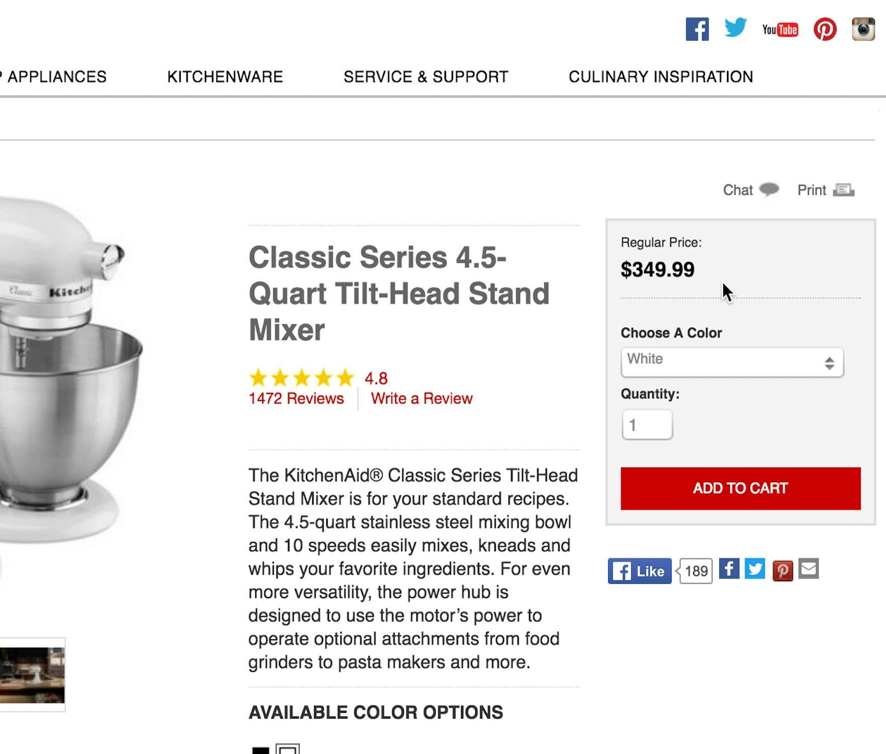
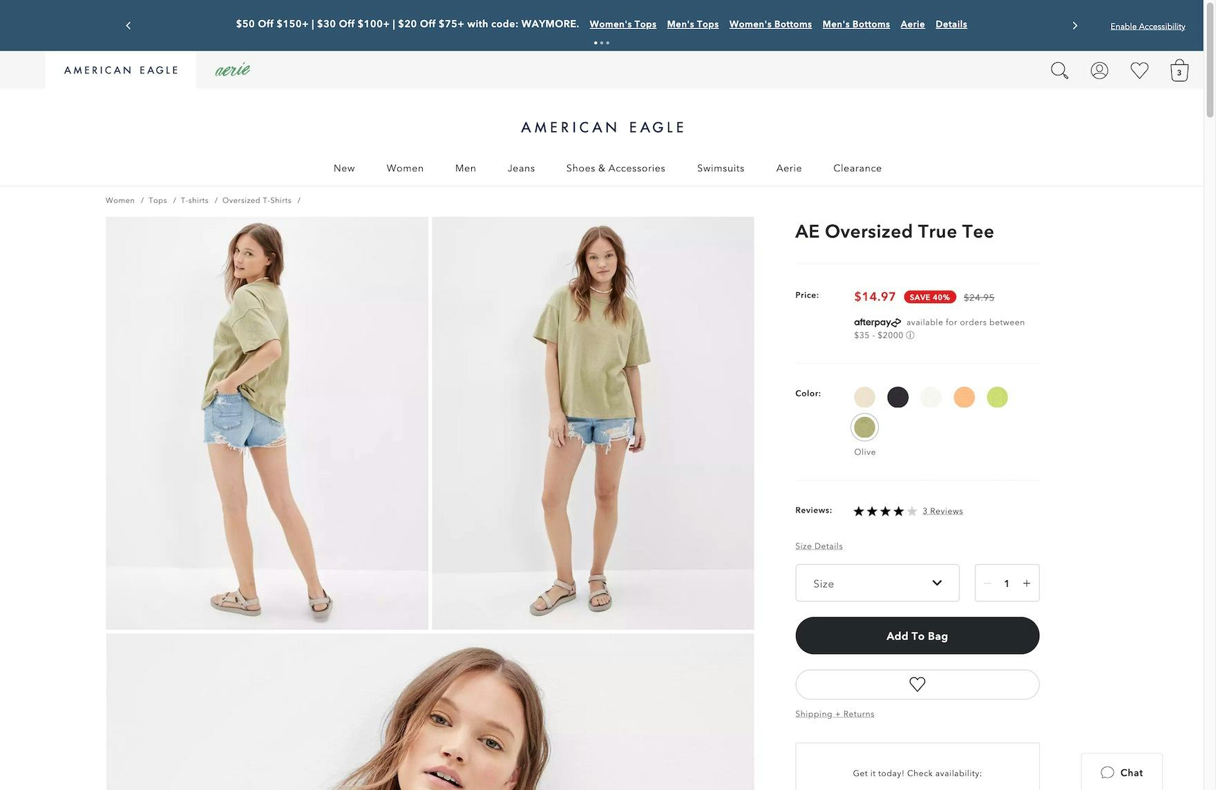
“You have the cost right here.” At KitchenAid, test participants easily found the price within the “Buy” section at the top of the PDP. The use of bold, lack of competing elements, and prominent placement help to draw users’ attention.
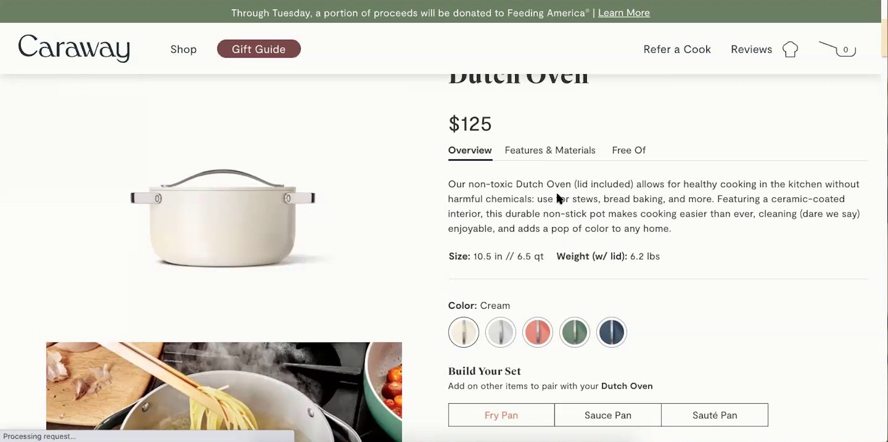
“It’s $125.” This participant on Caraway easily recognized the price, prominently displayed within the “Buy” section.
Therefore, as essential information, it’s important that the price and available discounts are highly visible and that users don’t have to search for it — it should be visible immediately at a glance on the product page.
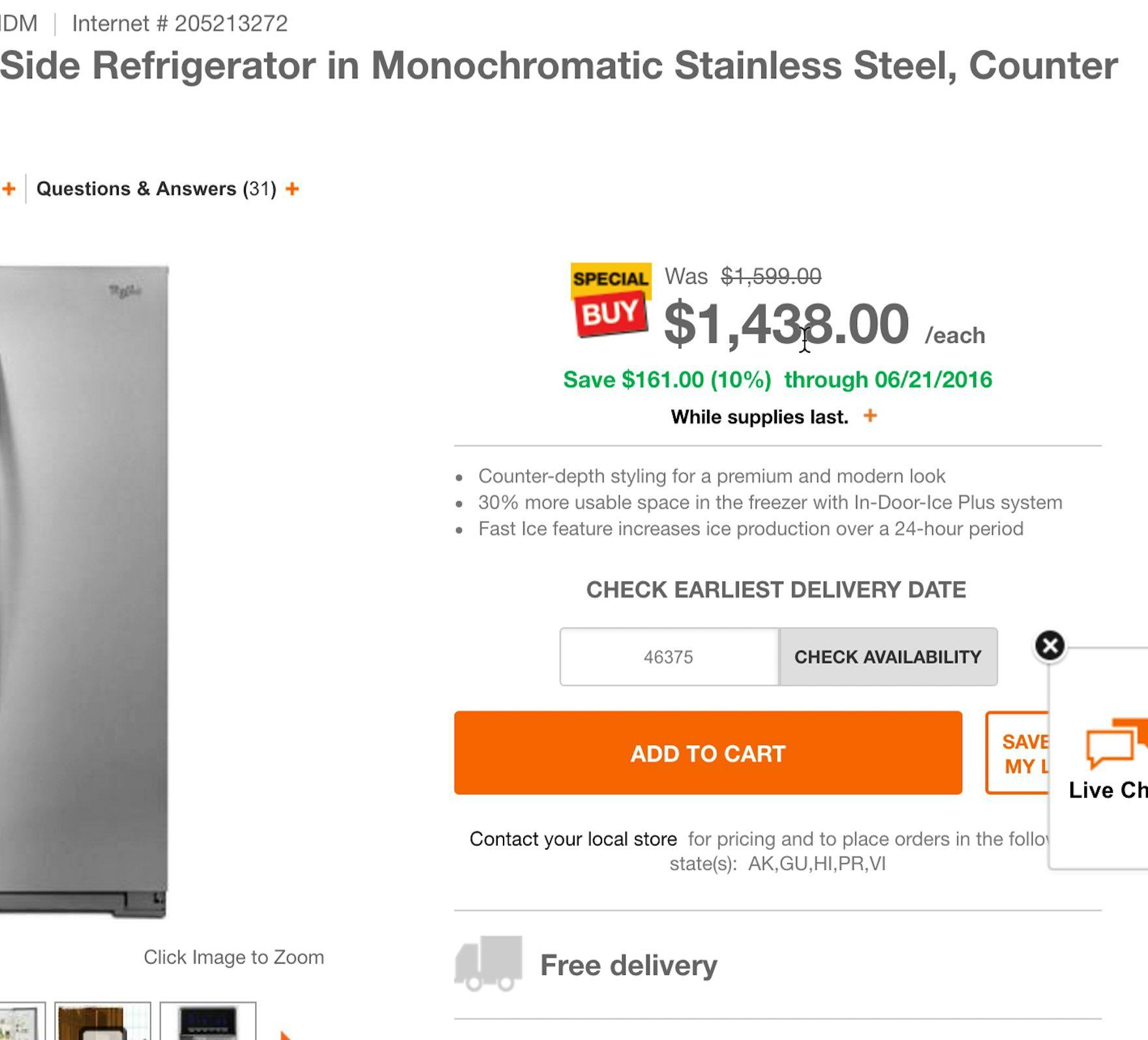

At Home Depot (first image) and Misen (second image), the large size of the price helps it stand out on the page.
In both mobile and desktop testing, using a large font size — close to the size of headers and product headlines — was most effective in drawing attention to this essential detail.
It’s important to remember that price, unlike a product headline, is typically a very short amount of text, and thus is easily overlooked by users when it’s displayed in a small font size.
World Market makes good use of color to draw attention to the product price.
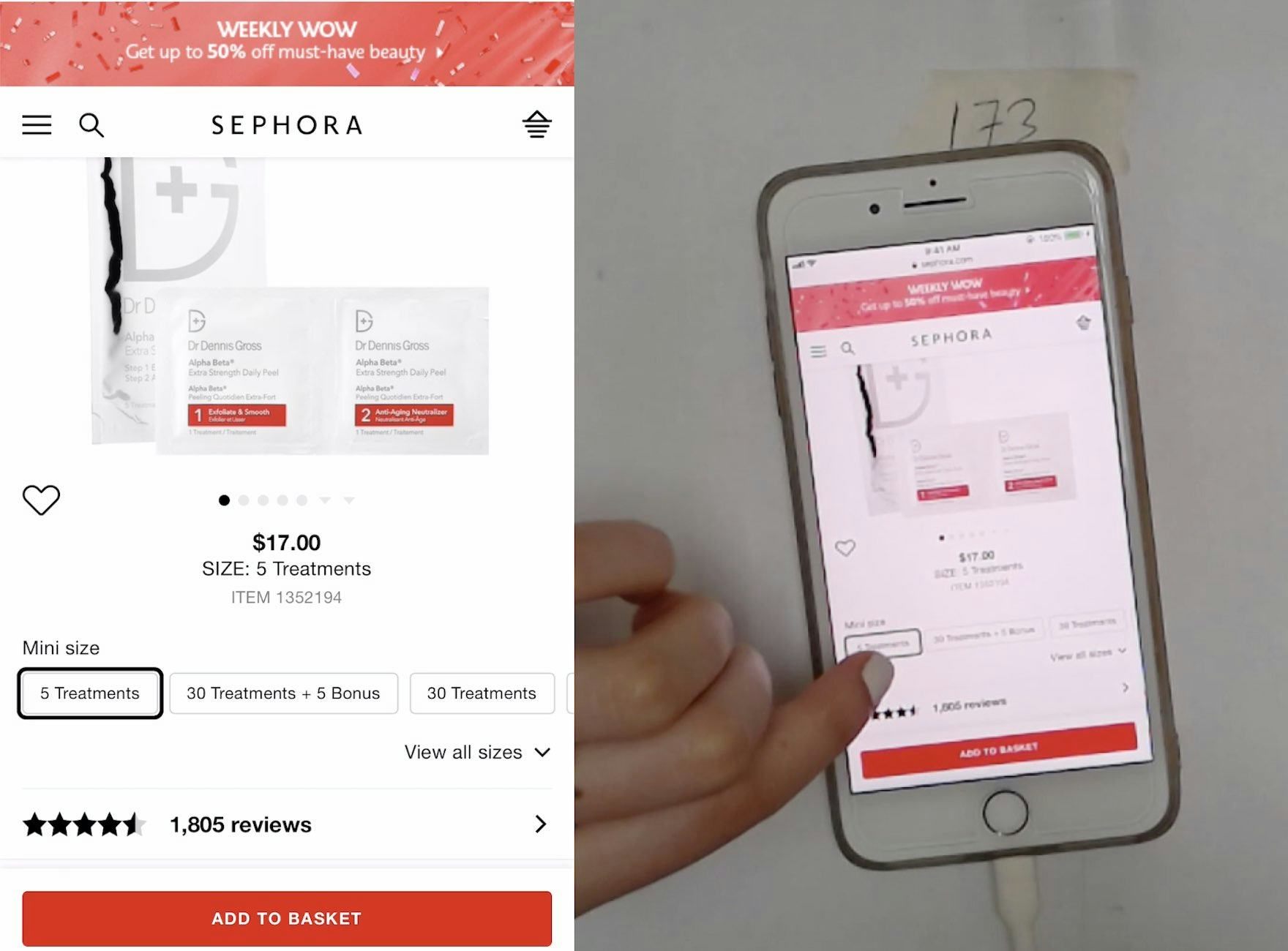
Meanwhile, Sephora uses bold text treatment to distinguish price from surrounding text (despite its small size).
Likewise, we observed the overall treatment of text, including styling, text color, and background color, to be an effective means of drawing the eye to a product’s price.
Using a distinguishing color helps differentiate price from surrounding text (for both standard and discount pricing), as does the use of bold styling and the use of a contrasting background color. In particular, smaller font sizes often require these additional eye-catching techniques to avoid being overlooked.
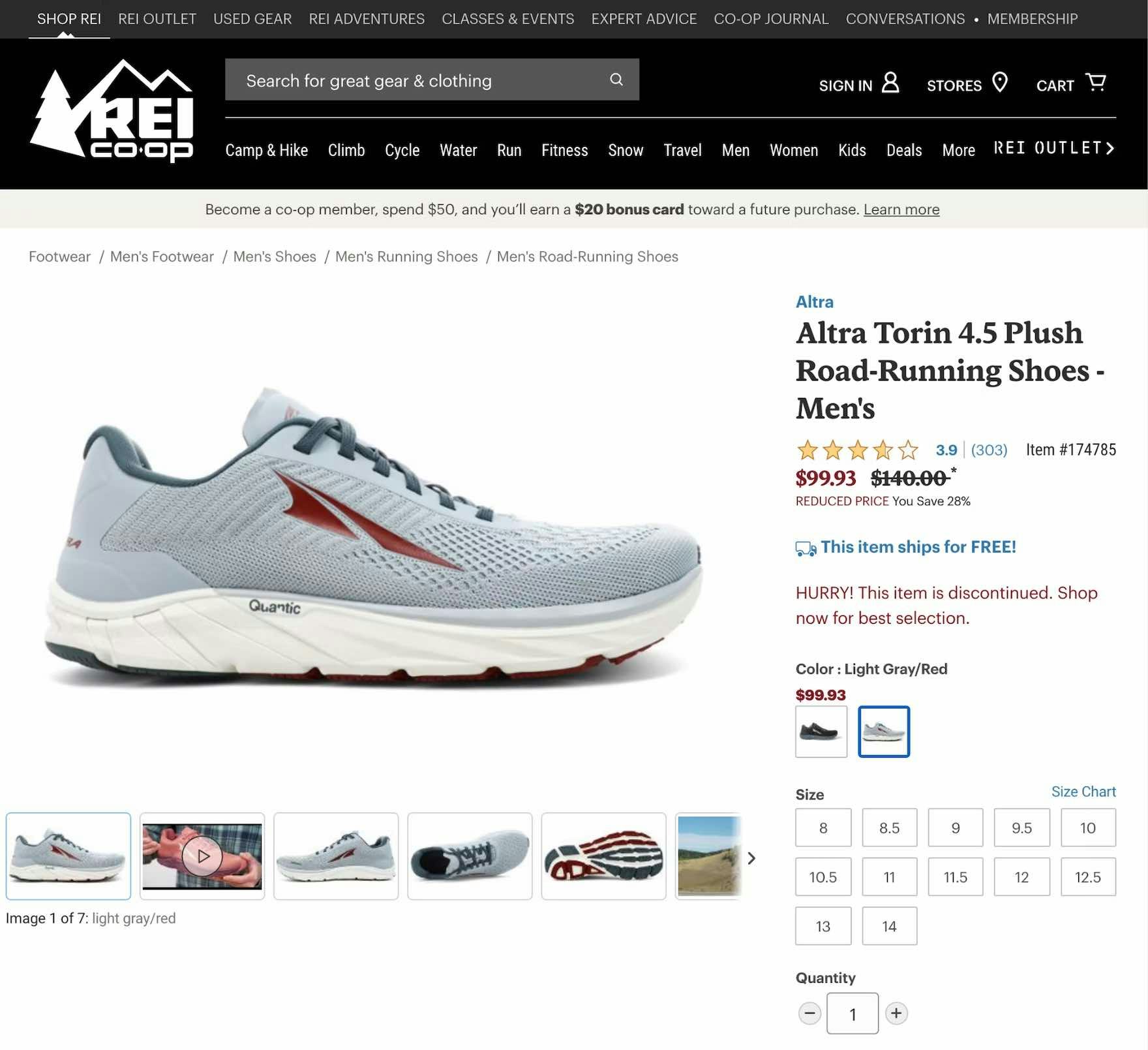
On REI, color and text treatment are used to help distinguish between the original price (presented in black with a strikethrough) and the current sale price (presented in bold red text).
When showing the original price alongside the discounted price, text treatment is an important way to distinguish between the two — essentially, it should be overwhelmingly clear to users what the new price is.
Using text treatment such as a strikethrough for the original price or larger bolded text for the sale price can help users understand the price they will actually be paying, helping to eliminate ambiguity.
Despite an easy-to-find price on the product page seemingly being a “UX basic”, 18% of desktop sites and 11% of mobile sites make it unnecessarily difficult to locate the product price.
2) Locating Discounts Far Away from the Product Price
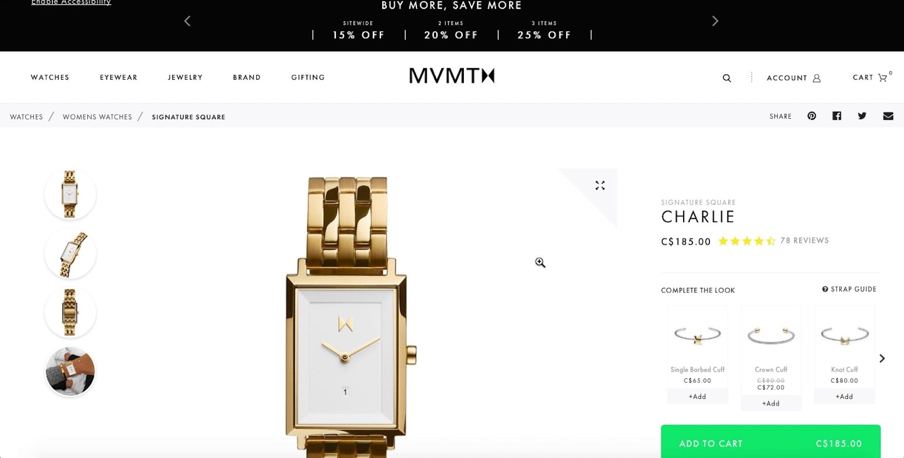
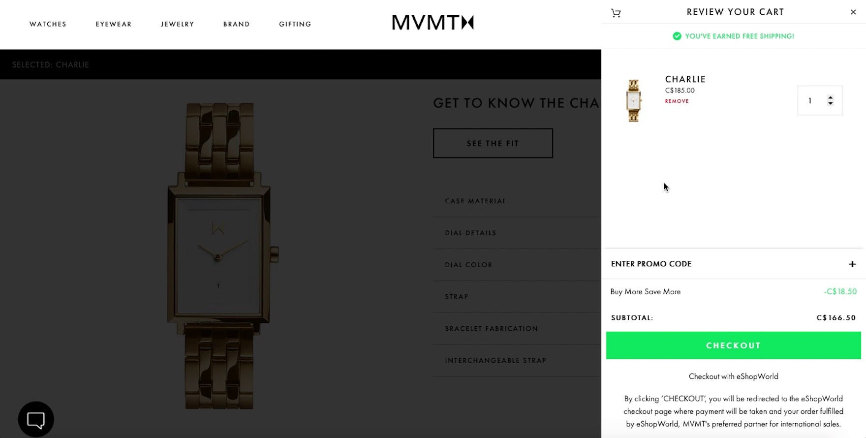
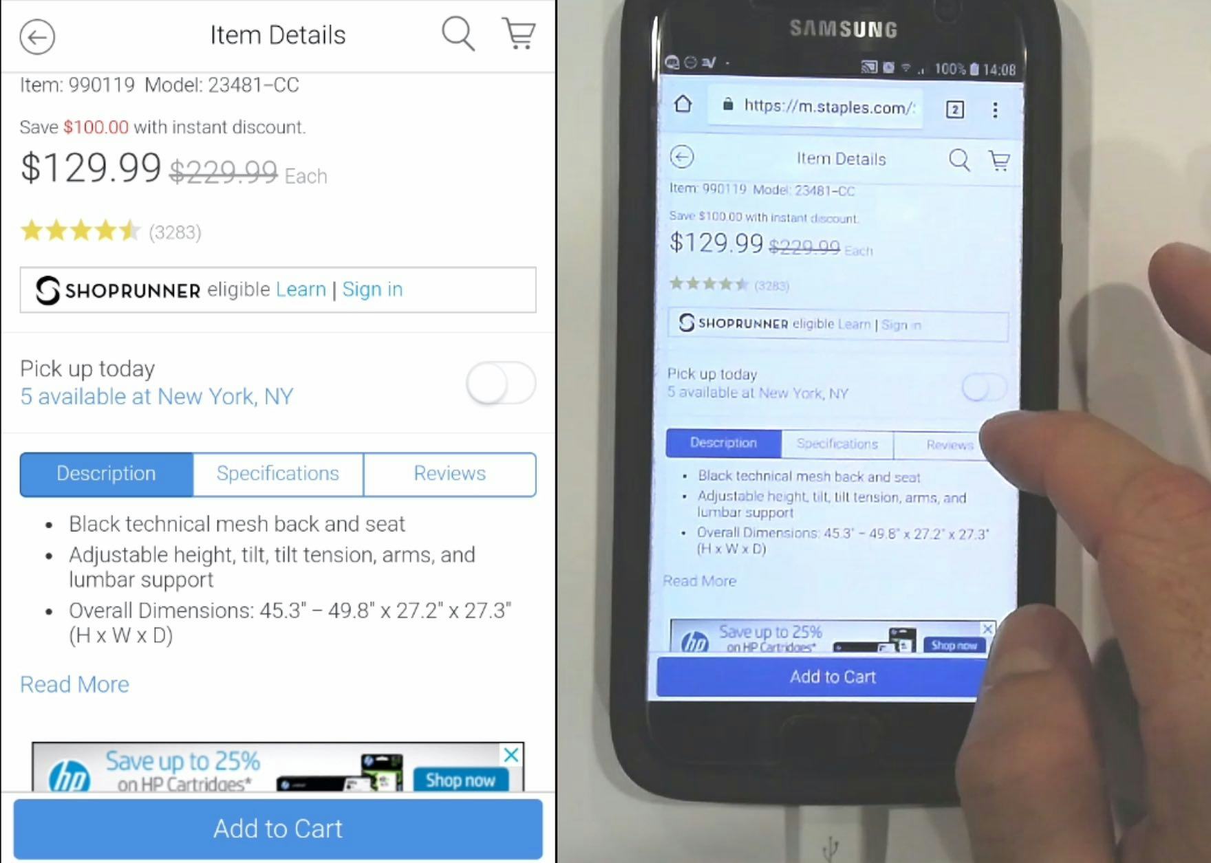
“I’m going to add it to the cart…to see how much and see the discount.” While a discount was promoted heavily within a sitewide banner, the price on the product page at MVMT didn’t appear to reflect the discount (first image). Confused, this participant needed to add the product to the cart before seeing the discount applied (second image). Ambiguous or missing discount messaging can make it more difficult for users to interpret the true cost of products they’re considering.
Even when users easily locate and understand the base price, the presentation of or messaging around discounts and special offers can cause users to become confused, frustrated, and mistrustful of the site.
During testing, participants often had a difficult time understanding a discount’s context when the special offer text was located far from the product’s price.
For example, during desktop testing some participants wondered whether “Special Offer” text, located near the product image gallery, actually referred to a sitewide discount (e.g., “Free shipping for orders over $75”) rather than an offer for the specific product they were looking at.
In practice, static special offer or discount descriptions that are far from the product’s price introduce ambiguity, risking users won’t easily understand whether the special offer applies to the product they are currently investigating.
In some cases, discount messaging that is presented separately from product’s price can even be overlooked entirely, resulting in some users failing to recognize the special offer altogether.
In reality, price-conscious users may strive to find more information on available sales and discounts, distracting them from their original product-exploration task — or, worse, causing them to fail to be convinced that the special offer is genuine and abandon the product or site as a result.
According to our e-commerce UX benchmark, 14% of desktop sites locate promotions far from the price on the PDP, making it more difficult for users to understand what discounts are applicable.
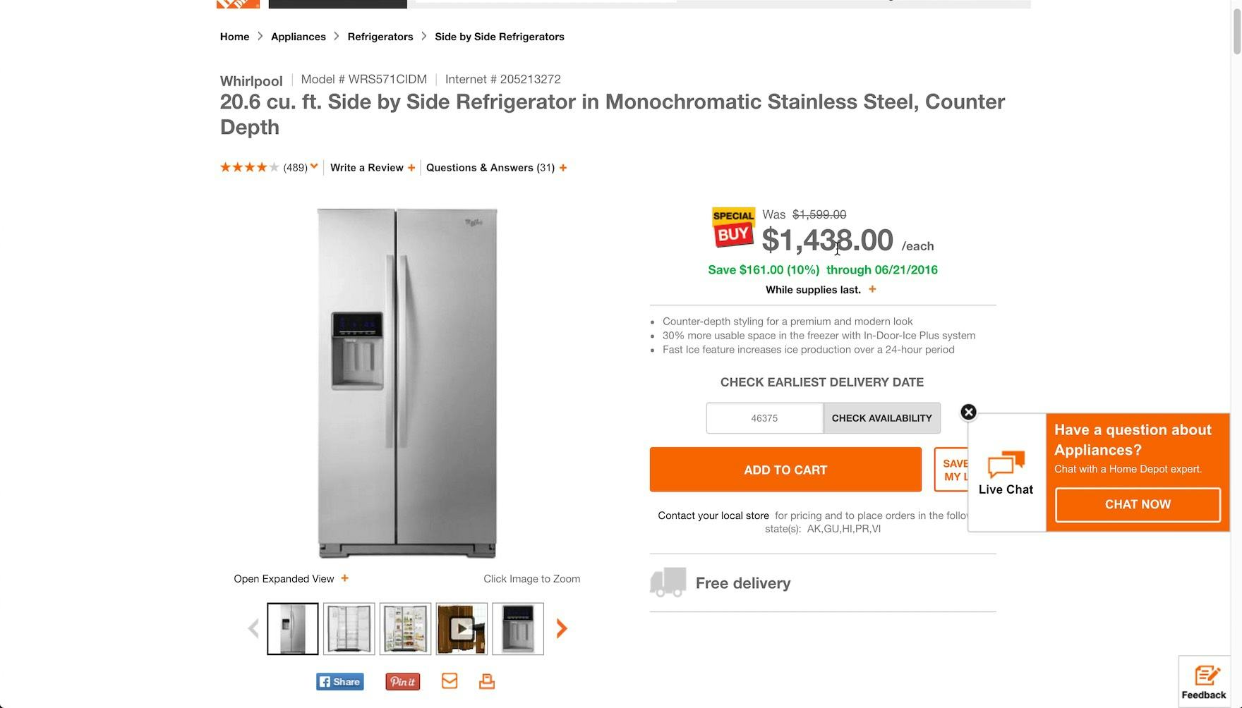
“I feel like I’m getting a little bit of a deal…it’s 10%”, a participant testing Home Depot said, immediately understanding the discount. All offer information is grouped together and located near the product price. Note the struck-through original price, the “Special Buy” badge located next to the price, the description of the total amount saved, and the percentage and the qualifying date.
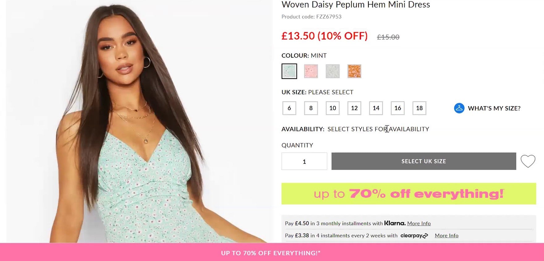
“It’s hard to miss the discount…” The font size and color, coupled with the less prominent original price, made this discounted price easily discerned on Boohoo (UK) during large-scale European testing.
To ensure price-related special offers and discounts are easily seen and understood, they should be placed in close proximity to the product price in the “Buy” section.
During testing, this location was observed to make special offer text more findable and less prone to misinterpretation.
Additionally, sitewide badges (e.g., “Rollback”, “Clearance”, etc.), if provided, should be displayed near the product price as well, to emphasize that this product is “On Clearance”.
Grouping all price-related special offer and discount information together makes it easier for users to consume this information all at once (e.g., “Okay, so this is 20% off, and it’s on ‘Rollback’, and it qualifies for free shipping”).
3) Displaying Promotions Multiple Times on the PDP
“‘Save 10%’, but it’s not clear if that is already factored into the price, so that makes me confused, because there’s $20 off already, so I don’t know if I’m getting an additional 10%”, one participant said, unable to determine if the “Special Offer” referred to one or two stacking offers. Another participant took exception to how it was written: “This seems like false advertising, that I would save 10%, because they are already doing that.”
During testing, multiple special offer descriptions brought some users to a halt while they puzzled over the correct interpretation.
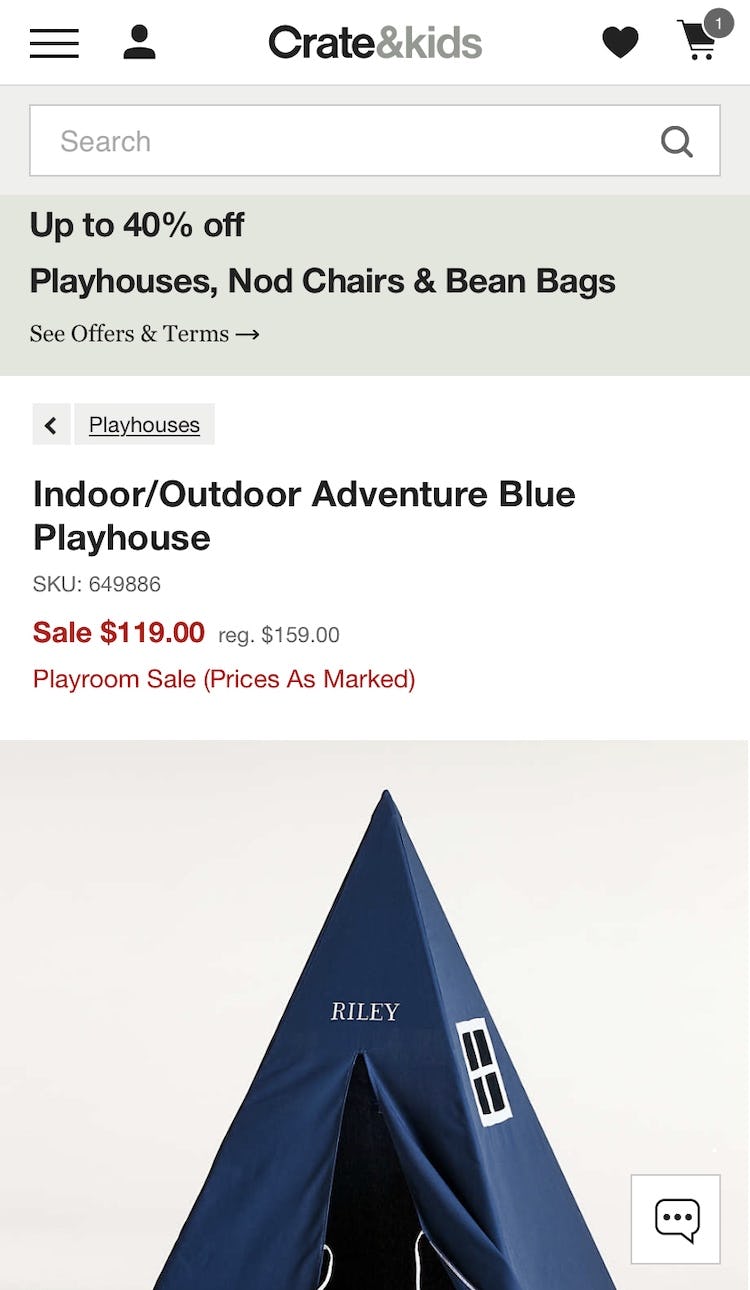
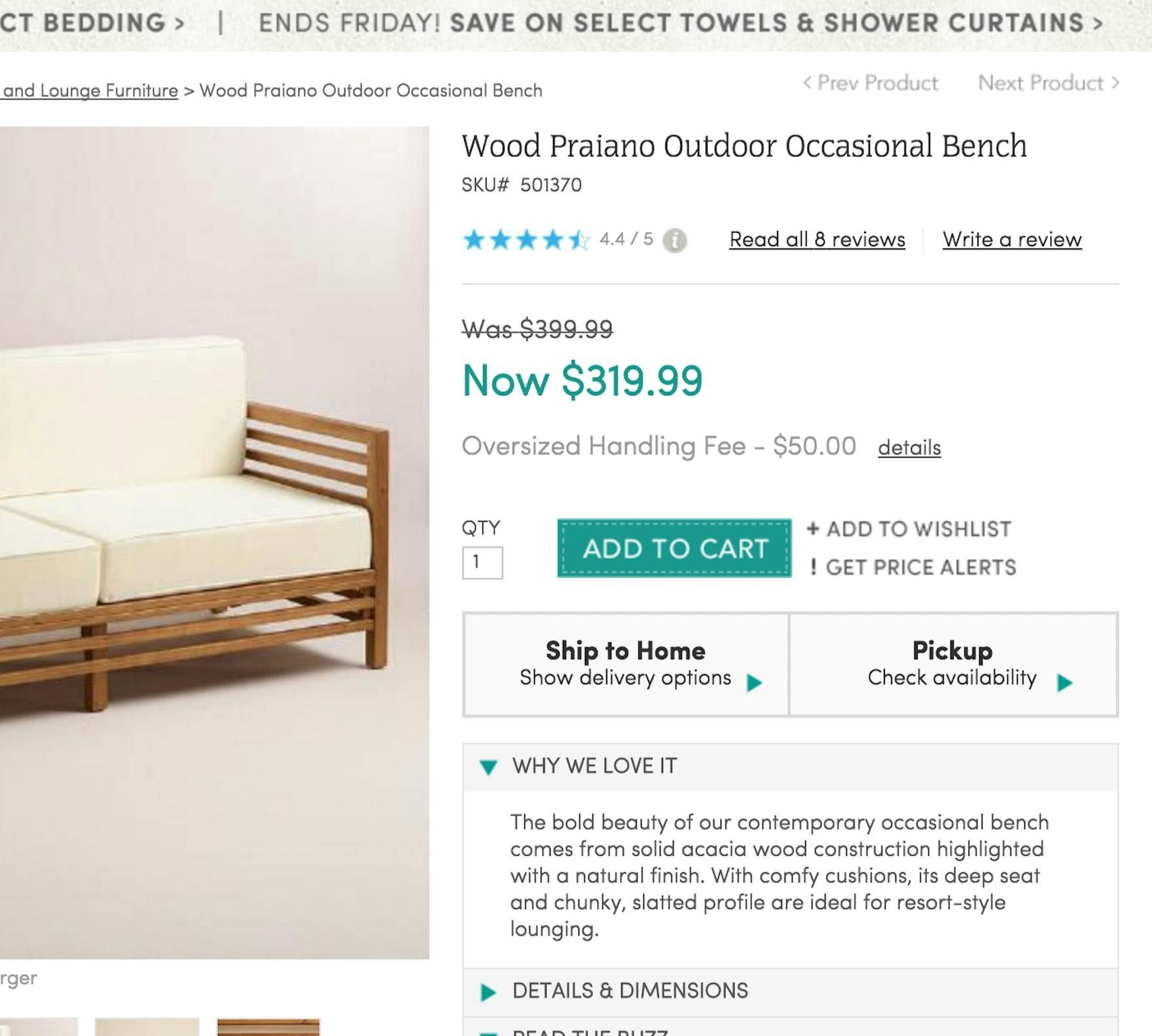
At Crate&Barrel, multiple highlights of the same offer introduce the potential for confusion. Is the “Up to 40% off” offer displayed in the banner the same as or different from the savings indicated on this product details page?
In practice, multiple descriptions of the same offer make it difficult for users to understand exactly what they’re getting, slowing their decision-making and introducing the risk of misinterpretation.
Indeed, despite the special offer messaging likely being very clear to site designers and company employees, in our testing we’ve observed participants to ask questions such as, “Does each of the offer descriptions represent separate offers, or are they all different descriptions of the same offer? or “Can the offers be stacked on top of each other?”.
For sites that display special offers on the product page, 19% of desktop benchmark sites risk confusing users over multiple descriptions of the same promotional offer.
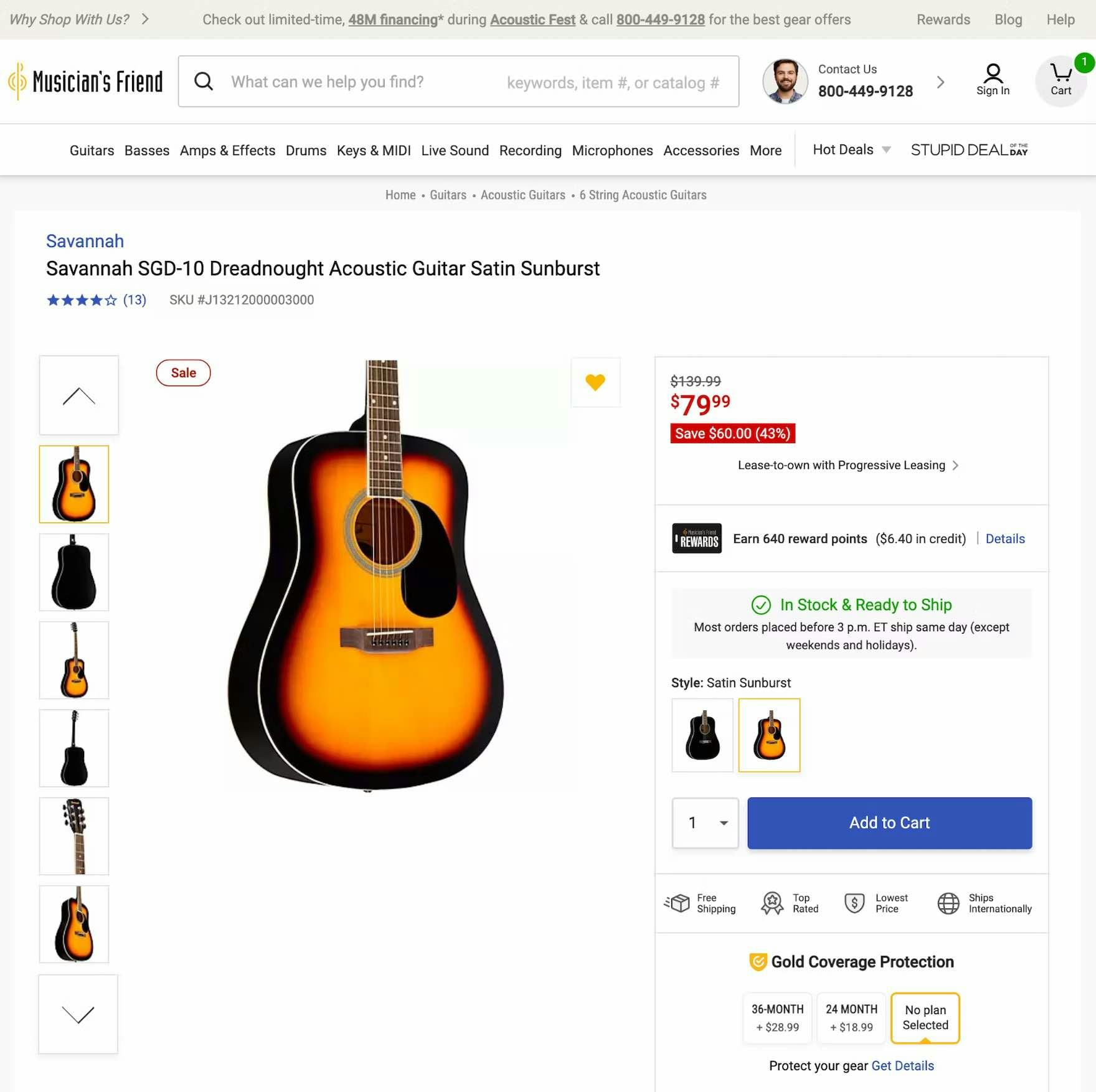
Musician’s Friend eliminates the potential for misinterpretation by highlighting the $60 discount on this guitar only once, prominently featuring it in the “Buy” section of the PDP.
To avoid ambiguity, a single offer should generally only have a single description displayed on the product page — again, placed in close proximity to the product price.
If multiple descriptions of the same offer are truly needed (e.g., at the top and bottom of very tall product pages), the offer descriptions should be identical or almost identical in wording to clarify that it’s the same offer displayed twice and not two separate stacking offers.
Streamlining the presentation of discounts on the PDP helps to immediately focus users on the special pricing and avoids the potential for confusion.
4) Failing to Highlight Percent or Amount Off

When it comes to displaying the discount itself, it’s important to underscore to users what a good deal they’re getting to help entice them to move forward with the purchase.
In practice, there are two main approaches: displaying the absolute discount (“$5 off”) or the relative discount (“20% off”).
“I like the fact that…there’s a discount.” This participant appreciated the prominent discount pricing highlighting “Save $100.00 with instant discount” on Staples’s mobile site. In this instance, displaying “Save $100” likely has a stronger psychological effect than the same discount presented as a percentage (“Save 43%”).
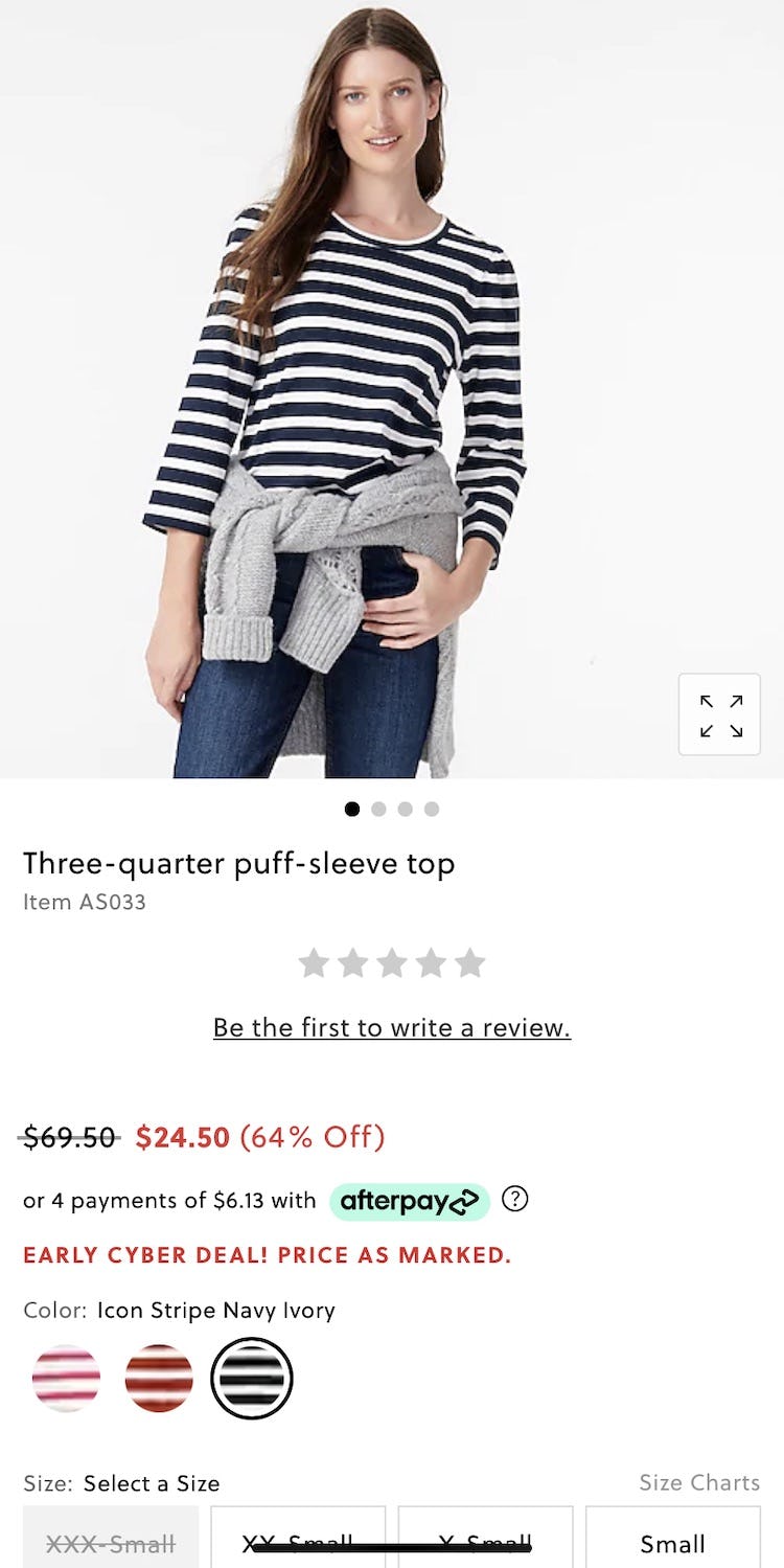
Meanwhile, J.Crew highlights the relative discount (“64% Off”) for this product. The advantage of displaying a relative versus absolute discount depends on which is perceived as a “larger number”.
From our large-scale UX testing, we’ve observed that displaying both the absolute and relative discount works best.
However, if wanting to conserve space and only display one or the other, then consider Jonah Berger’s “Rule of 100”.
Jonah Berger, a marketing professor at the Wharton School, has researched how to best display discounts and found that users are generally most inclined to act on an offer if the highest discount number is always displayed.
For example, a $20 item discounted to $15 should display “25% off” (and not “$5 off”), whereas items priced above $100 should generally display the discount in absolute numbers; for instance, a $1,000 item discounted to $900 should display “$100 off” (and not “10% off”).
While the total discount is the same, users’ perception of the significance of the discount is more favorable when the higher number is used.
Clear Pricing Makes the Purchase Decision Easier
Overstock clearly displays the price and discount information, locating them closely together within the “Buy” section to help users find and understand the offer.
With pricing and discounts being so top of mind for so many users, it’s vital that this key information be clear and easy to find on product details pages.
To optimize findability and clarity, sites should avoid these 4 common pricing pitfalls:
1) Pricing and discounts blending in with other PDP elements
2) Locating discounts far away from the product price
3) Displaying promotions multiple times on the PDP
4) Failing to highlight percent or amount off
Clarity around pricing and discounts gives users confidence that a product will fit their preferences and help them decide to move forward with the purchase, ultimately giving users satisfaction while bolstering the site’s e-commerce conversion rate optimization.
Yet our research in e-commerce UX shows that 18%+ of e-commerce sites fall into 1 of the 4 pitfalls — making it unnecessarily difficult for users to get access to this basic product information.
This article presents the research findings from just 1 of the 650+ UX guidelines in Baymard Premium – get full access to learn how to create a “State of the Art” e-commerce user experience.