Key Takeaways
- Our new research has uncovered 600+ usability issues specific to food delivery and takeout sites
- The research has resulted in 372 guidelines that describe the issues, as well as design patterns verified to perform well for users
- In particular, the research provides insights on the content and features food delivery and takeout sites need to provide users to ensure they’re able to make a purchase decision
At Baymard our research team has just spent 1100+ hours usability testing and researching online food delivery and takeout website features, layouts, content, and designs — leading to our new study on Food Delivery & Takeout UX.
The research is based on more than 90 qualitative user/site usability test sessions following the “Think Aloud” protocol (1:1 remote moderated testing).
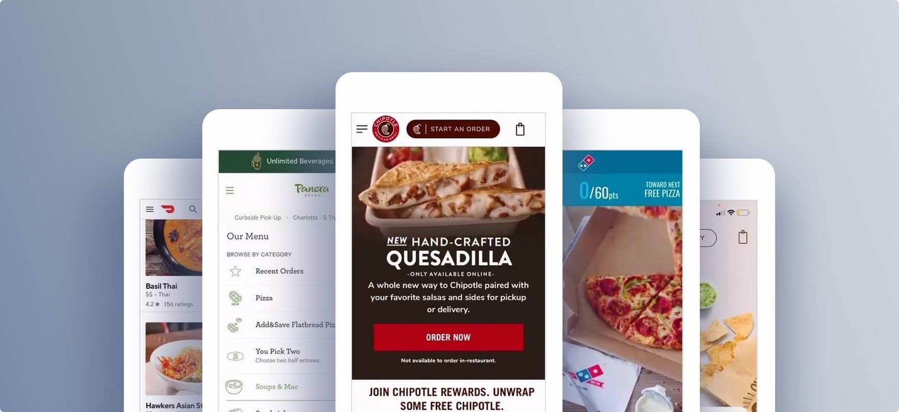
The test sites spanned both individual restaurant sites and apps (Starbucks, Chipotle, Domino’s, Panera Bread) and aggregate third-party restaurant delivery sites and apps (Doordash and Uber Eats).
During testing, users at these sites frequently ran into issues that severely disrupted their ability to efficiently order food for delivery or takeout.
Indeed, during testing the users encountered 600+ medium-to-severe usability issues. These issues have subsequently been analyzed and distilled into the 372 UX guidelines found within our Food Delivery & Takeout UX research study (all of which are available as part of our Premium UX research).
The 372 guidelines cover most aspects of the online ordering of food delivery and takeout, at both a high level of general user behavior as well as at a more granular level of specific issues users are likely to encounter.
In this article we’ll introduce 3 high-level UX findings for online food delivery and takeout sites:
- Selecting a suitable meal order can be a friction-filled experience
- Sitewide UX issues can lead to abandonments
- The progress to finalizing fulfillment can be halted by several common pitfalls
1) Selecting a Suitable Meal Order Can Be a Friction-Filled Experience
Many users at food delivery and takeout sites are returning to reorder from their favorite restaurants — and thus often know exactly what they want.
However, finding their preferred meals can be surprisingly difficult — making what should be a quick ordering experience into a longer slog through the site.
In particular, users testing food delivery and takeout sites looked to the homepage as a logical place to help them quickly begin the process of ordering their previously ordered food.
“Where the hell is that order? I always have a hard time finding that…I don’t think there’s a way to do that.” Despite being a regular Starbucks customer, this user testing its mobile app was unable to locate how to reorder her past purchases, initially scrolling up and down the homepage to find this functionality. When users are likely to have staples or “standing orders”, the lack of visibility to these items makes it harder for them to achieve their goal.
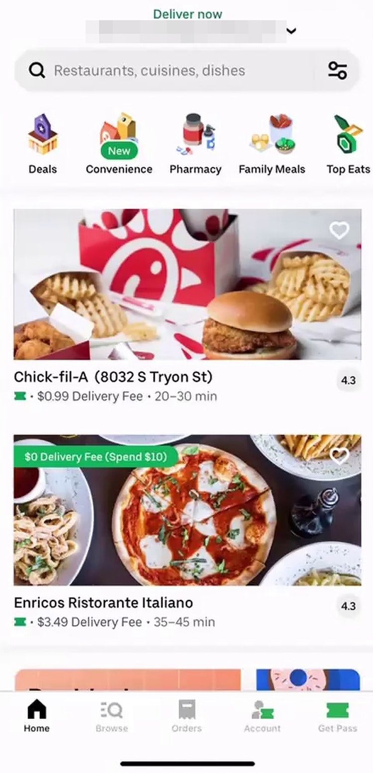
“Right away, I don’t see anything. I will have to search for that a little bit.” This user on UberEats struggled to find restaurants she had ordered from in the past, which were not displayed on the homepage. For industries where returning users are likely to reorder items they have gotten in the past, the homepage is a common place to look for this functionality.
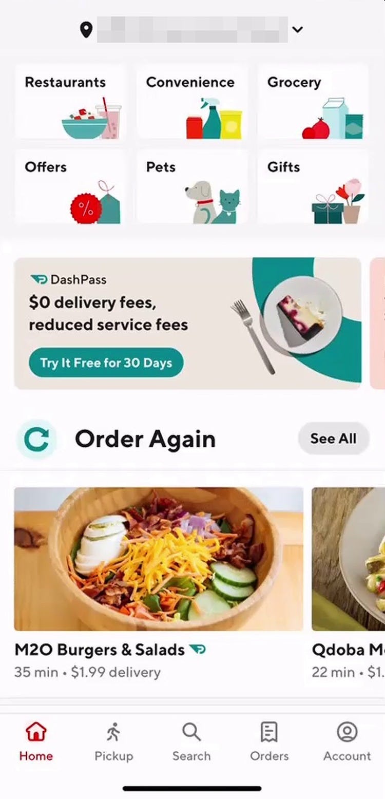
At Doordash, this user quickly located restaurants he had ordered from in the past by using the “Order Again” feature on the app’s homepage.
Yet some sites prioritized featured meals or adlike content instead — missing out on an opportunity to personalize the experience for the returning user, and making it more difficult than it should have been for the user to quickly get to the checkout process.
Moreover, once users eventually settle on a meal order, upon arriving at the beginning of checkout some users decide they need to make changes before proceeding.
For example, users placing a coffee order might choose to have cream, sugar, or syrup added to their coffee; users placing a burrito order might choose to have no beans, extra beans, guacamole, etc.
However, during testing many sites didn’t make it easy to change meal preferences once they had been selected — leading to user hesitation at a crucial stage of their ordering process (i.e., right at the beginning of checkout).
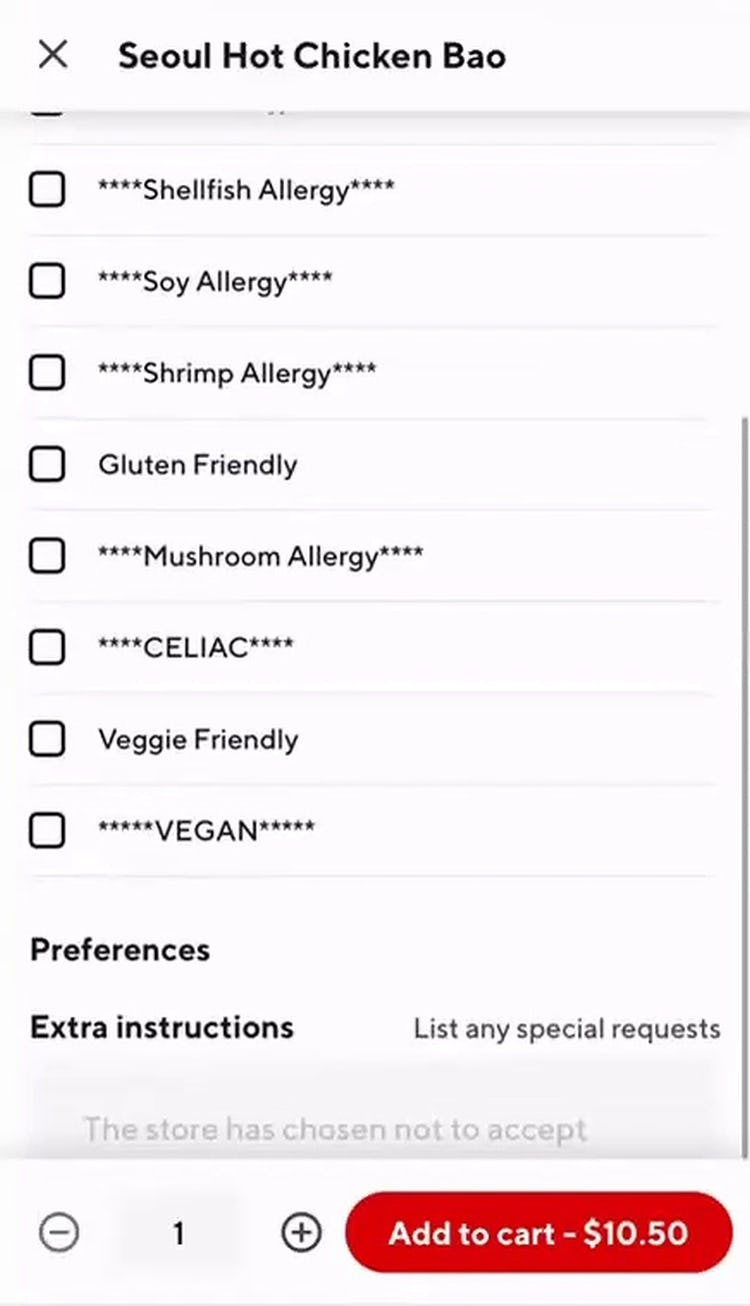
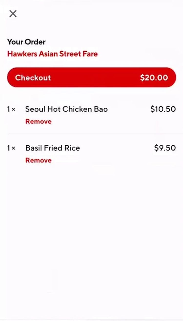
“It looks like I would have to remove and then recustomize…I don’t really see another way to customize after you’ve already [added the item to the cart].” Despite the ability to customize items before adding them to the cart (first image), this user ordering from Doordash’s mobile site wasn’t able to edit customizations for items already in his cart (second image). He continued, “It doesn’t seem like it should be that hard to add in the ability to edit it from here…it is annoying. It’s an extra step, especially if I wanted to do something more than just adding chicken to one of my fried rice, like if there were a couple of things that I needed to make sure to change — I don’t know, it would get really annoying really quickly”. The inability to easily edit items from the cart can dissuade users from ordering if they believe their only alternative is to start over.
Indeed, if there’s no easy way to make changes to meal orders in the cart, many users will assume that, in order to update the item, they must remove it from the cart entirely and customize it from the beginning — causing many users to reconsider whether the order is worth the bother.
For instance, one user, finding no way to adjust her complex meal customizations in the cart, shared, “Probably I would have to remove the item and start over…This stuff’s supposed to be very simple. It’s annoying to have to delete it and then do it again. I might just abandon it and then go somewhere else”.
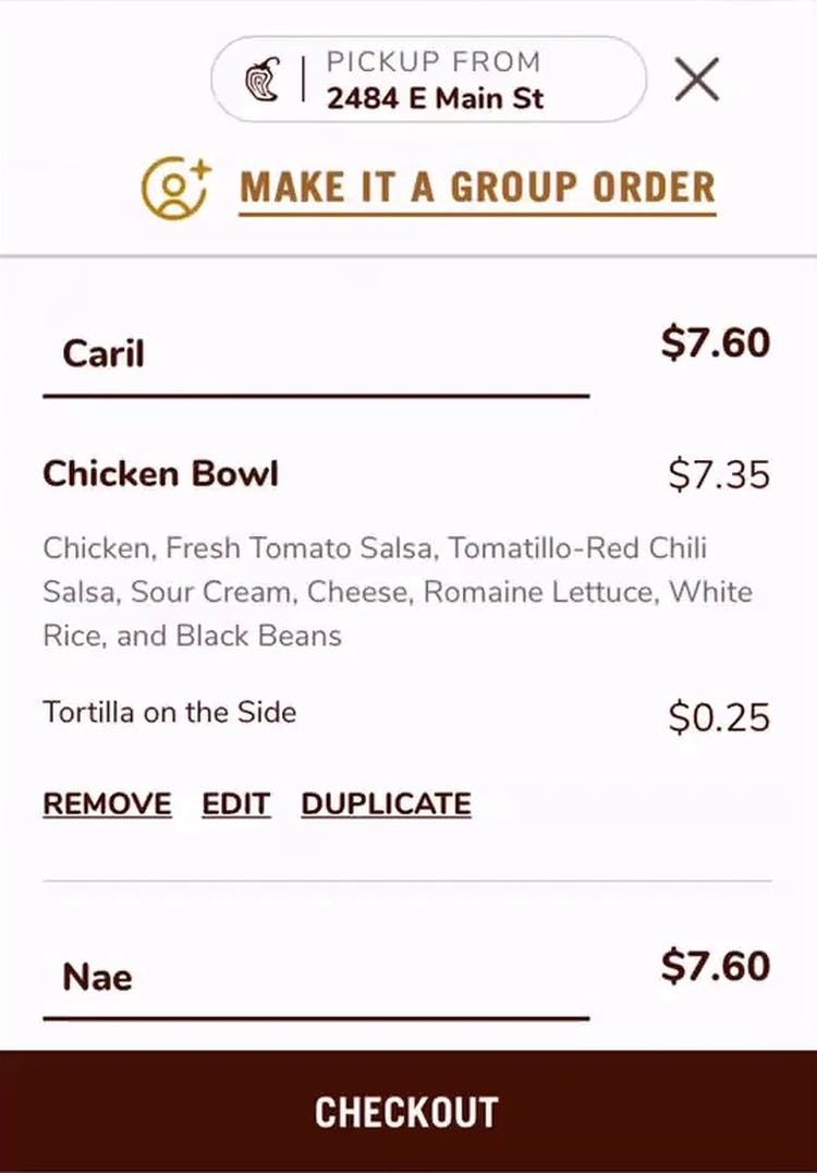
Chipotle provides a clear “Edit” link in the cart for each item being ordered, making it easy for users to quickly adjust what can be complex meal orders.
Therefore, food delivery and takeout sites should ensure that users in the cart can quickly edit or change meal preferences — or face a higher cart abandonment rate as some users simply give up on completing the checkout.
2) Sitewide UX Issues Can Lead to Abandonments
Sitewide UX issues can torpedo even the best user experience.
Over the course of hundreds of tests sessions we’ve observed abandonments resulting from such sitewide issues — for example, issues using the “Back” button, performance-related issues such as laggy UIs, overly aggressive “Install App” ads, issues specific to the mobile interface, or general layout bugs.
If a site doesn’t seem to be performing on any one of many sitewide UX aspects users are quick to give up — maybe to try again later, but often to simply not place the order or place it on a competitor’s site.
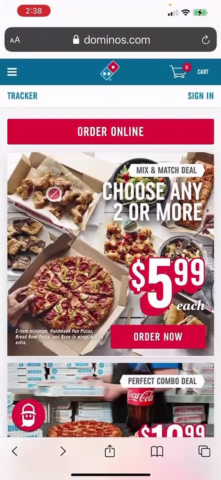
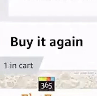
“Oh, it canceled my whole order…I was trying to actually find the menu so that I could order something else and I didn’t know how exactly to get to the menu, so I just pressed the “Back” button and then it took me all the way back to the first page, where I had to choose even the location from where I would pick up. So I, yeah, I don’t like that because I had spent so much time ordering the pizza.” At Dominos a user spent many minutes building a pizza order, only to have it removed after using the “Back” button. (Note in the first image the “1” in the cart, which is gone in the second image.) Basic navigation issues can derail what would otherwise be high-performing user experiences.
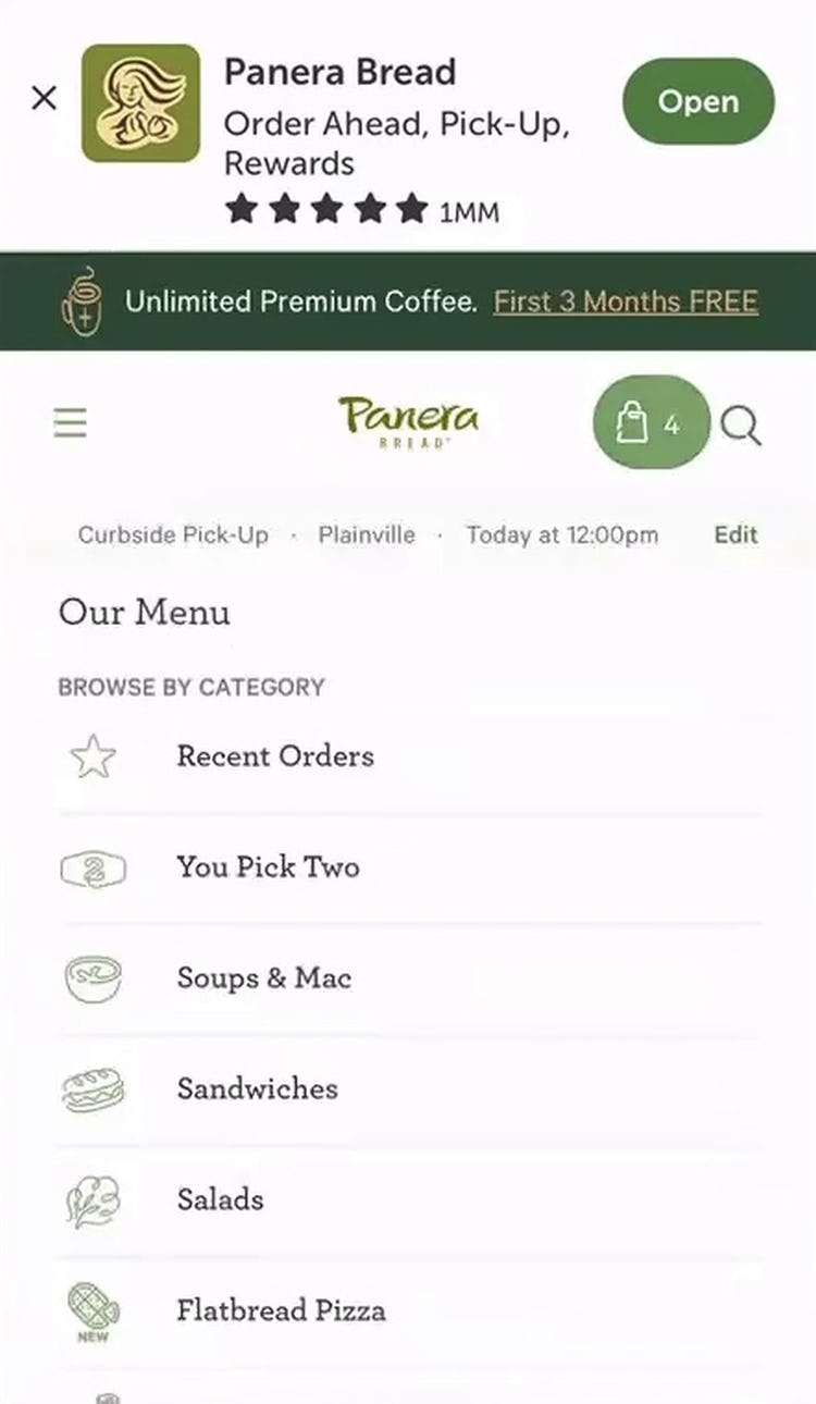
“I wanna do ‘Menu’…it’s hard to see it.” A user at Panera, building a takeout order on Panera’s mobile site, found it difficult to navigate with the “Install App” banner crowding the mobile viewport (and didn’t immediately think to close the ad).
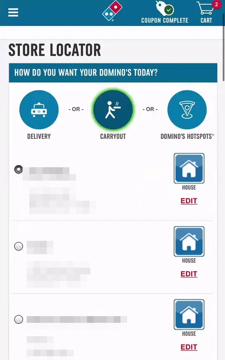
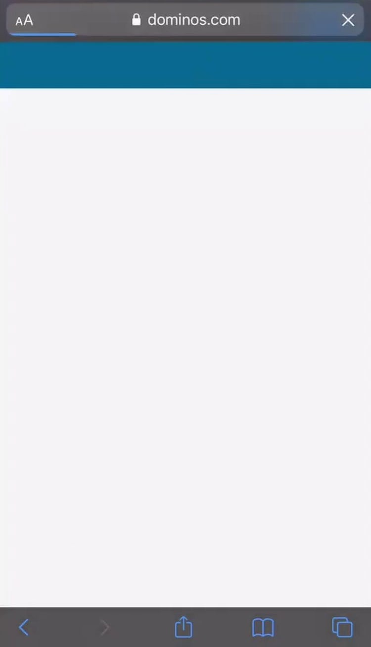
“I don’t think [it worked]…I mean, if it happens, like one time, it’s okay, but I mean, if it’s like every time I go to it, it’s the same issue, then it’s like, it starts to become annoying.” At Dominos a user switched from delivery to carryout, but didn’t see the confirmation/search button below the fold (first image). He navigated away before realizing it didn’t save his change. He then tried to make the selection a second time, but got a blank page instead (second image).
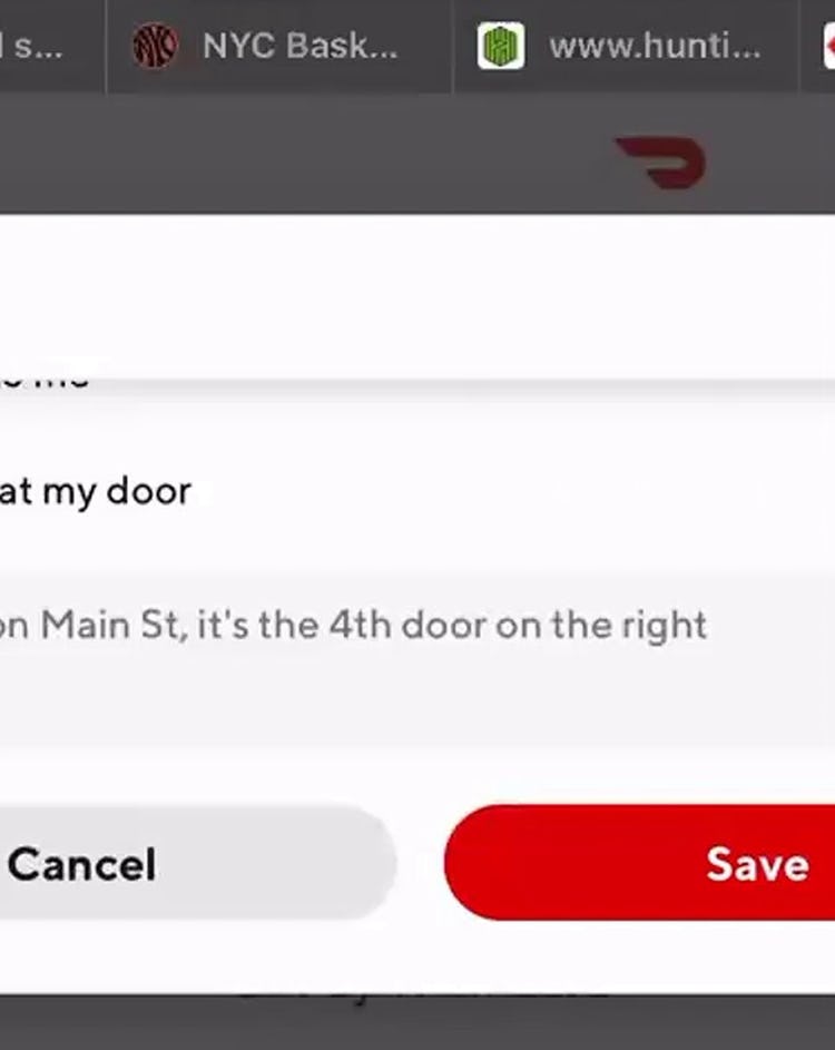
“Okay, it doesn’t save. All right, so, I don’t know if it’s something on my end or not…I mean, it makes me think about it…if the delivery driver just thinks to leave it at the door…they might just leave it by the front gate.” A user at Doordash updated delivery instructions and tapped to save them, but there was no response from the site. He zoomed in and tried again multiple times before giving up. UX issues such as these can leave users stuck at a UX dead end.
Furthermore, users on takeout and food delivery sites have often invested a good amount of time customizing their order — for example, adding all the toppings they want for a pizza, or scheduling a pickup at their nearby Starbucks.
Thus, sitewide UX issues can be even more frustrating when experienced on a takeout or food delivery site compared to when shopping on a more general e-commerce site such as Amazon.
While it’s likely not possible to ensure that these issues never occur for any users, it is possible to invest the resources to continually test and monitor the site for issues such as these to limit their occurrence.
3) The Progress to Finalizing Fulfillment Can Be Halted by Several Common Pitfalls
Once users have selected their meal and made their customizations, they’ll need to progress to checkout and eventually finalize their order.
Yet during testing we observed that on takeout and food delivery sites there are several pitfalls that delay or stop users’ progress toward completing their order.
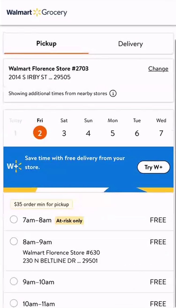
“I’m going to say that I wanna pick it up tomorrow.” This user on Walmart’s mobile site easily scheduled her grocery pickup for the following day by using the layered date and time selector, first picking the date (tomorrow) and then browsing the available times. (Note the inclusion of additional information for specific time slots; e.g., “At-risk only” for the 7am–8am time slot.)
For example, despite the necessity of scheduling a pickup or delivery date and time, several takeout and food delivery sites provided users with a suboptimal fulfillment-scheduling feature, such as one long list of dates and times, a “double scroll wheel” UI, or a simple drop-down menu — rather than a calendar-type selector, which testing showed to be much more intuitive for users.
“All right, so I could enter my phone number, and then what I want to know is, is this person gonna call me or text me?…If they need to contact me for everything as they’re filling the cart, I don’t wanna take three phone calls about this.” This user checking out on Instacart’s mobile site worried about the type and frequency of communication to expect from their shopper, particularly with regards to substitutions. Without further details on what to expect postcheckout, some users may hesitate to move forward.
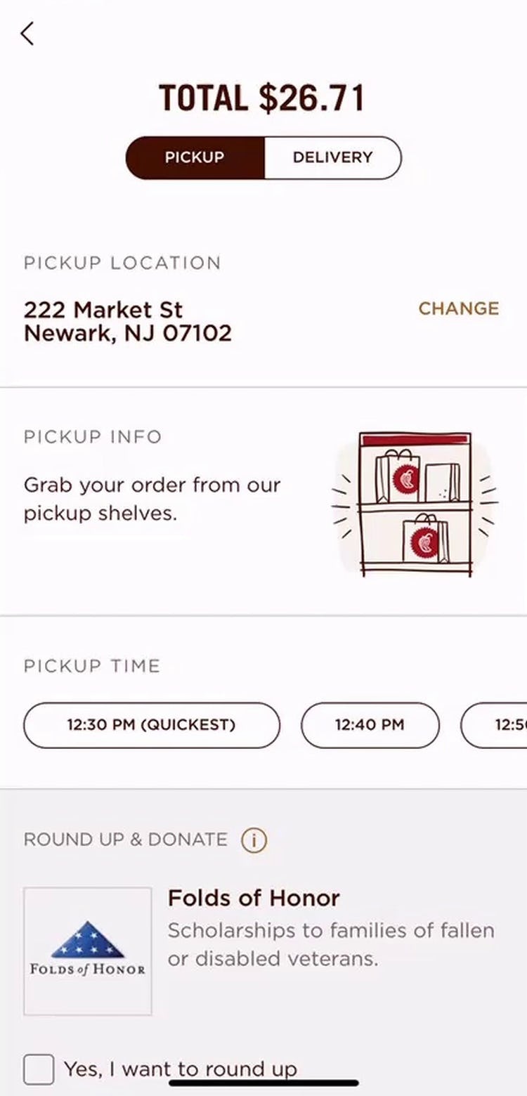
“Okay so it says, ‘Grab your order from our pickup shelves’.” This user checking out on Chipotle’s mobile app quickly noted the instructions for where to find her pickup order.
Additionally, users picking up their food or getting food delivered often need additional instructions regarding the final fulfillment of their order — for example, where to park for pick up, how they can communicate with their delivery person, or how to track the order’s status.
Yet many sites during testing failed to provide this necessary information — leaving users hesitant about continuing to finalize their order.
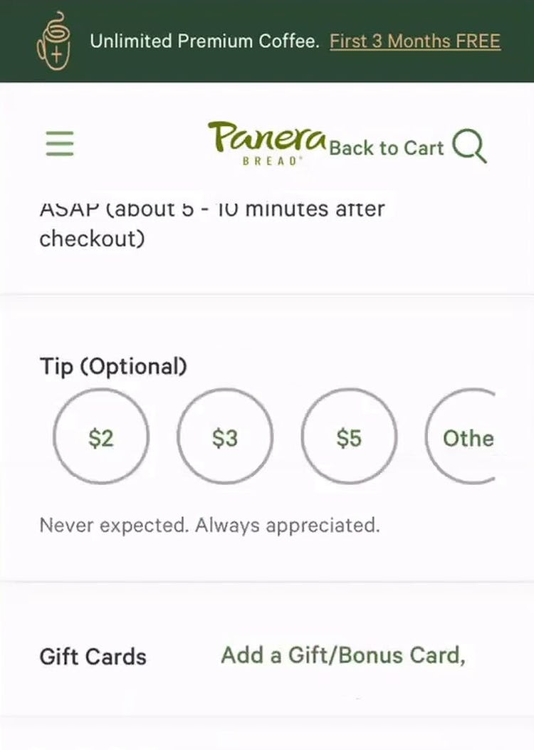
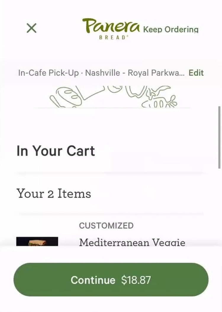
“Oh, that’s interesting, so they’re just dollar amounts, as opposed to a percentage tip…[which] I was just looking for. I don’t remember how much the order was…I’ll just go back.” Reaching the review step of checkout on Panera’s mobile site, this user hesitated to select a tip because they were shown only in dollar amounts (first image). Wishing to tip based on the order total — a common tipping convention — she navigated back to the cart to find this cost information and then attempted to calculate the percentage tip for herself (second image): “Yeah, $19, so tip — hmmmmm.” In situations like this, users must calculate for themselves their preferred tip.
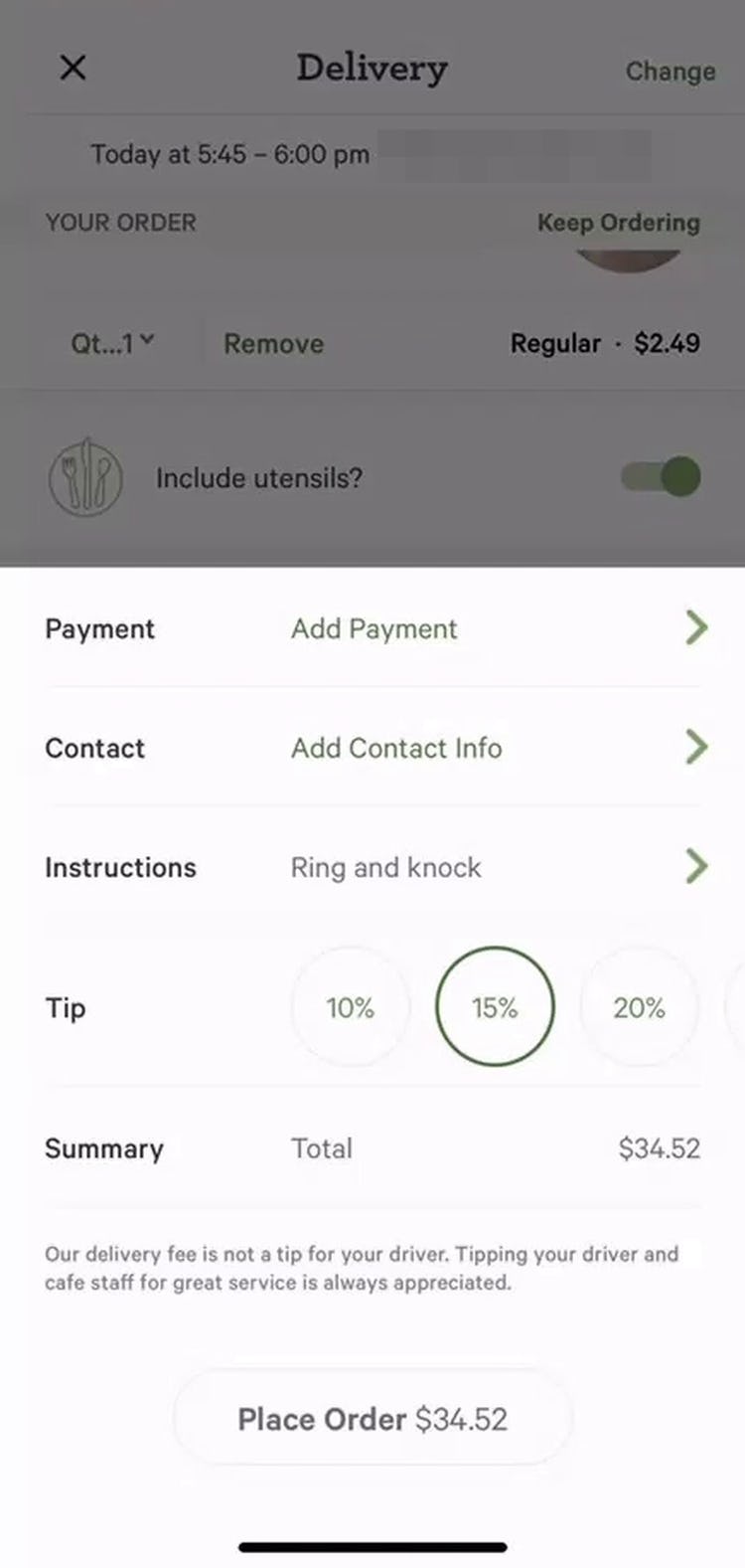
“Okay, here it is. So, the tip…” Meanwhile, on Panera’s mobile app, this user was not able to see the dollar amount associated with each tip option — only the percentage. While the total below updated to reflect the included tip, users must do their own math to determine the actual amount they are paying in tip.
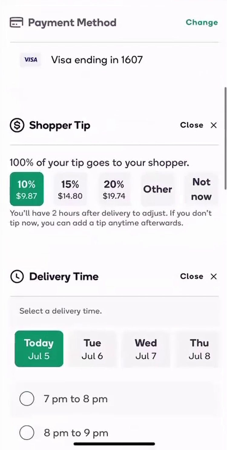
“Okay and then it gives you the option to tip. I’ll do 20%.” On Shipt’s mobile site, this user easily compared tip options by referencing the included percentages and associated dollar amounts.
Another common pitfall identified during testing was related to tipping — a common feature for many takeout and food delivery sites.
Several sites either displayed only the percentage of the tip (e.g., “20%”) or the dollar amount (e.g., “$4”) — forcing users who preferred the option that wasn’t available to determine for themselves the missing information.
While some users will quickly make the necessary calculations themselves, others will go backwards in the checkout process, potentially leaving checkout entirely — increasing the possibility that they won’t finalize their order.
Give Your Users What They Need to Quickly Order Their Food
“Chipotle’s nice because I order pretty much the same thing every time…When you first log in to Chipotle, it just gives you the option to add it immediately.” This user on Chipotle’s mobile app appreciated how easy it was to add her regular order to the cart, as it was prominently displayed on the homepage. With fewer items in an average order, displaying only one or a handful of “Past Purchases” on restaurant sites helps users quickly add their desired meals.
Ordering food online may be a new experience for many users, who are more used to shopping traditional e-commerce sites.
Thus it’s critical that new users are supported by a high-performing UX — as many will otherwise simply give up on ordering from a particular site.
Furthermore, during testing, even repeat customers of sites faced UX issues, which often derailed their ordering experience.
In particular, 3 high-level aspects of takeout and food delivery UX were identified during testing as especially important to focus on:
- How users select and customize a meal order
- Minimizing general sitewide UX issues
- The fulfillment-finalization flow, features, and UI elements
Ensuring your food delivery or takeout site performs well across these 3 high-level aspects of food delivery and takeout UX will help your site stand out from the crowd — and will likely result in a better-performing e-commerce conversion rate.
Getting access: all 372 food delivery and takeout UX guidelines are available today via Baymard Premium access. (If you already have an account open the Takeout & Food Delivery Study.) You may also want to visit our audit page page for information on booking an audit of a food delivery or takeout site with a Baymard auditor.