Key Takeaways
- In general, DTC benchmark sites perform similarly compared to the average e-commerce site across our benchmarks, with both performing on average in the “mediocre” to “decent” range.
- However, DTC benchmark sites have a significantly smaller spread compared to traditional e-commerce sites, with far fewer DTC site performing in the “broken” to “poor” range.
- “Homepage”, “Category & Navigation, and “Product Lists” are core to users’ product-finding strategies on DTC sites, but receive mixed scores according to our benchmark, indicating room for improvement.
Baymard recently published a new in-depth Direct-to-Consumer (DTC) Benchmark Database.
Representing a mix of both younger and more niche small-catalog brands as well as established, more traditional DTC retailers, this database contains DTC UX performance rankings for the following 36 DTC sites:
Niche small-catalog DTC brands: Our Place, Away, Bang & Olufsen, Twice, Everlane, Harry’s, Snowe, Anine Bing, Backdrop, and Fitbit.
Established DTC retailers: Gucci, Van Cleef & Arpels, Louis Vuittion, TAG Heuer, Adidas, Chanel, Jimmy Choo, Apple, Marks & Spencer, L.L. Bean, H&M, Nike, IKEA, American Eagle, GAP, Dell, Victoria’s Secret, LEGO, Ann Taylor, Disney Store, HP, GoPro, Microsoft, Thermo Fisher, Berlin Packaging, and Hitachi.
These sites have been manually assessed by Baymard researchers across 485 research-based UX parameters relevant for DTC websites.
In this article we’ll analyze this benchmark dataset to provide an overview of the UX performance of DTC, and outline 5 common design pitfalls and strategic solutions applicable to most DTC sites.
This article is divided into the following sections:
- DTC Industry Overview
- DTC UX Performance Overview
- DTC Homepage
- DTC Category & Navigation
- DTC Product Lists
- Conclusion: Help Users Learn about Your DTC Brand
DTC Industry Overview
Direct-to-consumer (DTC) brands, as the name suggests, sell their products directly to consumers through their own website.
While many young, niche DTC brands eschew the traditional retail model altogether, doing business directly with customers exclusively online, many larger and more established brands also engage in traditional retail practices, either maintaining their own brick-and-mortar stores or partnering with traditional retailers to resell their products.
Generally speaking, DTC sites exclusively sell their own brand, making their product catalog significantly smaller than larger traditional B2C sites (e.g., Amazon, Target, Home Depot, etc.).
While the largest DTC sites may carry hundreds of items, niche DTC brands may carry only a handful of products — or even only a single product.
As a result, many DTC sites won’t need to maintain hierarchies of product options and navigation choices, brand filters, or, in many cases, on-site search.
With a relative lack of choice compared to shopping at large B2C sites that carry multiple brands, users browsing DTC sites instead value “getting to know” the brand and products at a deeper level before they make a purchase decision, with many wanting to feel like the site shares their tastes, values, and goals.
In practice, DTC sites thereby focus heavily on their “Brand” and “Product” stories, leading to a unique depth of information about both the company overall and its products.
While many of Baymard’s UX guidelines and suggestions to accommodate user behavior still apply to DTC, the need to help users learn about and understand the offerings of a new niche brand results in topics such as the “Homepage”, “Category & Navigation”, and “Product Lists” taking on extra importance for DTC sites.
DTC UX Performance Overview
For this analysis we’ve summarized the 17,000+ DTC usability scores addressing 41 topics and plotted these benchmarked DTC sites across these in the scatterplot above. Each dot, therefore, represents the summarized UX score of one site across the 3–19 guidelines within that respective topic. The top row is the total overall DTC site UX performance.
In general, DTC benchmark sites perform similarly compared to the average e-commerce site across our benchmarks, with both performing on average in the “mediocre” to “decent” range. The slightly worse performance of mobile compared to desktop is similar to what we see consistently across all industries.
However, DTC benchmark sites have significantly smaller spread compared to traditional e-commerce sites, with far fewer DTC sites performing in the “broken” to “poor” range.
Looking at specific e-commerce themes and topics, we see that DTC sites tend to perform best when it comes to “Homepage”, with 8 sites performing “good” or “perfect”. This suggests that these companies have paid special attention to their homepage as a way to appropriately introduce new users to the brand and its offerings.
However, DTC benchmark performance is much lower when it comes to other themes and topics, including “Product Lists”, “Cart & Checkout”, and “Account & Self-Service”.
In this article, we will focus on “Homepage”, “Category & Navigation”, and “Product Lists”, as these are core to users’ product-finding strategies on DTC sites.
DTC Homepage
Despite being the best-performing topic in our DTC UX benchmark, we still see some common issues when it comes to helping new users learn about the brand and its product offerings.
In testing, the homepage was a critical resource for users to not only get to know the brand but also start learning about products’ core features and what makes them stand out from potentially better-known alternatives.
In fact, nearly all users in testing of DTC sites scrolled through the entire homepage to get a sense of what the site had to offer — a significant difference compared to behavior on large B2C retail sites, where users more often only glance at the homepage before diving in to the main navigation or search.
If users scanning the homepage are unconvinced about a DTC site’s unique product qualities or brand attributes, they are likely to conclude the site’s products don’t meet their needs and abandon the site without exploring further — never reaching product details or supplemental pages that may have won them over with detailed product features or illustrative product imagery.
In particular, there are 2 issues DTC sites tend to get wrong when it comes to enhancing their homepage.
1) Not Highlighting Core Product and Brand Features
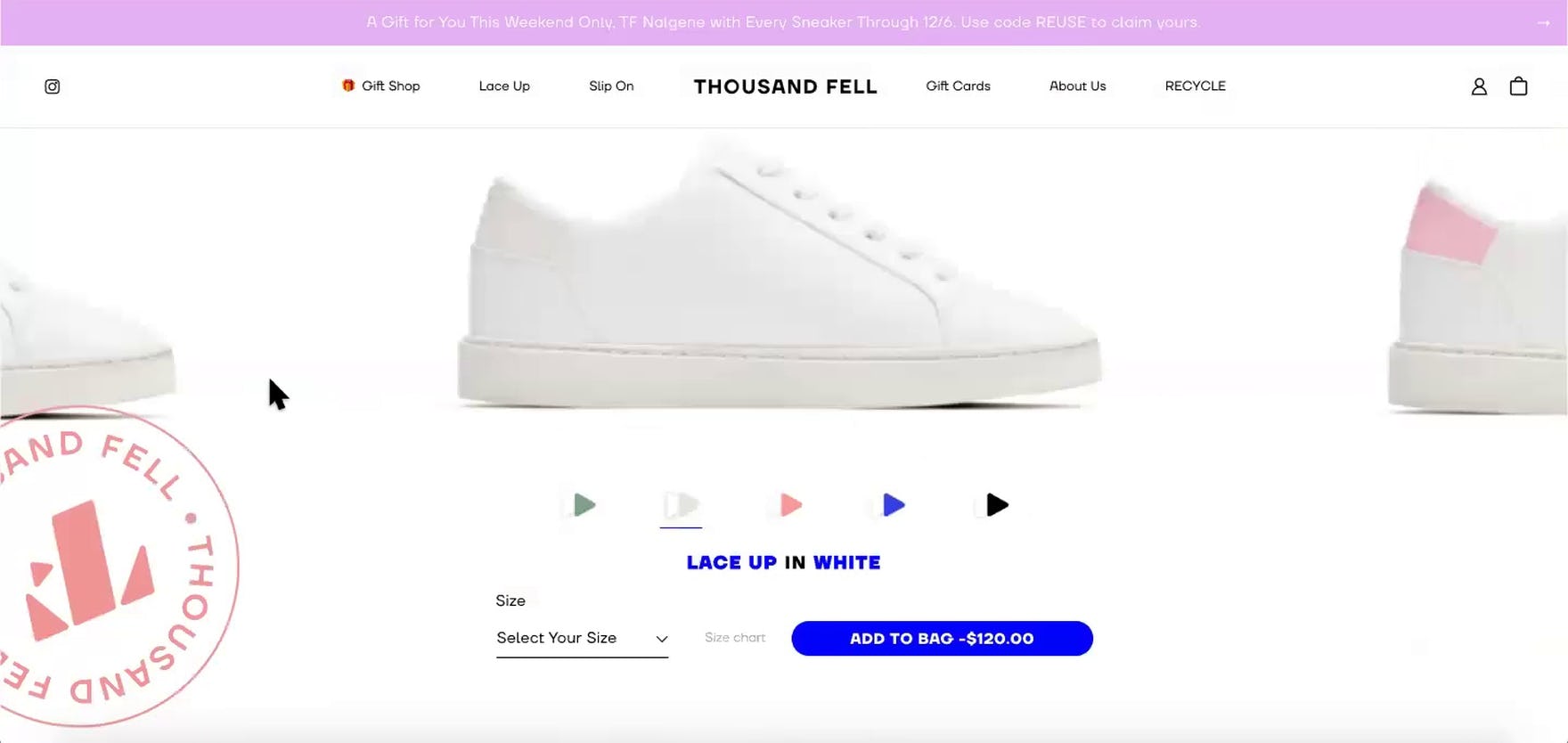
“I’m kind of unsure what’s so special about these sneakers. They’re just plain white…Do they have support?…Can I exercise in these, or are these just walking shoes?” Exploring the homepage of Thousand Fell, this user failed to be impressed, which was understandable given the lack of specific product information. This is despite the fact that the products themselves were heavily featured.
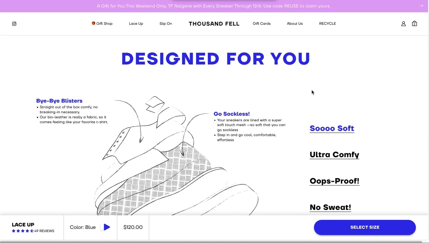
“Why do they not have this on the homepage? Why so hidden?…I think most people need to see this because…these are so much more interesting than white shoes.” Another user was impressed with the level of information on the product details page but wished the information had been provided earlier, saying she would have been “hooked” much sooner.
Generally speaking, a site’s homepage serves as an important introduction to a brand and its product offerings. This is especially true for first-time users, who may be unfamiliar with the brand’s unique products and overall value proposition.
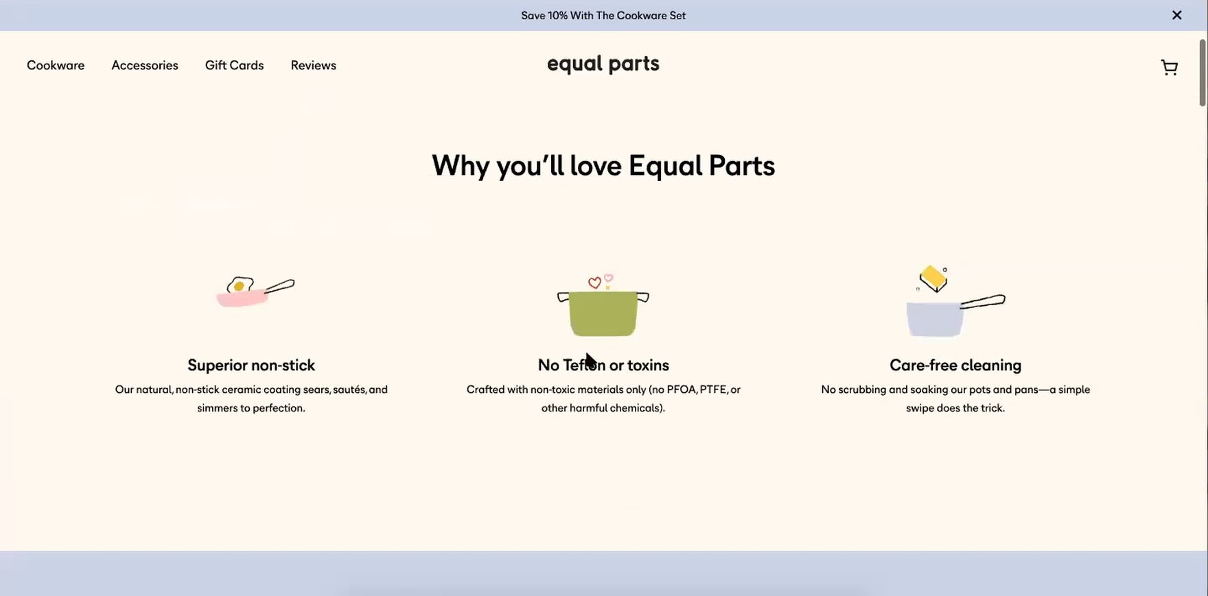
“I like ceramic coated non-stick things…and then the other thing I’m looking at here is this ‘Care-free cleaning’ because I also hate doing dishes…I think this is really good.” This user’s interest was piqued by the key product details highlighted on Equal Parts’s homepage.
During our testing of DTC sites, users were quick to assume the homepage would preview everything important about the brand and its products, highlighting not only featured products, but also unique brand and product attributes or important brand information.
In practice, users rely on this knowledge to decide whether or not the site has anything of value to offer and if it’s worth staying to explore further.
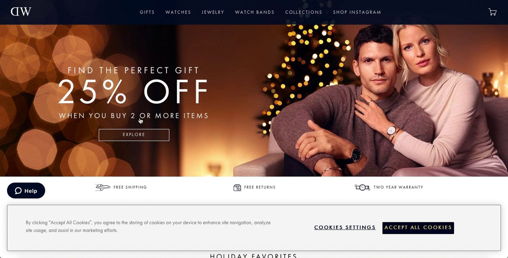
“I see there is 25% off when you buy two items, and free returns, two-year warranty, and free shipping. That’s important.” This user noticed not only the featured promotion, but also the highlighted shipping, returns, and warranty information. Top of mind for many users, such information can help build trust and entice users to explore the site further.
For many users, evaluating whether the site has anything of interest goes beyond what kinds of products that are offered, extending to nonproduct information, including the brand’s aesthetic and overall value proposition, availability of generous policies such as free shipping or a liberal return policy, and the perceived trustworthiness of the site.
During testing, when users felt the homepage lacked enough detail about key product or brand information — essentially, when the homepage failed to effectively highlight why the brand and its products were special — they quickly lost interest in the brand and were more likely to abandon the site.
In effect, the homepage needs to pique users’ interest in the products and brand, helping entice them to stay — but without overwhelming them with too much information all at once.
2) Favoring On-Site Product Reviews over Social Media and Other External Review Sources
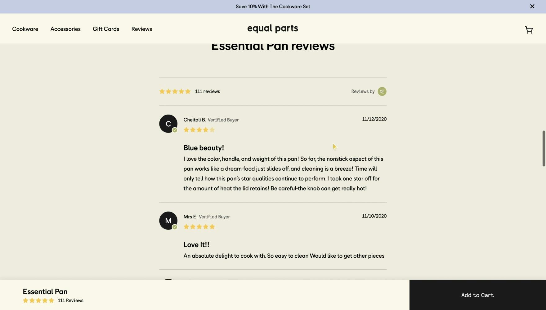
“I don’t usually take [reviews] very seriously on a manufacturer website because…they’re probably not, but they very easily could be altered or ordered in a certain way to make me think more favorably of the product…I very rarely spend any time on reviews on manufacturer sites usually, just because I know they usually pick the best ones.” This user on Equal Parts shared a sentiment that directly supported our observations from testing of DTC sites: users spend very little time engaging with site-provided reviews due to a lack of trust. (Also note the 5-star average rating: a not-surprising average that likely increases users’ suspicion of a site’s reviews.)
“I just saw that there’s also reviews…but I usually wouldn’t trust reviews on such a website because it can obviously be easily rigged, so they would probably not show any negative reviews. I would only trust reviews on Amazon.” Another user on Allbirds expressed her difference in trust between DTC/manufacturer sites and larger retailers (who are primarily resellers of other brands). In practice, users are more trusting of reviews on reseller sites versus the brand’s own.
In our testing of direct-to-consumer (DTC) sites, users were overwhelmingly skeptical about site-provided claims and reviews.
Far from being one of the most essential tools for learning about products, as observed in testing of large B2C sites, users testing DTC sites typically only glanced through site-provided reviews, relying far more heavily on other product page information and — importantly — off-site review content for making their purchase decision.
In fact, 62% of DTC users stated that they would engage in their own research and seek third-party or external reviews before being confident enough to purchase products from an unfamiliar brand, and 29% of users actually went off-site during the test session to find reviews or external information.
To supplement site-provided information and provide independent verification of reviews and overall sentiment, users repeatedly turned to external resources, such as general web searches and social media, reasoning that third-party sites would be less prone to bias and manipulation and therefore be more trustworthy.
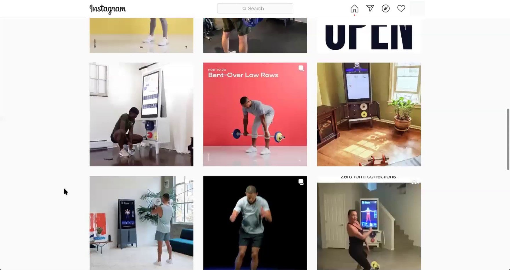
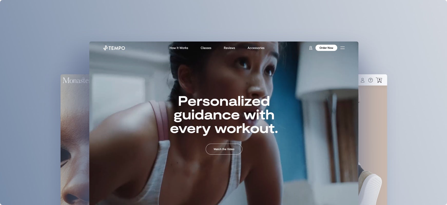
“I just want to see what they’re doing in terms of the community and see what they’re posting, seeing it set up in people’s houses. That’s really cool.” A user browsing Tempo navigated to the brand’s Instagram account hoping to see real-life examples of the product in use.
During testing, we observed several types of external resources users often turned to to learn more about brands and their products; in particular, general web searches, Instagram, Reddit, and YouTube. While these weren’t the only external resources mentioned or accessed, they do provide some insight into typical resources users may consult when pursuing information about an unknown brand.
What’s more, the third-party nature of social media posts also allows them to serve as a source of independent review content, being perceived as more authentic. As one user from testing observed, “[Instagram] is almost another way to look at reviews”.
Given the importance of these external resources, it makes sense for DTC brands to consider the off-site presentation and perception of the brand and what content users might uncover through general internet searches or social media.
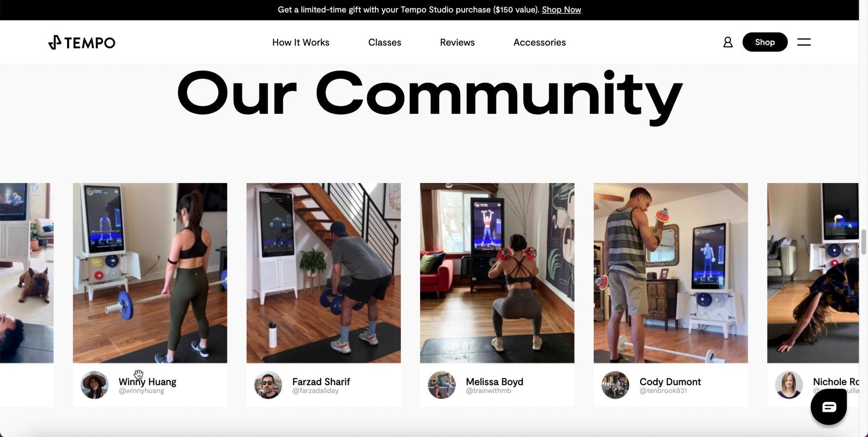
“Okay, so this is more reassuring.” This user, like many on Tempo, appreciated the featured images on the homepage derived from the brand’s Instagram account. Featuring social media content directly within the site provides a more seemingly authentic representation of the product in use.
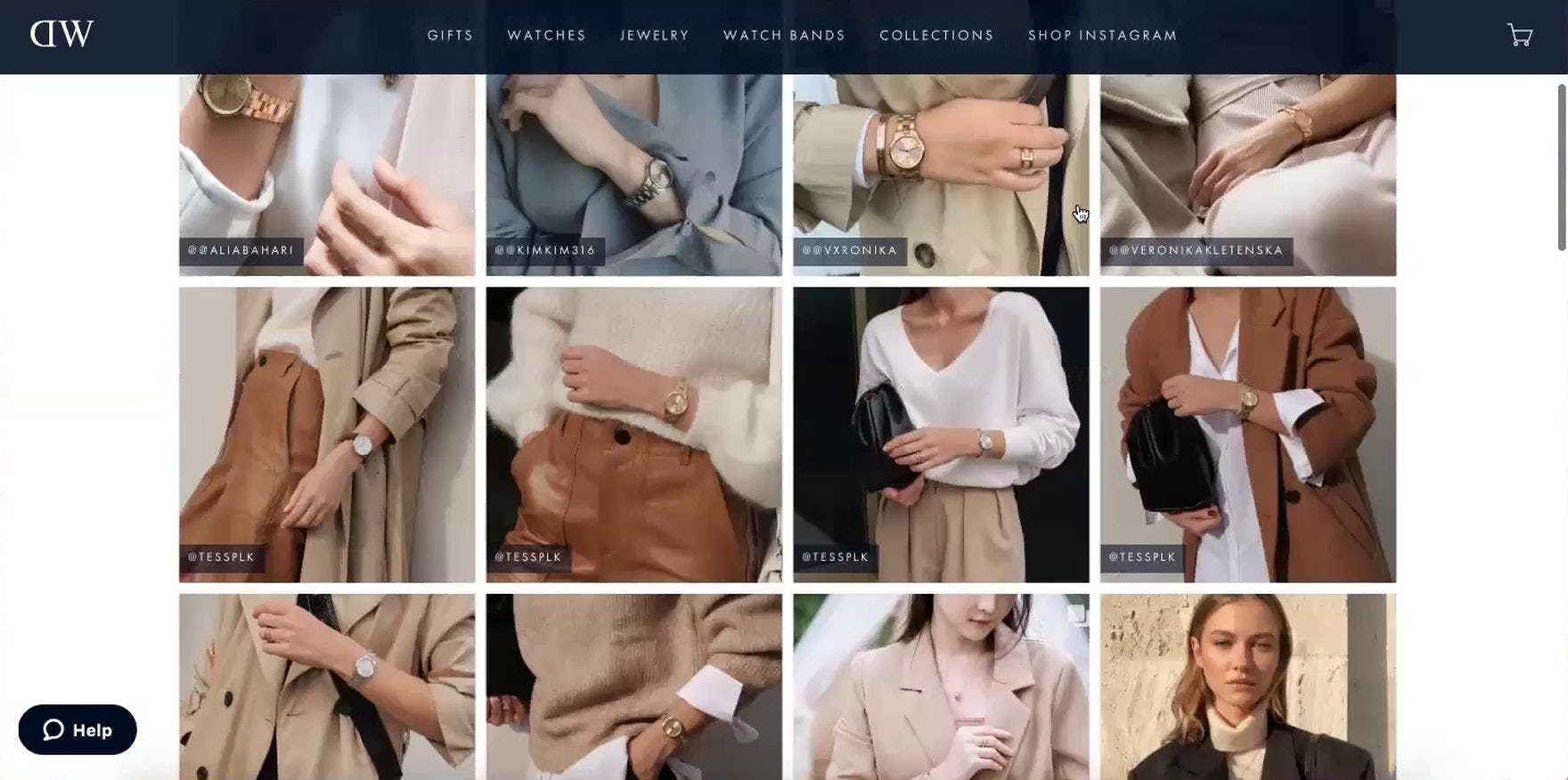
“Oh, let’s look at this — ‘Shop Instagram’. I like this section, actually. I like the aesthetic of it, and I like seeing how the watch is paired with other jewelry and outfits.” This user on Daniel Wellington spent time exploring the “Shop Instagram” page featured in the main navigation. Essentially displaying a shoppable replica of the brand’s Instagram feed, this level of integration can provide some of the benefits users seek from social media while keeping them on the site.
Taking social media investment one step further, brands should consider facilitating exploration of their social media messaging by integrating social media content such as Instagram posts into the site itself.
Serving in part as lifestyle or human model images, such integration can be a natural fit on the homepage, but also product details pages or as a separate dedicated page (e.g., “Shop Instagram”).
With only 3 in 10 DTC sites integrating social media into their homepage, this represents a significant opportunity to further leverage investment in social media channels while enhancing the value and perceived trustworthiness of site-provided content.
DTC Category & Navigation
“Category Taxonomy” ranks among the lowest scoring topics in the benchmark, with more than a quarter of benchmark sites presenting a “broken” experience.
In general, DTC users still need to “get to know” the brand and if it has anything of interest of offer — and be able to easily navigate without getting bogged down or distracted.
Considering the importance of “Category Taxonomy” and navigation — giving users a framework for understanding the site’s product offerings and providing the means to navigate towards products of interest — poor performance in this area is likely to have a major impact on users’ DTC site experience.
Yet due to having a tighter, narrower product catalog, niche DTC sites need to provide a lighter and more streamlined “Category Taxonomy” compared to large B2C retailers.
Just as noticeable as what DTC sites need to provide users, relative to general B2C sites, is what they don’t need to provide, especially when it comes to “Category Taxonomy”.
Here, we’ll highlight 2 issues DTC sites should focus on when considering navigation and “Category Taxonomy”.
3) Having Too-Many Navigation Layers (i.e., “Intermediary Category Pages”)
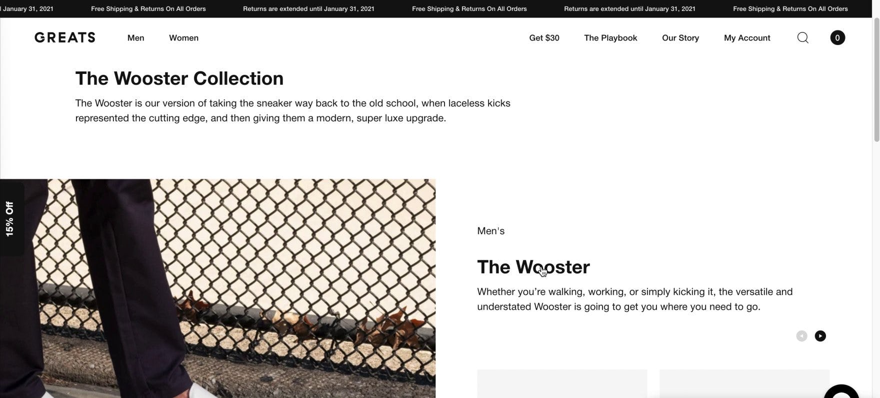
Selecting a subcategory from the main navigation menu, this user on Greats was initially disoriented by the lack of visible product listings — he had, in fact, arrived on an unexpected intermediary category page (first image). Attempting to locate the product list, he shared, “I’m going to click on ‘The Wooster’ here to see where this goes”, and arrived finally on the anticipated product list (second image). “So that was like an introduction page to that model?” he queried, still confused about this interstitial page. For users wishing to browse available products, intermediary category pages on small catalog sites increase the number of clicks — and amount of effort — required to reach product lists.
For traditional and mass-merchant retailers, intermediary category pages help users better understand the full range of options within a particular category and highlight navigational paths and related content.
However, with fewer and less-diverse products and a flattened category taxonomy, direct-to-consumer (DTC) and other small catalog sites simply have fewer potential navigational paths for users to decide among.
In fact, testing of DTC sites showed intermediary category pages to impede, rather than enhance, the experience of browsing products.
On DTC sites, intermediary category pages frustrate users and fatigue them before they even begin the process of making their product selection.
For example, one user from testing, having clicked no fewer than three times before arriving on the product list, stated, “I just need one product, click, and this page [the product list]. That’s all I need, just two clicks. They asked me to do five clicks to get to this product”.
In testing, 31% of users on one test site with intermediary category pages (Greats) struggled to reach the product list, with many initially misinterpreting the intermediary category page as the product list and missing out on functionality such as filters that they had not reached yet.
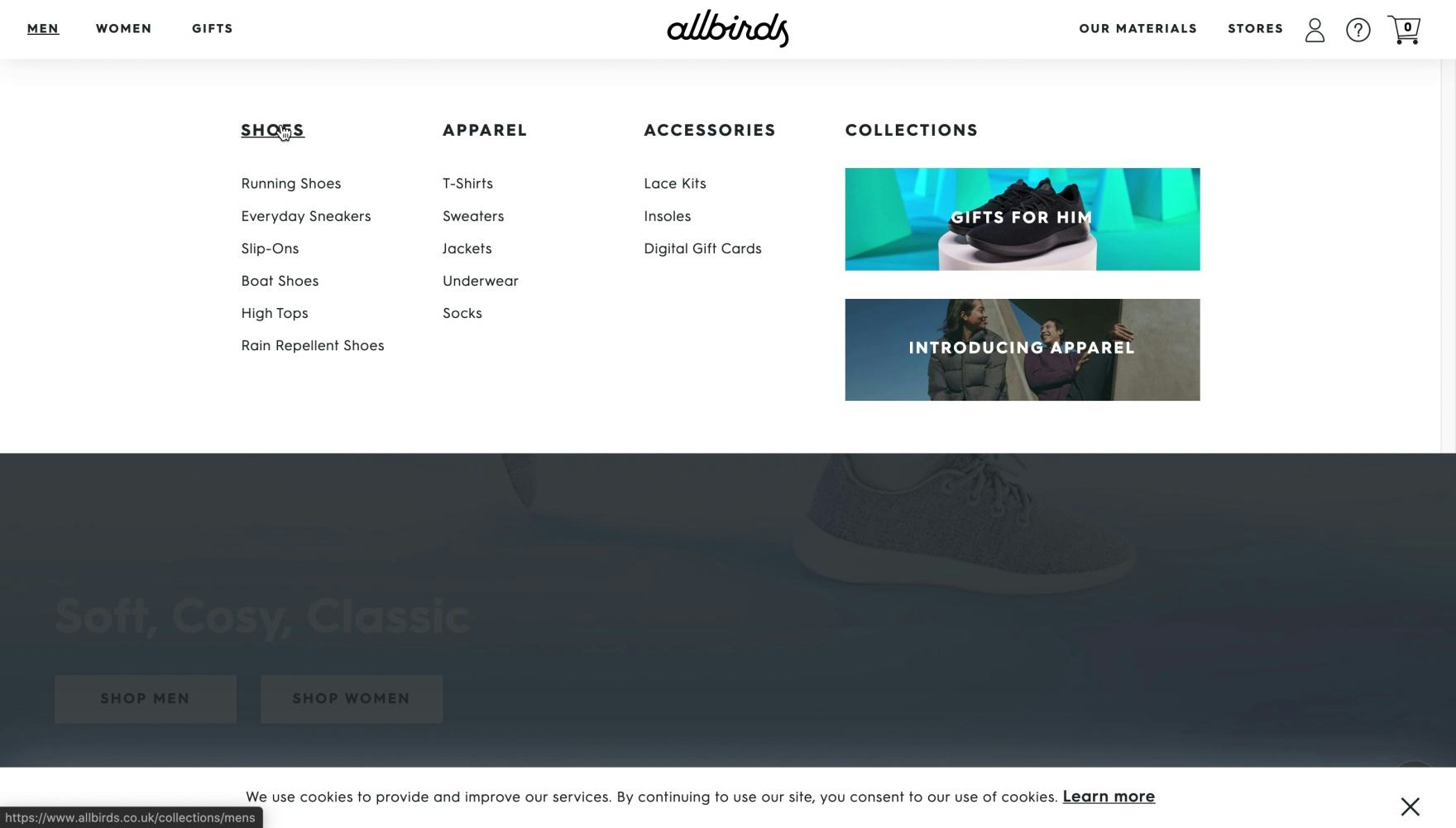
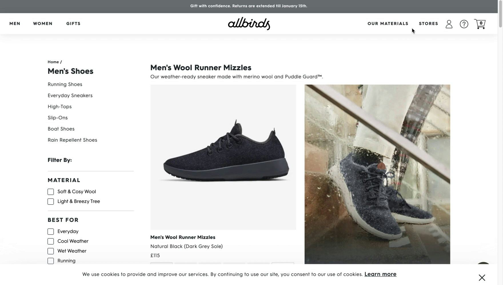
Another test site, Allbirds, could have implemented the “Men’s Shoes” top-level category as an intermediary category page (first image), requiring users to select a subcategory before reaching a product list. Instead, the browsing path is shortened, and the link opens a “View All” product list (second image). This implementation is effective because Allbirds only carries a dozen or so different men’s shoes, making it easier to scan a “View All” list than navigate through an additional layer of navigation.
In general, sites require a minimum number of products before the value of intermediary category pages outweighs the cost of the additional navigational clicks.
Indeed, even on mass-merchant sites our testing has shown that overcategorization can be an issue, which causes users to have trouble understanding the site hierarchy and leads to several “dead end” product categories with only a handful of products.
With a shallow and narrow product hierarchy, DTC and other small catalog sites lack the need to so finely segment users and direct them towards divergent paths, making intermediary category pages an unnecessary and burdensome step.
4) Not Providing a “Best Sellers” Category
When arriving on a new or unfamiliar e-commerce site, users can easily be overwhelmed with where to begin browsing products.
This is especially true for younger DTC brands that users are less likely to have heard much about or have previous experience with. On these sites, new users often need an overview of the available product range as well as additional guidance towards where to begin exploring and which products will be the most promising.
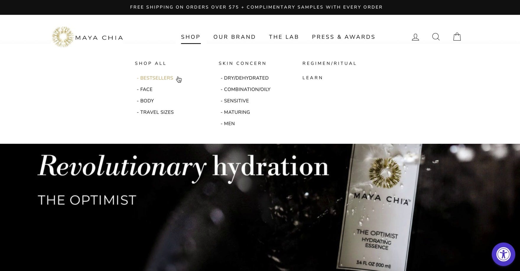
“So I always go to ‘Best Sellers’ as well, just because I’m curious to see what is the most popular thing on the website.” This user on Maya Chia navigated to “Bestsellers” as a way to learn about the brand’s most popular offerings. For users who are new to a site or brand, popular products serve as an introduction to the broader product catalog.
During testing, we observed that promoting a “Best Sellers” category provides an essential path to finding relevant products, serving as a popular entry point to begin exploring the site. In fact, 23% of users testing DTC sites that offered a “Best Sellers” category used it, often as their first navigational choice from the homepage.
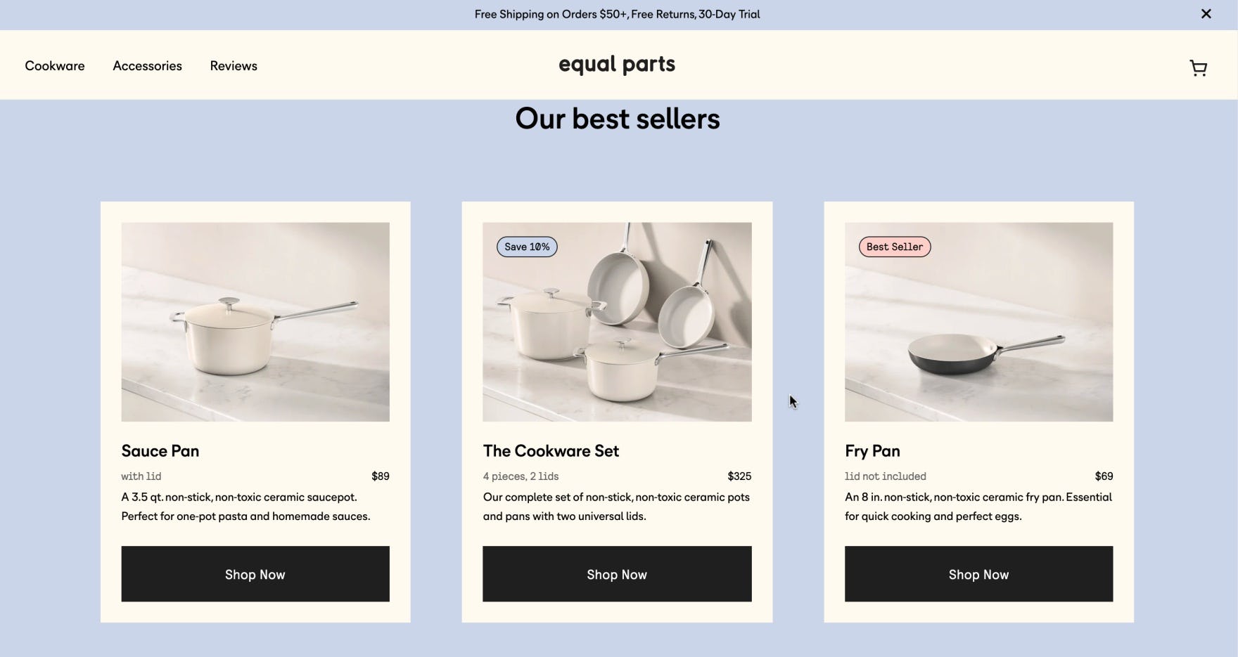
“I like that they highlight the ‘best sellers’. That gives me a sense of what they’re known for, what’s the most popular.” Featuring “Our best sellers” on the homepage or relevant category pages highlights products for users to begin browsing, helping introduce them to the site’s full catalog.
For example, one user, arriving on the homepage of a DTC watch site, shared, “Because I’m not that familiar with watches, I’m kind of looking for any recommendations or…anything to indicate what’s the best-seller. I’m looking for guidance”.
Only half of benchmark DTC sites provide a “best sellers” category, making this a missed opportunity to guide new users to products that are likely to be of interest.
DTC Product Lists
With far fewer products than larger traditional retailers, direct-to-consumer (DTC) sites are often able to have much more streamlined product lists — possibly even maintaining only a single list containing all of the brand’s products.
Yet despite this, the layout and presentation of the product list still has a major impact on users’ ability to easily see what products are available and decide which to explore further.
During testing of DTC sites, we observed certain product list implementations could be devastating, even when listing only a handful of products.
One of the most important issues for DTC product lists is presenting product variations.
5) Not Combining Product Variations
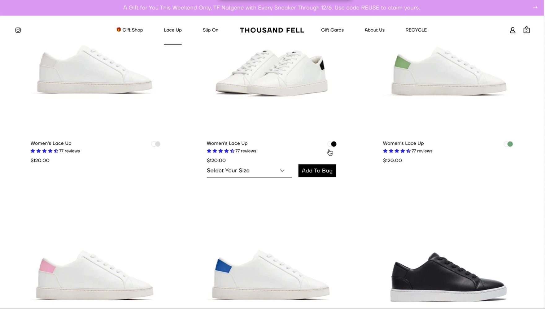
“It’s the same shoe in different colors? What?” This user on Thousand Fell was confused to see a single style of shoe listed multiple times with only small visual variations. Separating out visual variations into multiple listings can make the product list significantly more difficult to navigate and understand, even for small catalog sites.
Users are often interested in certain variations of a product, such as colors. However, we’ve observed repeatedly in testing that displaying product variations as separate list items results in distinct drawbacks.
DTC sites may be tempted to split out product variations in an attempt to make their product catalog look larger than it really is.
However, we observed the same behaviors during DTC testing, with users reacting negatively to “padded” DTC product lists that presented individual product variations as separate list items.
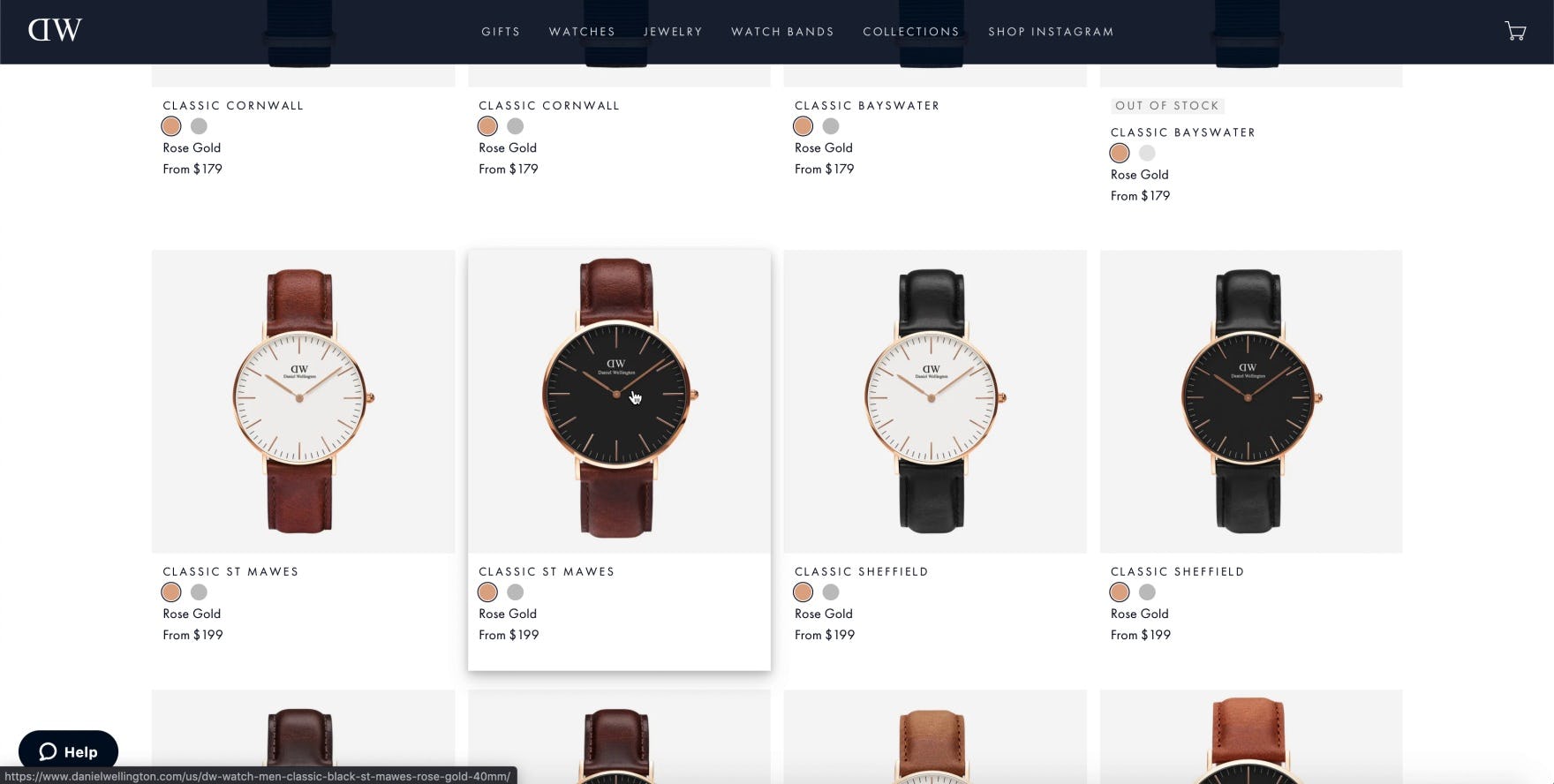
“There’s nothing different in these designs other than the strap.” On Daniel Wellington, this user found it difficult to determine key differences between watches besides the obvious color in strap. Another user shared, “This all, to me, looks like the same watch, and they could have just put it under one and had the color options [underneath]…it’s almost redundant”.
As on larger product lists, separating product variations obscures the true number of different products available and makes it harder for users to home in on products of interest.
When there are separate list items for each variation, the product list becomes cluttered, even with relatively few products — in effect, the ratio of unique products in the list drops.
As a result, users will need to spend more time scrolling through list items to find unique products than they would if variations were combined in one list item — and if the variations don’t appear one after the other, users would need to continuously work out as they scroll through the list which products are different to those viewed already.
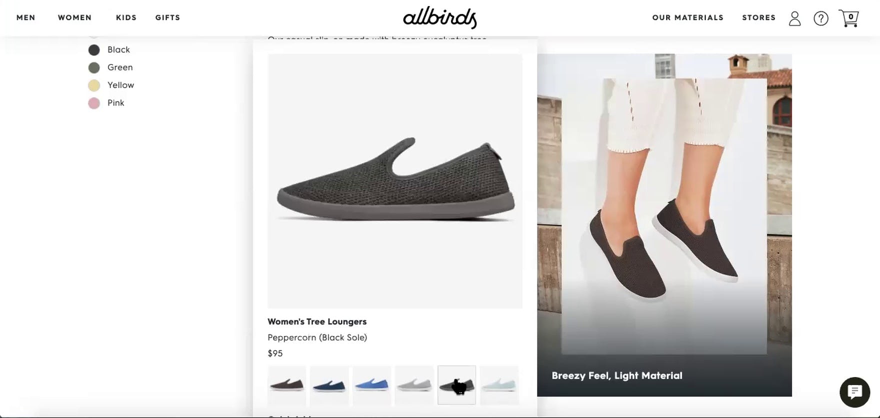
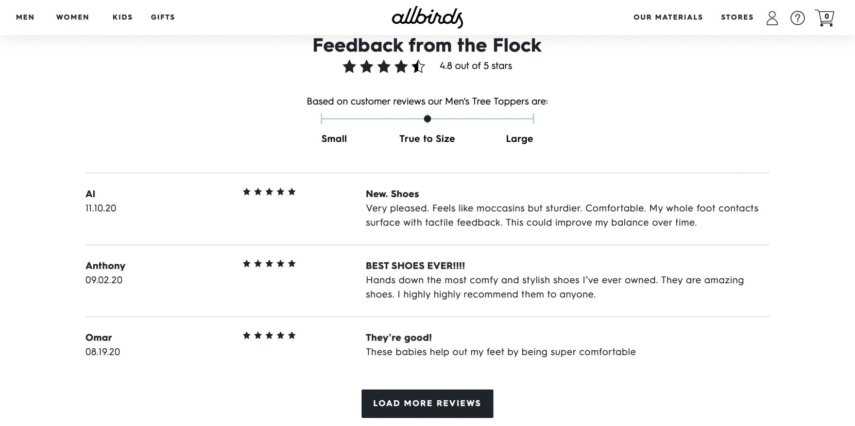
“I can just pick my color instead of seeing 10 of these and having to scroll down past 10 of the same thing.” This user on Allbirds appreciated the ease of navigating the product list, with variations condensed into a single listing.
Combining variations in product list items resolves the many issues users face with separate list items for variations.
When product variations are combined, product lists contain only unique products, which helps users get an overview of products more easily.
Almost 12% of DTC benchmark sites fail to combine product variations, giving users an inaccurate impression of the site’s product breadth.
Help Users Learn about Your DTC Brand
This high-level analysis of DTC UX focuses on only 3 of the 41 DTC subtopics included in our benchmark analysis. The 38 other subtopics should be reviewed as well to gain a comprehensive understanding of DTC UX, as well as to identify other site-specific issues not covered here.
Our DTC UX benchmark shows that the average DTC site has a “mediocre” or “decent” UX overall — making it clear that there’s still room for improvement.
Indeed, the performance of many sites is “poor” in at least one specific area.
Avoiding the 5 pitfalls discussed in the article should be among the first steps toward improving users’ DTC website experience:
- Not Highlighting Core Product and Brand Features
- Favoring On-Site Product Reviews over Social Media and Other External Review Sources
- Having Too-Many Navigation Layers (i.e., “Intermediary Category Pages”)
- Not Providing a “Best Sellers” Category
- Not Combining Product Variations
For inspiration on other sites’ implementations and to see how they perform UX-wise, head to the publicly available part of the DTC benchmark. Here you can browse the Direct-to-Consumer website implementations of all 36 benchmarked sites.
Getting access: all 400+ DTC UX guidelines are available today via Baymard Premium access. (If you already have an account open the DTC study.)