Key Takeaways
- Users shopping at online travel agency (OTA), large-brand hotel chain, and whole property rental sites need the ability to quickly determine the exact location of properties in their search results
- When the exact locations of the properties under consideration are not readily available, users can be severely hampered in identifying the most suitable hotel room or rental property to book
- Displaying search results using a “Split View” layout, with property listings and a map side by side, directly on the page, immediately satisfies users’ desire to understand the exact location of hotels or whole property rentals within the area they’ve queried
“I like to look at where hotels are — to me, location is the most important thing when I’m looking at hotels — no matter where I’m going.”
Baymard’s large-scale UX testing of online travel agency (OTA), large-brand hotel, and whole property rental sites reveal the property search results are a key decision point for users looking to book accommodations.
In particular, our Hotel & Property Rental Website UX Research confirms the exact property location is a key factor for users in determining the relevance of properties in the search results.
After all, users need to know where a hotel or whole property rental is located in context to the attractions they plan to visit and the activities they plan to participate in before deciding on booking it.
However, when the exact locations of the properties under consideration are not readily available, identifying the most suitable properties is needlessly difficult.
In this article we’ll discuss the test findings from our Hotel & Property Rental Website UX research study, including:
- 3 issues caused by showing properties in a “List View” by default
- Why a “Split View” is the optimal layout for presenting hotel and rental property search results
- 3 “Split View” implementation pitfalls to avoid
3 Issues Caused by Showing Properties in a “List View” by Default
Despite how vital the exact location is for users to evaluate and compare hotel properties in their search results effectively, 70% of online travel agency (OTA) and large-brand hotel sites in our large-scale Hotel & Property Rental Website UX research study displayed the search results in a “List View” layout — without a map — by default.
In particular, testing revealed 3 issues caused by showing properties in a “List View” by default:
- Users never find the link to the “Map View”
- Users have difficulty finding the “Map View” link
- Users have trouble navigating between the “Map View” and the “List View”
1) Users Never Find the Link to the “Map View”
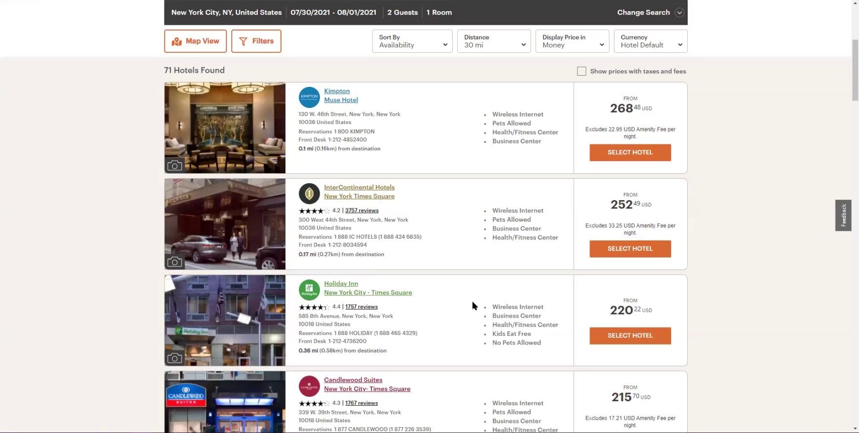
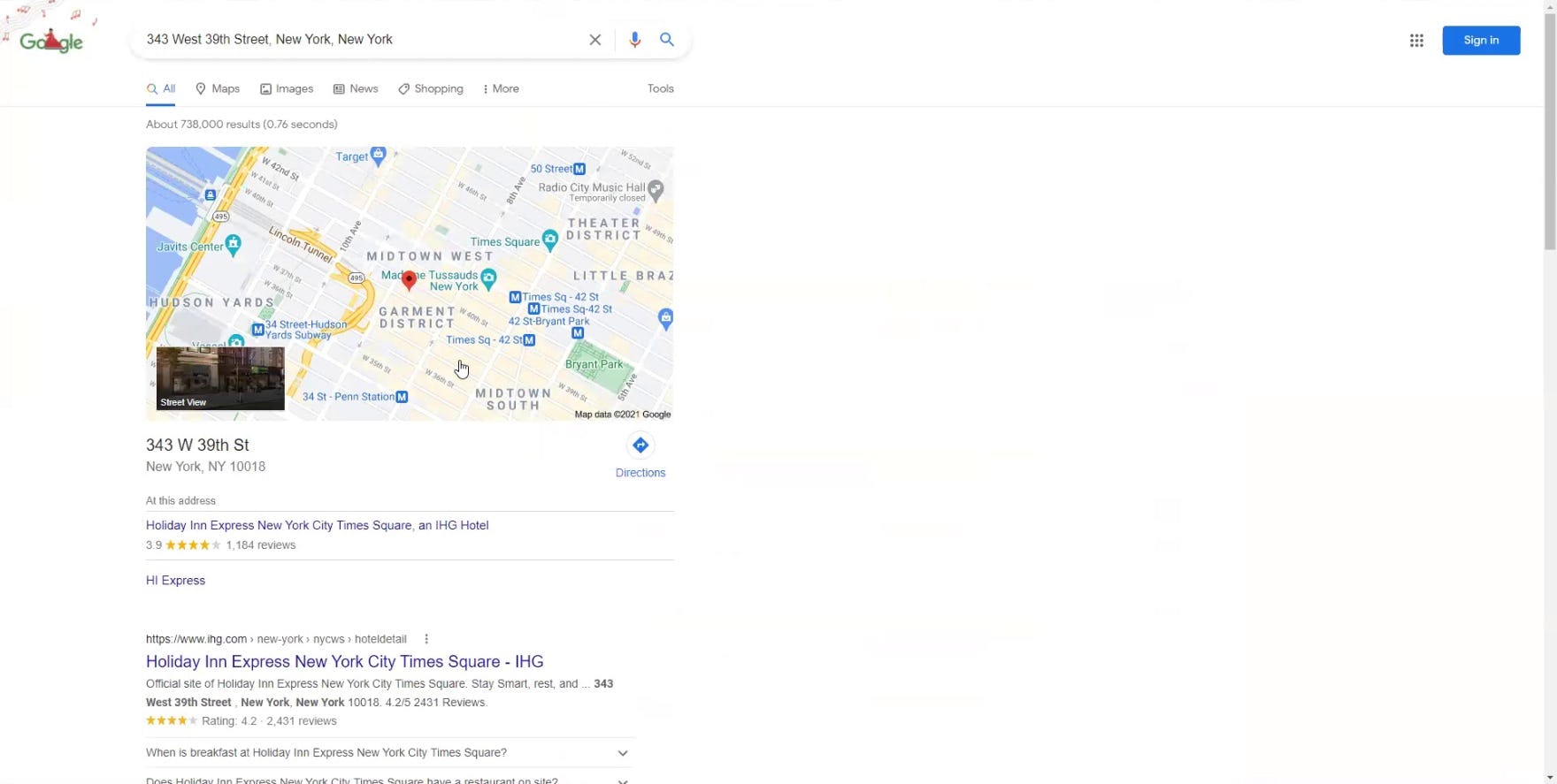
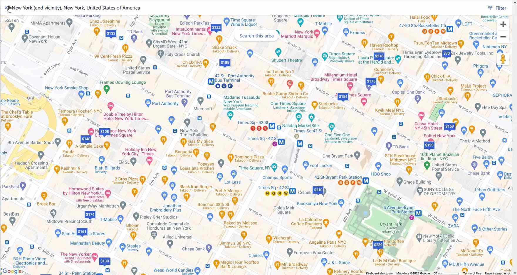
“So I would be wanting to stay in Times Square, but I’m curious where this is. I really wish they had a little map [to] give me a better idea of where that is”, complained a user at IHG. He’d scrolled past the “Map View” button at the top of the search results (first image). “I would do this. I would search for it”, he explained as he copied the address of the hotel he was considering into a new browser tab to view its exact location on a map (second image).
All online travel agency (OTA), large-brand hotel, and whole property rental sites in our large-scale Hotel & Property Rental Website UX research study provided a map on which to view the search results, indicating they are a “web convention” for the travel accommodations industry.
However, when property listings are not immediately visible on a map, users are at risk of overlooking the availability of a map entirely.
Indeed, during testing a few users never found the “Map View” link or button, which often failed to stand out visually from other elements like the filtering and sorting options at the top of the search results page.
Not only does the perceived absence of a “Map View” significantly hinder users in evaluating their search results, it can damage a user’s overall perception of the site, leading to site abandonment.
During testing, 65% of users shopping for hotel accommodations on sites that presented the search results in a “List View” by default didn’t leverage a map when evaluating and comparing hotel properties — either because they couldn’t find the map or simply overlooked its availability.
2) Users Have Difficulty Finding the “Map View” Link
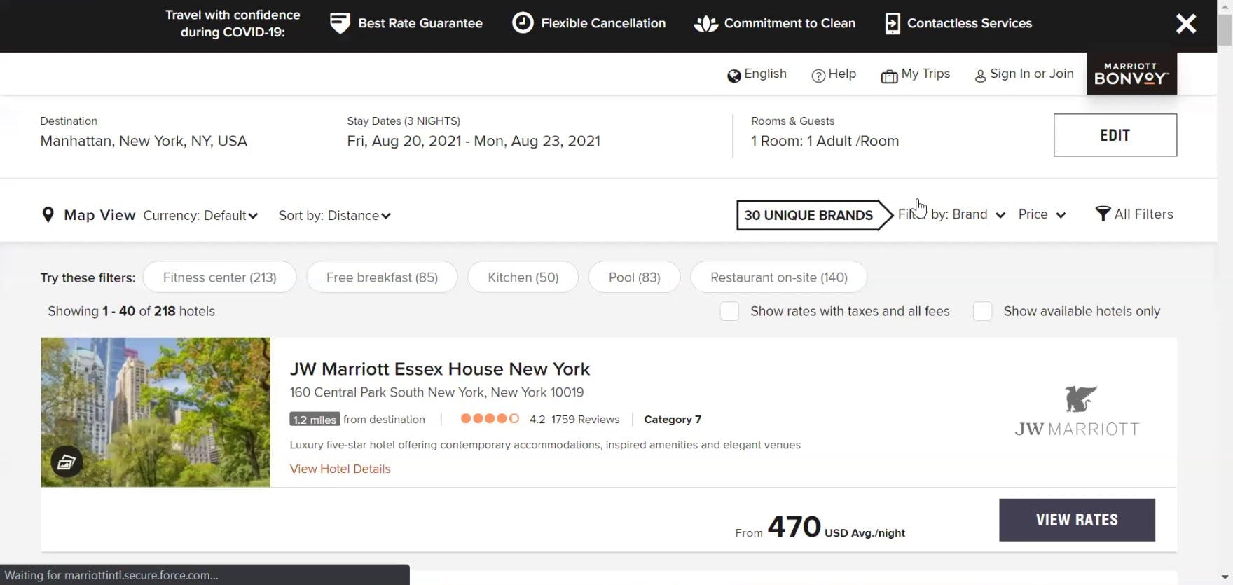
“All right, so the first thing I’ve been looking for once I come into the options is the map because I know the neighborhood I wanna stay in”, explained a user at Marriott. She scanned the page for about 20 seconds before locating the link, “Here it is, ‘Map View’”.
While some users never find the “Map View”, others do eventually find it — but only after wasting time searching for it.
During testing, several users presented with search results in a “List View” by default immediately redirected their attention to looking for a “Map View”.
However, a few had difficulty locating the “Map View” link or button at the top of the search results page — needlessly increasing the time and effort required to determine the exact location of properties in their search results.
3) Users Have Trouble Navigating Between the “Map View” and the “List View”
Moreover, even if users find the “Map View”, some will have an issue navigating back to the “List View” once they’ve confirmed the exact location of properties they’re considering.
For example, during testing, a few users missed the “List View” button on the “Map View” at IHG and attempted to navigate back to the “List View” via the browser “Back” button instead. However, when users clicked the browser “Back” button on IHG’s “Map View”, they wound up going all the way back to the beginning of their property search, and they thus had to reenter all of their search criteria over again.
In other words, separate “List” and “Map” views introduce further complexity to the process of evaluating properties — not to mention challenge how users expect the browser “Back” button to behave.

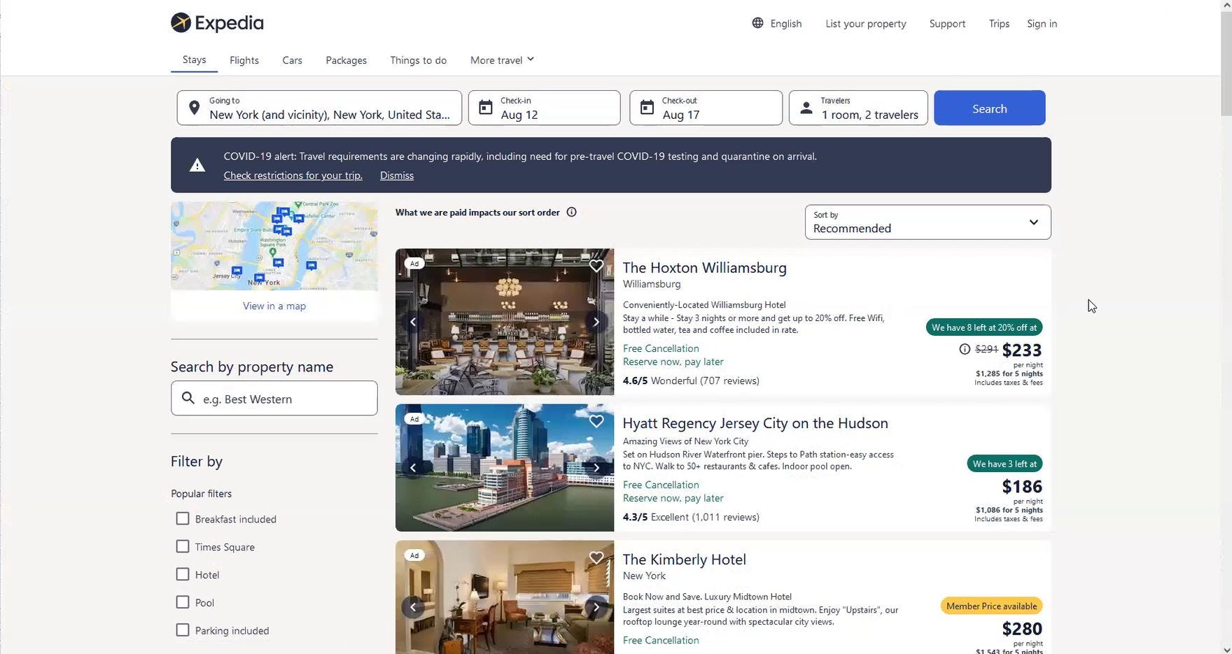
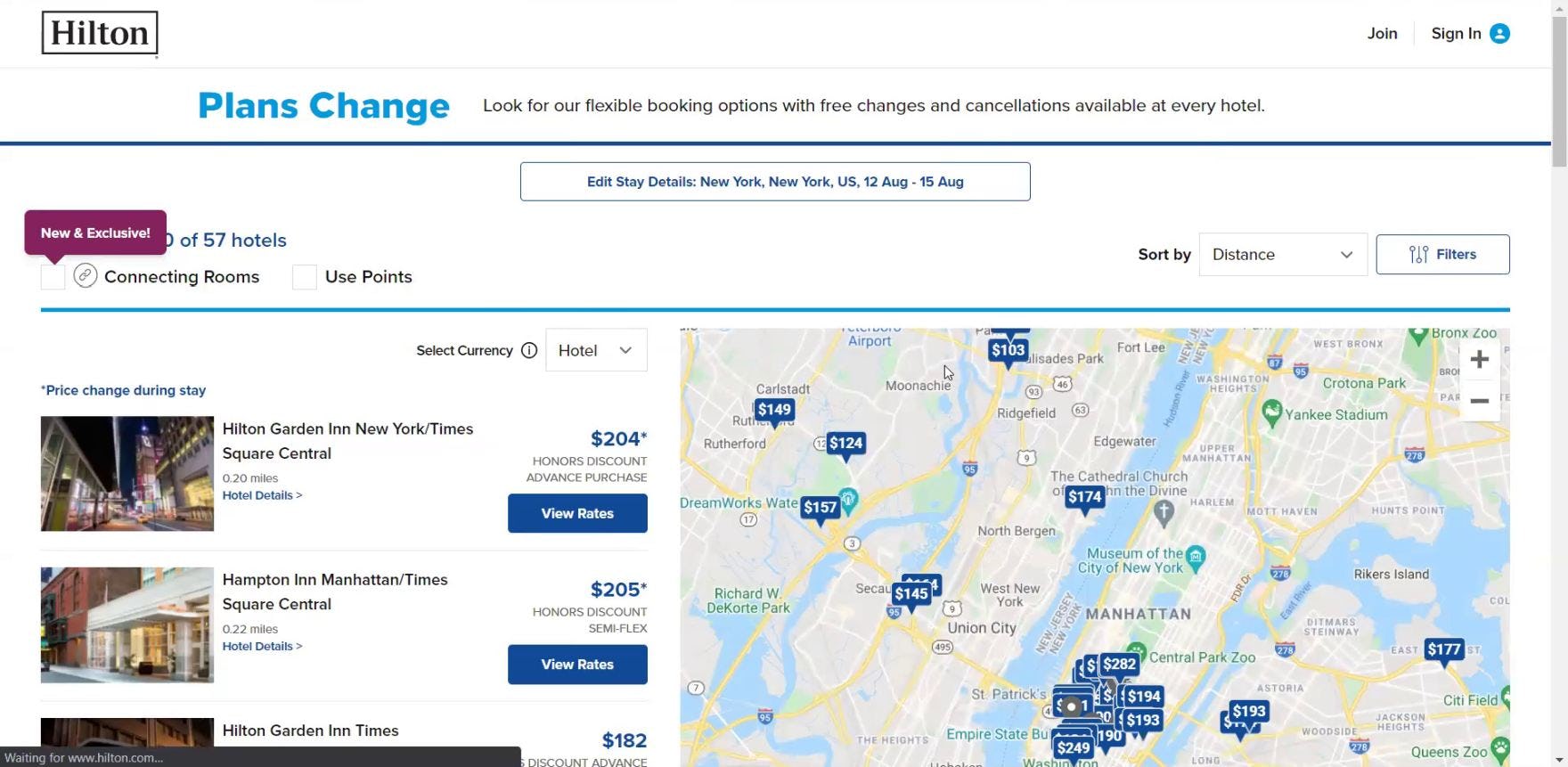
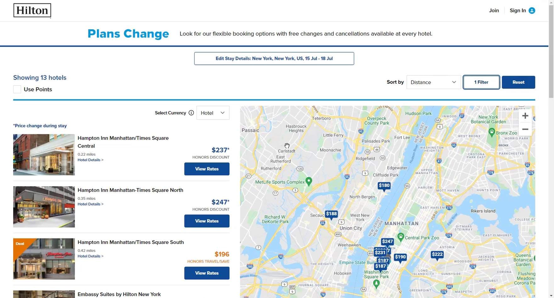
“I guess I wasn’t very specific — New York is a very, very large place. So we are going to ‘View in Map’ and narrow that down considerably”, remarked a user viewing his search results at Expedia (first image). He zoomed in on a specific area in the map, then exited the map: “I’m going to hit this ‘X’ here and hopefully get to the list of what’s there” (second image). “Oh great, it did not!” he remarked, irritated to discover the “List View” didn’t reflect the narrowed focus he had applied in the “Map View” (third image).
Additionally, not only do users have difficulty navigating between the “Map View” and the “List View”, but having the “Map View” as a separate interface introduces the potential that changes users make in the “Map View” won’t persist when they navigate back to the “List View”.
During testing, the most common issue was a “Map View” that had been zoomed by the user (thus reducing the number of properties under consideration), but when the user returned to the “List View” the original list of properties was shown — that is, properties that had been eliminated by the user during their interaction with the map reappeared in the “List View”.
Indeed, 75% of users at Expedia who zoomed in on the “Map View”, then returned to the “List View”, were provided with a list that didn’t reflect the narrowing of geographical focus they had completed while on the “Map View” page.
When a separate “Map View” fails to persist the narrowed search results on the “List View”, it defies users’ expectations, and undermines its primary purpose to allow users to zoom to filter.
Always Present Hotel & Property Rental Search Results In a “Split View” Layout
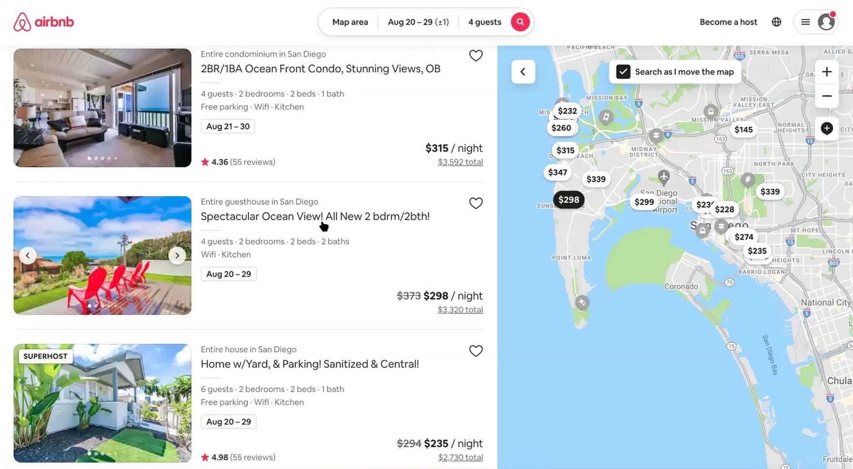
“Given I’m less familiar with Hilton properties, I’m sort of focusing my search on this area here, and this [map] makes it easy to do that”, explained a user at Hilton as he reviewed his search results. During testing of travel accommodations sites, 95% of users engaged the map provided in Hilton’s “Split View” layout to quickly zero in on an exact location to focus their search.
“So ‘Manhattan Times Square’. Oh, okay, this [map] makes it a little bit easier because I don’t know much about New York”, remarked another user at Hilton. Understanding the exact location of properties presented in the search results is key to choosing the most suitable hotel, particularly for users who are unfamiliar with their destination.
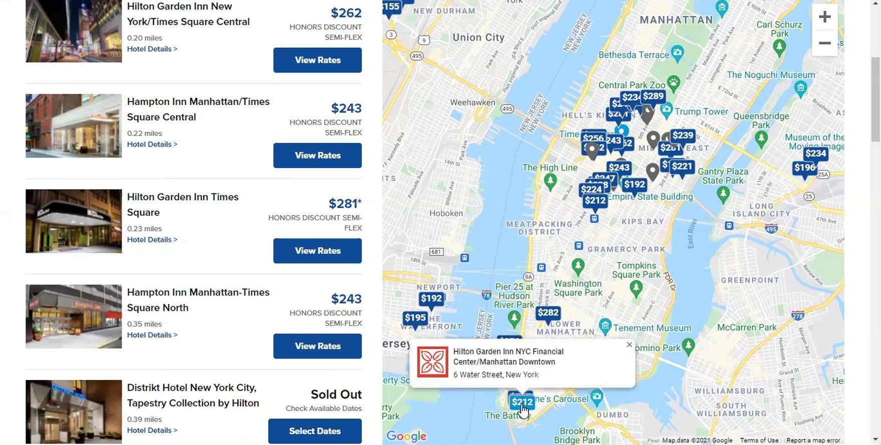
“Oh, so Hilton, when I searched, they gave me the list of hotels and the map, right off the bat. I like that because, clearly, I like to look at the map when I’m booking hotels in a big city.” Another user appreciated that Hilton’s search results for hotels in New York City were displayed in a “Split View” by default.
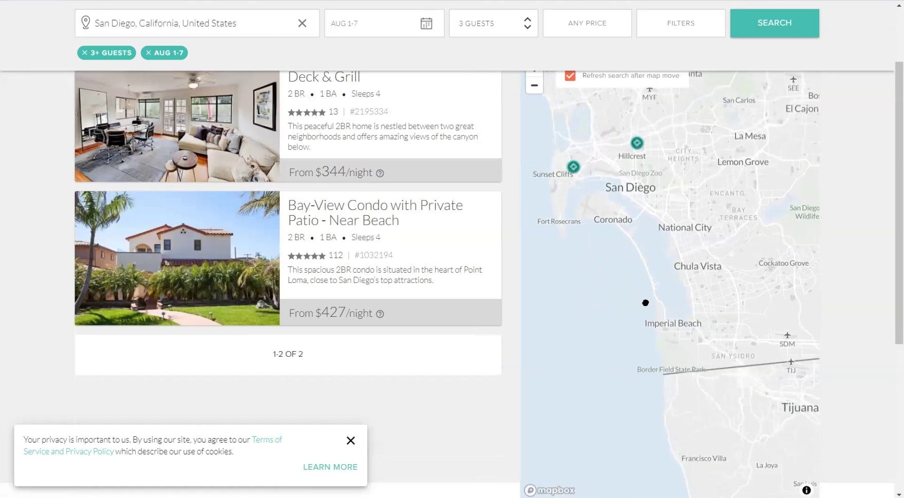
“I like that there’s this map over here — that’s very, very helpful. Even though I know the area, it’s still very helpful to kinda just see how far away from the border [Coronado] is”, explained a user viewing his search results at TurnKey. He lived in California yet still appreciated the map provided in the “Split View” layout while shopping for whole property rentals near San Diego.
To avoid the 3 issues described above, it’s essential to present property search results in a “Split View” layout containing the property listings side by side with an interactive map showing their exact location.
As one user stated, “I like the ‘Split View’ because it’s nice to know what you’re looking at and where it is.”
Indeed, using a “Split View” layout for property search results immediately satisfies users’ desire to understand the exact location of hotels or whole property rentals within the area they’ve queried.
Furthermore, when property listings are displayed side by side with an interactive map, it provides users a simple method of filtering their search results to only hotels or whole property rentals in the exact location where they want to stay — zooming in on the map was observed to be highly effective for narrowing the search results to a more precise location.
As a user at Airbnb remarked, “I am using the scroll on the mouse, and it’s narrowing it down. I do like that — that’s good functionality. So if I’m going to San Diego and I’m going on a beach trip, I want to be on the beach. So I like that I can narrow it down — that’s particularly useful with this ‘Map View’. I can kind of keep going down and see what’s right on the beach.”
Finally, displaying the property listings and map together in a single “Split View” layout simplifies the overall process of evaluating search results and choosing which hotels or whole property rentals to explore further by eliminating the need for multiple views that users must toggle between.
3 “Split View” Implementation Pitfalls to Avoid
Displaying search results in a “Split View” layout (i.e., property listings side by side with a map) is key to ensuring users can quickly determine the exact location of relevant properties when evaluating those they are considering to book.
However, there are 3 pitfalls to be wary of that, during testing, caused users some issues:
- Presenting the “Split View” layout in an overlay
- Displaying filters in a vertical sidebar
- Including vertical ads on the search results page
1) Presenting the “Split View” Layout in an Overlay
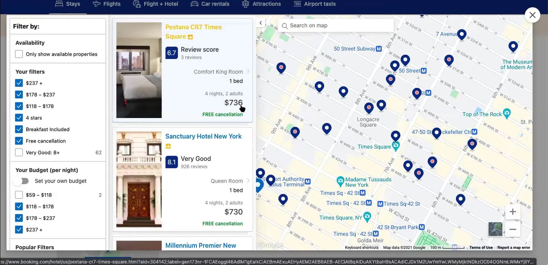
“I’d want to then [sort] it from lowest to highest. And I don’t really see how to do that. I would expect it to be like somewhere here, I guess here [applies 3 price filters]. Yeah, why is the most expensive up there? And I have no idea how to change it. So this is definitely my least favorite. Yeah, I would move on from this site. I wouldn’t want to deal with this.” This user abandoned Booking.com because she could not sort the search results presented in a “Split View” overlay. She, like many users, overlooked that she was viewing an overlay, and sorting was only provided in the “List View” beneath the overlay.
During testing, several users mistook the “Split View” overlay at Booking.com — the default display 50% of the time — for the search results page.
In practice, this misinterpretation can lead some users to overlook that the “Split View” overlay doesn’t provide all of the features afforded on the “List View” beneath it.
For example, if sorting the search results is not available in the “Split View” overlay, users will be unable to order the results in a way that is most useful to them for evaluating properties.
Indeed, during testing 1 user was so frustrated by her inability to sort the search results by price that she abandoned the site.
Overlays can also cause issues when using the “Back” button, or when simply trying to close the overlay, depending on the implementation of the “X” to close it.
Therefore, for general ease of use “Split Views” shouldn’t be provided in overlays.
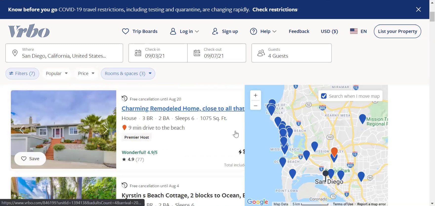
2) Displaying Filters in a Vertical Sidebar
“Whoa! Okay. So my first…hmm. I know that I said I liked the list and the map, but this is a little busy for me. I see that you can be very specific in the [filter] selections you make. I think I’d probably prefer, though, like this filter to be a button somewhere so that I can say what I want to filter and then close it out — having it here just makes the page smaller, and it looks really, really busy to me. So I’m not really getting a good photo of the room, and I don’t see how to close [the filters]”, complained a user viewing her property search results in the default “Split View” overlay at Booking.com. If the “Split View” layout is visually crowded, users will feel overwhelmed and struggle to identify relevant properties.
When filters are displayed in a vertical sidebar alongside the property listings and the map in a “Split View” layout, it was observed during testing to create a very crowded presentation, thus making it difficult for users to narrow the results and evaluate properties effectively.
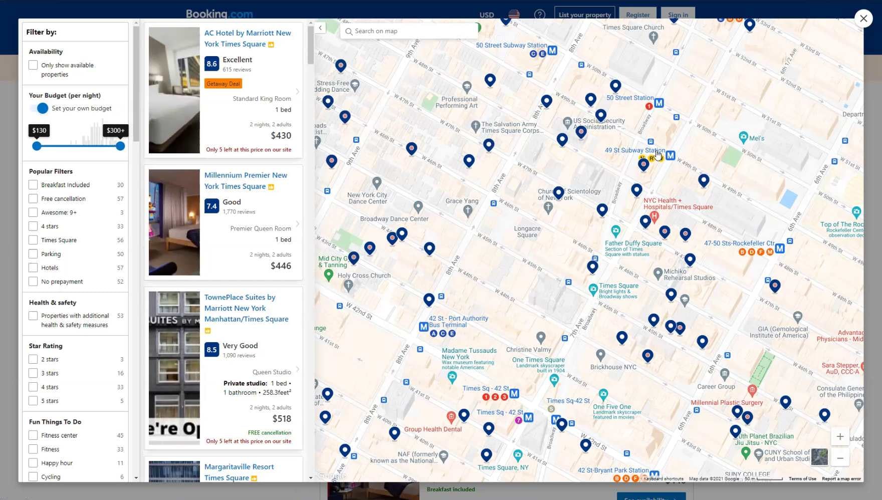
For example, the “Split View” layout used for search results at Booking.com displayed filters and property listings in 2 narrow columns alongside the map.
However, this approach was observed to be problematic because it provided insufficient space for the property listing details.
Consequently, users will need to exert more effort to identify potentially suitable properties to explore further.
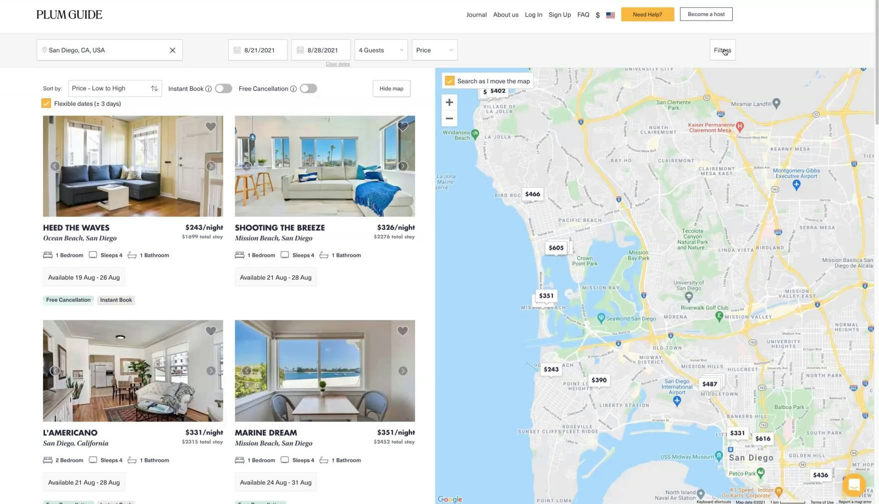
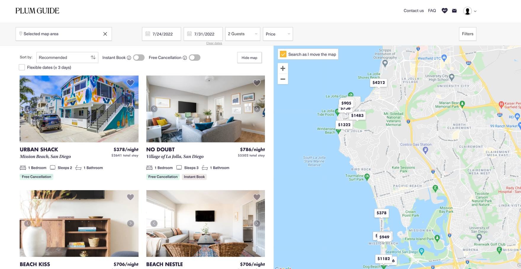
At Plum Guide, the use of horizontal filtering and sorting bars on the search results page ensures valuable screen real estate is devoted to the property listings and the map. During testing, users preferred the simplicity of this layout over the use of a vertical sidebar for filters.
On the other hand, test sites that used a horizontal filtering and sorting bar in conjunction with presenting search results in a “Split View” layout were observed to perform very well.
The horizontal filtering and sorting bar avoids taking up screen real estate that can be left for the map and list instead, thus providing users with more of the information they’re most interested in (i.e., the list of properties and their geographic location).
Additionally, note that truncating property search results filters (as with truncating sidebar filters) requires that sites take care to display the most popular and relevant filters by default, as well as clearly visually indicate the means to expand and reclose the additional filters.
3) Including Vertical Ads on the Search Results Page
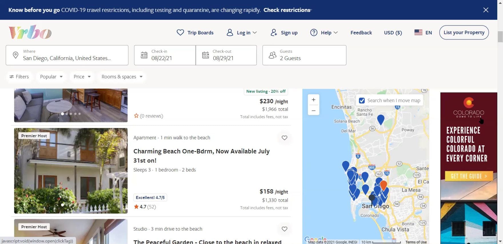
“I find that the real estate with the irrelevant advertising to the side for Colorado and I’m looking at San Diego is just a little bit irritating”, remarked a user viewing his search results for whole property rentals in San Diego, California at Vrbo. During testing, ads for other destinations were generally seen as an annoyance or ignored.
Meanwhile, for some users, these ads caused severe display issues. As another user viewing his search results complained, “I can’t actually see the price or anything else here, which is really strange…Obviously, something on the web page isn’t quite jiving…that would frustrate me if I couldn’t see the price, and I had to click into each one of these to see it. So that’s annoying”.
During testing, vertical ads on the search results page at one of the test sites were met with negative reactions because they were deemed irrelevant by users (a common finding across our research).
In practice, irrelevant ads on the search results page can set a very negative tone for the entire booking experience.
Moreover, the vertical ads take up precious screen real estate that could otherwise be devoted to the map and list of properties.
Finally, during testing ads failed to display correctly for 22% of users. Such UI bugs not only make the site seem less stable to users but also during testing resulted in the map covering critical property details, including price.
Given how precious search results page real estate is for providing detailed property listings side by side with an interactive map, including vertical ad content can cause unnecessary annoyance and distract users from their primary goal of identifying a property to book in the current location.
A “Split View” Containing Property Listings and a Map Is the Optimal Layout for Search Results
Plum Guide displays search results using a “Split View” layout, with property listings and a map side by side, directly on the page. This layout simplifies the process of evaluating search results by ensuring users can quickly understand the exact location of properties and narrow the results further by zooming in on the map.
Our Hotel & Property Rental Website UX research study confirms exact location of properties in the search results is essential to users shopping at online travel agency (OTA), large-brand hotel chain, and whole property rental sites.
However, when property listings are not immediately visible on a map, it places an undue burden on users and increases the risk that a subgroup of users will fail to find a property to book.
Considering that the same hotel room or rental property is often available to book through several different travel accommodation sites, the risk that users can easily abandon a site for a competitor shouldn’t be underestimated.
In particular, testing revealed 3 issues caused by presenting search results in a “List View” by default:
- Users never find the link to the “Map View”
- Users have difficulty finding the “Map View” link
- Users have trouble navigating between the “Map View” and the “List View”
On the other hand, when users can quickly determine the exact location of properties within the area they’ve queried, they can identify the most suitable hotel room or rental property to book effectively.
As a user shopping for hotel rooms in New York City remarked during testing, “This [map] makes it easier because I don’t know much about New York.”
Therefore it’s crucial to display search results using a “Split View” layout, with property listings and a map side by side, directly on the page.
However, be mindful to avoid these 3 “Split View” implementation pitfalls:
- Using overlays for the “Split View”
- Displaying filters in a vertical sidebar
- Including vertical ads on the search results page
Having the property listings and a map side by side allows users to focus on what’s most important — evaluating search results and choosing which hotels or whole property rentals to explore further — instead of wasting time searching for and toggling between multiple views.
Getting access: all 368 travel accommodations UX guidelines are available today via Baymard Premium access. (If you already have an account open the Travel Accommodations Study).