Key Takeaways
- Our new research has uncovered 700+ usability issues specific to grocery sites
- The research has resulted in 427 guidelines that describe the issues, as well as design patterns verified to perform well for users
- In particular, the research provides insights on the content and features grocery sites need to provide users to ensure they’re able to make a purchase decision — and the content and features they don’t
At Baymard our research team has just spent 1,168 hours usability testing and researching grocery mobile website and app features, layouts, content, and designs — leading to our new UX research study on Online Grocery UX.
The Grocery UX research is based on more than 70 qualitative user/site usability test sessions following the “Think Aloud” protocol (1:1 remote moderated testing) of grocery sites.
The test sites spanned both individual grocery store sites and apps (Amazon Whole Foods, Walmart, Target, and Aldi) and aggregate third-party grocery delivery sites and apps (Instacart and Shipt).
Yet despite testing some of the largest grocery sites, users frequently ran into issues that severely disrupted their ability to place their grocery order — issues that are likely to increase many grocery sites cart abandonment rate.
Indeed, during testing the users encountered 700+ medium-to-severe usability issues. These issues have subsequently been analyzed and distilled into the 427 UX guidelines found within our grocery UX research study.
The 427 guidelines cover most aspects of the grocery experience, at both a high level of general user behavior as well as at a more granular level of specific issues users are likely to encounter.
In this article we’ll introduce 5 of our high-level UX findings for grocery e-commerce sites:
- For grocery UX, convenience is king
- New grocery site users require a near-seamless UX
- The importance of some site areas and features is greatly diminished for grocery users
- Cart & Checkout present unique challenges
- The mobile grocery experience can be especially challenging
How the Online Grocery Site UX Differs from the General B2C Site UX
Shopping online for groceries has over just a few years quickly grown from a niche curiosity to a regular habit for many users — accelerated for many by the COVID-19 pandemic.
With that, online grocery sites have had to design experiences that meet the needs of many new and emerging users — without alienating existing users.
While online grocery sites may at first glance appear similar to traditional e-commerce sites, there are unique differences that distinguish them.
Indeed, while grocery sites share many similar e-commerce site elements with more general retailers — for example, search tools, product lists, and product pages — the grocery experience for users differs in some unique ways, starting with how easy or difficult it is to quickly add products to the cart.
1) For Grocery UX, Convenience Is King
The first factor is simply one to do with a user’s increased frequency on grocery sites and, subsequently, potential for long-term loyalty.
With, for example, fresh produce items needing to be ordered regularly on a weekly basis, users have a tendency to use a particular grocery site with much greater regularity than, say, an apparel or electronics site.
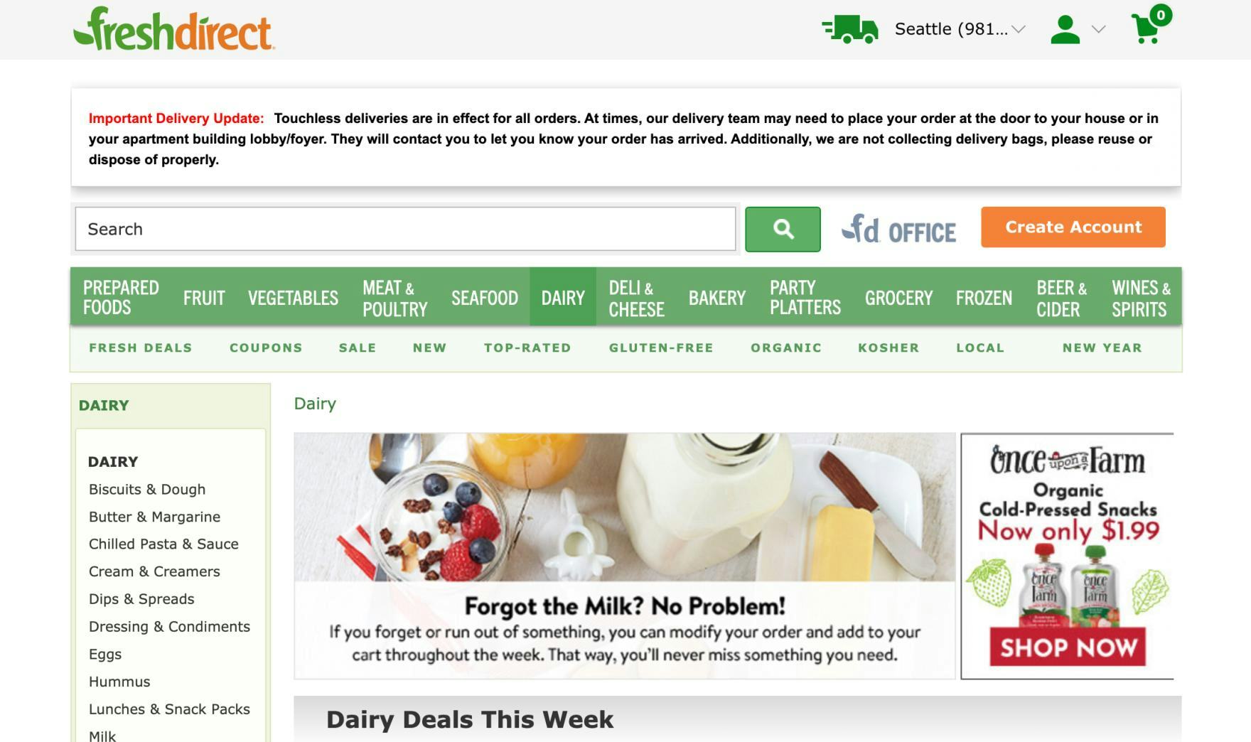
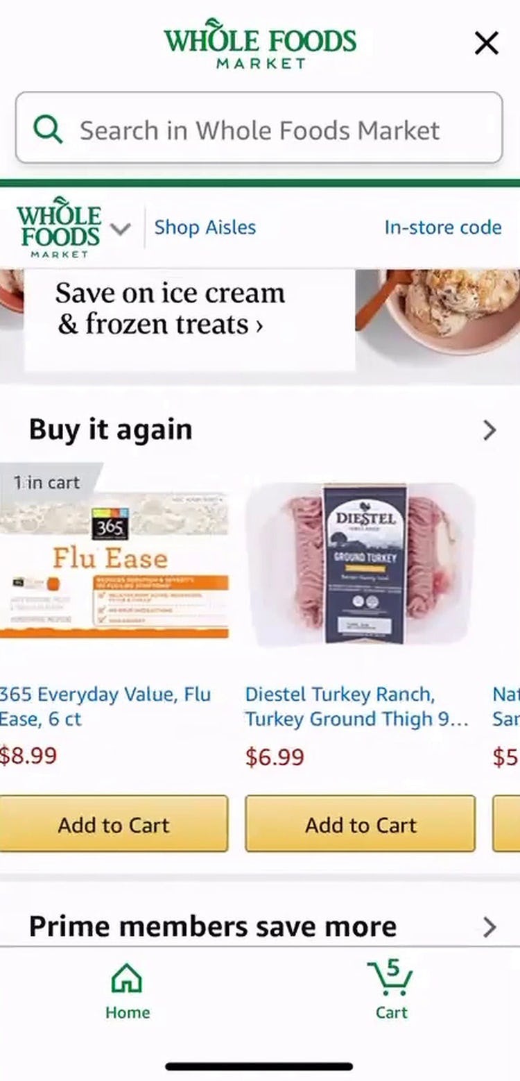
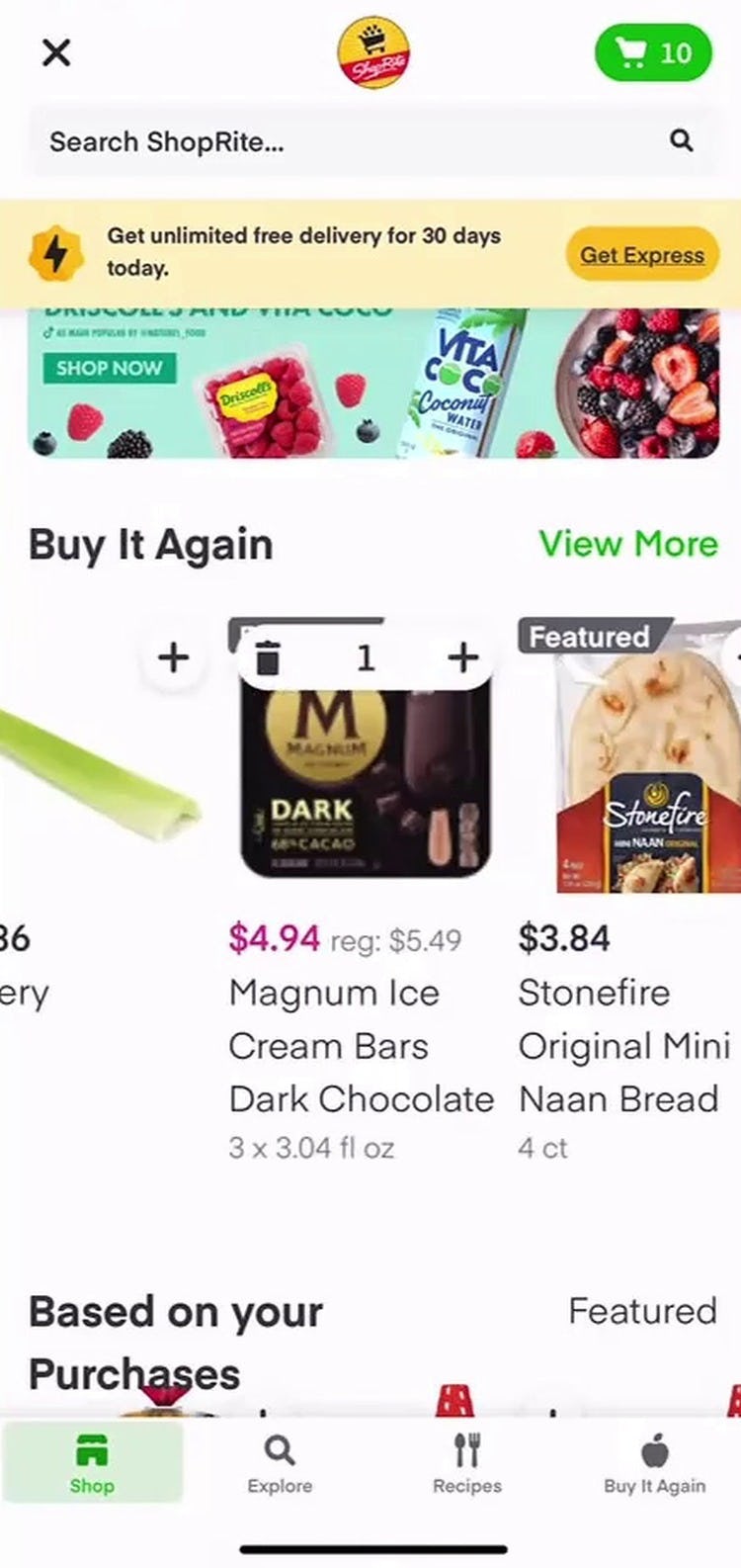
In testing, users who had previously placed an order at the site relied heavily on features that allowed them to repurchase past items, including highlighted features on the homepage and within search.
Such convenience features make it easy for users to repurchase staple items without needing to search to refind them each time they return for a new order.
On the other hand, the absence of the features is keenly felt by users, who are looking for ways to help them place their order as efficiently as possible.
2) New Grocery Site Users Require a Near-Seamless UX
For new users to transition to becoming long-term users, they have to find their initial site interactions satisfactory.
Otherwise, if they’re initially underwhelmed by the site performance, users may look elsewhere to find a grocery site that better accommodates their needs and saves them time.
Indeed, the number of online groceries is growing, and so users have more options than they did previously when it comes to selecting a site from which to purchase their groceries.
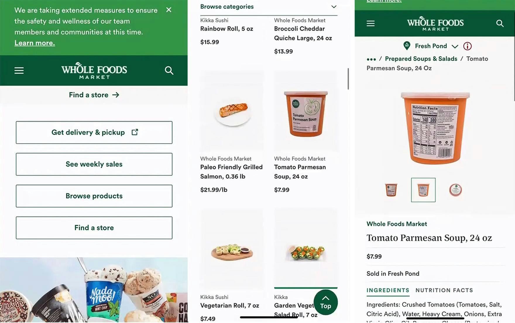
“Where do I add? Is it sold out? I’m actually not sure where to add this, so that’s confusing. It doesn’t make a ton of sense to me. I’m not interested…in the background of the product, so I basically only want to click to purchase…that is not clear to me.” This user on Whole Foods’s mobile site overlooked the homepage link to “Get pickup & delivery” (first image) and instead selected “Browse products” and wound up on a product list (second image), eventually navigating to the product page for an item she wished to purchase (third image). However, from this place within the site, there was no way to do so. In practice, a single segmentation link for users seeking online ordering cannot always prevent siloing issues — 27% of users testing on Whole Foods struggled to locate the link to the online grocery site.
In particular, during testing some new users found it very difficult to actually begin the process of adding grocery items to their cart, as they were siloed in a brand’s grocery site that didn’t support online shopping.
The “store-within-a-store” concept was an issue all the way back in 2013 during our first research on mobile e-commerce, and this recent testing of grocery sites supports that it remains a difficult concept for users to grasp.
While users who’ve previously placed an order at a site are likely to be familiar with which site supports online ordering (or have the app installed on their mobile device), the struggles new users face were evident from testing if the path to online ordering wasn’t clearly and frequently highlighted.
3) The Importance of Some Site Areas and Features Is Greatly Diminished for Grocery Users
Additionally, some site areas that are crucial to general B2C users have much less importance for grocery users.
For example, only half of grocery users in testing ever visited the product page — the centerpiece of product browsing and exploration for many general B2C users — opting instead to add items to the cart exclusively from the homepage, search results, or product lists.
It makes sense that grocery users would avoid the product page, given that many of the items they’re looking to purchase they’ve purchased before.
Thus, they don’t need the level of detail that a product page provides, and instead prize efficiency in adding the product to the cart over reading detailed product descriptions.
In practice, users often simply need to restock an item that they are already very familiar with, making it doubly crucial to ensure users have enough information at the product list step to facilitate a purchasing decision.
4) Cart & Checkout Present Unique Challenges
Next, once users have added all of their grocery list items and entered the Cart & Checkout flow, grocery users have a variety of unique options that are often not available for other online retailers.
These can include multiple fulfillment options (e.g., local delivery versus in-store pickup); selecting the location, date, and time for order fulfillment; and confirming specific substitutions should the selected products be out of stock.
These additional options — while often necessary and helpful to users — may increase the complexity of the checkout process.
Indeed, during testing some users were so overwhelmed by the prospect of, for example, selecting substitutions for 50+ items that they abandoned the site.
Others spent 20+ minutes adding items to their cart, only to discover that their cart contained a mix of items that were reserved for pickup and items that were going to be shipped and delivered several days later — forcing the users to go back and redo their previous work.
In short, as users will likely have to encounter a grocery site’s Checkout UX on a weekly basis, Checkout optimization needs to be at the forefront to ensure Checkout is as smooth as possible to avoid unnecessary abandonments.
5) The Mobile Grocery Experience Can Be Especially Challenging
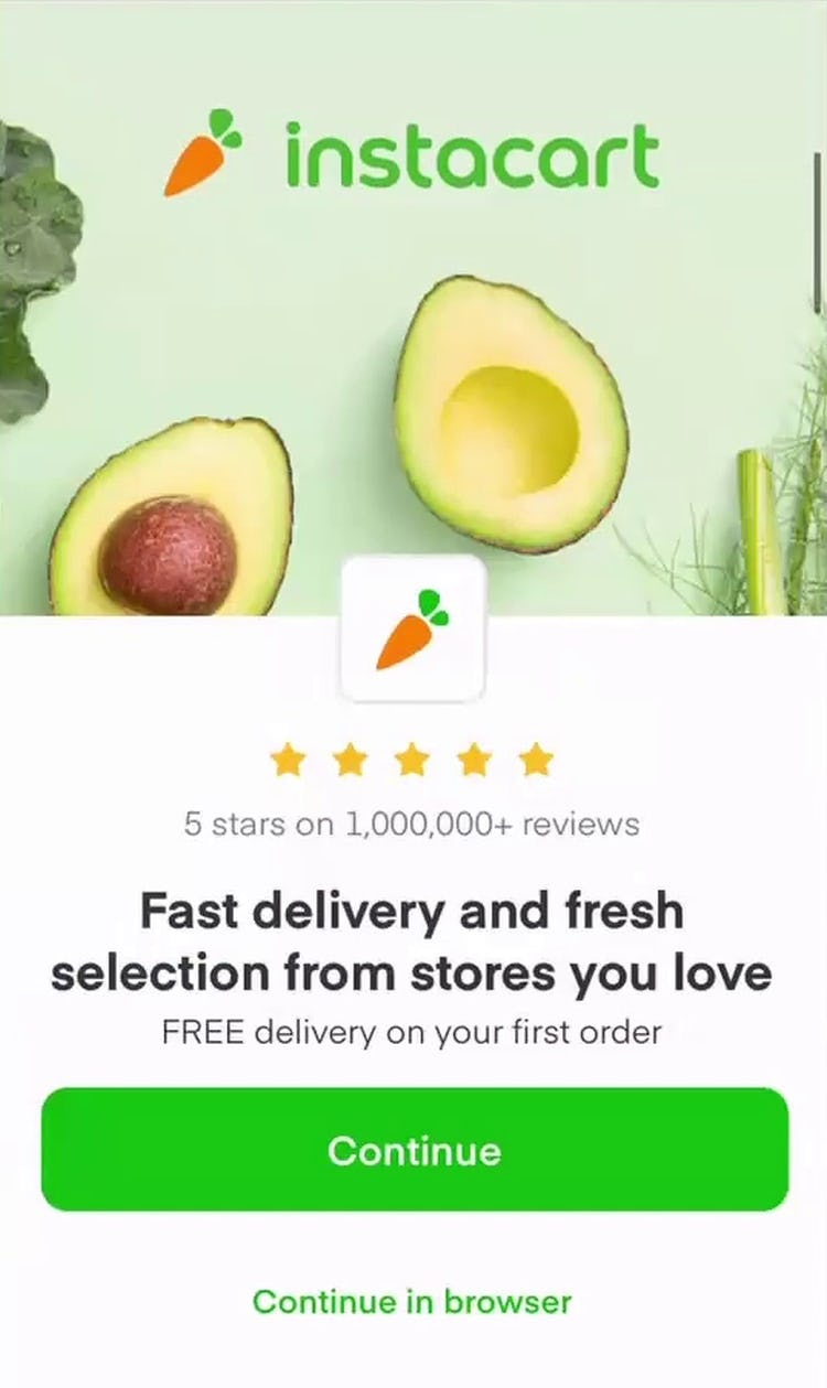
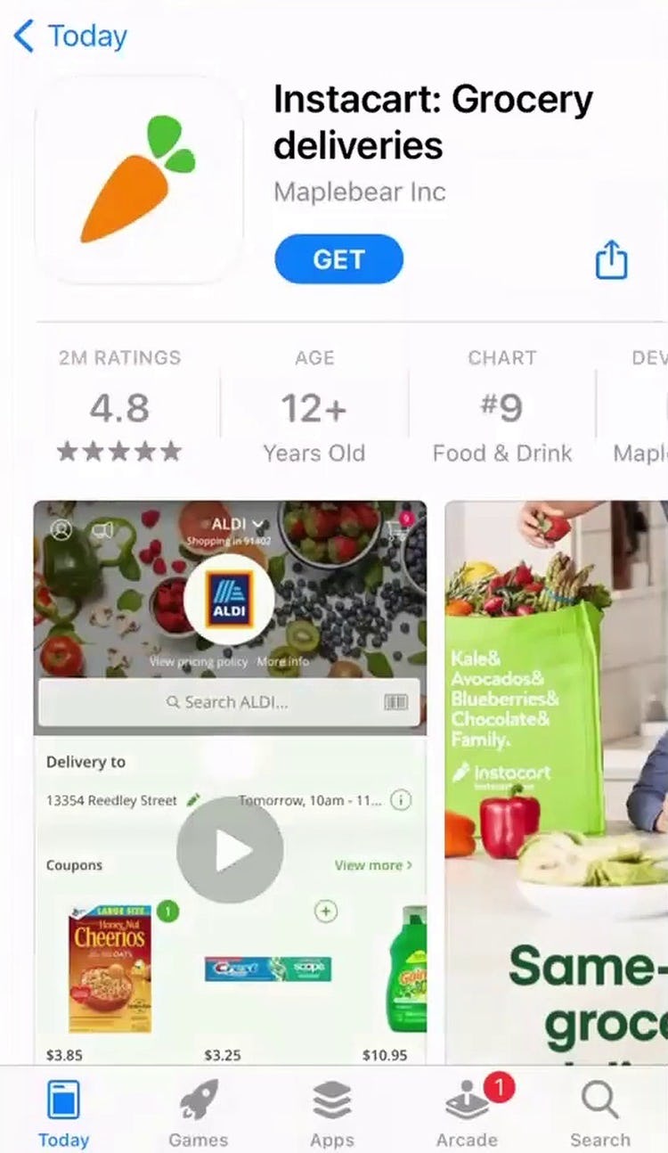
“Oh no, I don’t want to do that!” This user accidentally tapped the overly prominent call-to-action on Instacart’s app download splash page (first image) and was taken away from her browser to the app store (second image). Overly aggressive app download promotions can make the process of product browsing significantly more difficult.
Finally, mobile users often encounter a tricky experience, with many of the aforementioned issues being compounded on the smaller viewport with difficult-to-tap hit areas and challenging on-screen keyboards.
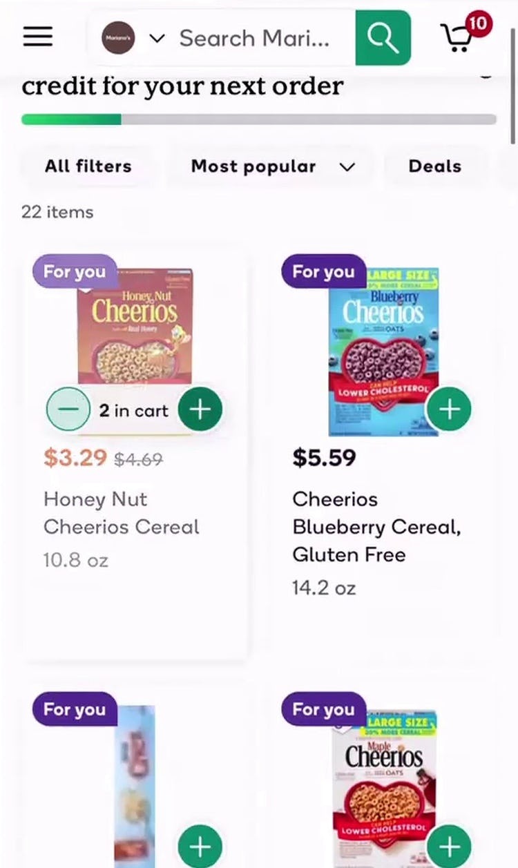
However, beyond these typical issues common to Mobile UX — regardless of whether they’re on a grocery site or a general B2C e-commerce site — grocery users often have the additional challenge of adding dozens of products to their cart.
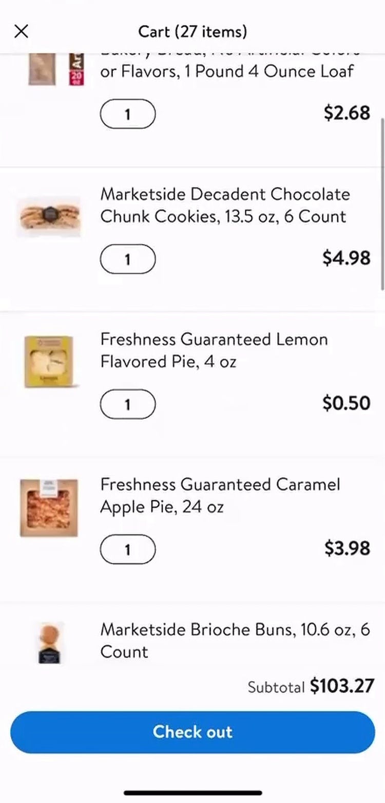
This can be difficult to accommodate on the smaller mobile screen, as the shopping cart can quickly balloon to multiple viewports in length, which users must navigate prior to checking out.
Thus, the cart in particular has to be carefully designed to support this unique challenge — yet many sites during testing failed to recognize the cart’s importance, leading to some unnecessary abandonments as users gave up on carts that made it difficult to get an overview of the order or proceed with checking out.
Ensure Your Grocery Site UX Supports Repeat Visits
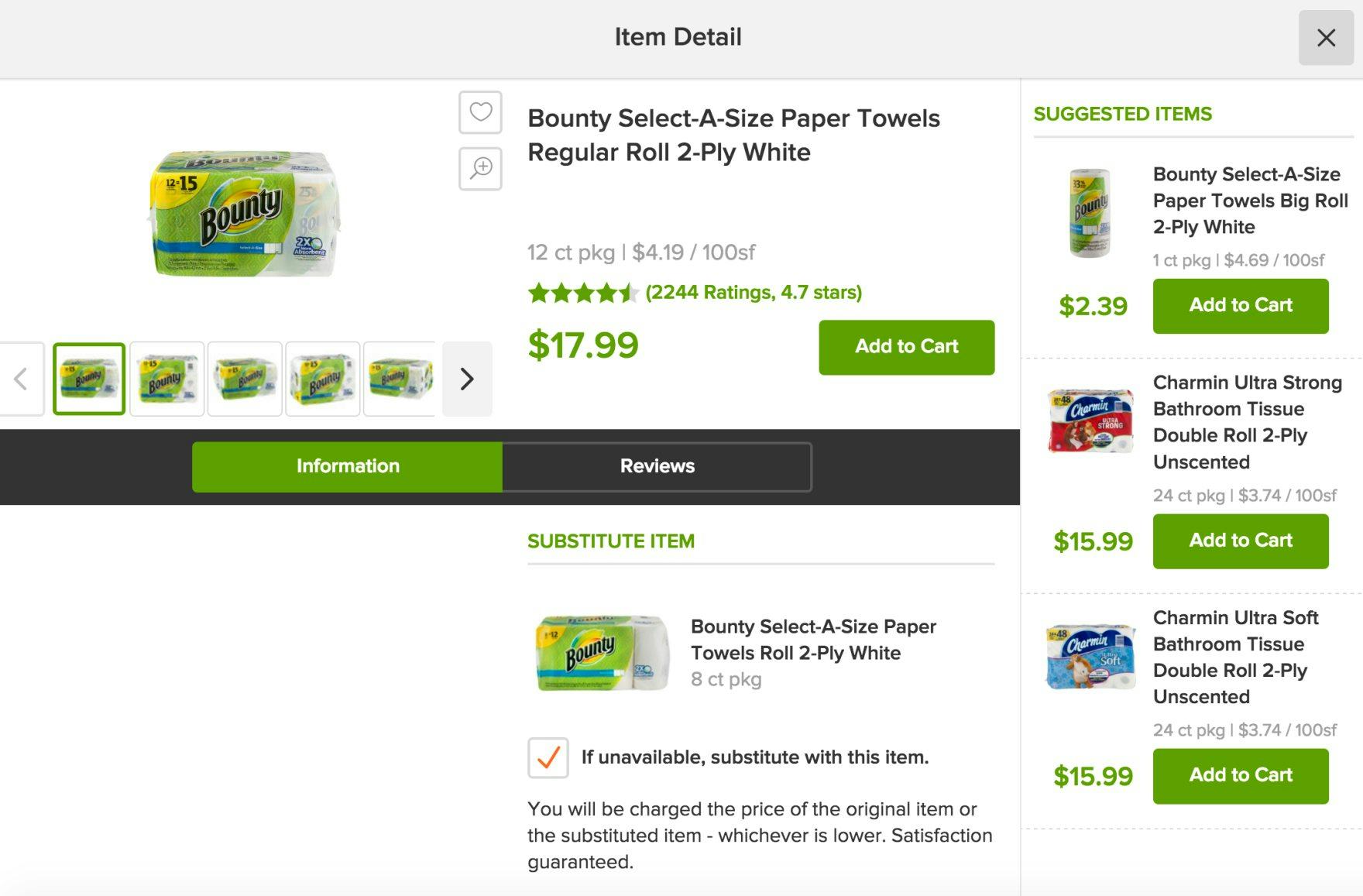
Peapod makes it easy for users to compare the prices of multiquantity items, like paper towels, available in a variety of different sizes and at a variety of different price points, by providing the price per 100 square feet for each product.
Buying groceries online is, for most users, a utilitarian task.
Indeed, while users on, for example, direct-to-consumer sites may need to be “wowed” by the brand, users on grocery sites typically just want to find their items and place their order as fast as they can.
In particular, it’s especially important to pay close attention to 5 aspects of the grocery UX:
- For grocery UX, convenience is king
- New grocery site users require a near-seamless UX
- The importance of some site areas and features is greatly diminished for grocery users
- Cart & Checkout present unique challenges
- The mobile grocery experience can be especially challenging
Yet this large-scale study of grocery site UX has revealed that many grocery sites make it unnecessarily difficult for users to proceed efficiently with filling their cart and placing their order — leaving themselves at risk of abandonment in favor of another local competitor, and negatively impacting their e-commerce conversion rate.
Getting access: all 427 grocery UX guidelines are available today via Baymard Premium access. (If you already have an account open the Grocery Study.) You may also want to visit our grocery ecommerce audit page for information on booking an audit of a grocery site with a Baymard auditor.
