Key Takeaways
- Our UX benchmark of 5 Telco websites with 2,400+ weighted UX performance scores, shows that Telco “Homepage” and “Category Navigation” performs mediocre to decent
- Additionally Telco “On-Site Search”, “Product Lists and Filtering”, and “Device/Product Page & Plan Matrix” all perform poorly, and “Mobile Web” performs mediocre
- The 17 common UX issues discussed in this article can each be a direct cause for users abandoning Telco sites
Recently Baymard has published a new in-depth Telco UX Benchmark Database.
This database contains UX performance rankings for 5 new Telco websites: Bell, Verizon, Vodafone UK, Orange, and Xfinity.
These sites have been manually assessed by Baymard researchers across 400+ research-based UX parameters relevant for Telco websites.This analysis has resulted in 2,400+ weighted UX performance scores exclusively for Telco websites.Additionally, the database contains 1,625+ best-practice examples from leading Telco websites.
In this article we’ll analyze this dataset to provide you with an overview of the UX performance of Telco industry websites, and outline 17 common design pitfalls and strategic oversights applicable to most Telco websites.
This article is divided into the following chapters:
- Telco UX Performance Overview
- Telco Homepage and Category
- Telco On-Site Search
- Telco Product Lists and Filtering
- Telco Device Page, Product Page & Plan Matrix
- Telco Mobile Web
- Simplify the Decision-Making Process for Telco Users
Telco UX Performance Overview
Telephone communications (“Telco”) is a multibillion-dollar industry, made up of large multinational companies providing services and products all over the world.
From an e-commerce website perspective, telco websites are unique in that they sell both physical products (smartphones, tablets, TVs, internet modems) as well as digital/wireless subscription services (internet, tv, phone and data plans, etc.), often bundled together.
Users are also harder to accommodate, as some may be looking to bring their own devices and only sign up for a service plan, or may be seeking a customized package for their specific needs. Furthermore, sometimes certain services are restricted and hence not applicable to all users visiting the site.
All of this adds a level of complexity in communicating to users what their options are, with a need to highlight the benefits of combining certain devices with certain plans.
For this analysis we’ve summarized the 2,400+ Telco usability scores across the 52 topics and plotted the 5 benchmarked Telco sites across these in the scatterplot above. Each dot, therefore, represents the summarized UX score of one site across the 1–17 guidelines within that respective topic. The top row is the total Telco site UX performance.
Our Telco benchmark database reveals that all 5 Telco sites have a poor to mediocre UX performance.
Looking at specific e-commerce themes, we see that, while most Telco sites perform mediocre to decent when it comes to “Homepage and Category”, performance is poor when it comes to “On-Site Search”, “Product Lists and Filtering”, and “Device/Product Page, & Plan Matrix”, and “Mobile Web”.
For perspective, when looking at the broader e-commerce landscape, the average overall UX performance falls well below an acceptable level by user standards, with 83% of sites providing what can be described as a mediocre overall user experience, only 17% providing a good experience, and no sites providing a “State-of-the-Art” experience within all 7 themes that collectively constitute the overall e-commerce user experience.
Thus, Telco sites tend to perform worse when compared to the general e-commerce landscape. (Premium users can access the Overall E-Commerce UX Benchmark Analysis here.)
In this article, we will focus on the “Homepage & Category”, “On-Site Search”, “Product Lists and Filtering”, and “Device/Product Page & Plan Matrix” areas of Telco sites, as well as pitfalls observed for the “Mobile Web” platform.
Telco Homepage & Category

As a starting point for most users, the average UX performance in the “Homepage & Category” area for Telco sites performs mediocre to decent.
While this is the highest-performing area for the Telco industry, sites struggle to accommodate both new users (who are in information-gathering mode) and returning users (who are in account-management mode).
In particular, there are 2 issues Telco sites get wrong when it comes to the “Homepage & Category”.
1) Hiding Product Categories within a Single Navigation Item
Our Telco benchmark reveals there is a tendency to hide product categories within the main navigation, making it difficult for users to gauge what the site offers.
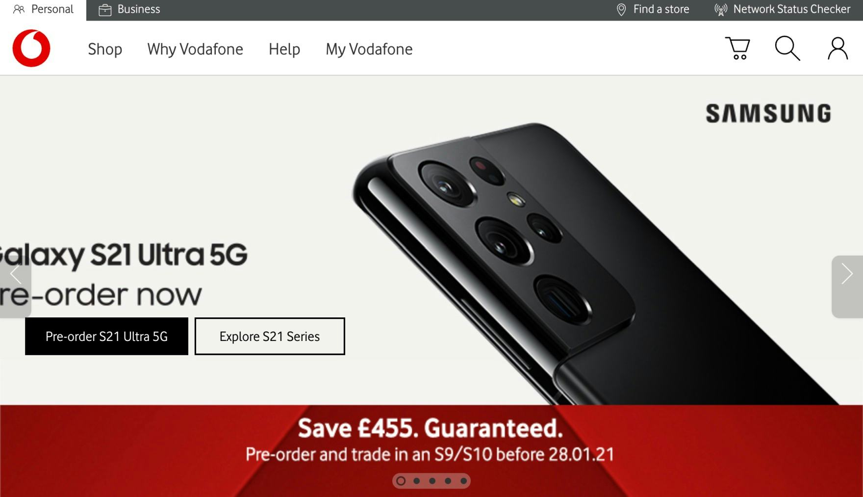
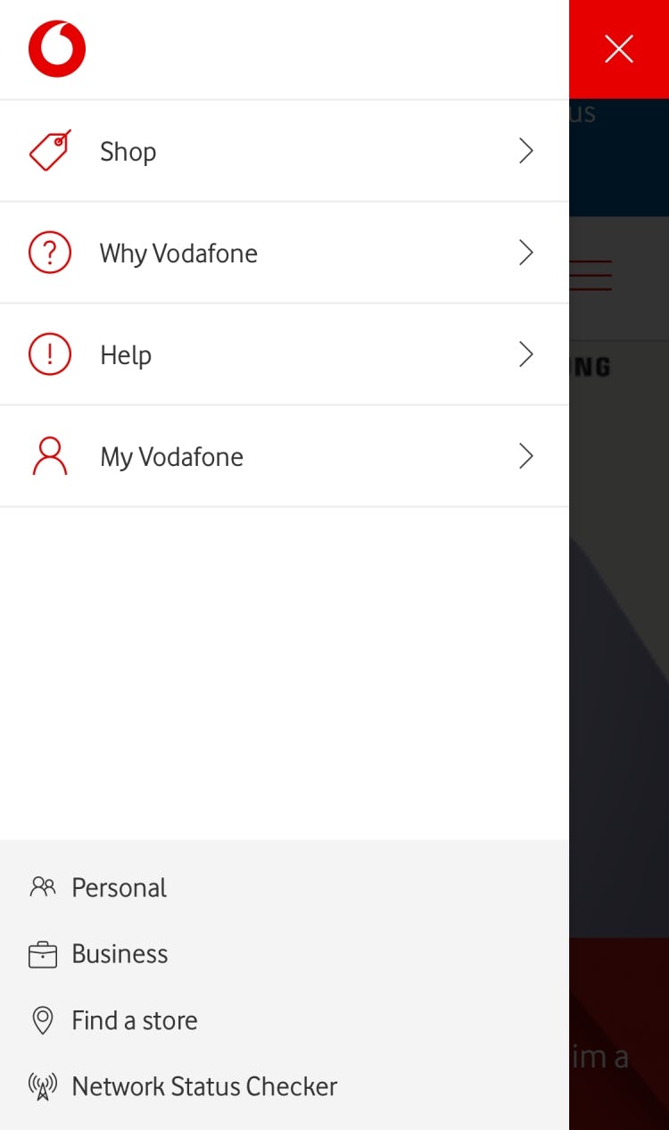
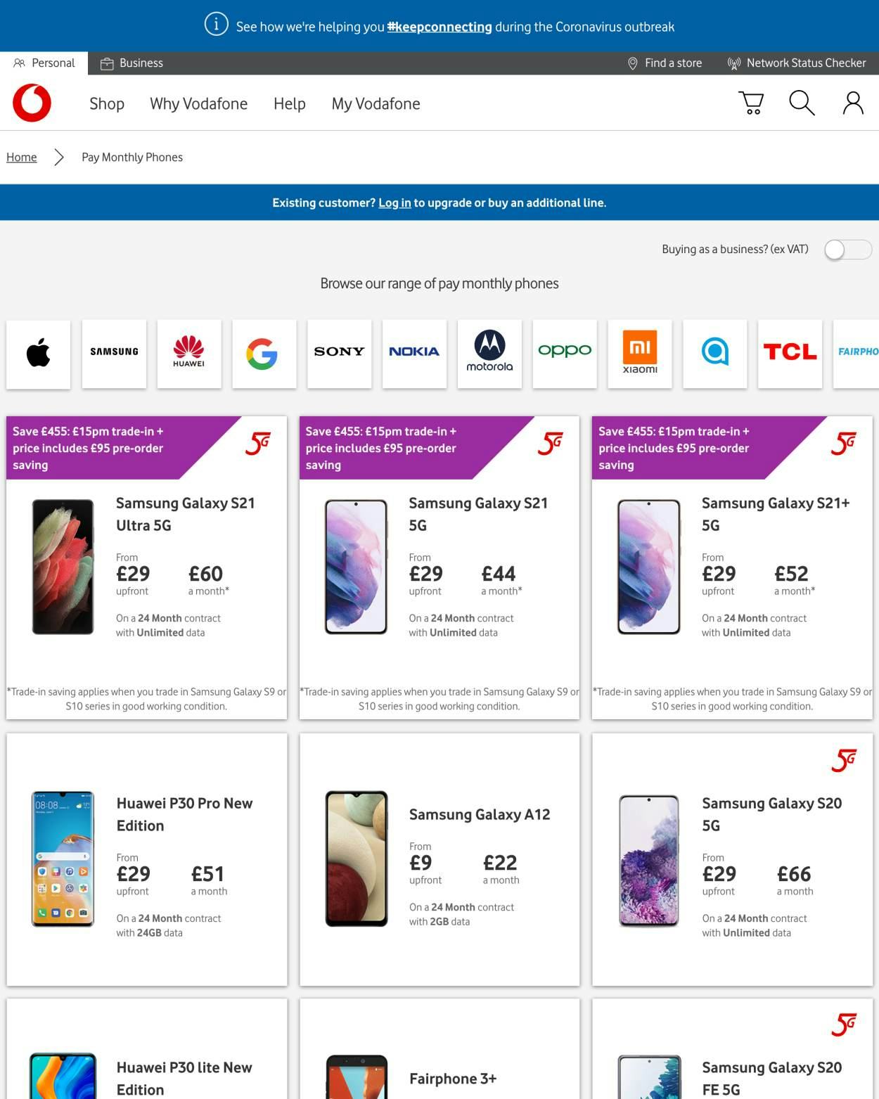
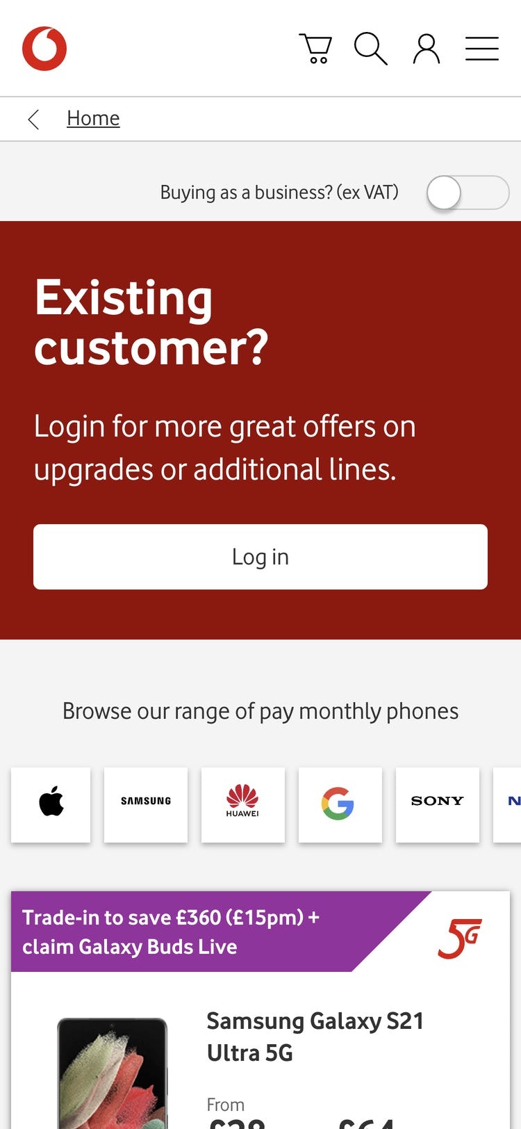
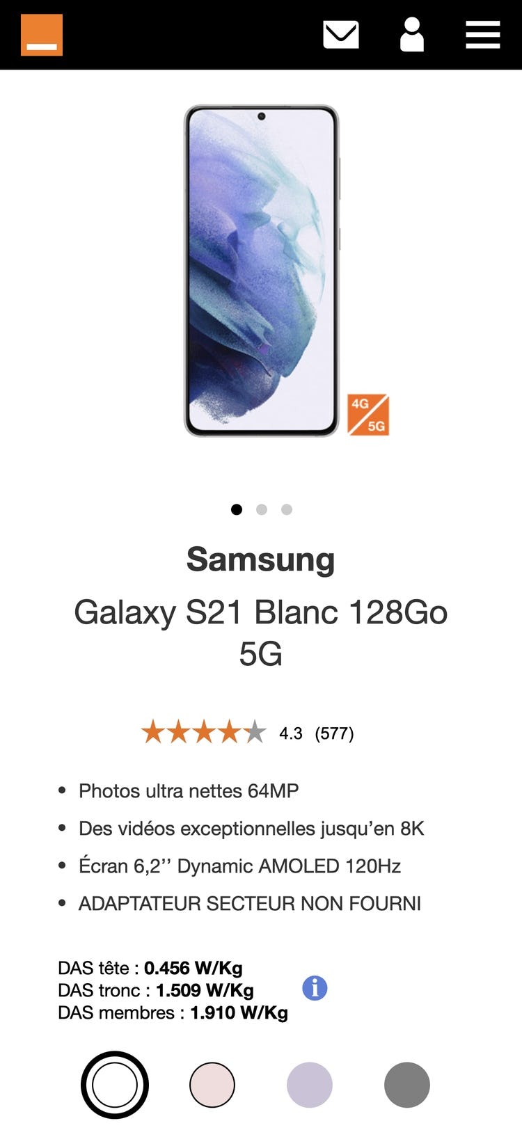
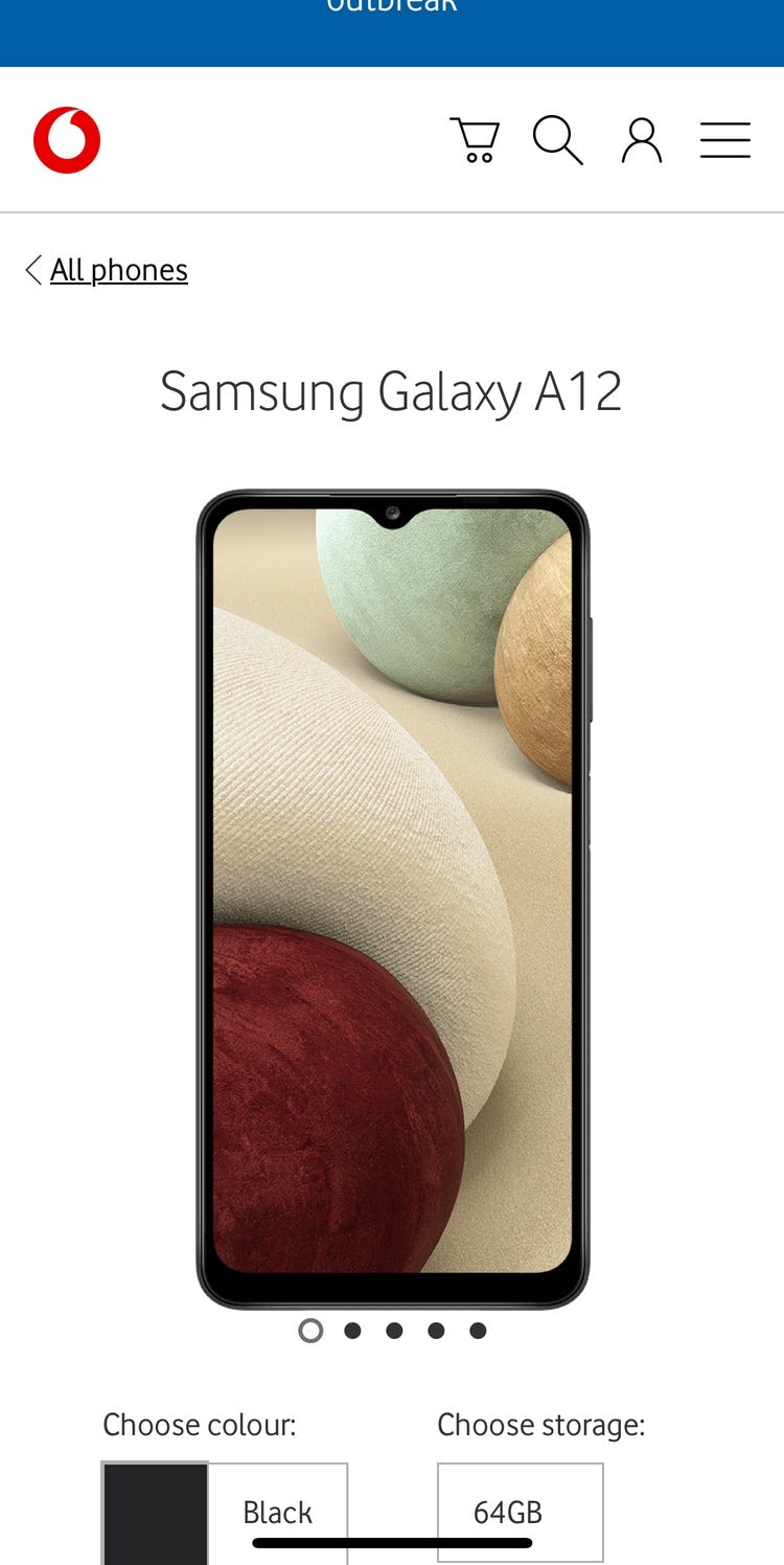
Vodafone UK hides its product categories in a “Shop” menu on both desktop (first image) and mobile (second image), making it needlessly cumbersome for new users to immediately understand the breadth of products and services offered.
In testing, we often observe that when sites didn’t implement the main navigation as the first level of product categories, the navigation experience for users vastly deteriorated.
On these sites users have to hover or click a solitary navigational item — typically called “Shop”, “Products”, or something similar — before even being able to see the first level of categories (e.g., “Phones & Tablets”, “Accessories”, “Plans”, etc.).
The most severe issue of scoping and collapsing the entire product catalog navigation within a solitary navigation item (e.g., “Shop”) is users not being able to fully understand the range of products the site carries.
Meanwhile, users on mobile sites often struggled to simply get started browsing the product catalog when product categories weren’t immediately visible in the main navigation.

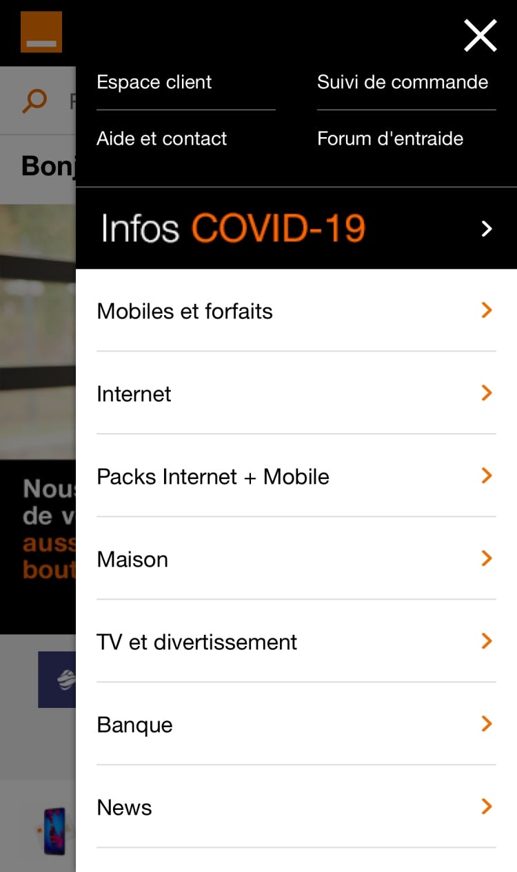
Orange displays its product categories directly in the main navigation on desktop (first image), enabling users to to infer the type of site they’ve landed on and the breadth of the product catalog in the page’s default state. Likewise, mobile users can immediately begin browsing after opening the main navigation menu (second image).
Therefore, product categories should be visible in the top level of the main navigation on desktop, and visible immediately after opening the main navigation menu on mobile.
2) Carousels Are Implemented Incorrectly
Carousels can perform okay, though there are many implementation details to get right to avoid frustrating users.
While our testing reveals that users generally like the large imagery of carousels, they can cause more harm than good if serious usability issues aren’t addressed.
For example, carousel slides were often observed changing just milliseconds before a user clicked — causing the wrong page to be loaded.
On the other hand, when implemented with care, carousels are a powerful way to promote features, offers, and wizards.
In particular, carousel slides can autorotate on desktop, but not too quickly (especially if they include text), and autorotation should temporarily pause while hovered and permanently pause after any user interaction.
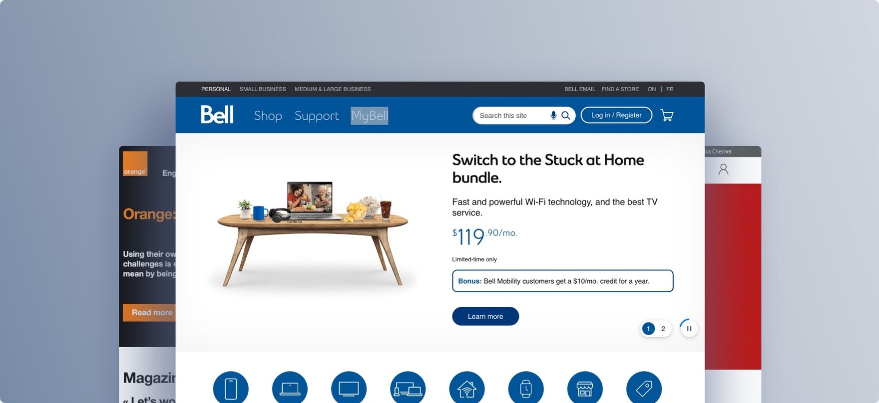
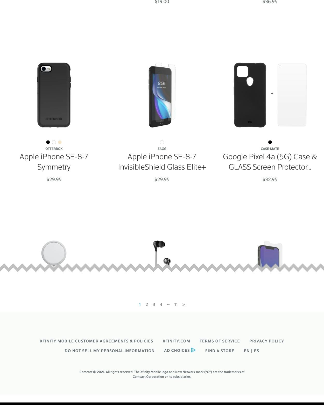
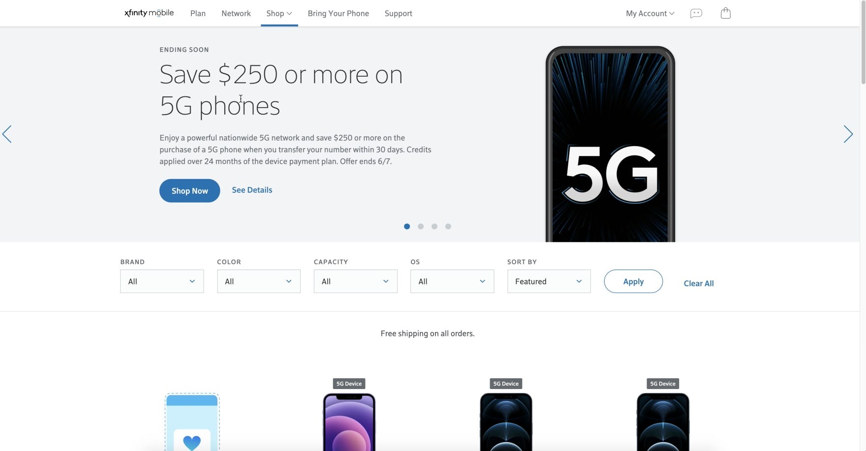
Of the sites in our benchmark, look to Xfinity for the best “Homepage & Category” implementation, with a small catalogue that is well organized and communicated to users.
Telco On-Site Search

While search is not likely to be the dominant strategy for Telco shoppers, given the complexity of the service plans, the unanimously poor UX performance of these benchmarked sites renders on-site search nearly impossible.
One site (Xfinity) fails to provide sitewide search altogether, and the remaining sites have wildly inconsistent support for all types of searches.
In particular, there are 3 issues Telco sites get wrong when it comes to Search.
3) Poor Support for Product Type Searches
“Product Type” searches are very general and may already exist as a category (often included in higher levels of navigation).
For example, a user may search for “tablet” or “smart watches” instead of plowing click-by-click (or tap-by-tap) through each step of a site’s navigation — or the searches may be synonymous with a product category (e.g., a search for “earphones” when the category is “Headphones”).
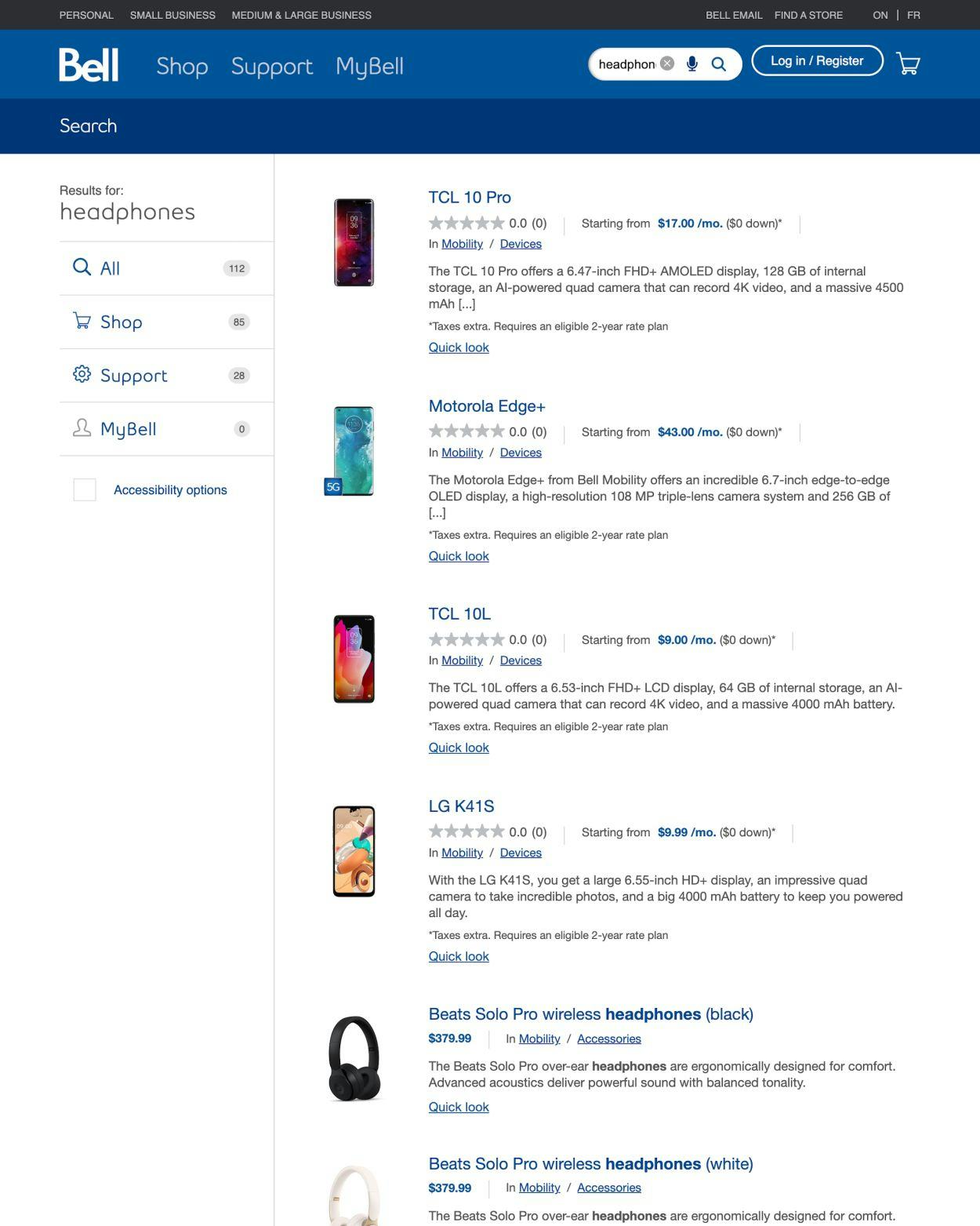
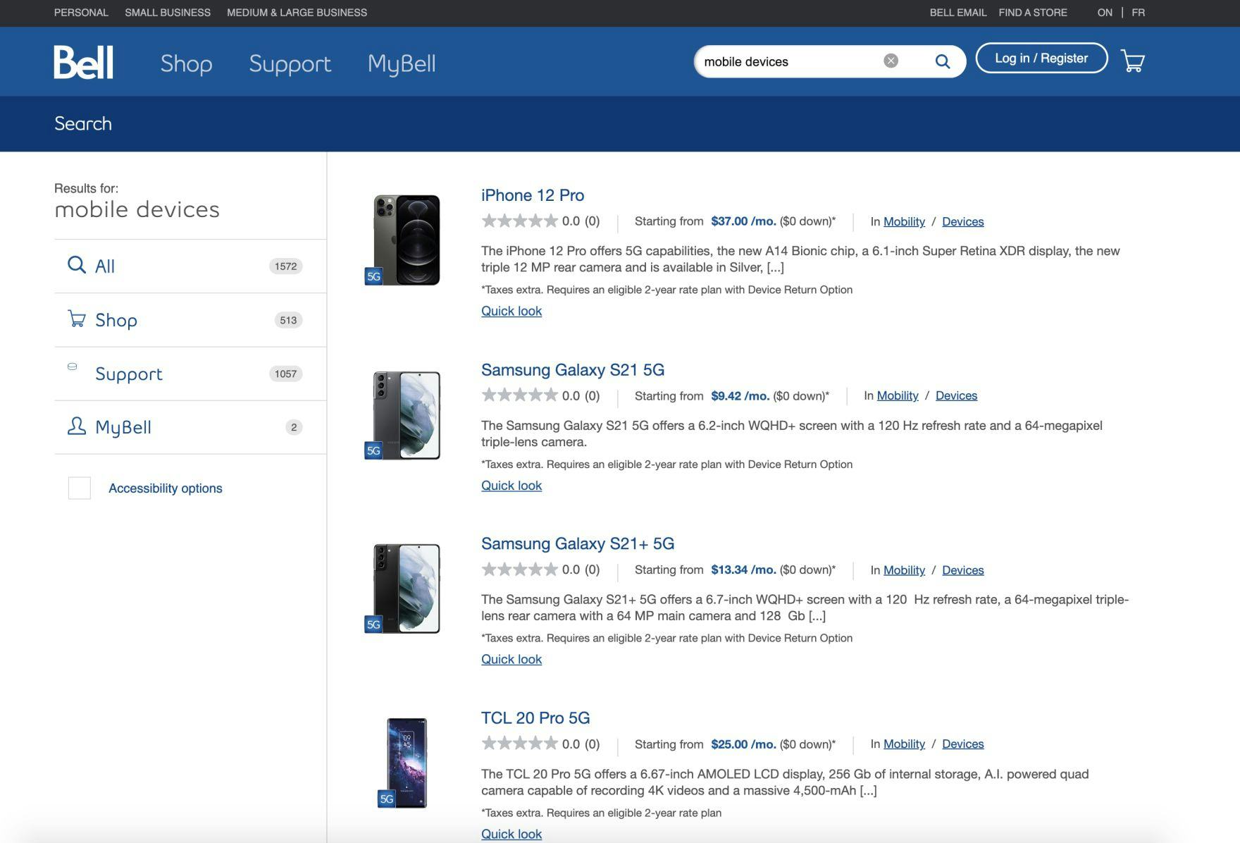
Although a query for “headphones” at Bell returns relevant results, they are positioned below irrelevant results. Consequently, users who do not scroll are likely to conclude the site does not carry the desired item.
During testing, when users scanning results began to see products unrelated to their query, they became puzzled and doubted the search feature or that the site would carry the products they were seeking.
Moreover, users faced with ill-matched “Product Type” results have to spend time deleting and retyping queries or use alternate-browsing methods to find products more relevant to them — causing a diminished perception of the site or even leading to abandonments.
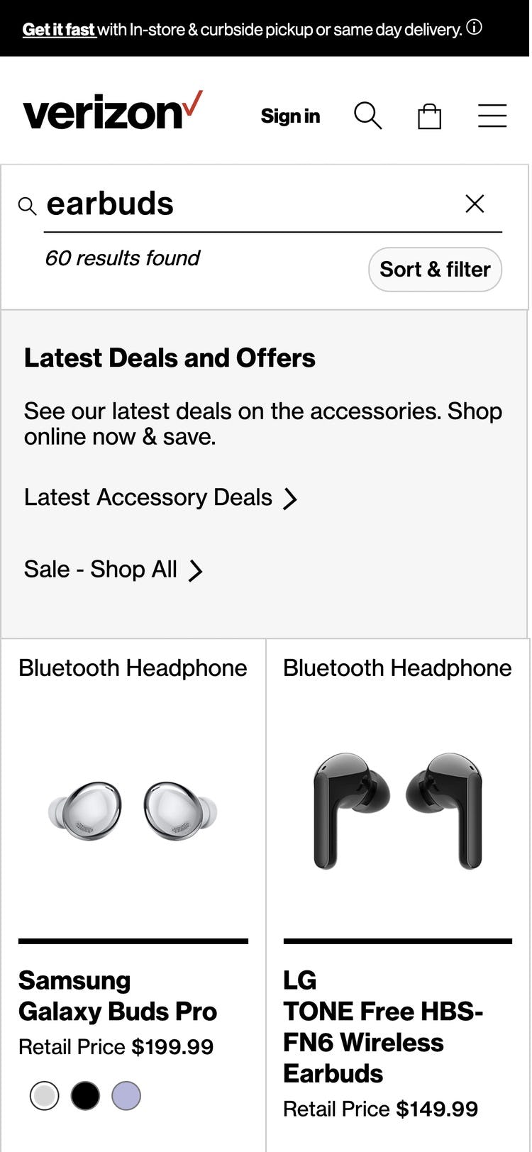
A query for “earbuds” at Verizon returns relevant results.
Since “Product Type” searches can be a first interaction with a site, they help shape users’ early impressions of what’s available, making it critical to get “Product Type” matches right.
Furthermore, users don’t always arrive at a site with an understanding of its organization or category wording. Therefore, it’s important to meet them where they are by mapping the words that users may type to describe products sought to the words a site uses to describe the categories and products that it carries.
4) Poor Support for Exact Searches
Users conduct “Exact Searches” when they have a precise idea of what they’re seeking — for example, users who are comparison shoppers, big-ticket item researchers, or repeat purchasers.
Unlike shallow exploratory searches (e.g., “smart phones”), “Exact” queries are detailed, consisting of specific product titles or model numbers which are frequently copy-pasted from another source.
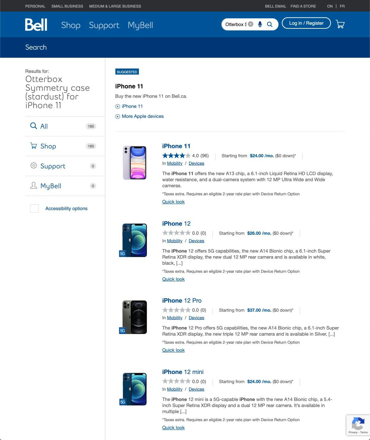
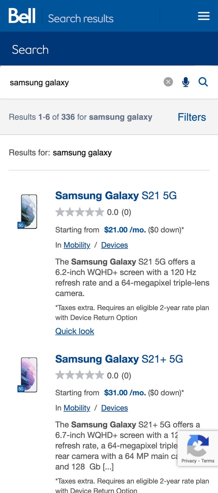
An “Exact Search” by product name at Bell returns 185 results. Users who are unable to find a desired product through “Exact Search” may presume that the product isn’t available and, instead of attempting other search methods, will often proceed to another site.
Many users will assume that the site does not carry a product when a relevant matching result for an “Exact Search” isn’t offered or isn’t highly placed in the search results, introducing the potential for abandonment.
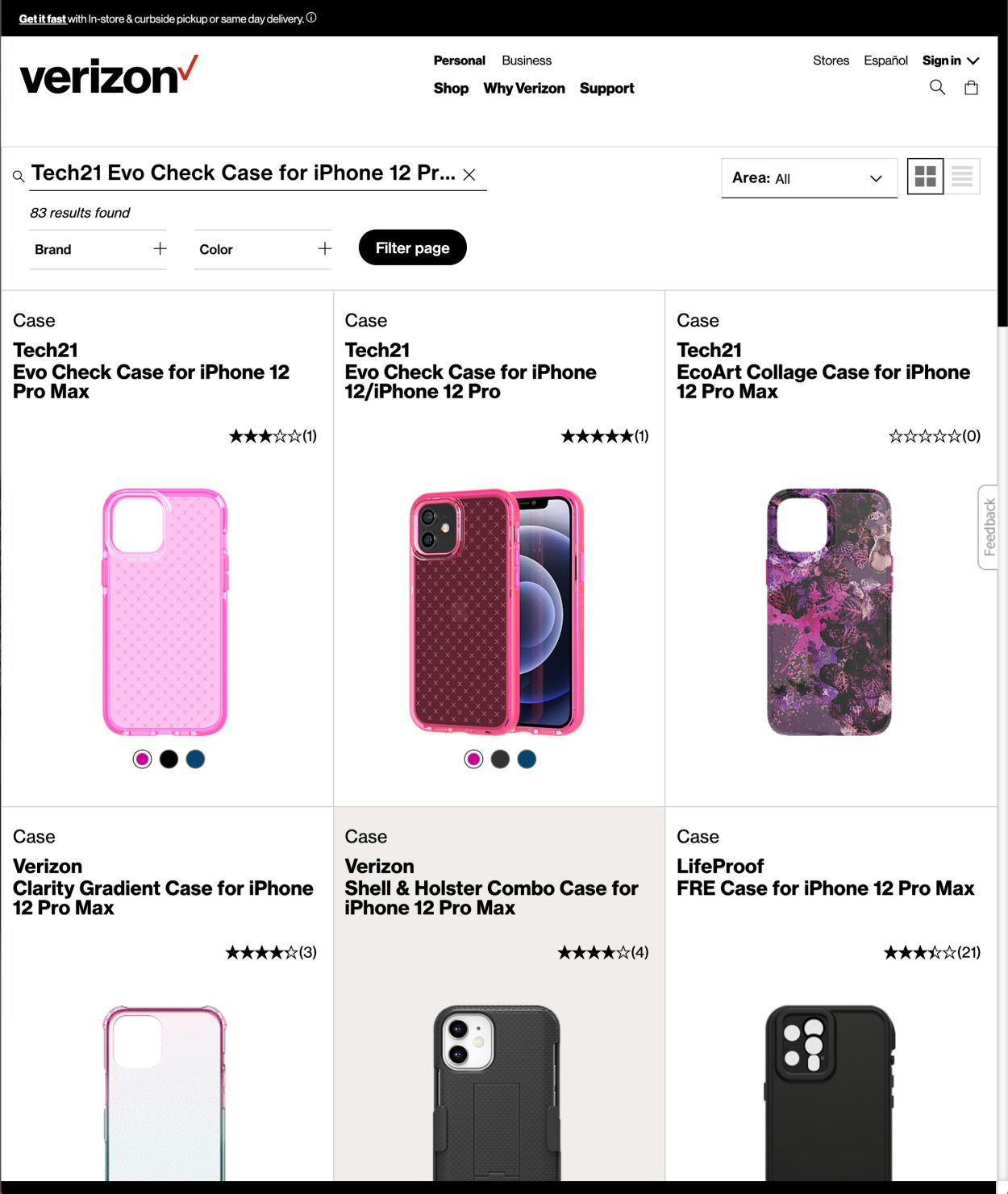
An “Exact Search” by product name at Verizon returns relevant items. The first result matches the query exactly, followed by partial matches. Some users will copy exact product names or numbers from one site to another to see if they can find a better deal on a competing site.
Since users conducting “Exact Searches” may often be closer to making a purchase decision than casual product browsers, it’s crucial to remove friction at this stage.
Therefore, users who search for an existing product — and match the title of that product exactly in their query — should find the corresponding product at or very near the top of the search results list.
5) Failing to Persist the User’s Search Query on the Results Page
During testing, users often went through multiple iterations of search queries (2.2 iterations on average).
For example, changing an initial query of “laptop charger” to “laptop charger mac” after scanning the search results.
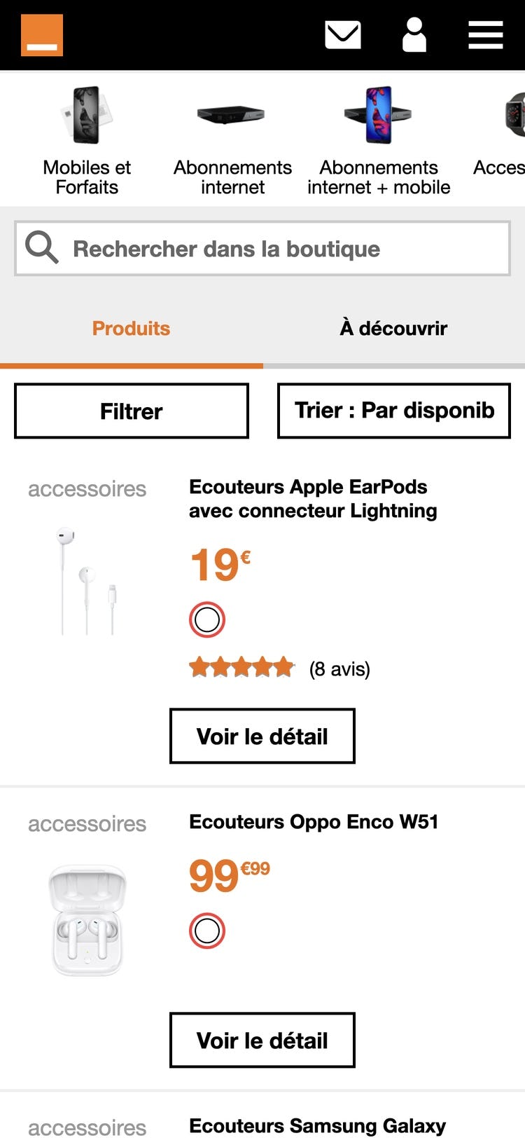
At Orange, the queried term is cleared from the search field, making it difficult for users to iterate the original query if the results are inadequate. Additionally, although the queried term and total number of results is displayed at the top of the results on desktop (first image), this information is completely absent on mobile (second image), denying users important feedback on the quality of the search query.
Clearing users’ search queries each time they are submitted makes it cumbersome to use the search feature, as it requires users to retype queries all over for each iteration.
As a result, it takes longer for users to use search to find products or other content, and may nudge some users to abandon using search as a product-finding strategy.
On mobile, users already have to grapple with small tap target sizes and numerous taps to backspace-delete a word (or words) before typing any new characters — both of which are already intricate interactions.
For users attempting to revise query text in the middle or beginning of search fields, the action of tapping into the precise position in the search field can make iterating a query even more tedious.
Further, these factors do not take into account the length of time it takes to type on mobile to begin with — which is typically longer than it takes on a physical keyboard. All of these aspects combined show the difficulties inherent in mobile typing.
On the other hand, during testing, when search queries were persisted, users made swift iterations by adding or removing a word or two from their original query, avoiding the “halt and retype” behavior that was necessary on sites that didn’t persist search queries.
Moreover, persisting the query helps relieve some of the strain on providing “perfect” filtering options for any given search query (as users can rapidly iterate their query instead, and “filter by searching”).
Although performance of all Telco sites in our benchmark was poor, look to two top e-commerce performers Best Buy and Newegg for strong “On-Site Search” implementations.
Telco Product Lists & Filtering

With a core base of phones, internet, and television products, Telco sites clearly share parallels with e-commerce electronics sites.
Surprisingly, when it comes to “Product Lists & Filtering”, every benchmarked site runs into significant issues (with the presentation of list items in particular), while 3 of the 5 sites can be considered outright broken.
With highly spec-driven products that feature various storage capacities, camera resolutions, processing speeds, and model numbers, Telco sites consistently fail to provide users with the necessary context to evaluate their product options based on their criteria.
5 usability issues contribute to this consistently poor product-browsing experience.
6) Failing to Use a List View Layout
The product list is ultimately about enabling the user to evaluate the available products so they can decide which items are of relevance to them and which they can skip.
It’s important to choose the right product list layout (i.e., “Grid View” vs. “List View”) because the layout greatly influences the data presentation of each list item — which in turn influences the user’s ability to evaluate those items.
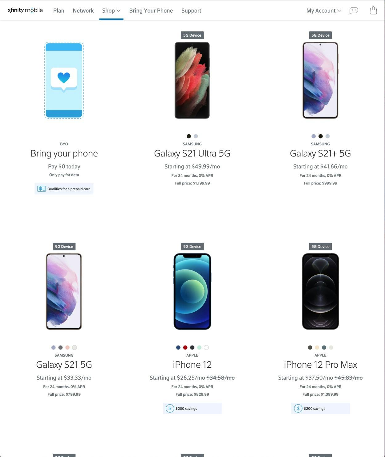
At Xfinity the use of a “Grid View” on the desktop site lowers list item scannability and comparability, making it more difficult for users to evaluate their available options.
During multiple rounds of e-commerce testing we observed that different contexts call for different product list layouts — sometimes a “List View” is more appropriate, other times a “Grid View” is better.
Because spec-driven verticals like Telco typically have more vital product attributes that must be included in list items compared to visually driven ones, the list items tend to need extra vertical space to fit these attributes.
When displayed in a “Grid View”, these specs can cause the list items to grow very tall with long lists of specs, increasing users’ efforts to evaluate and compare products.
On the other hand, some sites leave out certain specs, forcing users to perform extensive pogo-sticking between product pages and the product list to get a full view of specifications.
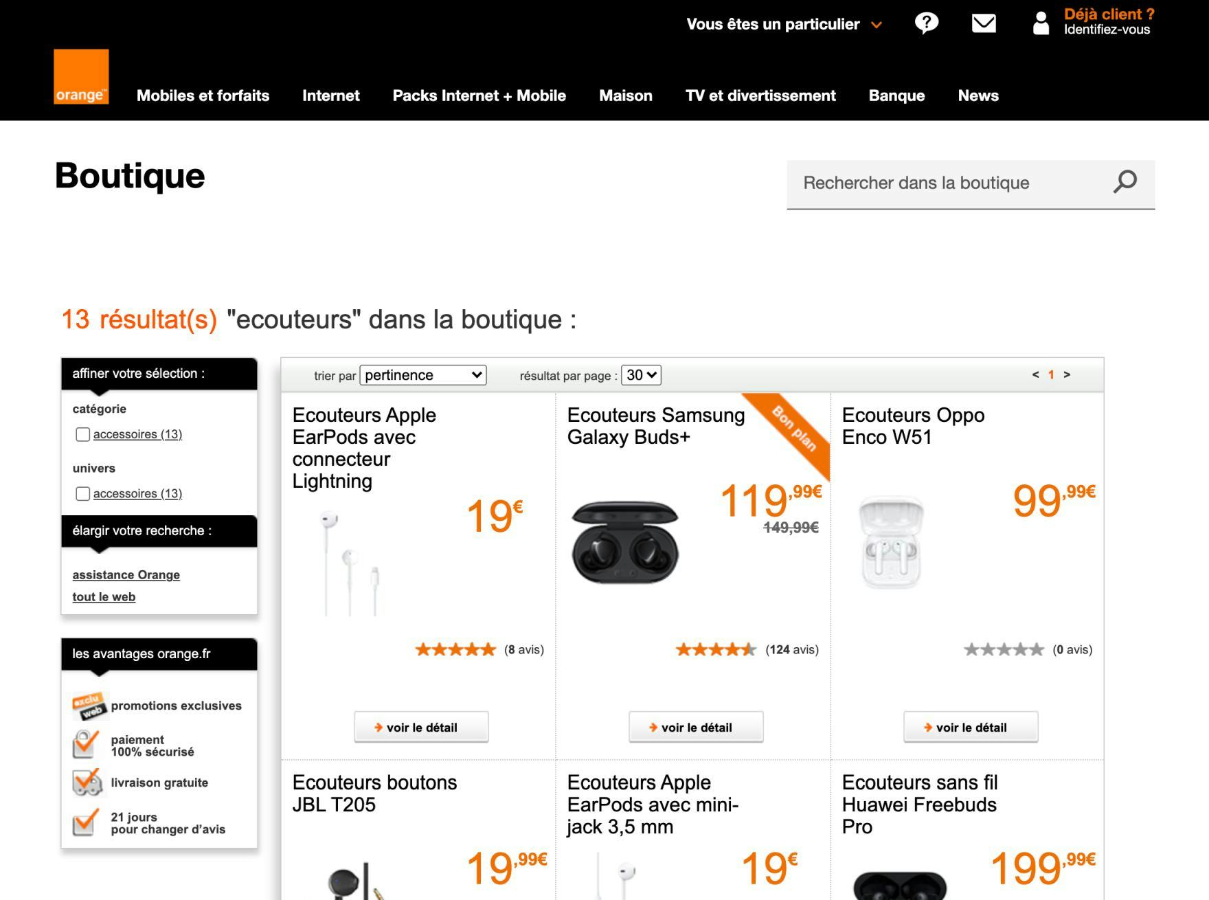
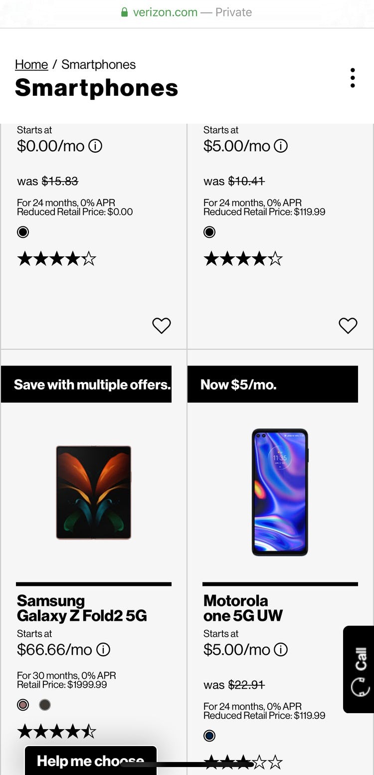
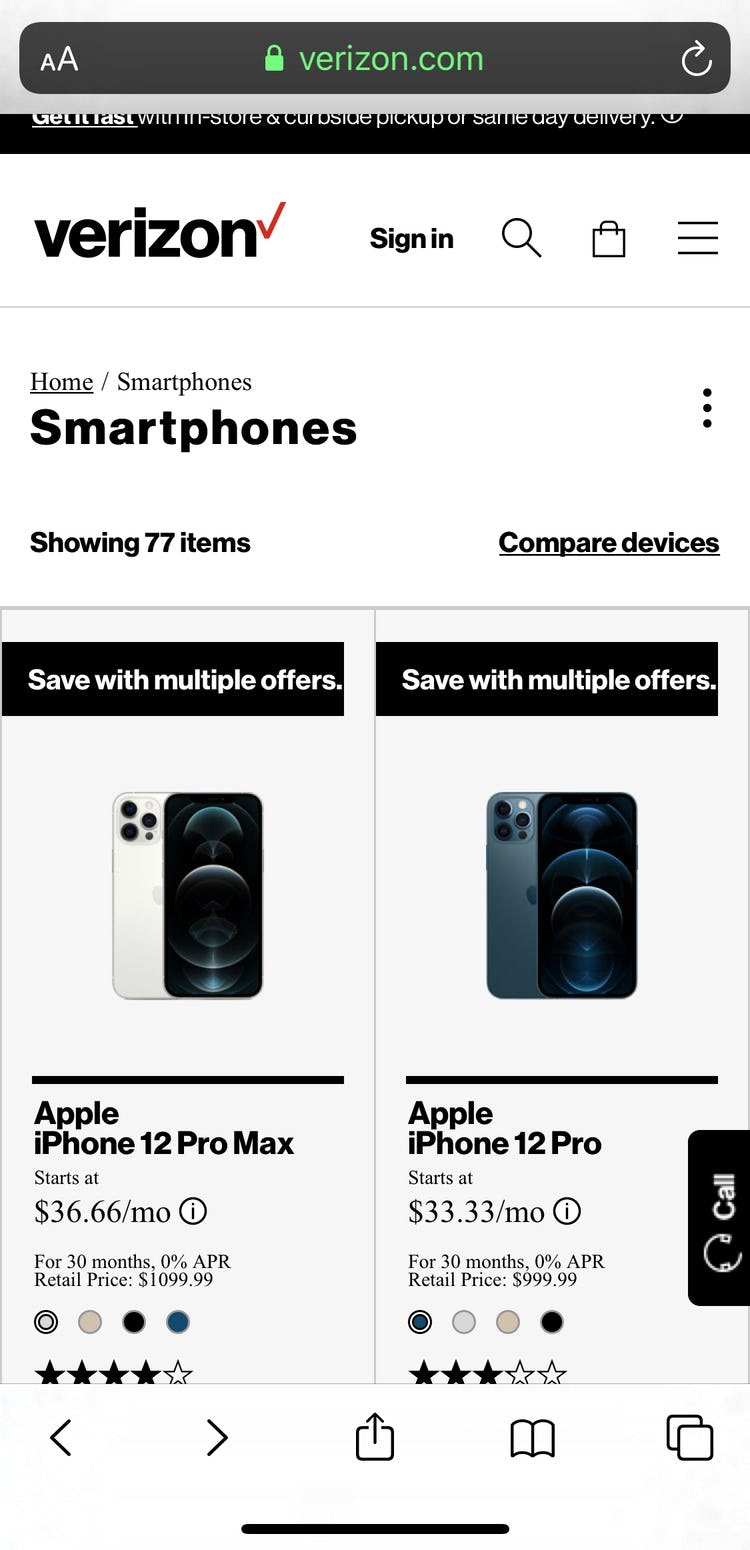
Despite making it extremely difficult for users to accurately compare specifications of their various options, every Telco product list in our benchmark opted for a “Grid View”.
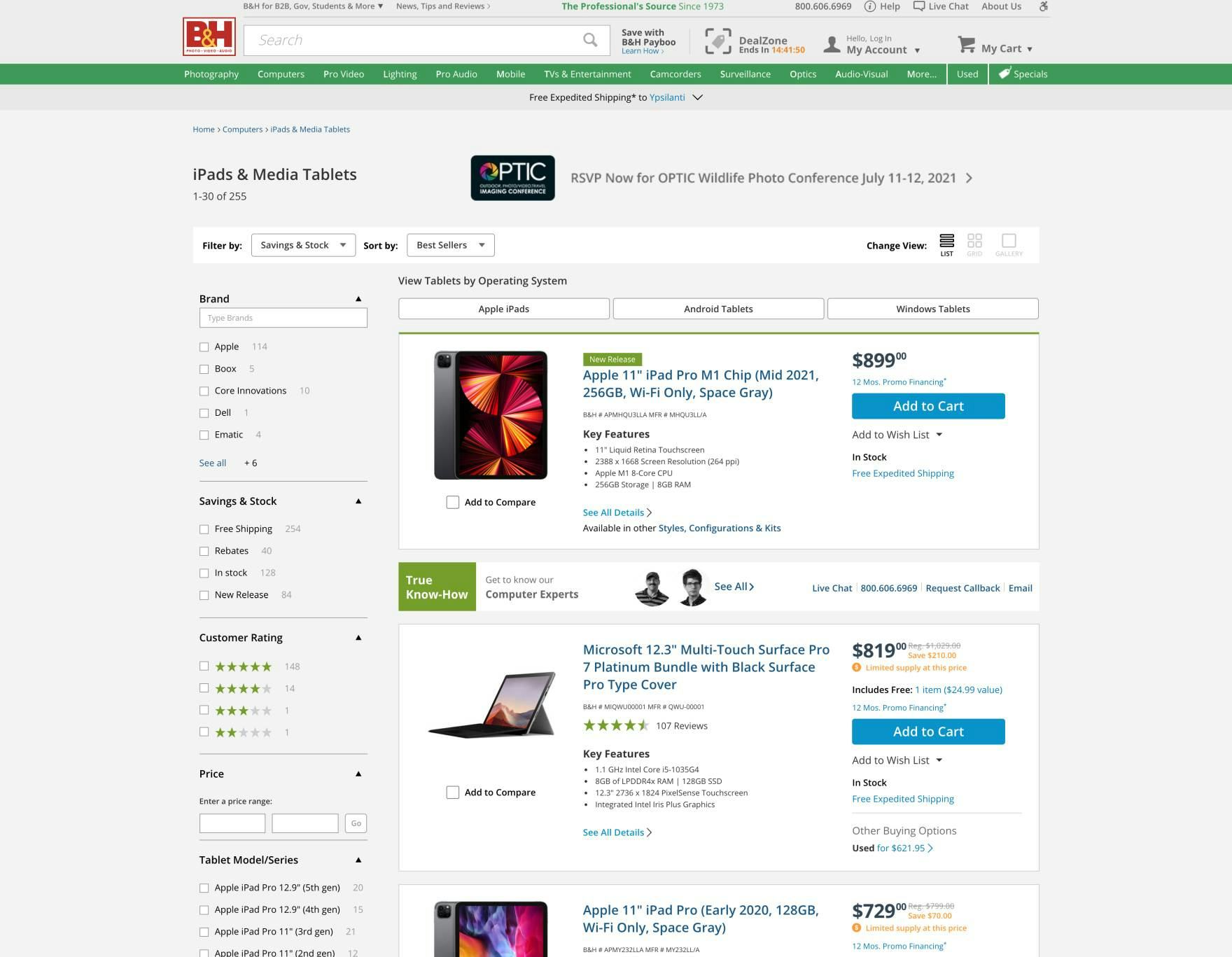
B&H Photo uses a “List View”, providing more room for category-specific product attributes and thereby reducing the need for the user to pogo-stick between the product list and product pages when trying to determine which products are of relevance and which are not.
To avoid excessive pogo-sticking, a “List View” is more appropriate for spec-driven product verticals like Telco, as the extra width allows for both horizontal and vertical distribution of the specs in each list item — affording much-needed space and structure to the many product specifications.
This enables more specs to be displayed upfront, giving users a better foundation for determining which products are of relevance and which they should skip.
7) Not Showing the Total Number of Items in the Product List
Making a decision on the usefulness of the product list depends on knowing how many items are in the current selection.
If the number of items is missing or is hard to see, users lack the information they need to take action on modifying the list.

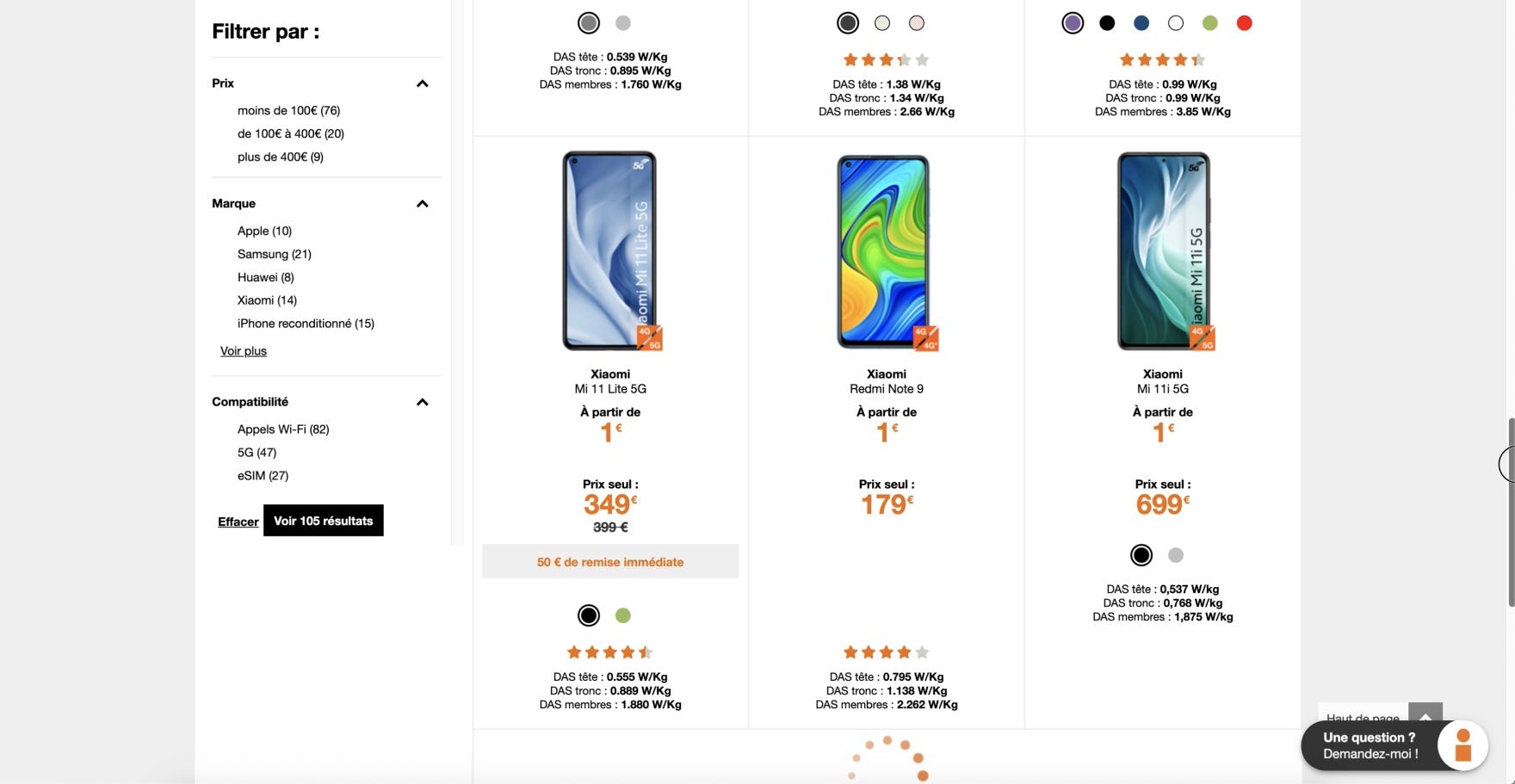
Users won’t be able to quickly judge whether the scope of this list of “Pay Monthly Phones” at Vodafone UK is too broad or too narrow because the total number of items is not displayed.
During testing, some sites didn’t show the total number of items in the product list, and as a result users were unable to quickly make judgements on the extent of the list: “Are these results too broad? Or perhaps they’re overly narrow?”.
If the total number of items isn’t displayed, many users will skip or forget to make this initial judgement of the product list, often causing them to waste time on a product list that is overly narrow or excessively broad.
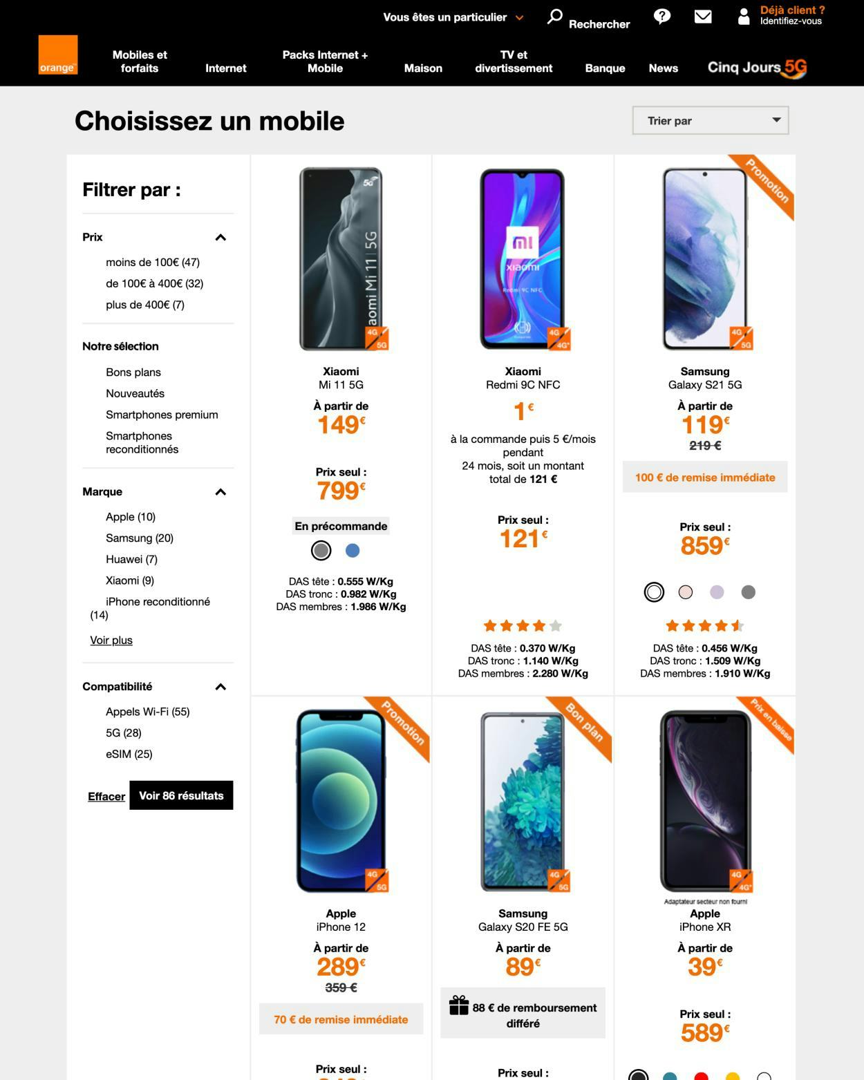
At Orange, the total number of items is displayed at the bottom of the filters. When the number of items is not easy to immediately identify, users may overlook it and make decisions based on incorrect information.
Another issue that arose during testing was that some users often overlooked the number of items displayed due to poor positioning or lack of prominence.
For example, if the number of items is placed too far away from the product list, or if the text is relatively small or styled such that it doesn’t stand out among other page elements , it can be easily missed by users who are quickly scanning the page.
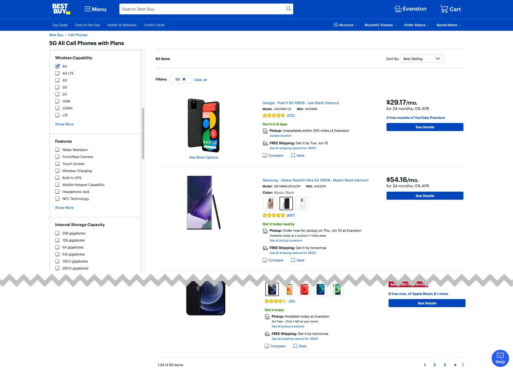
The number of items on Best Buy’s product list is easy to see. Moreover, it’s repeated at the end of the product list, at a point where users might make a decision on loading more items (although pagination should generally be avoided, as noted in #8 below).
Showing the number of items above the product list encourages users to think about whether the product list size is appropriate — or if they’re about to browse a potentially overwhelming list or just a few items.
Likewise, it’s helpful to users to have the list size repeated at the bottom of the page, so they are reminded of it before they decide whether to view additional products or try to narrow the list instead.
Moreover, size, placement, and styling of the number of items should make it easy to discern.
8) Using Inappropriate Product-Loading Methods
While there are a number of ways to load more products, testing has revealed significant issues with both the “Pagination” and “Endless Scrolling” methods that account for 100% of loading schemas in our Telco benchmark.

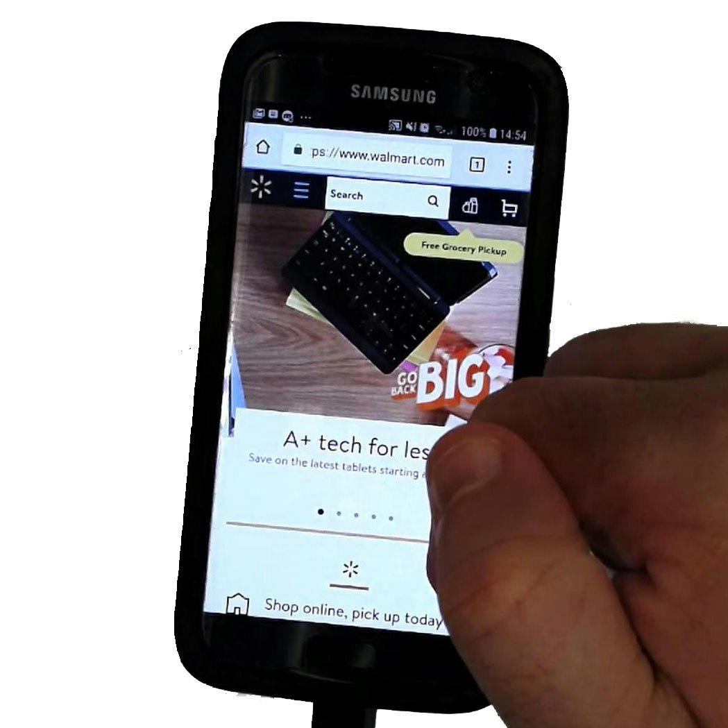
At Xfinity, the hit areas of pagination links, even on desktop (first image), can be quite small and close together. In addition to size and spacing issues on mobile (second image), slow-loading pages can also cause users to tap more than once on pagination links.
Throughout multiple rounds of e-commerce testing, users generally perceived pagination to be slow, and seeing more than a handful of pagination links would often discourage them from browsing the full product list.
Furthermore, especially on mobile sites, pagination links can be difficult to tap accurately, because they often have small hit areas and are closely spaced.
At Orange, “Endless Scrolling” makes it very difficult for users to access the site footer while also increasing the risk users will become disoriented as to their position within the overall product list. Note how upon nearing the bottom of the page (first image), additional items are automatically loaded (second image).
Meanwhile, on sites that employed “Endless Scrolling”, users were observed to scan more but focus less on individual items, experience severe difficulty accessing the footer, and become easily overwhelmed by the number of products being added.
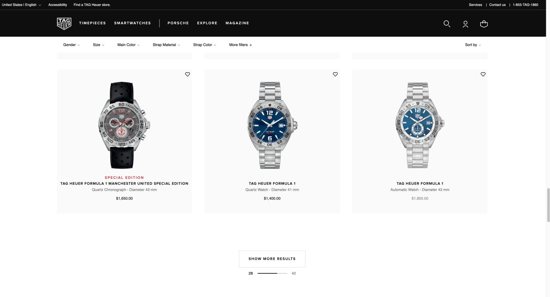
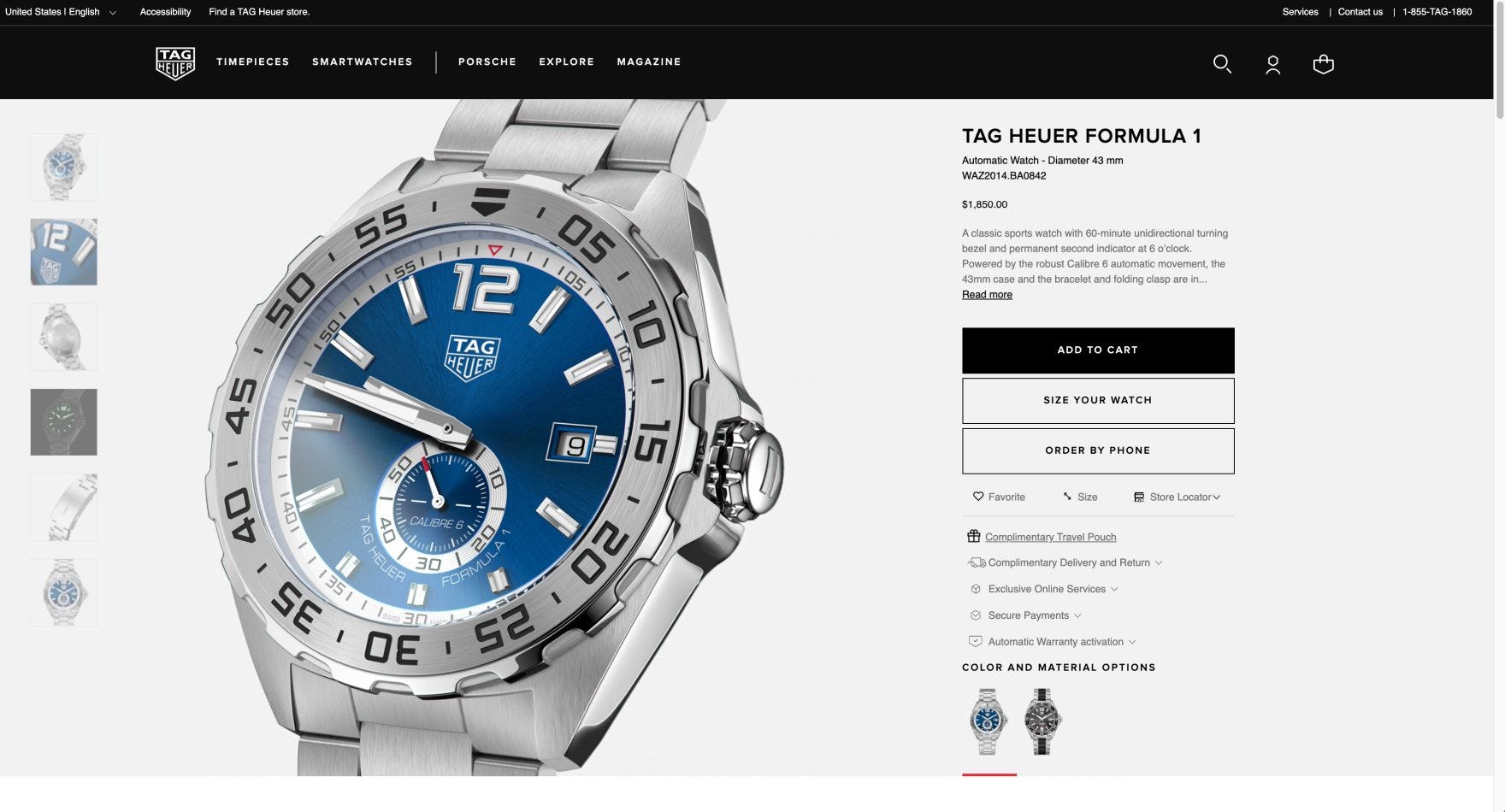
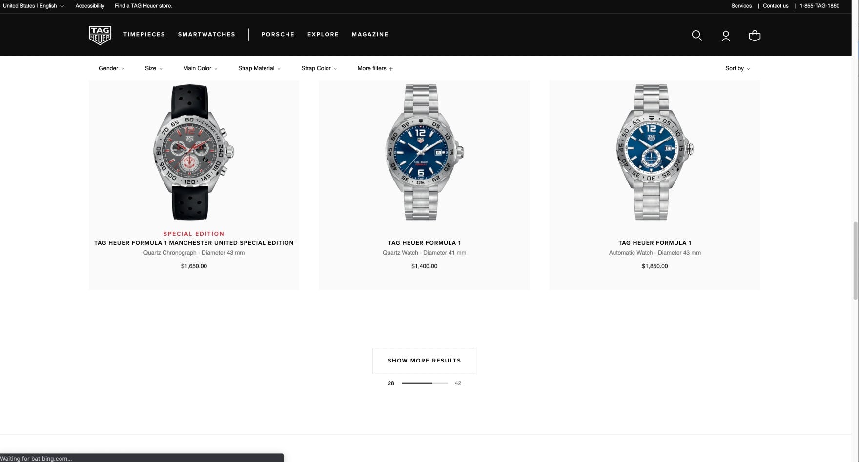
The “Load More” implementation at Tag Heuer provides a natural break in the listings (first image). Additionally, as users click the browser “Back” button on a product details page (second image), they are taken back to the correct position in the product list (third image) so that they can continue browsing. No telcom sites in our benchmark that employ the “Load More” loading schema return users to the correct place in the product list when returning from a product details page.
“Load More” proved to be the loading schema that performed best across desktop and mobile e-commerce testing, for both category-based product lists and search results. Note: Implementing the “Load More” method requires a careful consideration of the “Back” button behavior (see #9 below).
The benefits of “Load More” — simplicity, being able to access all items that have been viewed on one page, and having the footer always available — make it the best method for adding items to product lists and search results.
9) Not Returning Users to Their Previous Place in the Product List when Returning from a Product Details Page
If users have to constantly refind where they were in a product list after returning from a product page, they may not find products of interest again and will become annoyed at having to redo previous work, and could abandon.
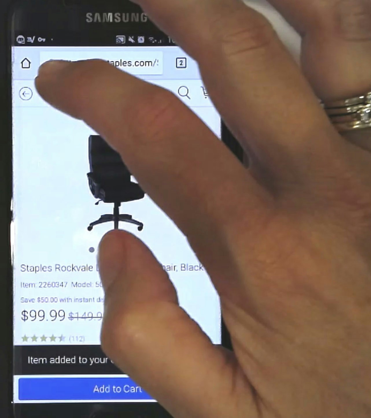
At Xfinity, users waste a lot of time refinding their previous position in the product list (first image) because when they click back into it after viewing a product details page (second image), they are redirected to the top of the page (third image) instead of where they left off.
At Verizon, mobile users have to refind their previous place (first image) after tapping through to a product details page (second image), because they are returned to the top of the product list (third image) when they tap the browser “Back” button. Excessive page load times, in addition to having to refind the product last tapped on the product list, can make it quite an ordeal for mobile users to move back-and-forth between product lists and product pages.
During testing, when users scanning a product list found an item of interest, they would visit the product page for more details. However, if when users clicked back into the product list they were not taken to where they were previously in the list, they were unable to resume scrolling downwards knowing that they had already viewed the products above.
Instead, users had to scroll to find the product they just investigated and then restart scanning items from that point.
This extra step of refinding the correct place in the product list caused severe problems, particularly for mobile users — because scrolling is often slower and more cumbersome, fewer items can be seen in the viewport at once, and page load times can be excessive.
On the other hand, when sites return users to the correct place in the product list, product finding becomes more efficient.
Users can resume browsing immediately on returning to the list and their time won’t be wasted refinding the item they last viewed.
10) Failing to Provide Basic Sort Options
If a site fails to offer the right sort type options, some users will have a more difficult time finding the products they most want to see.
At Vodafone UK, the absence of sort options offered on the desktop site (first image) and mobile site (second image) make it much more difficult for users to find relevant products.
During testing, we observed 4 product list sort types that were most commonly sought out by users: “Price” (both “low to high” and “high to low”), “User Rating”, “Best Selling”, and “Newest”.
In the absence of relevant sort types, users who are interested in particular attributes must either find a way to use available filters to approximate their desired product list — risking that they exclude potentially relevant products — or sort through the product list manually to pick out products that might meet their criteria.
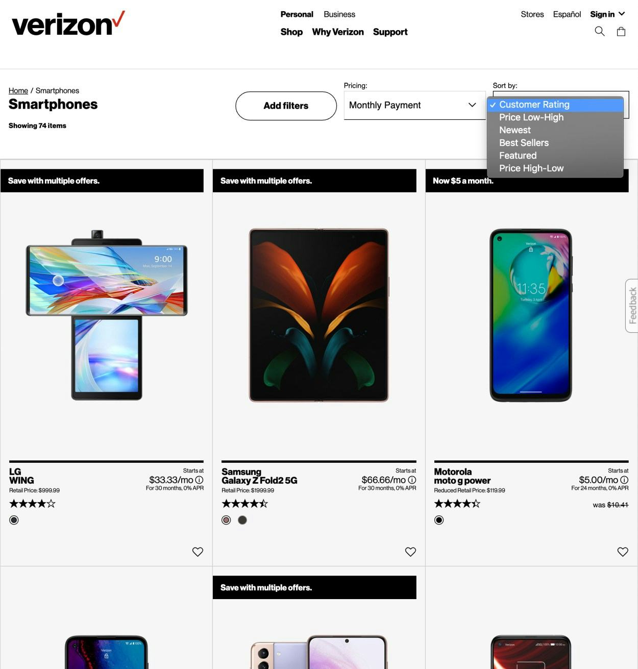
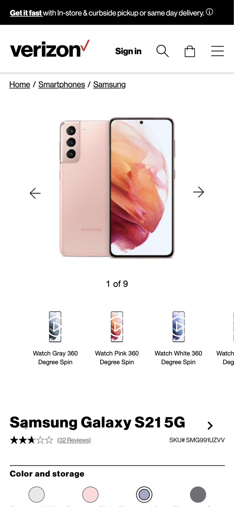
Verizon offers the 4 key sort types on desktop (first image) and mobile (second image). Sorting provides the user with a “soft” boundary by listing all available products ranked according to an attribute that is most relevant to them.
Therefore, always offer “Price” (both “low to high” and “high to low”), “User Rating”, “Best Selling”, and “Newest” for product lists.
These 4 key sort types, combined with a diversity-based “Relevance” default sort, will likely meet the needs of the majority of users, allowing them to rank product lists according to the most popular product attributes.
Of the benchmarked sites, Orange performs better overall with some filtering options and a grid design that includes most of the necessary information. That said, Orange still violates more than half of the guidelines in this area, indicating significant room for improvement.
Telco Device Page, Product Page & Plan Matrix

Aligning with traditional e-commerce paths, users arriving at a Telco device or product details page need support in determining whether that particular product suits their needs.
However, once users have assessed a specific device or product and are interested in purchasing it, Telco sites introduce a layer of complexity that is uncommon to traditional e-commerce — users then have to decide on the subscription or plan that comes with the device.
The average telco site performs mediocre when it comes to device and product pages, and 4 issues in particular negatively impact the performance.
11) Using Horizontal Tabs as the Product Page Layout
In an effort to organize large amounts of information, many telco sites opt for a “Horizontal Tabs” layout for their product pages, which unfortunately contributes to discoverability issues, causing users to lose out on vast sections of crucial product information.
Of the four dominant layout types for product details pages within e-commerce, having a “Horizontal Tabs” layout proved during testing to be the worst-performing layout and navigation pattern — regardless of the tested industry and product type.
Besides the issue of a subgroup of users overlooking the tabs, horizontal tabs were also observed to have a number of issues regarding the titling of the tabs, including lack of sufficient information scent and misinterpretation.
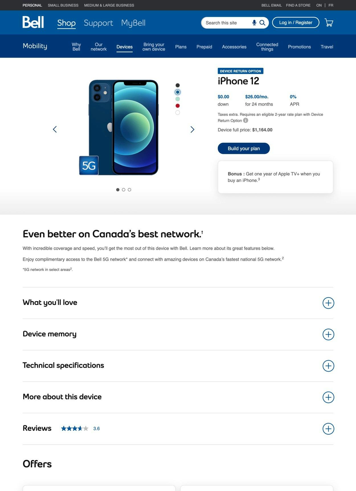
“Vertically Collapsed Sections”-layouts, as seen here at Bell, provide users a good overview of the product page sections, without suffering from having a subgroup of users overlooking content.
Due to a significant subgroup of users overlooking horizontally tabbed content entirely, along with the many title-related issues, e-commerce sites should generally avoid horizontally tabbed interfaces.
Instead, sites should employ one of the two main product page layout alternatives — “One Long Page with a Sticky TOC” or “Vertically Collapsed PDP Sections” — observed to perform well during testing.
12) Not Providing Sufficient Resolution and Levels of Zoom for All Product Images
Users need to see crucial product details to fully visually inspect products, and if they’re unable to, they may abandon an otherwise suitable product.
At Xfinity, the lack of Zoom makes it impossible for desktop users to see fine details of products. Users need to see crucial product details to fully visually inspect products, and if they’re unable to they may abandon an otherwise suitable product.
At Bell, clicking on the product image to view it in detail often produces an even smaller image. The absence of zoom even when a larger image renders properly risks product abandonment.
During multiple rounds of testing, we repeatedly observed users relying on their ability to zoom in on images as their primary means to better understand fine visual details.
However, when users feel unable to get a sense of small but important visual aspects of a product, they will lack confidence that the product has the specific features and overall quality they need, which could lead them to abandon the product.
Nevertheless, 80% of the telco sites benchmarked fail to provide images with sufficient levels of zoom.
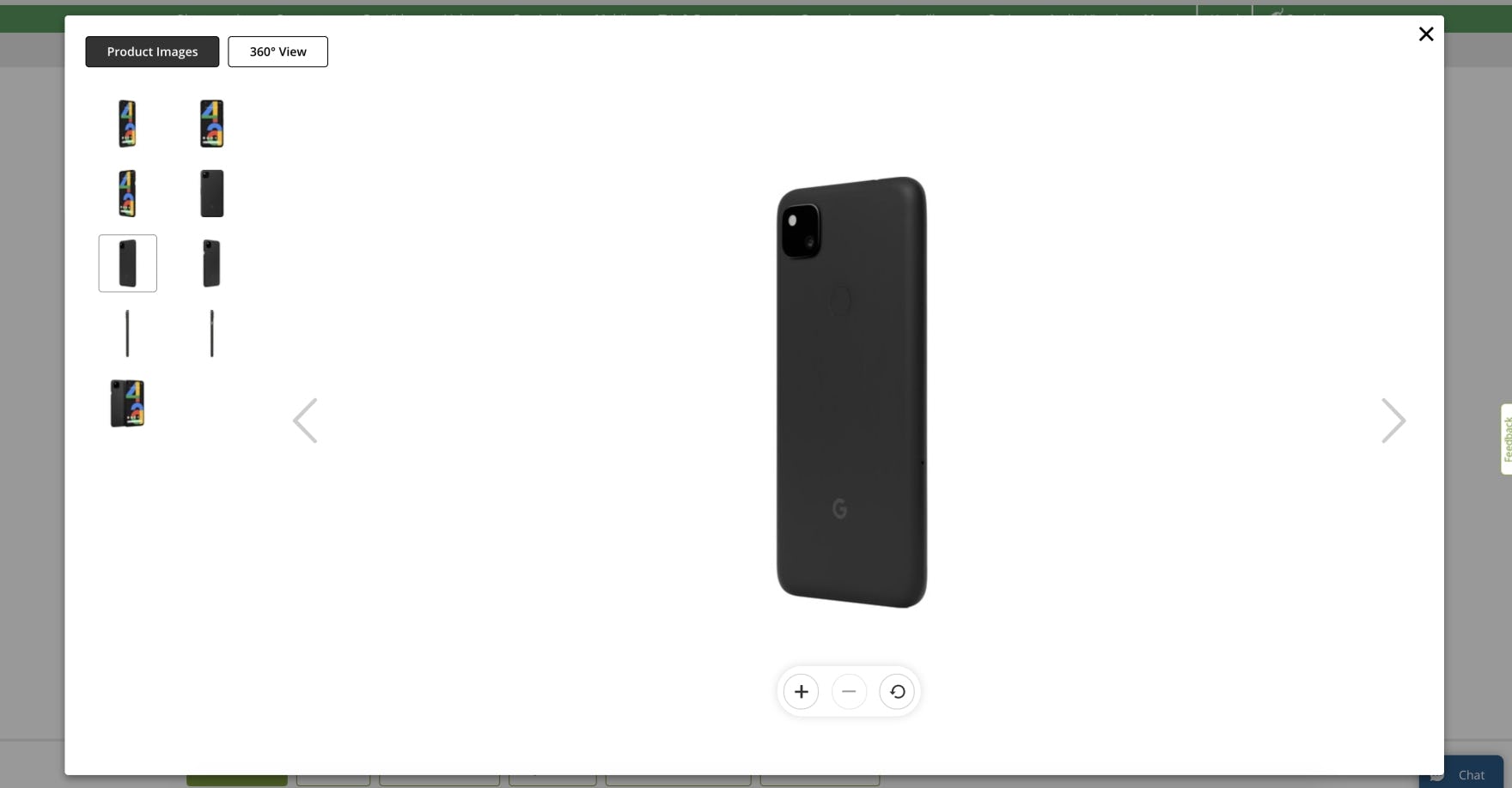
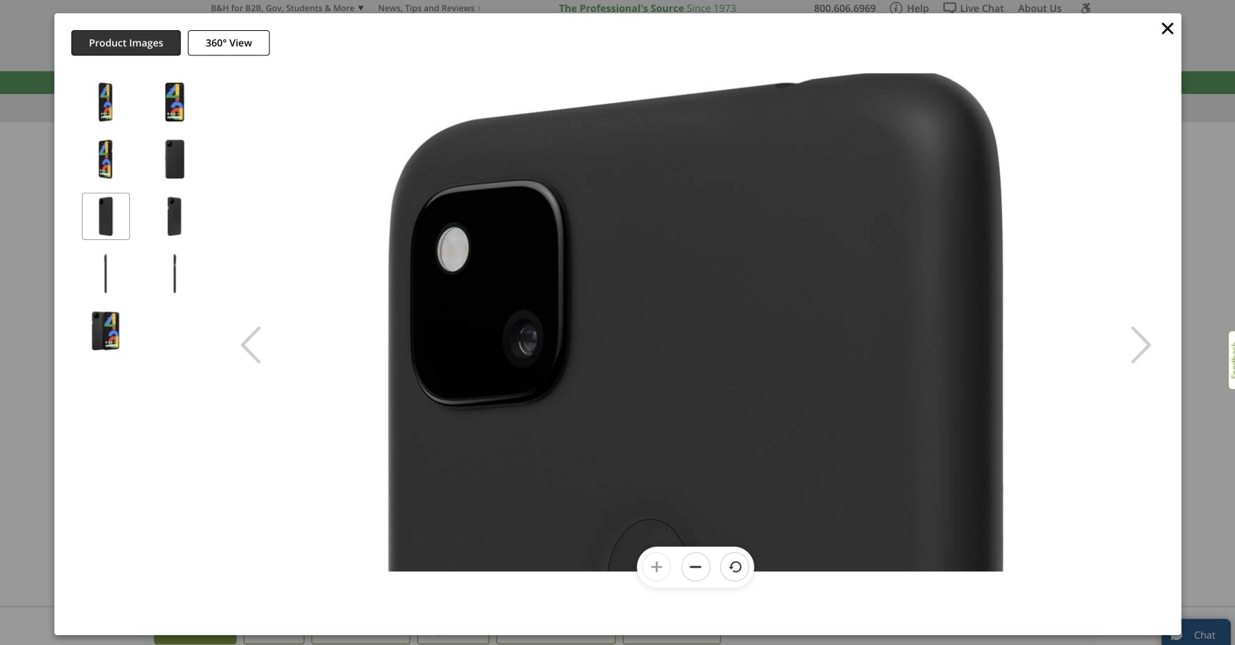
At B&H Photo, the high-resolution images for a mobile phone (first image) ensure users get a rich visual sense of a product when they zoom in (second image), which is crucial to most users’ product-exploration strategy.
Whether on desktop or mobile, high-resolution images and decent levels of zoom increase the attractiveness of products to users.
Users will have a better sense of a product from such images, which is critical when buying products on the web to help replace the tactile information that’s lost compared with shopping in a physical store.
Sites that consistently have high-quality product images provide a more polished and professional experience, and users are more confident purchasing products when they feel like they’ve had the chance to sufficiently visually investigate them.
13) Not Explaining or Defining Spec Sheet and Plan Matrix Features
For users that lack a lot of domain knowledge as well as for those who don’t know exactly what they are looking for, domain and industry jargon in specification sheets and the plan matrix can be more problematic than helpful as they try to find and understand basic product and plan information.
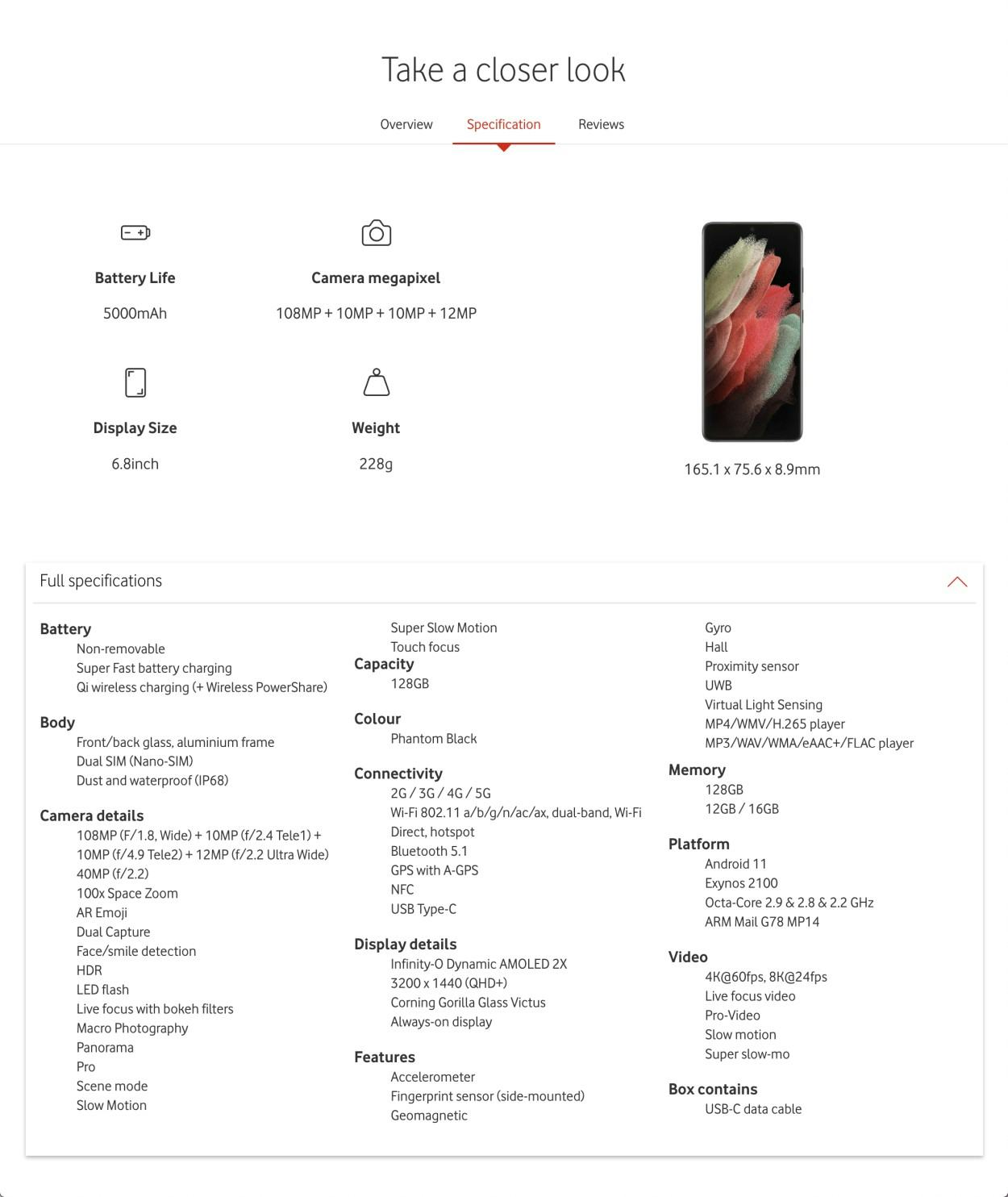
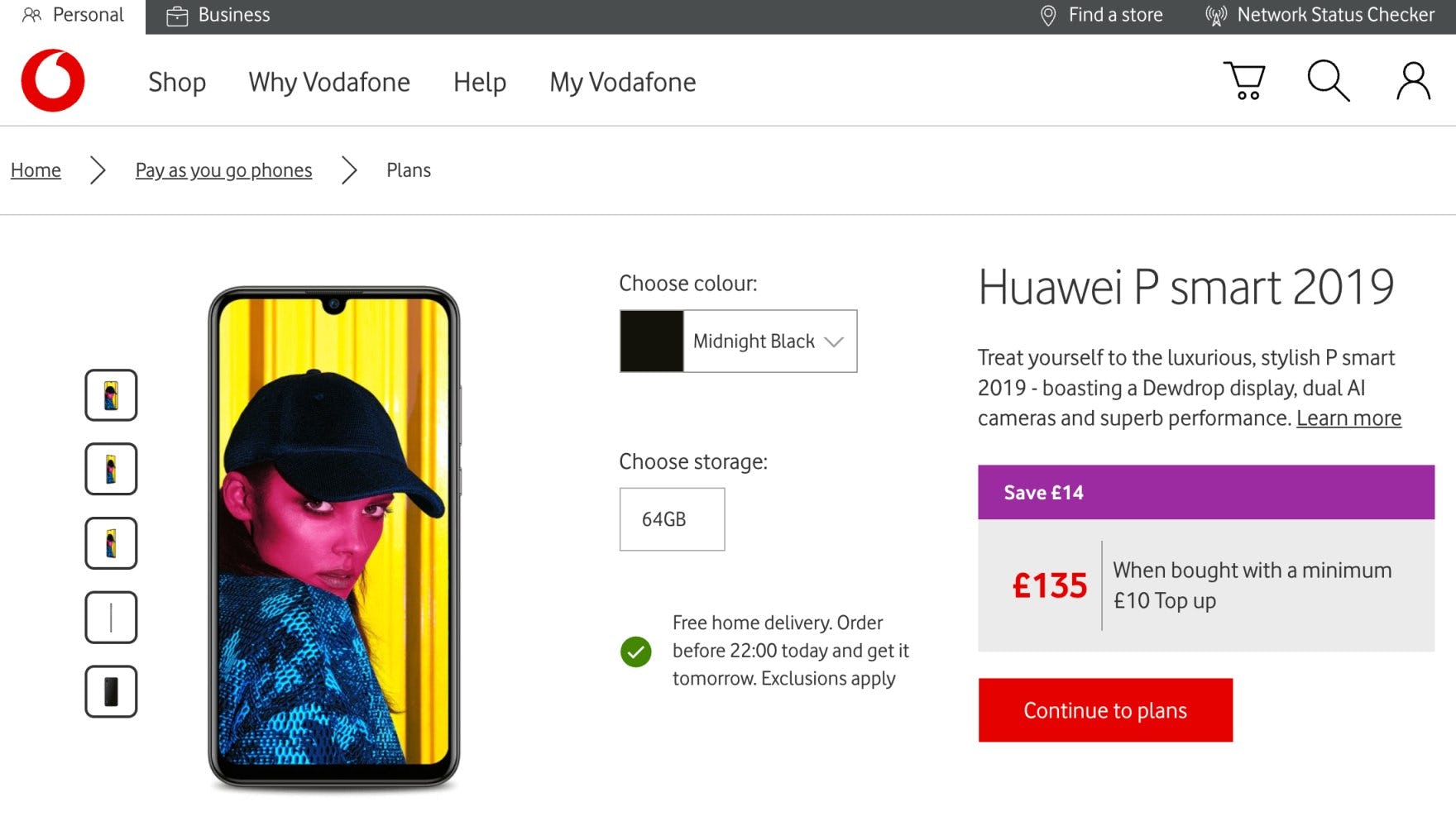
Some users may not readily understand all of the technical specifications for camera and display details, connectivity, and video at Vodafone UK, making it unnecessarily difficult to compare and determine if the current mobile device is most suitable to meet their needs.
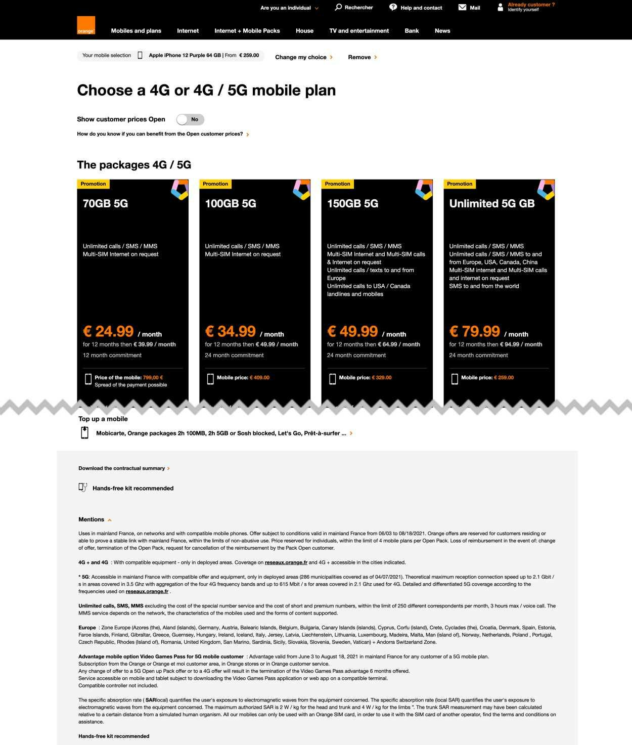
In this example at Orange, explanatory content is provided for less than 25% of the features in the plan matrix. Moreover, the content is provided in small-sized text at the bottom of the page. Even users with technical or industry knowledge may be unable to immediately grasp some industry- or brand-specific jargon and thus will not fully understand the benefits of all the features offered for a particular plan.
During e-commerce testing, when the verbiage used in specification sheets was not fully understood — or not recognized at all — novice users were either unable to take the product detail into account or went off-site to research what its meaning and impact was.
Of course, as soon as users are off-site, there’s a chance they will not come back, and during testing some users ended up on competing sites in their specification-research process.
Similarly, our Digital Subscription Services study revealed that users who cannot easily decipher or, minimally, confirm the meaning of any one of the plan matrix page features will ultimately lack the necessary information to make a fully informed and confident decision about which plan will best meet their needs, and will consequently drop the site from consideration.
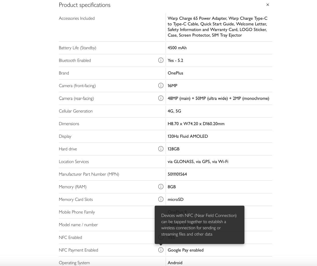
This spec sheet for a mobile phone at John Lewis includes tooltips for several technical device specifications, allowing users to easily get a more detailed explanation of many of the terms they are unfamiliar with, without having to leave the product page. However, providing tooltips for all potentially unfamiliar terms would ensure all users are supported.
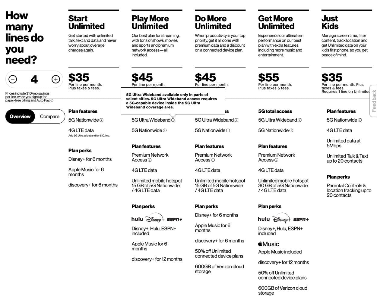
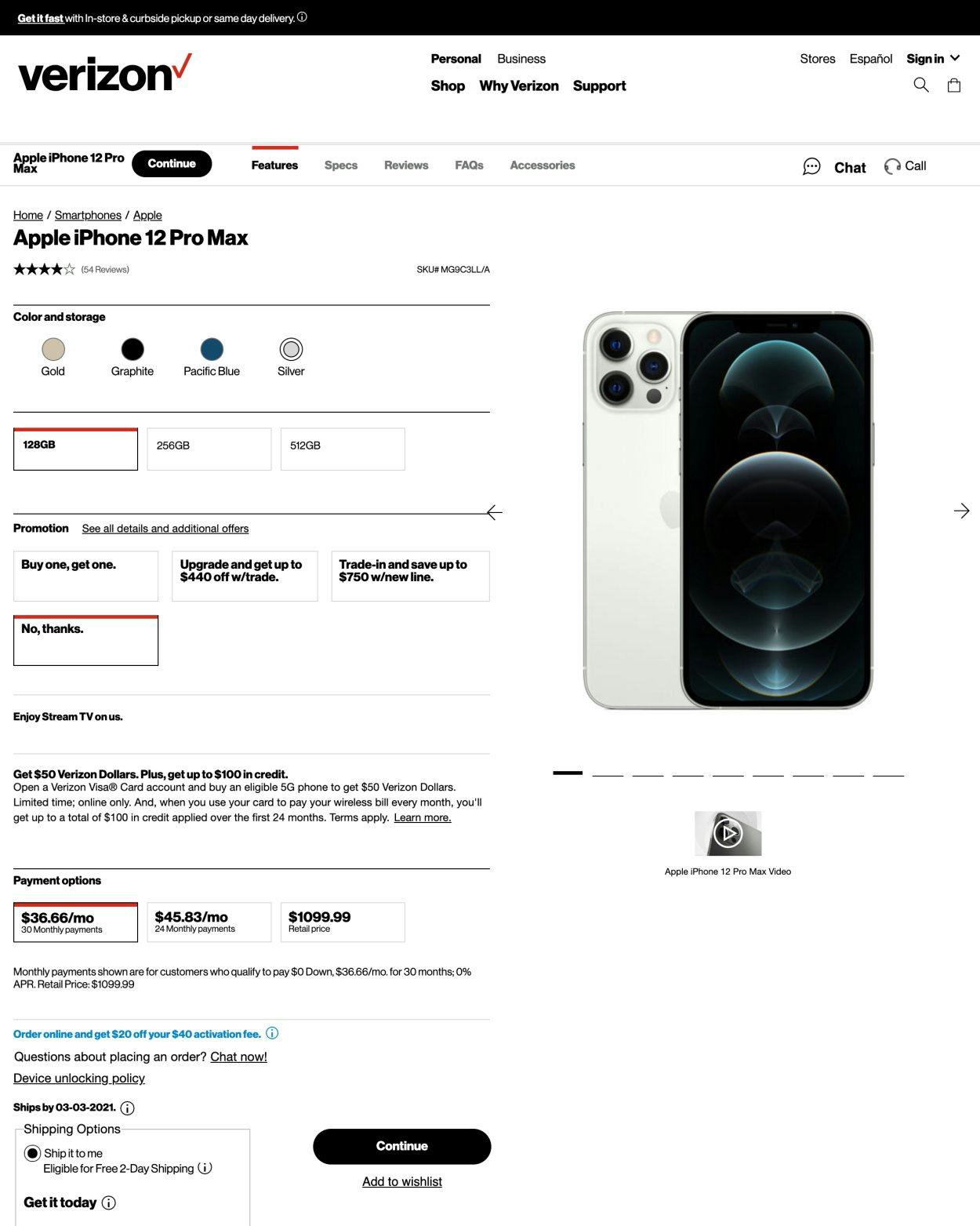
Similarly, the plan matrix at Verizon provides tooltips for plan features such as “5G Ultra Wideband” that may be difficult for novice users to understand. However, it assumes novices users understand other features like “4G LTE data”.
Given the disruption and distraction that the uncertainty about any one device or plan feature can cause to the evaluation and comparison process, it’s critical to explain or define all spec sheet and plan features that use any industry terminology, or where the feature or its label’s meaning isn’t self-explanatory.
14) Failing to Provide an Estimated Delivery Date Near the “Buy” Section
Many users don’t want to wait until checkout to know when they’ll receive their order.
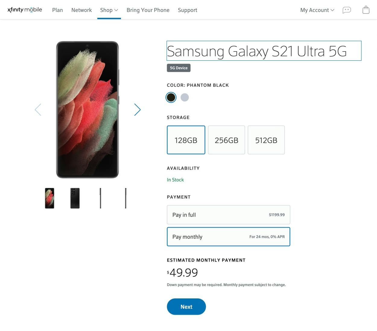
At Xfinity, users are informed that the item is “In Stock” but are not provided with any shipping information. Consequently, users are forced to proceed to checkout to learn how soon the order can arrive.
For users who have an immediate need for a product, it’s essential for them to know how soon the order can arrive — and in testing it was clear that users expect to be provided with this information as early in the process as possible, in many cases on the product details page.
Moreover, when only a delivery speed is provided users are forced to halt their product search to mentally calculate when they could actually expect to receive their product.
In other words, when users must make these calculations themselves, not only do they have to mentally struggle to understand the numerous factors that contribute to when their product will arrive, but they may end up being disappointed when it turns out their expectations were wrong and their products arrive later than expected.
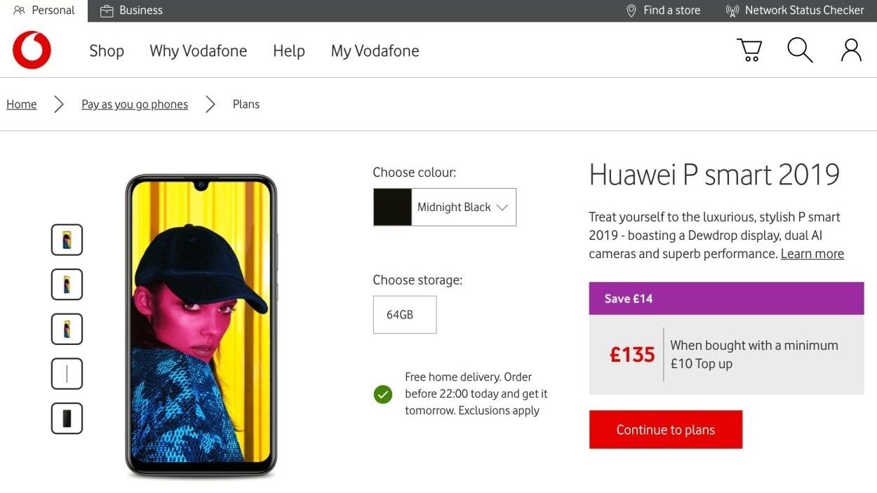
At Vodafone, an order cutoff time is provided so users know when they need to complete their order by to get the provided delivery date of the following day.
Therefore, specific shipping information, in the form of an estimated delivery date (not delivery speed) should be provided near the “Buy” section on the product details page.
When provided with a delivery-date estimate, users don’t have to be concerned about whether they should factor in order-processing time and how long that is, the current weekday of ordering, if there are any holidays ahead, if any of the available delivery methods deliver on Saturdays, or if the site’s internal cutoff time for processing orders has passed or not.
Additionally, consider embedding a delivery-date estimator tool (where users can enter their address information) to allow for a more accurate delivery-date estimate, and consider providing the order cutoff time as a countdown so users are aware of the condition for the delivery date estimate.
For inspiration in this area, look to Vodafone and Verizon, which feature strong imagery and video, well-designed product highlights, comprehensive specs, and helpful user reviews.
Telco Mobile Web

The average Telco site has a poor UX performance in the Mobile e-commerce area.
In addition to the issues listed below, many of the broader structural issues around search, product lists, and product pages present on the desktop site also filter down to the mobile site, with stronger implications due to the reduced viewport and more challenging interactivity for users.
15) Not Providing “Hierarchy” or “History” Breadcrumbs
Breadcrumbs perform a lot of heavy lifting on mobile sites, where users can quickly feel lost — or stuck.
Without “Hierarchy” breadcrumbs, it’s needlessly difficult for users to confirm their current location at Orange or move on if, upon closer inspection, the specific product isn’t relevant.
At Verizon, the “Hierarchy” breadcrumbs allow users to navigate more efficiently, with fewer taps than would be required to navigate via the main navigation menu. However, without a “Back to results” breadcrumb link on the product details page, users lack obvious and intuitive one-tap access to the previous page.
Our mobile testing confirms that users rely heavily on breadcrumbs on mobile sites for two reasons.
First, mobile users’ current location in the site hierarchy is much less evident due to the main navigation typically being hidden.
Second, navigating via the main navigation menu on mobile often requires more effort compared to desktop, where the main navigation is permanently visible, and users can typically access categories — and even subcategories if hover navigation is offered — with a single click.
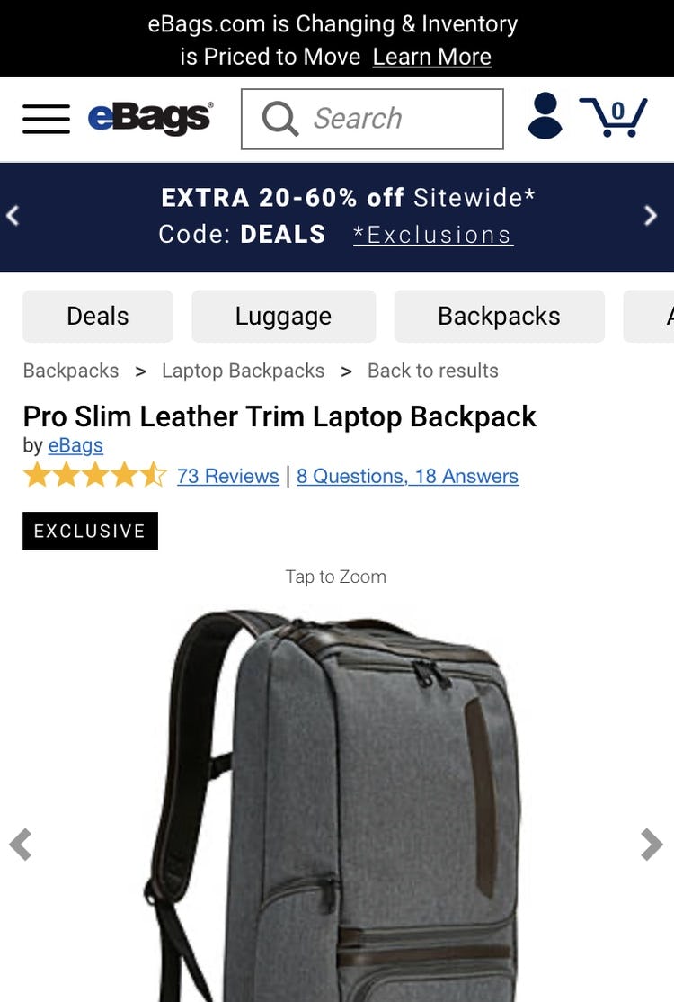
eBags provides both “Hierarchy” and “History” breadcrumbs on mobile, achieved in part by excluding unnecessary hierarchy layers representing the homepage and the current product details page. The “Back to results” link appended to the “Hierarchy” breadcrumbs takes users back to their previous product list with all filters retained. Note, none of the sites included in our telco benchmark provide both “Hierarchy” and “History” breadcrumbs on product pages.
Therefore, “Hierarchy” and “History” breadcrumbs should always be provided on product pages.
“Hierarchy” breadcrumbs can work especially well for users who access the product details page in a nonlinear fashion, but they also benefit users who access the product details page in a linear way by confirming their location within the overall site structure and supporting seamless navigation to higher levels of the hierarchy.
At the same time, “History” breadcrumbs allow users to easily take “one step back” to return to search results or a product list with filters and sort options intact, while at the same time reducing user anxiety that they’ll lose their previous changes.
16) Failing to Use Thumbnails to Represent Additional Product Images
Images are tremendously important to users’ product-browsing behavior; yet, only one of the mobile sites in the Telco benchmark uses thumbnails to represent additional product images.
At Vodafone UK, thumbnails are used to represent product images on desktop (first image), but not on mobile (second image), making it unnecessarily difficult for mobile users to tap on or find the images they are interested in.
During testing, we observed that only using indicators or text to represent the existence of additional product images caused severe interaction and orientation issues for mobile users.
For example, when users attempted to navigate the image gallery, the tiny and closely spaced hit areas of indicators often resulted in accidental taps.
Additionally, without adequate information scent, users have a more difficult time finding the particular image they need to answer their questions or complete their understanding of the product. Users must swipe or tap through the entire carousel of product images rather than directly navigating to specific images of interest.
For many mobile users, fatigue can set in before all product images have been explored — again, resulting in a wasted opportunity.
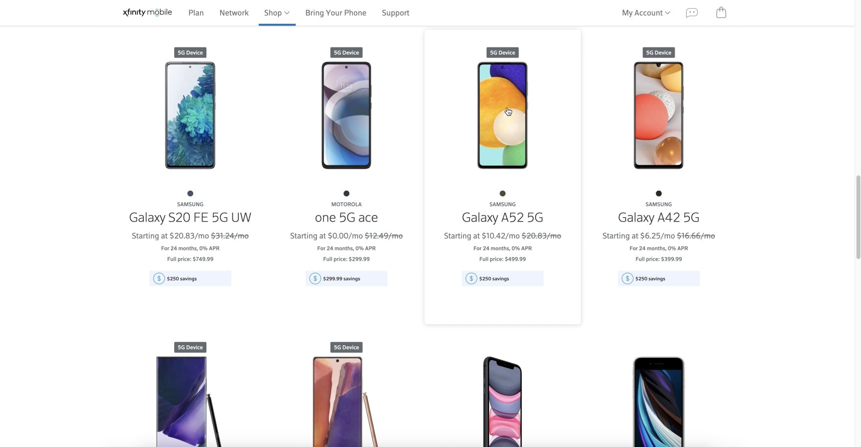
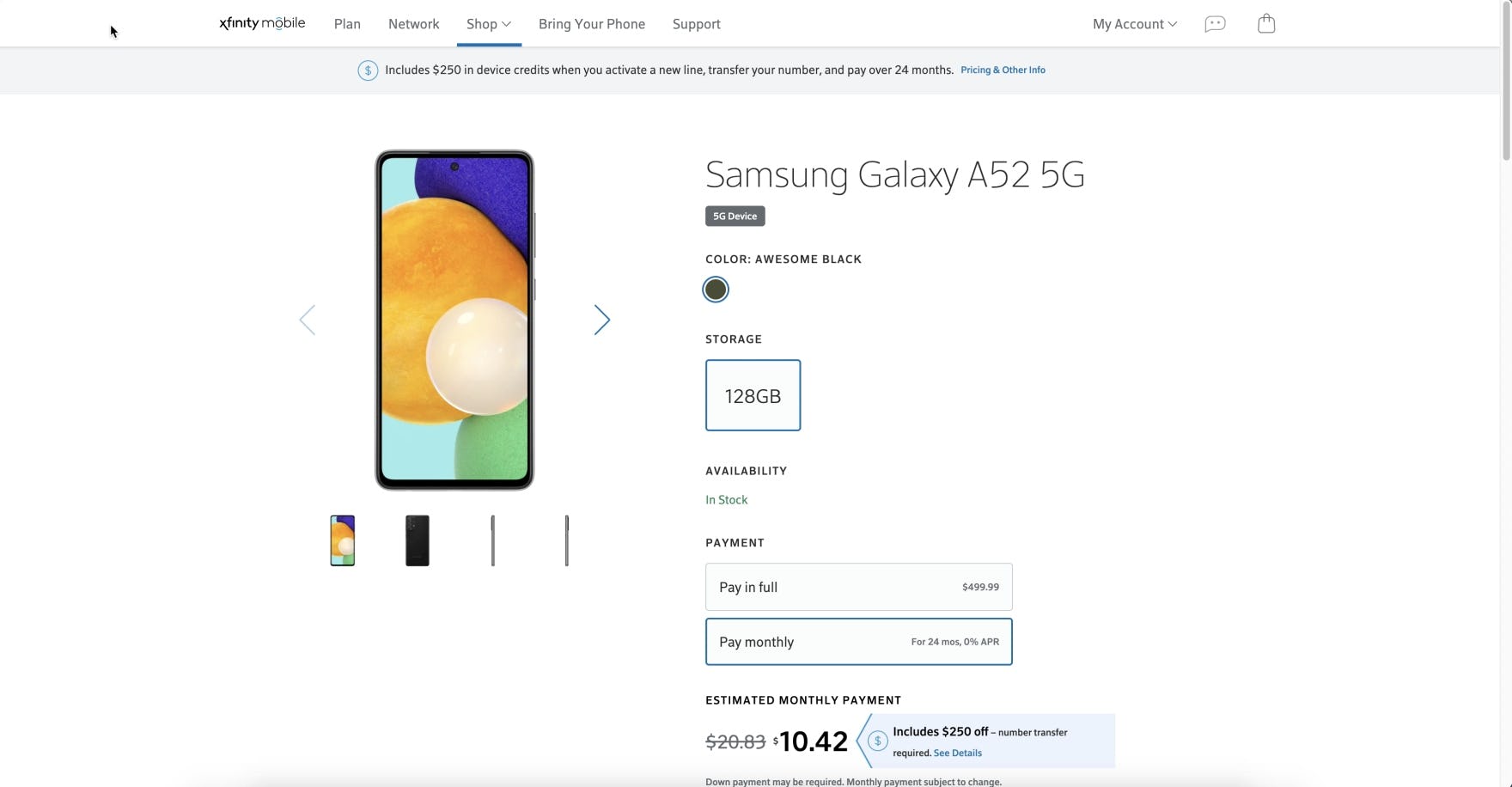
At Xfinity, immediate access to thumbnails on both desktop (first image) and mobile (second image) allows users to preview the array of images available and navigate directly to those they want to view.
Regardless if all the product thumbnails are located directly on the product page, are truncated on the product page, or if an overlay is used to display the additional product images, using thumbnails to represent product images results in enhanced visibility.
Additionally, thumbnails help to prevent hit area issues common among gallery indicators, providing clear and unambiguous access to additional images.
17) Having Excessively Tall Horizontal Scroll Areas
Navigating mobile sites will likely never be a completely smooth or error-free experience for users.

During testing, horizontally scrollable content sometimes led to minor scroll-hijacking interruptions, where users scrolled the horizontally scrollable content while intending to vertically scroll the webpage instead.
Of course even minor interruptions can drag down the overall user experience if they’re frequent occurrences, or if they occur in combination with other, more serious issues.
Additionally, the height of the horizontally scrollable content matters because content that takes up most of the viewport is more likely to hijack a user’s scrolling compared to content that takes up a smaller portion of the viewport.
For example, a carousel that takes up the entire viewport must be touched by almost all users who wish to scroll down the page, and at least some of these users will unintentionally scroll the content horizontally while trying to scroll down the page instead.

The height of this horizontally scrollable content section on the homepage at Vodafone UK is not more than 50% of the vertical viewport, reducing the risk of “scroll-hijacking” issues.
To address this issue, content that isn’t crucial to most users — ads, extended product descriptions, cross-sells, and other secondary content — shouldn’t be excessively tall (e.g., more than 50% of the vertical viewport) when implemented as horizontally scrollable content.
Of the benchmarked sites, Bell’s mobile site performs best, but remains in a mediocre state with substantial room for improvement.
Simplify the Decision-Making Process for Telco Users
This high-level analysis of the Telco UX focuses on only 4 of the 52 Telco Industry subtopics (plus Mobile Web) included in our Benchmark Analysis. The 48 other subtopics should be reviewed as well to gain a comprehensive understanding of Telco Industry UX, and to identify additional site-specific issues not covered here.
Although our Telco Industry benchmark has revealed that no sites have a completely broken UX, it’s clear that there’s much room for improvement, as no sites perform decent or even acceptable when it comes to overall desktop and mobile performance.
Avoiding the following 17 pitfalls is the first step toward improving users’ Telco website experience:
- Hiding Product Categories within a Single Navigation Item
- Carousels Are Implemented Incorrectly
- Poor Support for Product Type Searches
- Poor Support for Exact Searches
- Failing to Persist the User’s Search Query on the Results Page
- Failing to Use a List View Layout
- Not Showing the Total Number of Items in the Product List
- Using Inappropriate Product-Loading Methods
- Not Returning Users to Their Previous Place in the Product List when Returning from a Product Details Page
- Failing to Provide Basic Sort Options
- Using Horizontal Tabs as the Product Page Layout
- Not Providing Sufficient Resolution and Levels of Zoom for All Product Images
- Not Explaining or Defining Spec Sheet and Plan Matrix Features
- Failing to Provide an Estimated Delivery Date Near the “Buy” Section
- Not Providing “Hierarchy” or “History” Breadcrumbs
- Failing to Use Thumbnails to Represent Additional Product Images
- Having Excessively Tall Horizontal Scroll Areas
For inspiration on other sites’ implementations and to see how they perform UX-wise, head to the publicly available part of the Telco benchmark. Here you can browse the Telco Website implementations of all 5 benchmarked sites.
Getting access: all 404 Telco Website UX guidelines are available today via Baymard Premium access. (If you already have an account open the Telco study.)