Key Takeaways
- Our benchmark of 5 online Grocery sites shows that Grocery sites have a generally poor-to-mediocre UX
- In particular, Cart & Checkout performs especially poorly
- The 12 common UX issues discussed in this article can be a direct cause for users abandoning Grocery sites
Shopping online for groceries has quickly grown from a niche curiosity to a regular habit for many (especially during the COVID-19 pandemic).
With that, online Grocery sites have had to design experiences that meet the needs of many new users.
While online Grocery sites may at first glance appear similar to traditional e-commerce sites, an important difference is a user’s increased frequency on Grocery sites and, subsequently, potential for long-term loyalty.
With fresh produce items needing to be ordered regularly on a weekly basis, users have a tendency to use a particular Grocery site with much greater regularity than, say, an apparel or electronics site.
However, to become a long-term user, a user has to find their first initial site interactions satisfactory. Otherwise, if they’re initially underwhelmed by the site performance, users may look elsewhere to find a site that better accommodates their needs and saves them time.
Indeed, as the number of brick-and-mortar Grocery stores that are beginning to offer their goods online increases, users will have more opportunity to find a better experience at a competing site.
With that in mind, to begin to assess how Grocery sites stack up when it comes to the e-commerce user experience, we’ve recently published a new in-depth Grocery UX Benchmark.
This database contains UX performance rankings for 5 new Grocery sites: Albertsons, Peapod, FreshDirect, Ocado, and Sainsbury’s.
These sites have been manually assessed by Baymard researchers across 380+ research-based UX parameters relevant for Grocery sites, resulting in 1,930+ weighted UX performance scores exclusively for Grocery sites. Additionally, the database contains 1,550+ best-practice examples from leading Grocery sites.
In this article we’ll analyze this dataset to provide you with an overview of the UX performance of Grocery e-commerce, and outline 15 common design pitfalls and strategic oversights applicable to most Grocery e-commerce sites.
This article is divided into the following 6 sections:
- Grocery UX Performance Overview
- Grocery Homepage and Category Navigation
- Grocery On-Site Search
- Grocery Product Details Pages
- Grocery Cart and Checkout
- Conclusion: Help Grocery Users Transition to Repeat Visitors
Grocery UX Performance Overview
For this analysis we’ve summarized the 1,930+ Grocery usability scores across the 36 topics and plotted the 5 benchmarked Grocery sites across these in the scatterplot above. Each dot, therefore, represents the summarized UX score of one site across the 4–33 guidelines within that respective topic. The top row is the total Grocery site UX performance.
Our Grocery benchmark database reveals that all Grocery sites have an “poor” or “mediocre” UX performance.
This falls short of e-commerce UX performances in general, which have an average “mediocre-to-decent” performance.
Drilling down to specific e-commerce themes, we see that Grocery sites performed the worst in Cart & Checkout and Mobile E-Commerce, with most sites having a “poor” performance.
Perhaps surprisingly, almost all Grocery sites also performed “poor” in Homepage & Category Navigation — an area of e-commerce where most of the other e-commerce sites in our benchmark tend to perform at a “decent” level.
The range of performance for the other themes — On-Site Search, Product Lists & Filtering, Product Page, and Customer Accounts — was quite wide, with sites performing from “poor” all the way to “good” for a few of the sites.
Clearly, Grocery sites have a ways to go to ensure their users are having even a “decent” experience.
In this article, we will focus on the Homepage, Search, Product Lists and Filtering, Product Page, and Cart & Checkout areas of Grocery e-commerce UX design.
Grocery Homepage and Category

Within Grocery Homepages and Category Navigation, the average site performs “poor”.
For users looking to browse for products via a more traditional category-driven strategy, they will have a difficult time, with cumbersome navigation options and an often overwhelming categorization structure that puts users in scopes that are either overly narrow or too large, with very little of the guidance and support that is commonly found on other traditional e-commerce sites.
While there are many potential issues to discuss, the two below were found to be particularly detrimental to the Homepage and Category Navigation user experience.
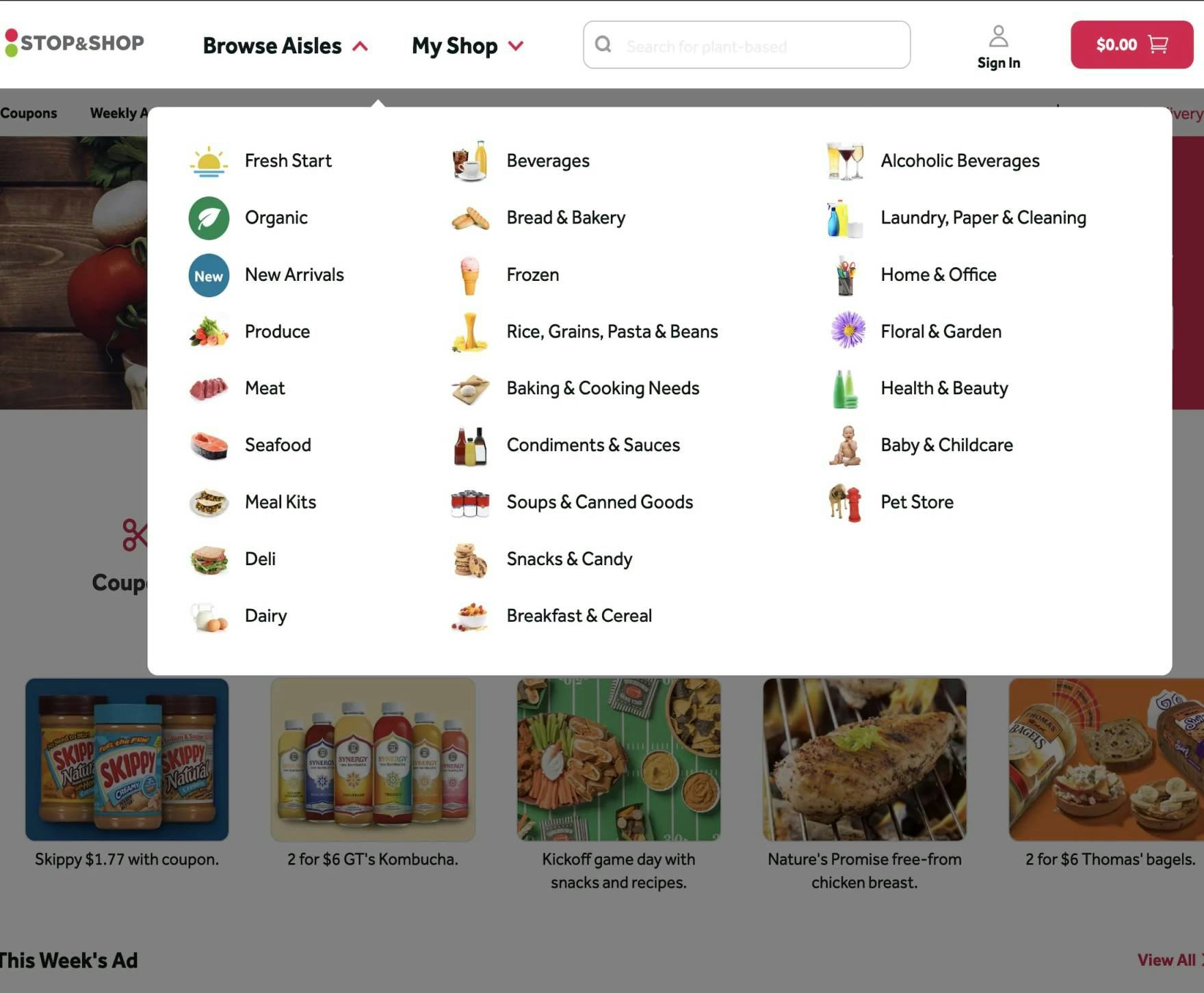
1) Hiding Product Categories within a Single Navigation Item
Our Grocery benchmark reveals there is a tendency to hide product categories within the main navigation, making it difficult for users to gauge what the site offers.
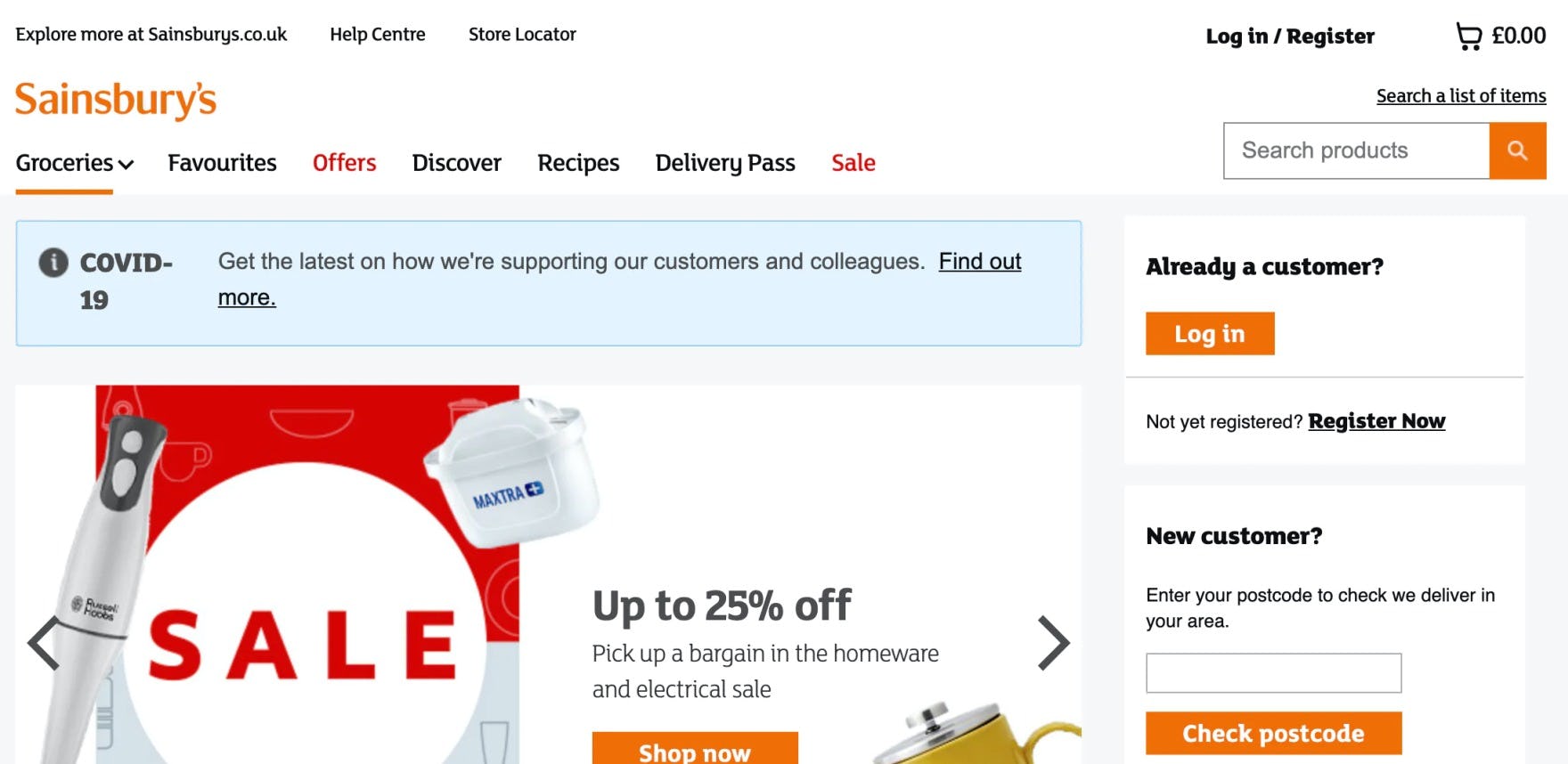
At Sainsbury’s the Grocery categories are all collapsed within the “Groceries” navigation menu item — making it more difficult for users to find where they need to go on the site.
In testing, we often observe that, when sites didn’t implement the main navigation as the first level of product categories, the navigation experience for users deteriorated.
On these sites users have to hover or click a solitary navigational item — typically called “Shop”, “Products”, or something similar — before even being able to see the first level of categories (e.g., “Meats”, “Seafood”, “Produce”, etc.).
The most severe issue of scoping and collapsing the entire product catalog navigation within a solitary navigation item (e.g., “Shop”) is users not being able to fully understand the range of products the site carries.
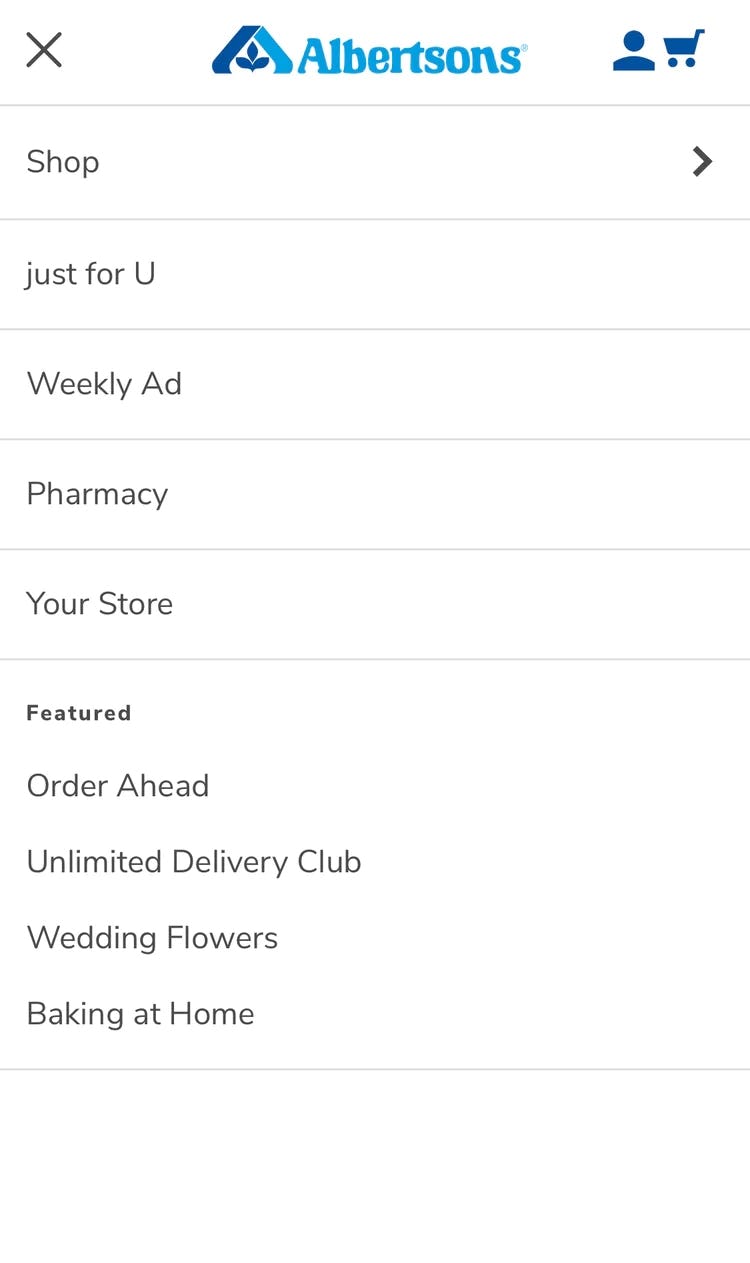
On Albertsons’s mobile site, the “Shop” menu is at the same level as the likely much less important “just for U” — the actual Grocery categories can’t be seen until “Shop” is selected.
Meanwhile, users on mobile sites often struggled to simply get started browsing the product catalog when product categories weren’t immediately visible in the main navigation.
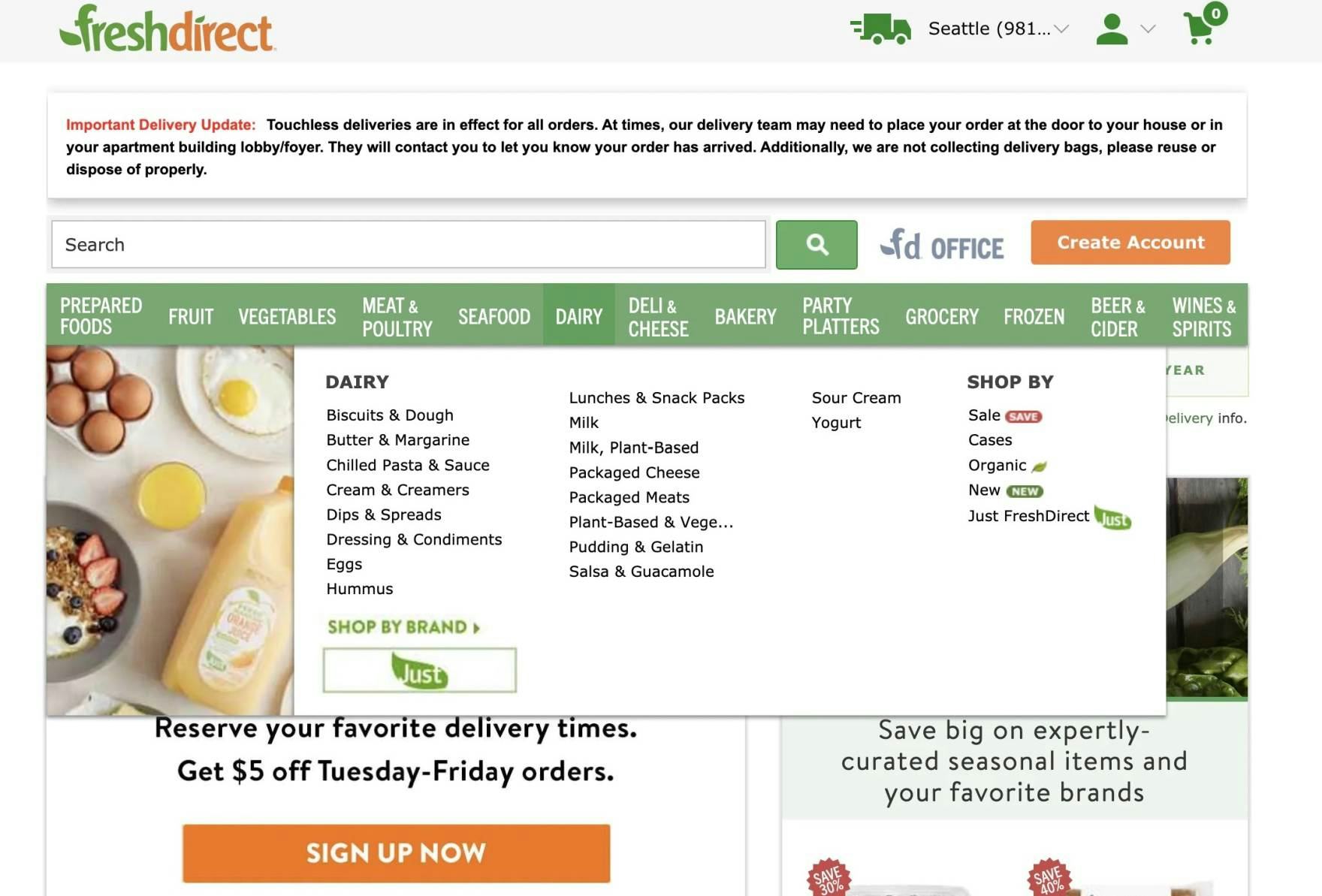
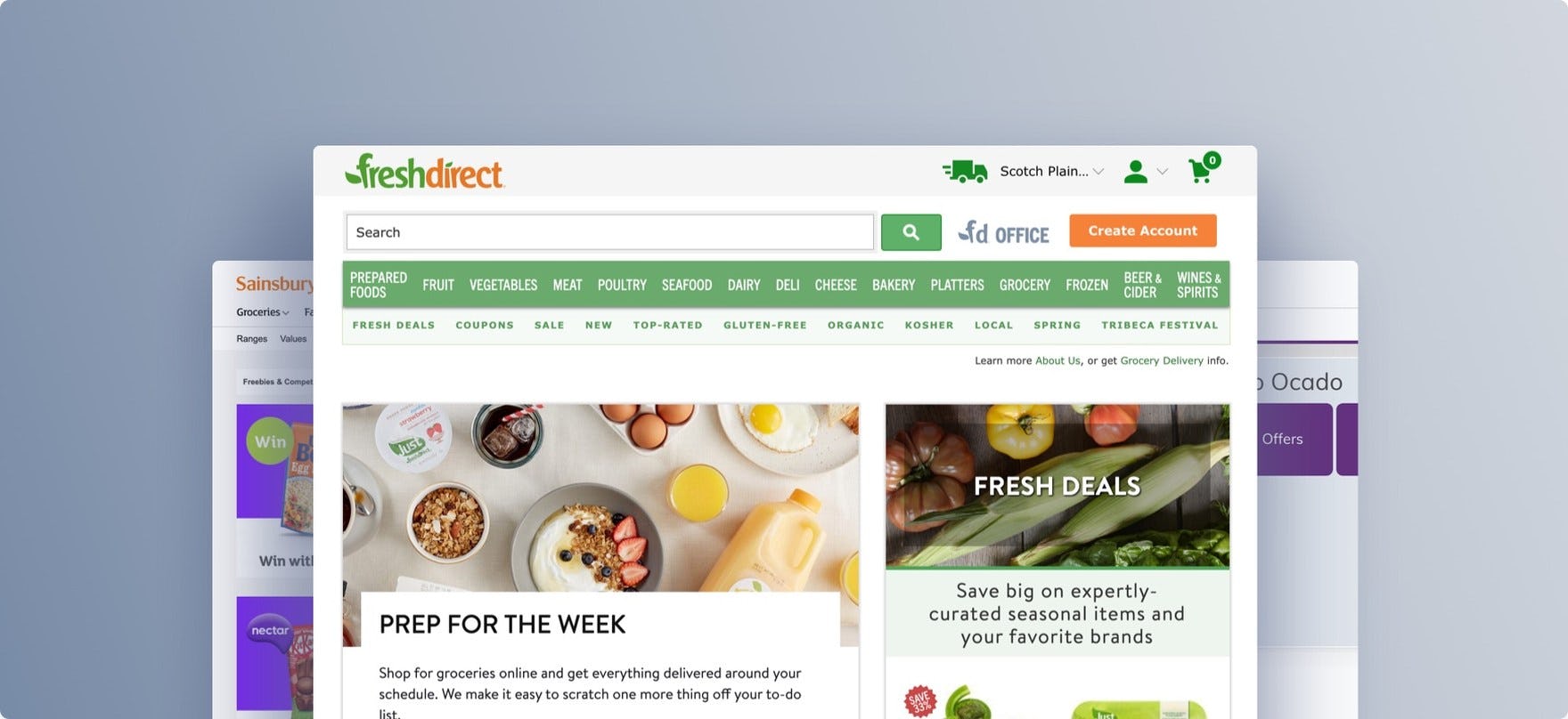
At FreshDirect, rather than collapsing the Grocery categories into a single main navigation item, the options are immediately available — “Fruit”, “Vegetables”, and so on — giving users new to the site a head start on understanding the type of site they’ve landed on and helping all users get started with product browsing.
Therefore, product categories should be visible in the top level of the main navigation on desktop, and visible immediately after opening the main navigation menu on mobile.
2) Having Too Many or Too-Few Categories
At Peapod, there are more than 20 top-level categories, which many users will find overwhelming.
On desktop sites, one of the benefits of drop-down menus is that they can hold an almost unlimited number of options — but this is also their Achilles’ heel.
There’s so much space available that all departments and product managers typically get a say in what goes in the drop-down menu, instead of doing the tough work of creating and maintaining a well-curated hierarchy (this can be particularly difficult in a large organization, which often has multiple internal agendas to reconcile).
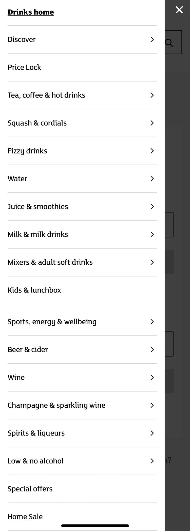
At Sainsbury’s a subcategory has more than 15 sub-subcategories — an example of poor categorization that will make it difficult for some users to get an overview of the subcategory.
Additionally, on mobile sites and apps, it’s much easier for users to get overwhelmed at the number of category or subcategory options, compared to desktop.
While navigating or scanning long lists of categories on desktop is difficult, on mobile the task is harder, as users will have to scroll through the options — a time-consuming and laborious task — and will find it difficult to establish an overview of the navigation.
Furthermore, there’s minimal information scent provided on mobile, as users can’t hover menu items to potentially learn more about the category, and there’s less space to include inline text descriptions of the items.
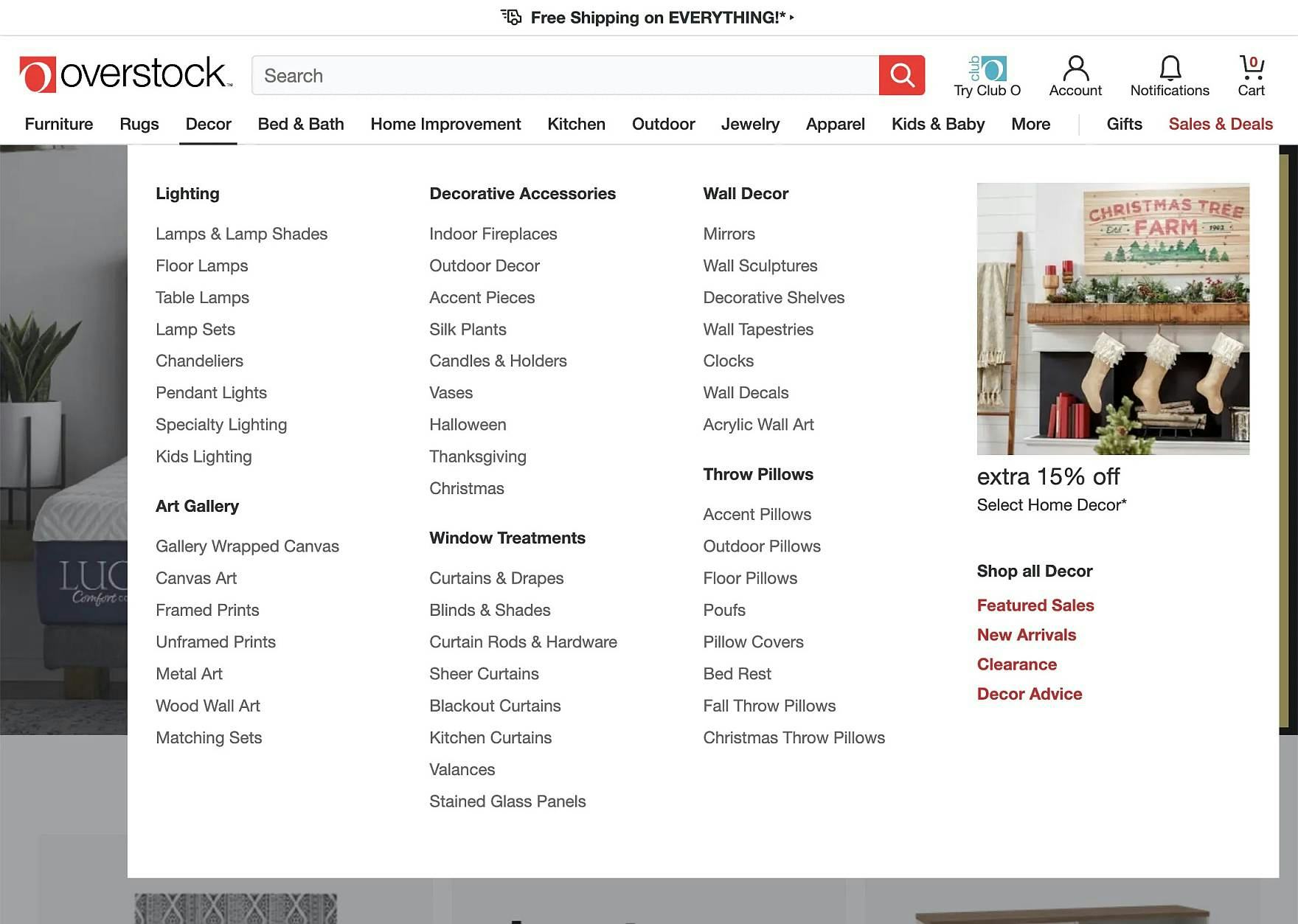
Despite having a massive number of products, Overstock manages to keep the category navigation manageable by having 14 or fewer categories available at the top level, ensuring none of the subcategories display 15 or more sub-subcategory options, and ensuring no subcategories have fewer than 10 products. None of the benchmarked Grocery sites provided a good division of categories and subcategories.
Therefore, it’s important to divide categories and subcategories into manageable chunks — subdivide when reaching around 10 categories, and aim for at least 10 products in the categories at the deepest level.
All of the benchmarked Grocery sites do poorly when it comes to Homepage and Category Navigation performance, with the exception of Sainsbury’s, which has a “decent” performance, and therefore can be a source of inspiration.
Grocery On-Site Search

Considering that the average Grocery site user will need to fill their shopping cart with a higher number of items (often 20–100+ items) than a user on a traditional retail site, a fast and accurate search experience is vital for users to quickly find what they need.
However, a number of technical shortcomings keep the Grocery search experience from being as strong as it could be.
For example, users should be able to use the search feature to access non-product information, and the search autocomplete tool should offer users greater assistance with the often-dense category depths of the large product catalog. Additionally, the search results pages could be improved to better facilitate users who are evaluating and comparing many different brand and product options.
In particular, there are 4 issues Grocery sites get wrong when it comes to the Grocery Search experience.
3) Poor Support for “Non-Product” Search
Users don’t just look for products at e-commerce sites; they also look for many other types of content, such as help sections, store information, and account features.
However, without support for “Non-Product” queries, they won’t be able to find that content via search.

At Albertsons, a search for “Returns” yields no results. Some users curious about how the process of obtaining a refund for, for example, a spoiled item they purchased will have difficulty locating the information.
On mobile, finding “Non-Product” content via on-page links or navigation can be even more challenging as these options are often even harder to find compared to desktop sites.
The user behavior of searching for “Non-Product” information (e.g., “returns”, “delivery cost”, etc.) has been observed throughout multiple separate rounds of testing. For example, in our Accounts & Self Service testing, 34% of users tried to use site search to find “Non-Product” content.
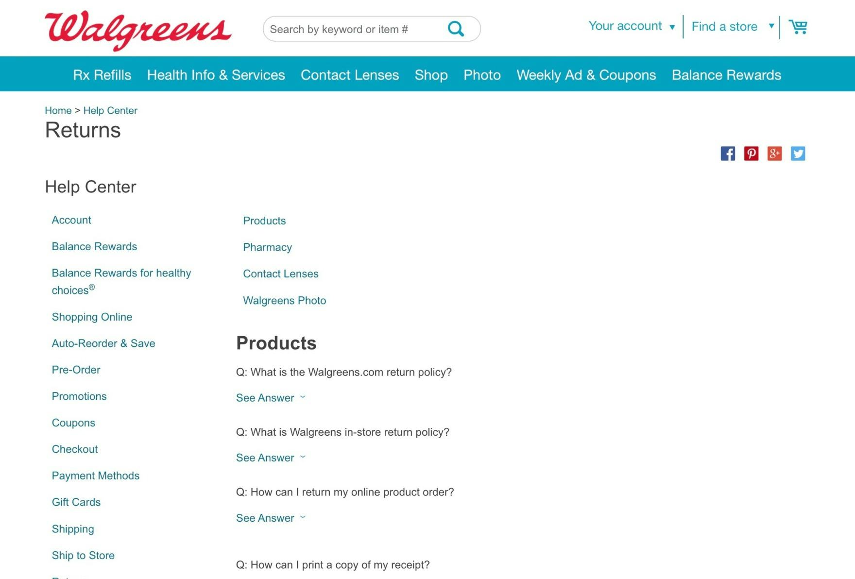
At Walgreens, a search for “returns” takes users to the Help Center — a reasonable place for most users to start when wanting to know more about the site’s return policies.
It’s clear therefore that searching for “Non-Product” content — and expecting to find relevant results — has become an ingrained behavior and expectation for a large subgroup of users, and therefore needs to be supported.
4) Failing to Include Relevant Category-Scope Suggestions in Autocomplete
Applying a search category-scope, such as a user seeking “Strawberries in Desserts” vs. “Strawberries in Produce”, is not a natural part of most users’ thought process — rather, they’re thinking of the type of product they want and trying to come up with terms that may prove well-suited for producing such results.
However, once users are exposed to category-scope suggestions, they can be a useful way to preselect a narrower and more relevant list of products, compared to what they’d get if they conducted a sitewide search.
At Peapod there are no category-scope suggestions in autocomplete — a missed opportunity to help guide users to the most appropriate results.
Without category-scope suggestions, or when category scopes are not obvious, users can select sitewide query suggestions that span many categories and end up arriving at an overwhelming number of results.
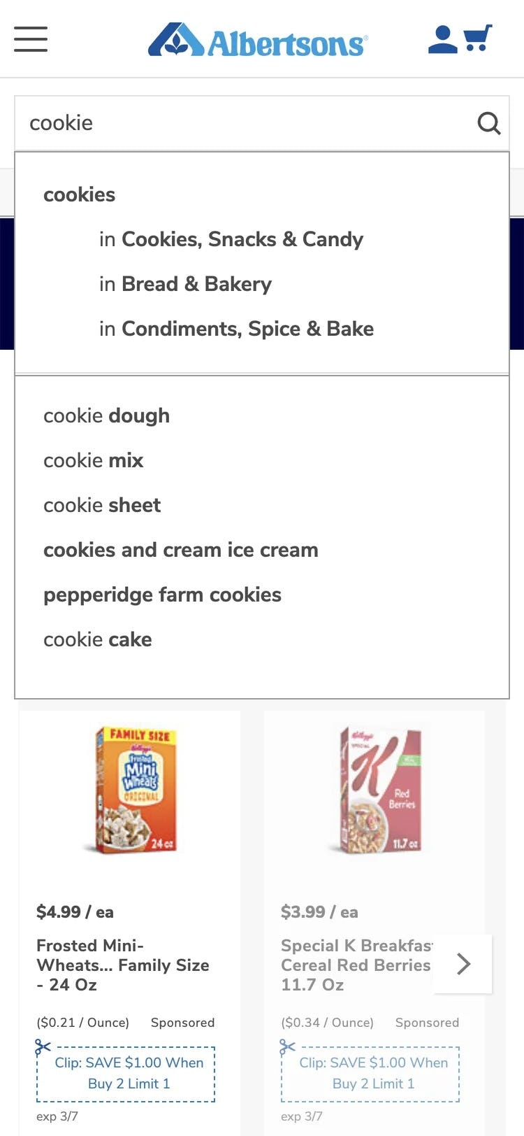
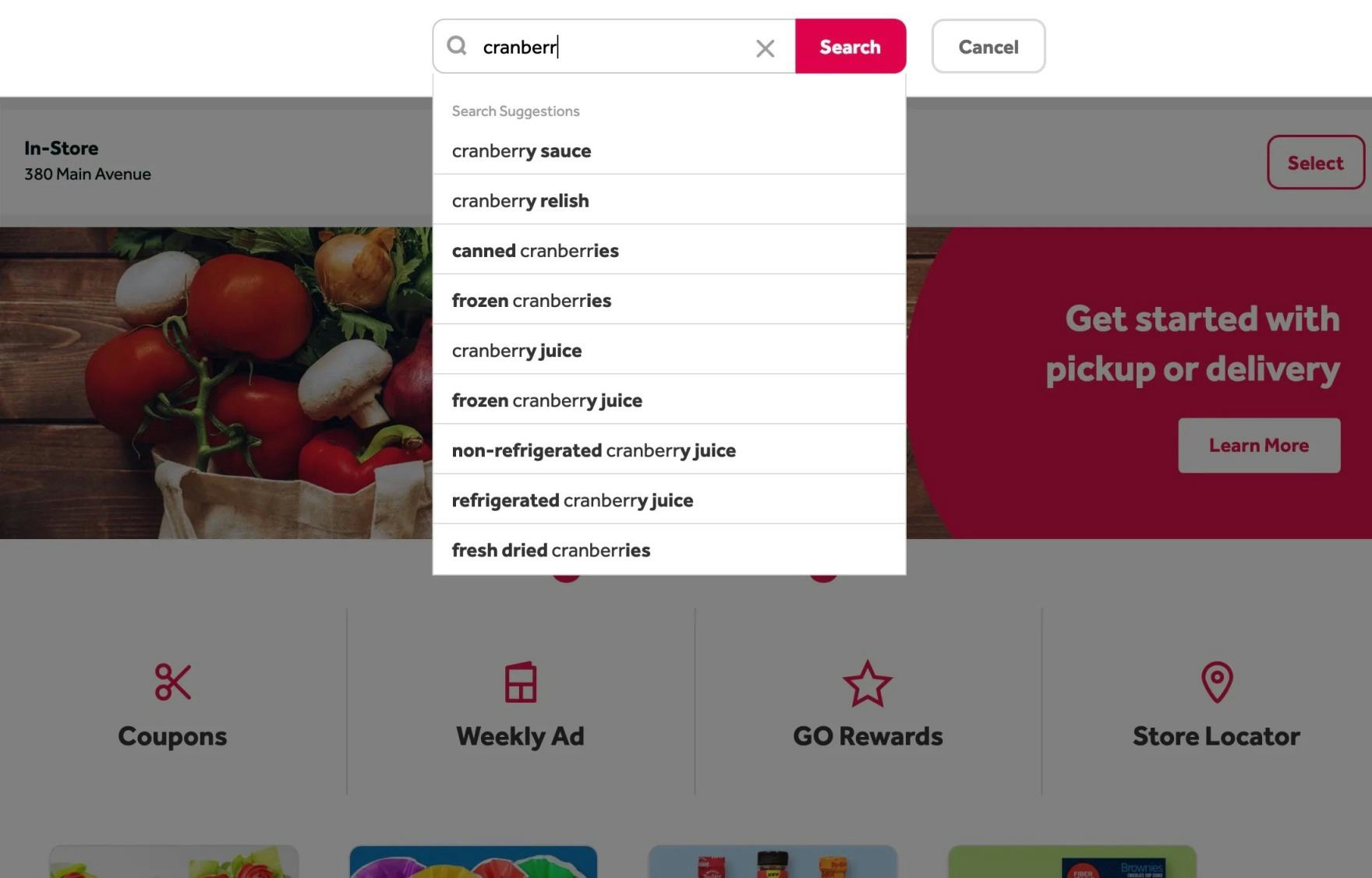
Although likely an example of having too-many categories (see #2 above), Albertsons provides users with category-scope suggestions in autocomplete. Users searching for snack cookies could select the first option to get a very relevant list of results.
Therefore, include relevant and clearly delineated category-scope suggestions in autocomplete, and style the category scopes to make them distinct from unscoped sitewide query suggestions (e.g., by using a different font color for the category scope, prefaced by “In”).
5) Failing to Offer Relevant Autocomplete Suggestions for Closely Misspelled Search Terms and Queries
During testing, nearly all users relied on the guidance of autocomplete suggestions at some point when devising queries.

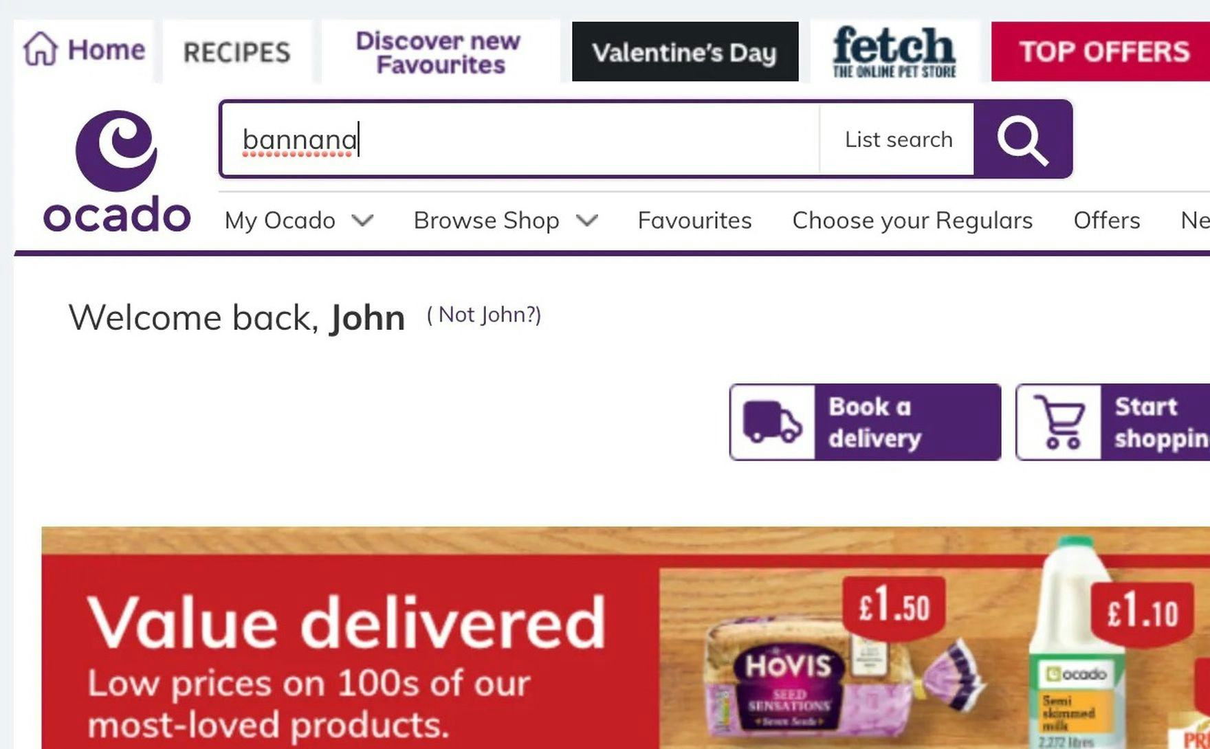
At Ocado, the autocomplete suggestions that normally appear (first image) disappear if there’s a typo (second image).
However, those suggestions often failed users if queries contained even the slightest spelling error (e.g., searching “grpes” instead of “grapes”) — which was especially common during mobile testing.
Since autocomplete plays a key role in early search interactions, unexpected suggestions due to minor typos can contribute to abandonment downstream if alternate product-finding strategies don’t quickly lead to relevant results.
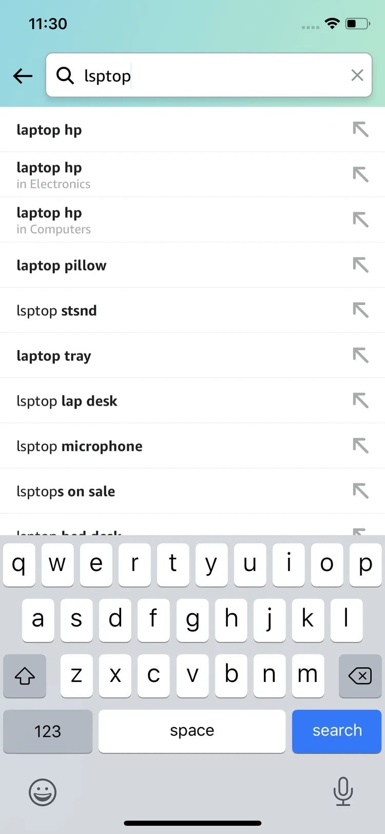
At Amazon, despite misspelling “laptop” as “lsptop”, a user is still provided with relevant and correctly spelled autocomplete suggestions.
Therefore, it’s important to provide relevant autocomplete suggestions when closely misspelled terms and queries are entered in the search field.
Depending on the search engine and autocomplete implementation, careful monitoring of autocomplete query logs or search logs, or both, should shed light on misspelled queries that users enter into the search field, which can be a good starting point for analysis and prioritization of improvement efforts (e.g., mapping misspelled words to meaningful autocomplete suggestions) for autocomplete-spelling suggestions.
6) Not Providing Alternate Paths and Content on the “No Results” Page
At some point, even the best search engines will be unable to produce results for a given user query.
Sometimes the site doesn’t have what the user is looking for, or the user’s query is so cryptic that not even the best search engine will be able to yield relevant results for it.
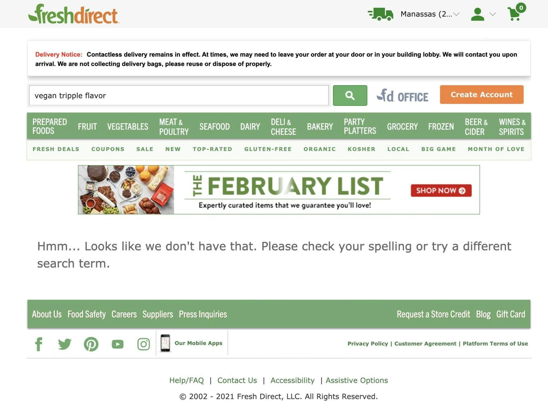
At FreshDirect, users are essentially at a dead end if their search query returns no results.
However, if there’s little or no helpful guidance or content on the “No Results” page, the user has two options — either think up a whole new product-finding strategy (which may or may not be successful) or abandon the site.
Yet there’s good news, too: on the opposite end of the spectrum, we find that great “No Results” pages that take users by the hand and point them toward meaningful content and solutions can become an enabler rather than a roadblock.
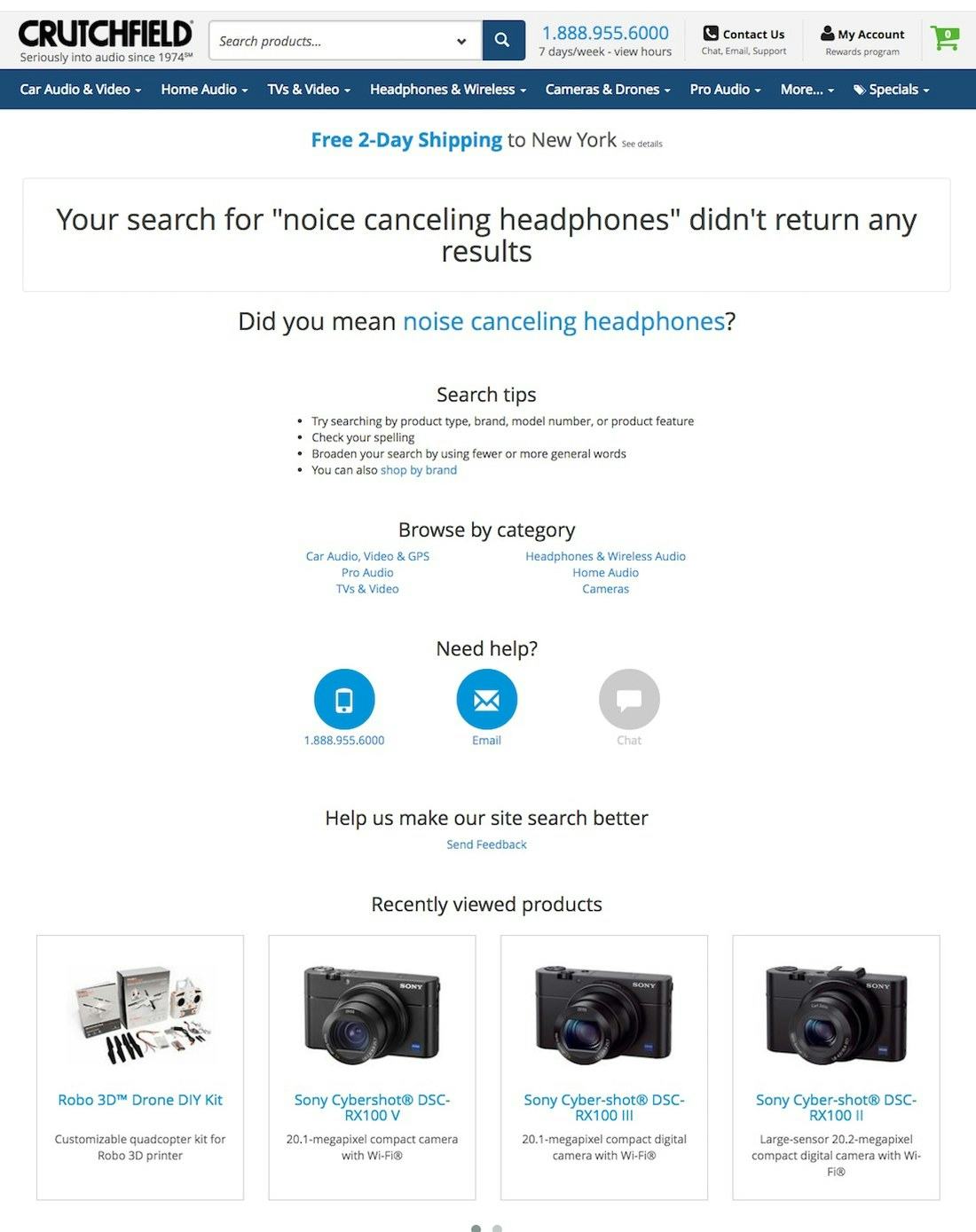
Crutchfield’s “No Results” page offers 4 of the 6 essential elements — an alternate query, related categories, links to get help, and personalized recommendations — making it more likely users will be able to find a suitable product. None of the benchmarked Grocery sites had helpful “No Results” pages.
In particular, all or some of the following 6 elements of successful “No Results” pages will help many users get back on track:
- Category suggestions (suggesting one or more categories that the user may try out, which should be based on the user’s search query)
- Alternate queries (related queries that would yield results)
- Personalized recommendations (e.g., “Recently viewed products”)
- A phone number to sales, a chat feature, and other help links
- Ads (contextual ads based on the user’s search query)
- Popular products and categories
For inspiration on On-Site Search consider looking closer at Albertsons, which has a “good” search performance.
Grocery Product Details Pages

When online Grocery site users proceed to the product page, they will likely have a reasonably good experience, on par with other e-commerce retail sites.
Product imagery is functional, descriptions tend to be rich with cooking methods and ingredients, and spec sheets are consistently implemented with easily scannable information. User reviews are also present on many of the sites, aiding users in their decision-making.
That said, as users get closer to adding items to their cart and entering the checkout process, they may run into friction interpreting the page layout, saving products of interest, assessing cross-sells, and fully understanding the “Buy” section and their place within the hierarchy of the site.
7) Not Styling the Primary “Add to Cart” Button to Be Unique and Prominent
On many product pages, users must contend with a great deal of information and page elements — the product image gallery, product descriptions and specifications, cross-sells, and sitewide banners, to name a few.
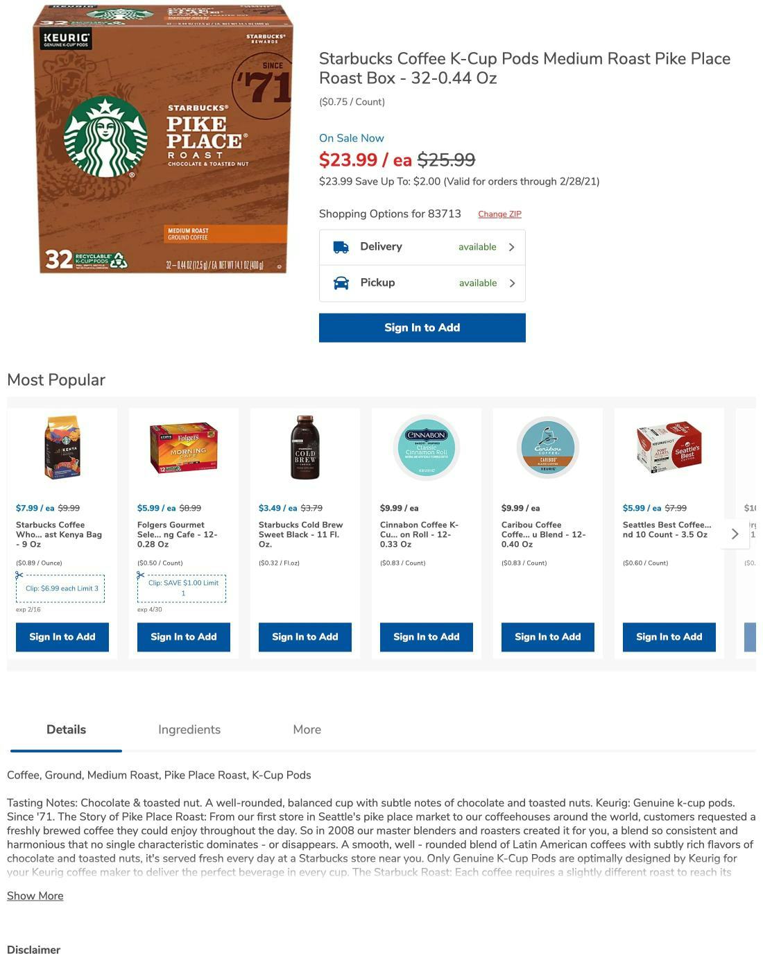
At Sainsbury’s, the primary “Add to Cart” button is styled similarly to the “Product Details” button and the “Add” button for cross-sells. Some users will hesitate when seeing so many like-styled buttons, and some will even add the wrong product to their cart — causing issues down the line when the receive their order.
During desktop and mobile usability testing, we observed that, with so much competing for their attention on product details pages, users can easily become disoriented and lose track of the primary call to action: the “Add to Cart” button.
In the worst cases, when there are multiple call to action buttons with a primary styling, it quickly becomes unclear to users which one represents how to add the product to the cart.
At this critical time in the product-purchasing process, any delay and confusion can easily pull users off their path, causing them to lose momentum as they stop to investigate the differences between the different buttons.
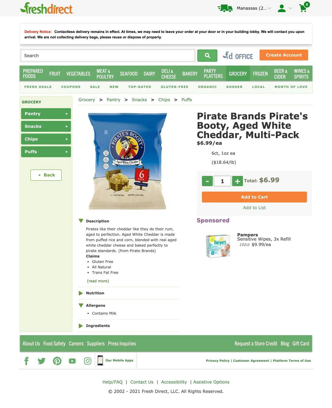
Despite having an interface that’s quite visually busy, the primary “Add to Cart” button at FreshDirect doesn’t share styling with any of the elements in the main content area (the only exception being the “Create Account” button above the main navigation).
To avoid this issue, ensure the “Add to Cart” button has unique styling that isn’t reused with other buttons, and clearly distinguish it as the page’s primary button.
If using a sticky “Add to Cart” button, surround it with sufficient white space (i.e., don’t use full-width sticky “Add to Cart” buttons).
8) Not Recommending Alternative Products
When users land on a product page and learn that the specific item doesn’t match their criteria perfectly, they essentially have two options: 1) abandon the product search or 2) go look for alternatives until they find an item that fits their criteria.
While FreshDirect provides “Sponsored” product suggestions on the product page, it doesn’t provide alternative product suggestions. Thus, if this popcorn weren’t available, or wasn’t the perfect match, users may simply opt to go without popcorn for the week rather than hunt down a substitute on the site.
Initially, most users will opt for the latter option, continuing their product search, but after a while more and more users will drop off as they fatigue.
This can especially be the case on Grocery sites, where users are adding often large numbers of products to their cart. If you need to add 100 items to a cart you’re not likely to spend much time trying to find a substitute for the one item that isn’t available, or isn’t quite what you were looking for.
At Albertsons, if the coffee K-cups aren’t satisfactory, users are provided with alternatives to consider without having to leave the product page — making it more likely they’ll end up finding a suitable product.
On the other hand, if users are provided with a list of relevant alternative items on the product details page, they have viable options without the friction of endlessly navigating back-and-forth between product pages and product lists or search results. Indeed, during mobile testing, subjects often took advantage of cross-sell sections containing alternative products, as the cross-sell section streamlined the process of finding similar items.
For inspiration on Grocery Product Page performance see Ocado and Peapod, both of which have “good” performances.
Grocery Cart and Checkout

Once users have added all of their Grocery list items and enter the Cart & Checkout flow, there are unfortunately significant issues across all benchmarked sites, resulting in the lowest-performing area on both desktop and mobile.
As users would likely have to go through this checkout on a weekly basis, it needs to be as smooth as possible. Most of the issues are related to customer and address information, order review and confirmation, form page and design, and the overall flow back-and-forth through the checkout steps.
In particular, 4 issues and shortcomings were identified during benchmarking, which are also commonly missed opportunities found on most e-commerce sites.
9) Not Hiding the “Coupon Code” Field
Our eye-tracking test sessions confirm all our other think-aloud checkout usability test findings: empty form fields draw a disproportionate amount of user attention.
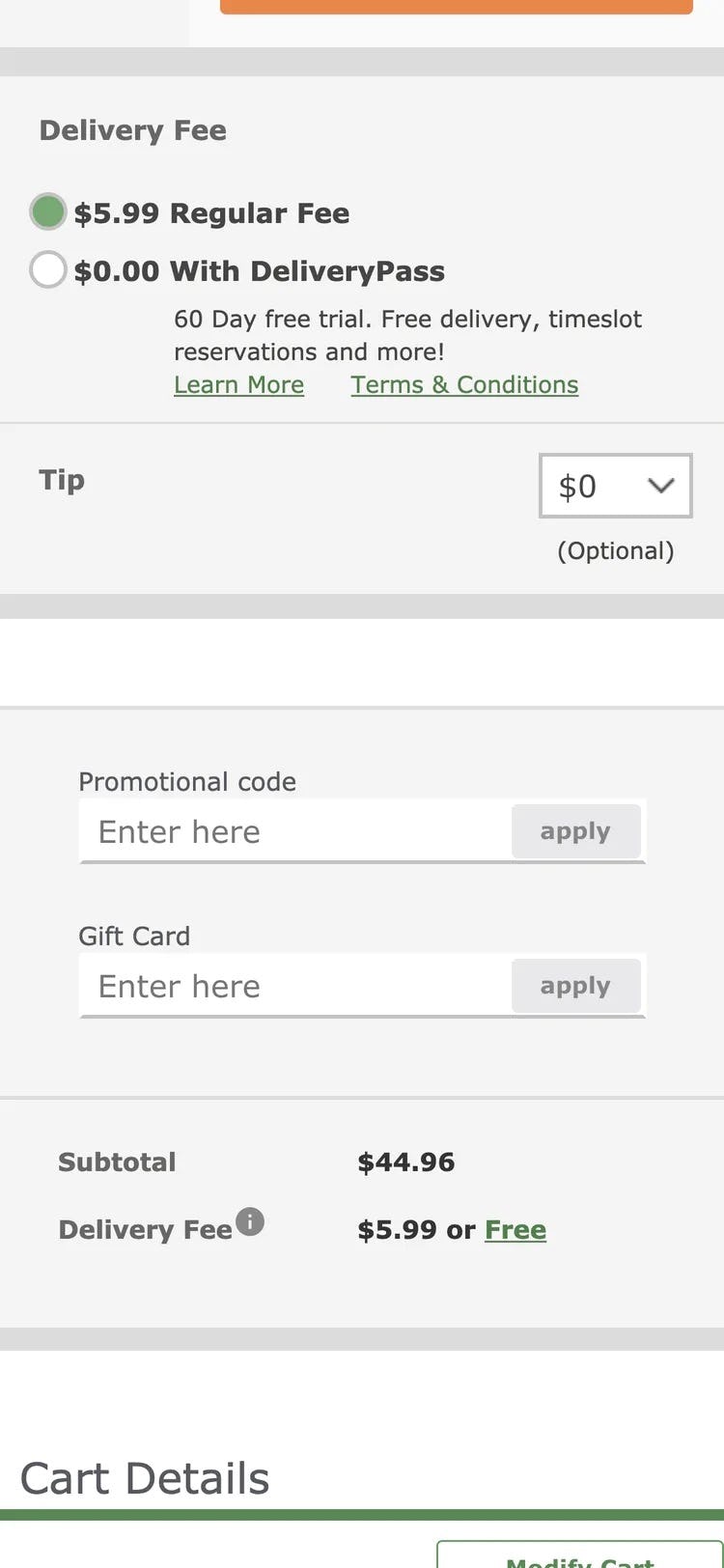
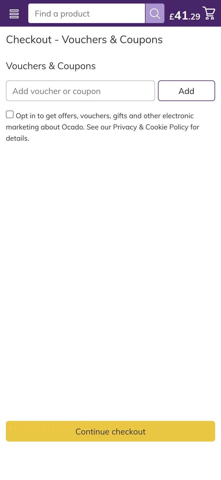
At FreshDirect, the “Coupon Code” is placed above another field that only a subgroup of users will need, the “Gift Card” field (first image). Both fields combined will draw a disproportionate amount of user attention. Meanwhile, Ocado has an entire step in the checkout process devoted to entering in a “Coupon Code” (second image) — which will spur some users to off-site and “coupon hunt”.
Furthermore, promotional fields, like “Coupon Code”, will get noticed immediately by all users if shown by default within the normal flow of form fields — yet the field only likely needs to be seen by a subgroup of users.
Moreover, we consistently see during testing that “coupon hunting” is a persistent issue. Once users notice the coupon field, they will often feel like they are overpaying or, as one user complained, “I find it slightly annoying that they’re flashing these coupon code fields as much as they do, because it is like, ‘You should have a coupon, you could get this cheaper if you knew this code’…I don’t”.
At Bass Pro Shops, the “Coupon Code” field, along with other fields not needed by the majority of users, are collapsed behind links. This allows users who don’t need the fields to continue their checkout unimpeded, while also providing an obvious place for users who do need the fields to enter their information. None of the benchmarked Grocery sites hid the “Coupon Code” field behind a link.
The main component in reducing the amount of needless attention drawn to promotional fields is hiding the promotional fields (and any “Apply” buttons) behind a link.
We observed this to perform well during testing, as empty form fields in the checkout are generally seen by users as a potential task that has to be completed — removing the form field from the default checkout flow will therefore greatly reduce the amount of needless attention it receives.
At the same time, testing also showed that those users who do need the field, because they have a code to enter, will all find the link, as getting their discount is top of mind before they complete the checkout.
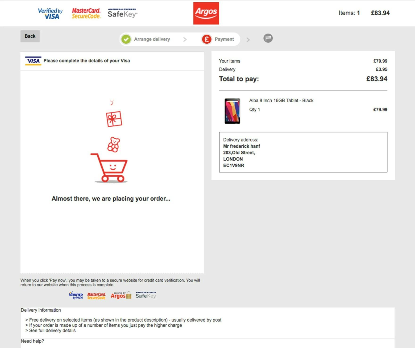
10) Failing to Luhn Validate the Credit Card Number Field
Typing the typically 15- or 16-digit credit card number string, without errors, can be difficult for users.
One aspect that more easily allows users to correctly input their credit card number is allowing them to type spaces and autoformatting the spaces embossed on the card (typically breaking the long input into more manageable 4-digit chunks).
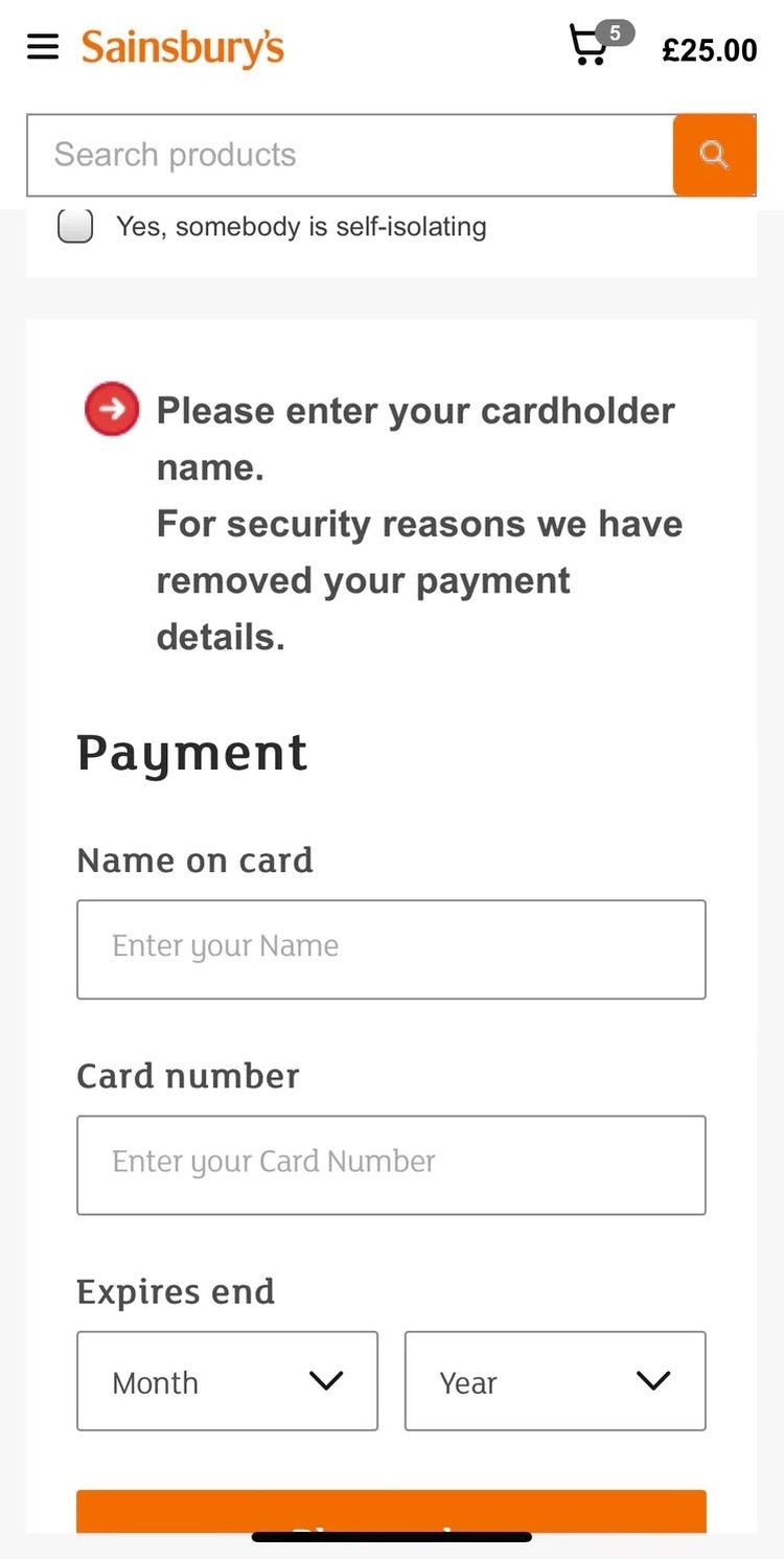
At Sainsbury’s, the credit card number isn’t Luhn validated — no error message appears after having typed an invalid card number and exiting the field. Moreover, the card data is cleared, forcing users to retype al their card data — a tedious and error-prone process on mobile.
However, even when broken into smaller chunks, the 15–16 digits still have to be typed perfectly to avoid payment validation errors.
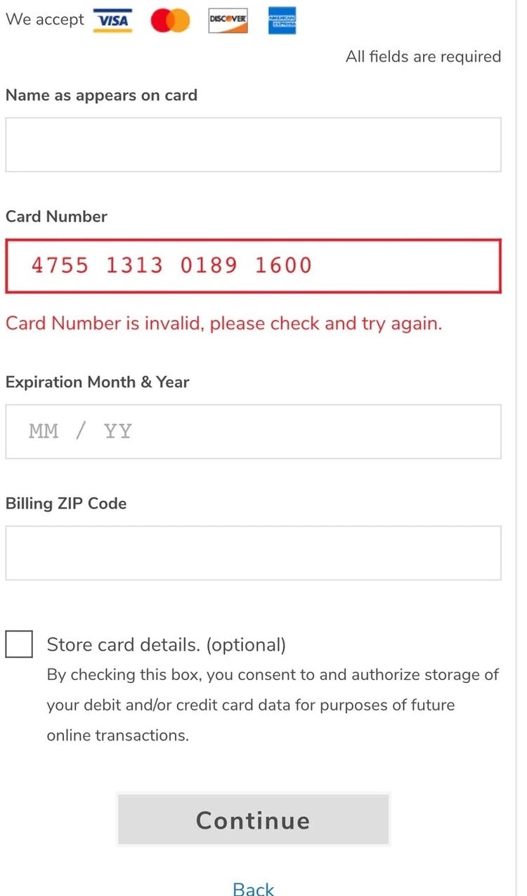
At Albertsons, when an invalid credit card number is detected the user is alerted to this as soon as they leave the field. This makes it easier to correct and recover from a card number–typing error, and proceed with checkout.
To further aid users typing in their credit card number, it’s important to Luhn validate the user’s input before the entire card dataset is submitted (front-end validation).
Luhn validation works to check to see if the card number entered by a user is plausible — all credit card numbers follow a pattern that will allow a simple Luhn/Modulus 10 checksum validation.
Note that the check doesn’t submit and verify the card data with the payment processor. In other words, the Luhn validation can’t say if the card is valid, has sufficient funds, etc. — it can only tell if the typed card number sequence has been incorrectly typed, which gives users a chance to correct their error immediately after they’ve made it.
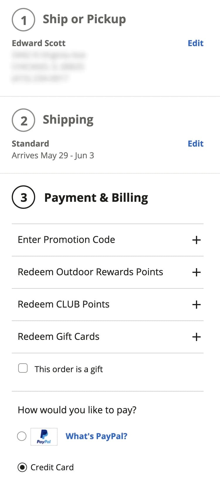
11) Failing to Mark Both Required and Optional Fields
What information users are required to provide during a checkout flow is highly inconsistent across sites.
For example, some sites require users’ phone numbers, others don’t. Some require a cardholder name, others don’t, etc.
Therefore, most users have few preset expectations on what information is required and what may be optional.
So while it might seem obvious to site designers that the phone field isn’t required on their site, but all the other payment fields are, this will by no means be obvious to the average user.
Users simply have no way to intuitively know a particular site’s requirements beforehand. They need to figure it out on a site-by-site basis for each and every form they fill out.
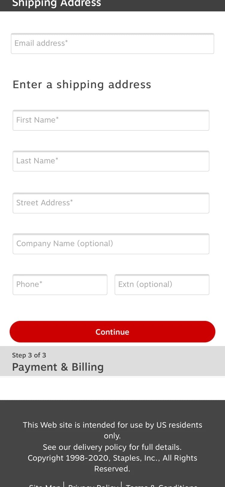
At Staples, both “Required” and “Optional” fields are marked — simplifying the form-filling process for users. No benchmarked Grocery sites marked both “Required” and “Optional” fields.
To avoid this issue, and make it completely clear to users what information they need to provide in checkout, it’s important to always label both required — and optional — fields on forms.
During testing, it was verified that using an asterisk was sufficient to indicate required fields, while the optional fields can be marked as “Optional” after or close to the field label.
12) Not Providing a Load Indicator
Load performance should always be optimized. Yet how quickly steps or features load during checkout is partly outside of a site’s control, since a user’s location and connection greatly affects the speed.
Furthermore, checkout steps and features are generally slower than most other page types, as they rely on slightly slower HTTPS connections, and often use one or more third-party dependencies (most noteworthy being the payment-processing requests, which can be very slow).
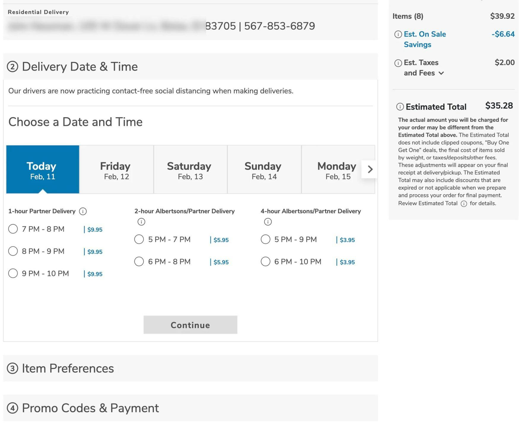
At Albertsons, there are no load indicators during checkout, despite the checkout having many slow-loading features.
While most checkout steps and features load fairly swiftly most of the time, users during testing got either anxious or, more commonly, impatient as soon as load times began to approach 4–5 seconds or longer.
Some clicked primary buttons multiple times to try and move the process along. This can result in serious errors if, for example, a user clicks “Submit” multiple times and inadvertently submits multiple orders.
Therefore, it’s important to provide load indicators when loading a new step or feature. This was observed to make users feel less anxious and like “something was happening”.
Moreover, the “Place Order” button should be disabled during loading to avoid multiple clicks from impatient users.
Finally, consider updating the load indicator with a message if a request takes 20+ seconds to load, as even the most patient users will start to get antsy after 20 seconds.
No benchmarked Grocery sites perform above “mediocre” when it comes to Cart & Checkout. For inspiration, consider Build.com’s desktop site and Nordstrom’s mobile site, the two top performers from general B2C e-commerce retail.
Help Grocery Users Transition to Repeat Visitors
This high-level analysis of the online Grocery UX focuses on only 4 of the 50 Grocery subtopics included in our Benchmark Analysis. The 46 other subtopics should be reviewed as well to gain a comprehensive understanding of Grocery UX, and to identify additional site-specific issues not covered here.
Our benchmark has revealed that Grocery sites in general have a poor-to-mediocre UX — it’s clear that there’s much room for improvement.
Avoiding the following 12 pitfalls is the first step toward improving users’ online Grocery experience:
- Hiding Product Categories within a Single Navigation Item
- Having Too Many or Too-Few Categories
- Poor Support for “Non-Product” Search
- Failing to Include Relevant Category-Scope Suggestions in Autocomplete
- Failing to Offer Relevant Autocomplete Suggestions for Closely Misspelled Search Terms and Queries
- Not Providing Alternate Paths and Content on the “No Results” Page
- Not Styling the Primary “Add to Cart” Button to Be Unique and Prominent
- Not Recommending Alternative Products
- Not Hiding the “Coupon Code” Field
- Failing to Luhn Validate the Credit Card Number Field
- Failing to Mark Both Required and Optional Fields
- Not Providing a Load Indicator
For inspiration on other sites’ implementations and to see how they perform UX-wise, head to the publicly available part of the Grocery benchmark. Here you can browse the Grocery implementations of all 5 benchmarked sites.
Getting access: all 383 Grocery UX guidelines are available today via Baymard Premium access. (If you already have an account open the Grocery Study.)