Key Takeaways
- Our benchmark of 7 Luxury Retail sites shows that Luxury Homepages and Product Pages perform well overall
- However Luxury Search performs poorly, while Product Lists and Filtering and Luxury Mobile sites perform fair to middling
- The 15 common UX issues discussed in this article can be a direct cause for users abandoning Luxury Retail sites
We’ve recently published a new in-depth Luxury Goods UX Benchmark.
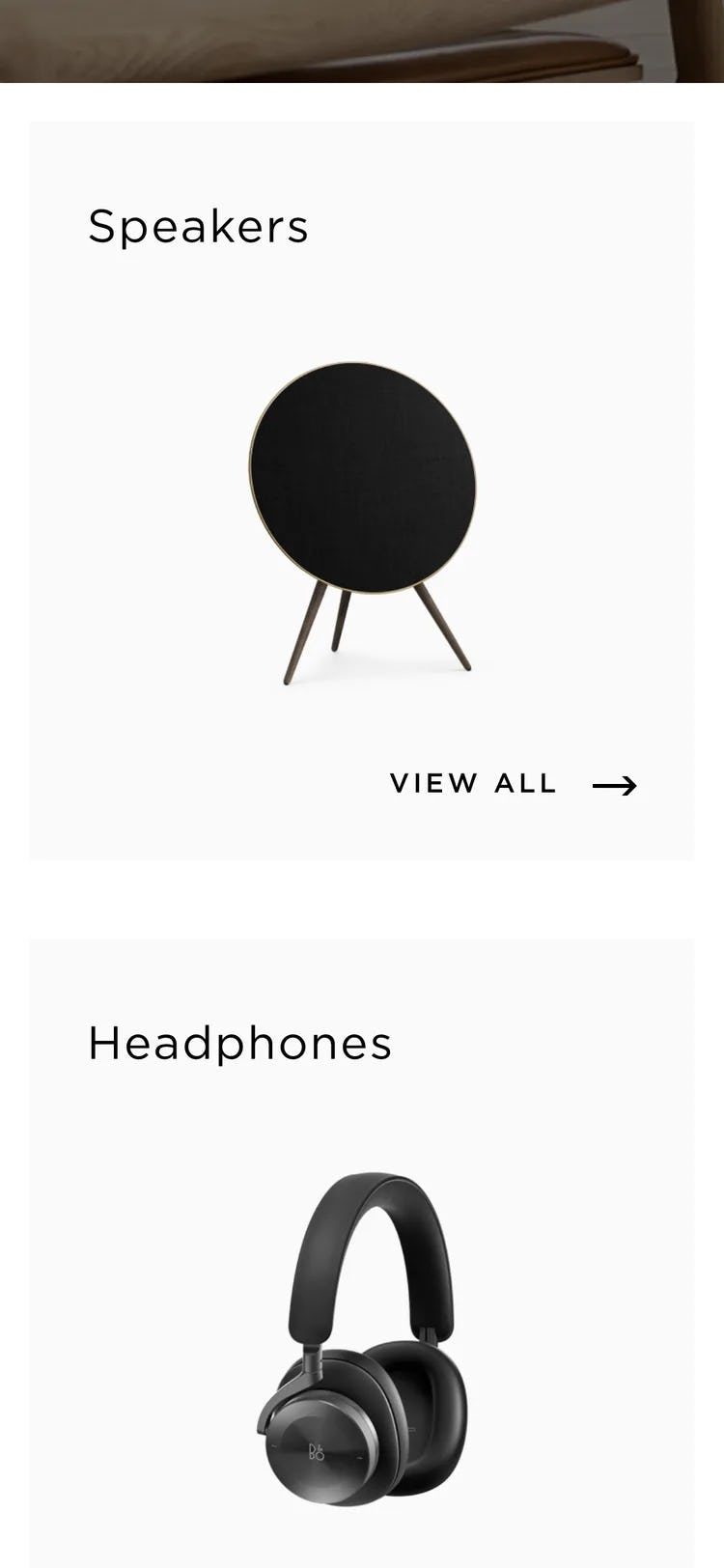
This database contains UX performance rankings for 7 new Luxury Goods sites: Bang & Olufsen, Chanel, Gucci, Jimmy Choo, Louis Vuitton, TAG Heuer, and Van Cleef & Arpels.
These sites have been manually assessed by Baymard researchers across 360+ research-based UX parameters relevant for luxury sites, resulting in 2,500+ weighted UX performance scores exclusively for Luxury Retail sites. Additionally, the database contains 1,800+ best-practice examples from leading luxury goods sites.
In this article we’ll analyze this dataset to provide you with an overview of the UX performance of Luxury Retail e-commerce, and outline 15 common design pitfalls and strategic oversights applicable to most Luxury Retail e-commerce sites.
These 15 pitfalls will be discussed in the context of 4 e-commerce themes, as well as the mobile web experience:
- Luxury Retail Homepages
- Luxury On-Site Search
- Luxury Product Lists and Filters
- Luxury Product Details Pages
- Luxury Mobile Web
Luxury Retail E-Commerce
The luxury goods industry is unique in that, while it technically overlaps with existing industries in our research catalog (e.g., the Apparel, Beauty, and Electronics industries), the UX design patterns that work well, and those that don’t, feature distinctive traits and significant deviations.
Luxury retail brands, such as Bang & Olufsen, often strive to sell users more on their “brand qualities” compared to more general e-commerce sites such as Amazon or Walmart.
The primary purpose of luxury sites is to drive brand awareness, brand loyalty, and facilitate off-line purchases at the brand’s own store or at third-party stores. This differs from traditional e-commerce sites, where driving online sales is the priority.
As such, Luxury sites need to provide users with an overall online browsing experience that matches the brand values and qualities.
At the same time these sites still need to function effectively as online stores — yet sometimes these sites inadvertently or knowingly make website design choices that prioritize “brand aesthetics and values” over what converts best from a pure online sales perspective.
For this analysis we’ve summarized the 2,500+ Luxury usability scores across the 51 topics and plotted the 7 benchmarked Luxury sites across these in the scatterplot above. Each dot, therefore, represents the summarized UX score of one site across the 4–12 guidelines within that respective topic. The top row is the total Luxury site UX performance.
Our Luxury benchmark database reveals that almost all Luxury sites have a “Decent” UX performance when it comes to e-commerce best practices.
While no sites perform exceptionally poorly overall, at the same time no sites perform exceptionally well either, leaving much room for improvement.
Drilling down to specific e-commerce themes, we see that, while most Luxury sites perform “Good” to “Perfect” when it comes to Homepage and Category Navigation and Product Details Pages, Luxury sites generally perform “Poor” when it comes to On-Site Search and Customer Accounts. Performance in Product Lists and Filters and Mobile E-Commerce is generally “Decent” to “Good”.
For perspective, when looking at the broader e-commerce landscape, the average overall UX performance falls well below a “Decent” level by user standards, with 83% of sites providing what can be described as a “Mediocre” overall user experience, only 17% providing a “Good” experience, and no sites providing a “State-of-the-Art” experience within all 7 themes that collectively constitute the overall e-commerce user experience.
Thus, Luxury sites tend to perform better when compared to the general e-commerce landscape. (Premium users can access the Overall E-Commerce UX Benchmark Analysis here.)
Yet despite performing better on average than the typical B2C e-commerce site, Luxury sites have a ways to go to ensure their users are having even “Good” experiences — let alone a “State of the Art” experience.
In this article, we will focus on the Homepage, Search, Product Lists and Filtering, and Product Details Page areas of Luxury e-commerce, as well as pitfalls observed for the Mobile Web platform.
Luxury Retail Homepages

Within Luxury Homepages, the average site performs between “Good” and “Perfect”.
These sites sit in the upper tier of our benchmarked sites, exceeding even the similar Apparel and Electronics industry sites, which on average have a “Decent” performance.
Yet there are 3 issues in particular Luxury sites get wrong when it comes to the Homepage.
1) No Personalization Features
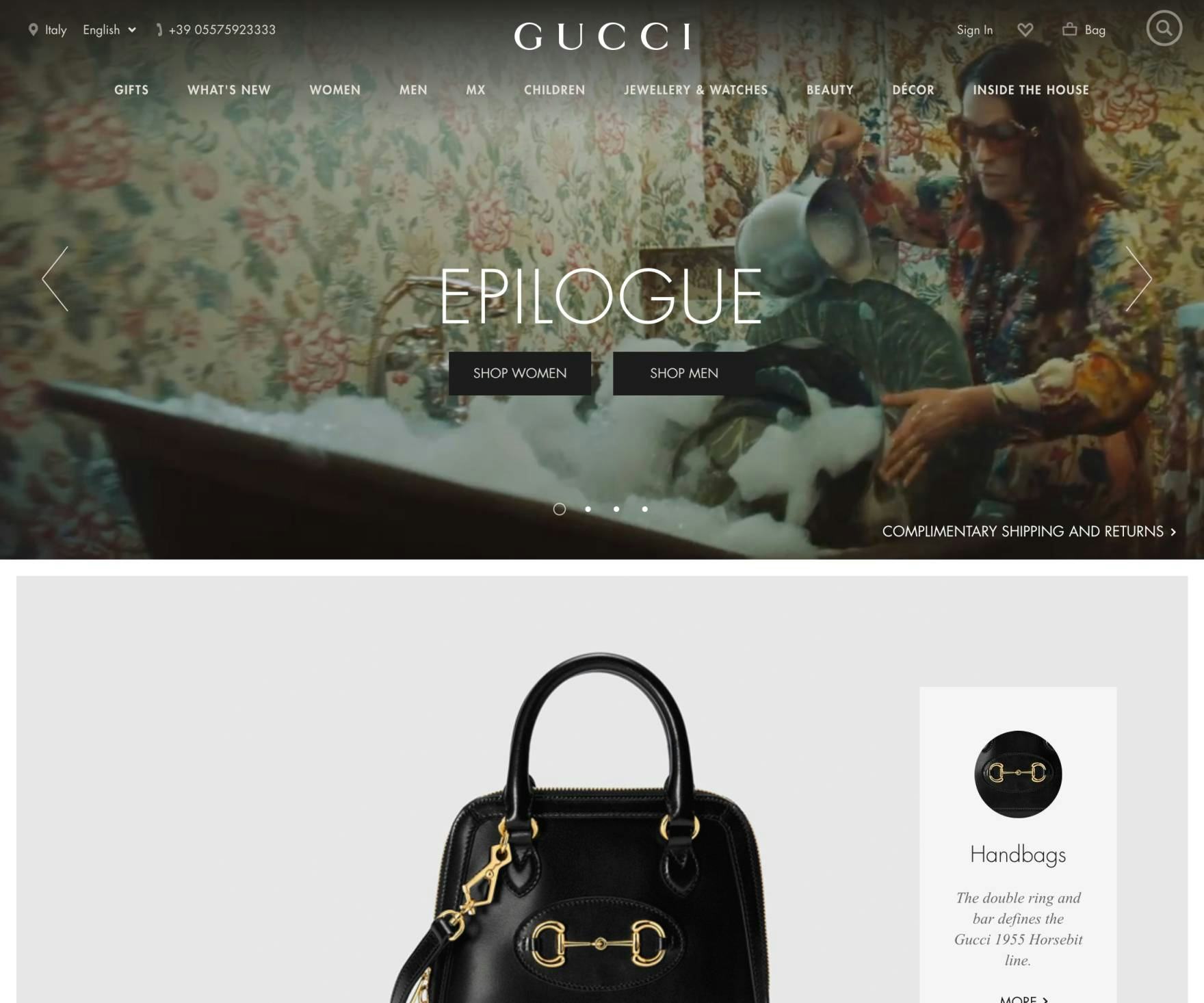
Gucci doesn’t offer any personalization features. This is a missed opportunity to cater to an individual user and enhance the overall site experience.
Personalization can be great. It’s an effective way to increase the relevance of a page to suit the needs of the individual user. And the more you know about the user, the better you can tailor that person’s experience.
This is especially true for Luxury sites, which are likely to have many repeat visitors, many of whom enjoy an individualized shopping experience (e.g., like one might expect from shopping at a brick-and-mortar store).
Urban Outfitters offers users a “Just for You” section that some users will be enticed to explore. No luxury sites we benchmarked offered personalization features.
Indeed, many of the Apparel sites in our benchmark recognize the value of personalization, as 41% offer some sort of personalized experience — for example, product suggestions based on the user’s past browsing history. Luxury sites should similarly seek to increase user engagement by providing personalization features.
2) No Direct Link to “Return Policy” and “Shipping” in the Footer
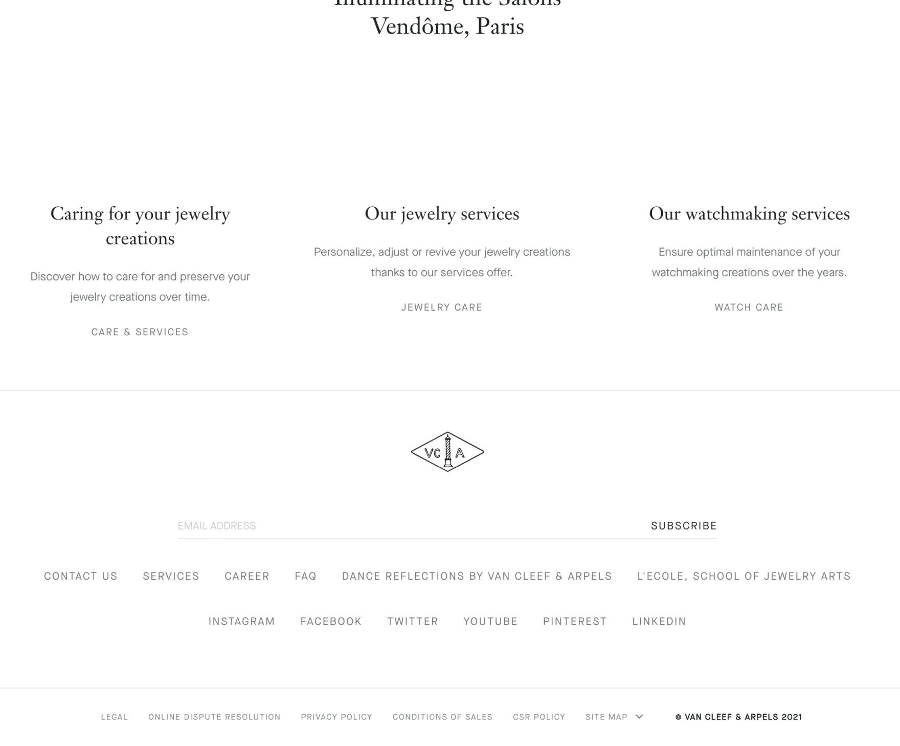
Van Cleef & Arpels doesn’t provide direct links to either the return policy or shipping info in the footer — yet this is where many users instinctively go when seeking out this crucial information.
In testing, we often observe that users need information about the site’s return policy or shipping options before they are able to make a purchase decision.
While this information can (and should) be available through multiple paths — for example, via the site header, on the Product Details Page, or through sitewide search (see #5 below) — testing revealed that a subgroup of users consistently will head to the footer when seeking such information.
When it’s not there, users must go “information hunting”, which, depending on how easy it is to find the information elsewhere on the site, results in an often substantial delay in product browsing.
More seriously, if users have difficulty quickly accessing basic returns and shipping information, some may reconsider whether they want to use the site to make their purchase.
A simple link to returns and shipping info, as seen here at Jimmy Choo, is all a subgroup of users needs when it comes to quickly accessing these details.
Therefore, it’s important to keep in mind that, whether on desktop or mobile, the footer is still associated by a subgroup of users as “the place to go” to find information on the site’s return policy or shipping options.
Having this information accessible from the footer — and structured to facilitate scanning — will ensure that these users have a starting point from which to begin their hunt for the information.
3) Hard to Understand Return Policies
Being able to quickly find the return policy is one thing. Being able to understand it, however — to the point of feeling confident in purchasing from a particular site — is another.

Jimmy Choo’s return policy appears as a wall of text, making it difficult for users to scan and understand the actual policy without reading in detail.
A strict return policy is a reason for some users to abandon a site: our 2021 quantitative study of 4,329 online shoppers in the US revealed that 11% of shoppers have previously abandoned orders in the last quarter because they found the return policy unsatisfactory.
Indeed, during testing, we observed that having difficulty both finding (see #2 above) and understanding the return policy can be a source of anxiety for many users and make them hesitant to purchase products.
If users can’t understand the return policy — and thus don’t feel comfortable buying a potentially unsuitable product — some users will look to purchase the product from another site.
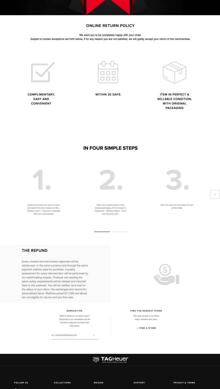
TAG Heuer provides users with an accessible and easy-to-follow return policy (which is also accessible from the footer). Note the use of icons and short text blocks, which help users quickly grasp the basic terms and conditions for returns.
In particular, testing identified 5 ways to make the return policy easier to understand:
- Provide a basic summary of the return policy
- Provide an easily scannable information structure with headings
- Write return policy information in plain language
- Clarify any potentially hidden costs or fees for “free returns”
- Tailor the return policy info to the user’s location
Following the above will help to ensure users can get a good sense of the return policy before moving ahead with product browsing or finalizing a purchase.
While most benchmarked Luxury sites do well when it comes to Homepage performance, for inspiration see Louis Vuitton’s desktop site and TAG Heuer’s mobile site.
Luxury On-Site Search

In stark contrast to the strong Homepage & Category performance, On-Site Search is perhaps the main area where Luxury sites underperform the most.
Luxury sites typically offer a fairly basic search, likely because luxury shoppers tend to prefer a browsing-based strategy over searching. On the other hand, users on such sites tend to be more demanding, and even relatively simple queries often cause embarrassingly poor results.
It would be beneficial for most luxury sites to prioritize search more, to allow users to quickly find the desired product via search and have an experience that better aligns with the high-quality brands and with what most users expect from online search.
In particular, there are 4 issues Luxury sites get wrong when it comes to the Luxury Retail Search.
4) Poor Support for “Feature” Search
“Feature” searches are queries that include one or more product attributes as part of the query (e.g., a search for “red watch” should yield only watches with the feature of being available in red).
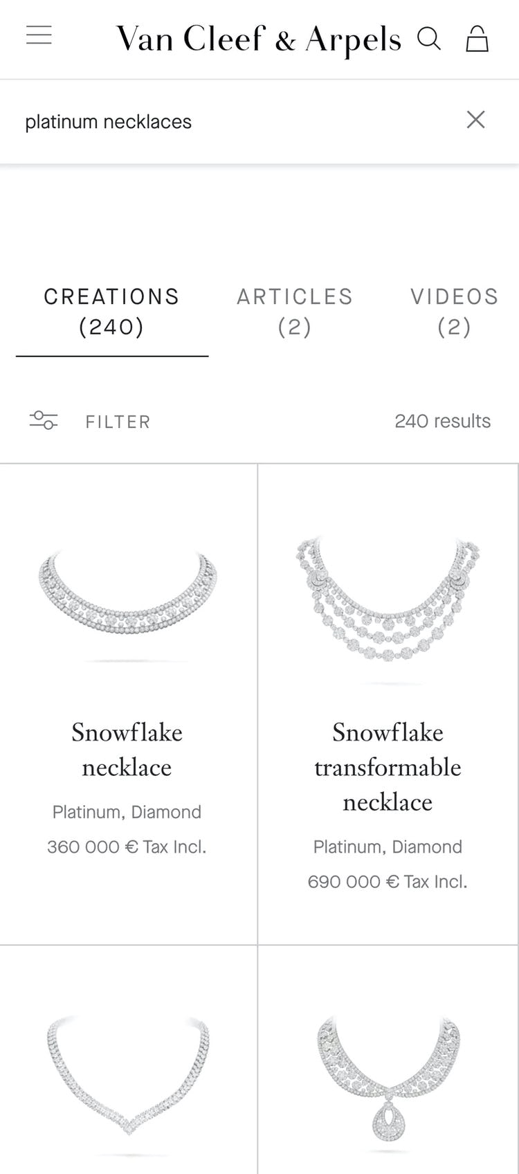
On Van Cleef & Arpels’s mobile site, the category page with the appropriate filter applied displays 8 products (first image), while the search results show all products (second image), including those that do not match the specified feature. This makes it difficult for users to use search to hunt for specific products.
During testing, however, “Feature” search results left users frustrated when few or irrelevant products were returned because it forced them to iteratively revise queries, or find alternate browsing methods, or even caused outright abandonment — particularly in cases where a “Feature” search was a second or third (or fourth, fifth, or beyond) search attempt.


At Gucci (first image) and Jimmy Choo (second image), feature searches are well-supported, as seen in these examples.
Therefore, it’s important to support “Feature” searches by leveraging product content (e.g., features, specifications, and descriptions) to present users with results that most closely match the desired product attributes included in their queries.
Note, however, that even if product attributes are well-defined users may phrase “Feature” search queries in a way that does not match those attributes. Since “Feature” query logic is quite complex (and priority areas of focus are heavily dependent on a site’s context), search logs should be monitored for “Feature” search usage behavior to help drive prioritization, and to help further define attributes and improve the quality of “Feature” search over time.
5) Poor Support for “Non-Product” Search
Users don’t just look for products at e-commerce sites; they also look for many other types of content, such as help sections, store information, and account features.
However, without support for “Non-Product” queries, they won’t be able to find that content via search.
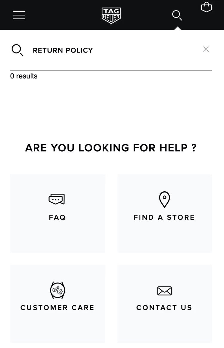
Even though TAG Heuer has an easy-to-understand return policy, it’s unnecessarily difficult to find it, as searching for “return policy” returns 0 results.
On mobile, finding “Non-Product” content via on-page links or navigation can be even more challenging as these options are often even harder to find compared to desktop sites.
The user behavior of searching for “Non-Product” information (e.g., “return policy”, “shipping cost”, “warranty info”, etc.) has been observed throughout multiple separate rounds of testing. For example, in our Accounts & Self Service testing, 34% of users tried to use site search to find “Non-Product” content.
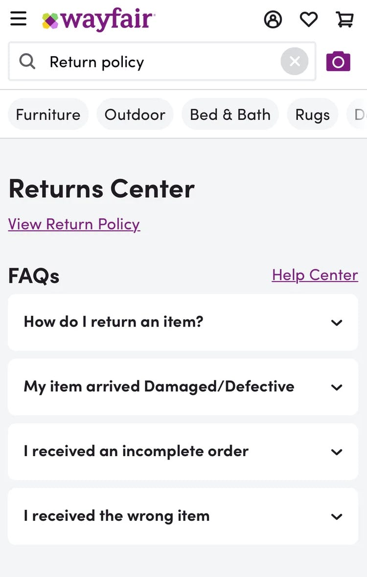
At Wayfair, a search for “Return policy” takes users directly to the “Returns Center”. None of the luxury sites we benchmarked supported “Non-Product” search.
It’s clear therefore that searching for “Non-Product” content — and expecting to find relevant results — has become an ingrained behavior and expectation for a large subgroup of users, and therefore needs to be supported.
6) Failing to Persist the User’s Search Query on the Results Page
During testing, users often went through multiple iterations of search queries (2.2 iterations on average).
For example, changing an initial query of “dresses” to “red dresses” after scanning the search results.
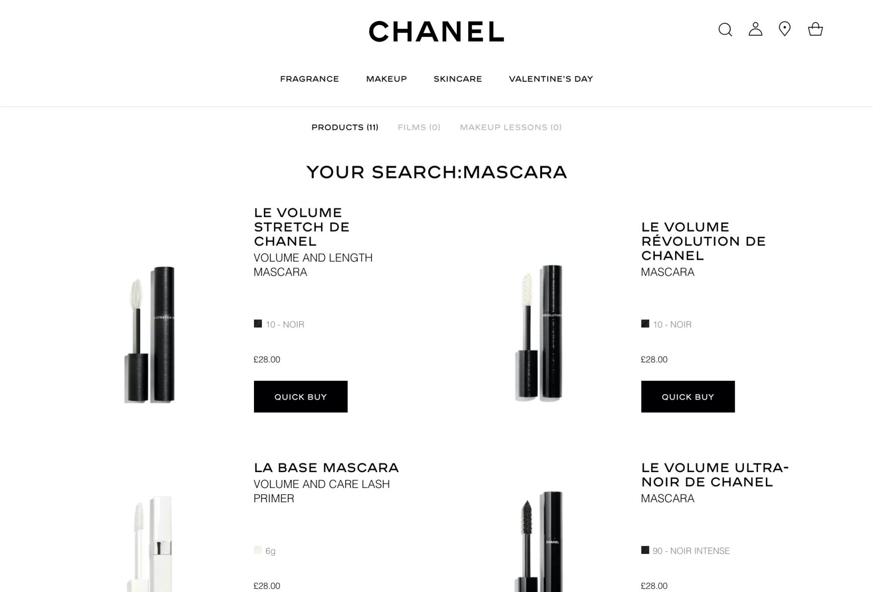
Chanel clears the search query after it’s submitted, which makes it difficult for users to iterate on their previous query.
Clearing users’ search queries each time they are submitted makes it cumbersome to use the search feature, as it requires users to retype queries all over for each iteration.
As a result, it takes longer for users to use search to find products or other content, and may nudge some users to abandon using search as a product-finding strategy.
Jimmy Choo’s mobile site also fails to persist search queries on the results page.
Moreover, on mobile users already have to grapple with small tap target sizes and numerous taps to backspace-delete a word (or words) before typing any new characters — both of which are already intricate interactions. For users attempting to revise query text in the middle or beginning of search fields, the action of tapping into the precise position in the search field can make iterating a query even more tedious.
Further, these factors do not take into account the length of time it takes to type on mobile to begin with — which is typically longer than it takes on a physical keyboard. All of these aspects combined show the difficulties inherent in mobile typing.
Search query text that is persisted, as seen here at Chanel, allows users to more easily make minor adjustments to query text without the need to retype, which helps to expedite product exploration.
On the other hand, during testing, when search queries were persisted, users made swift iterations by adding or removing a word or two from their original query, avoiding the “halt and retype” behavior that was necessary on sites that didn’t persist search queries.
Moreover, persisting the query helps relieve some of the strain on providing “perfect” filtering options for any given search query (as users can rapidly iterate their query instead, and “filter by searching”).
7) Failing to Autocorrect or Assist with Obvious Misspellings
Nobody is perfect, and the average user is certainly not a perfect writer. And they shouldn’t have to be.

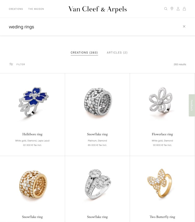
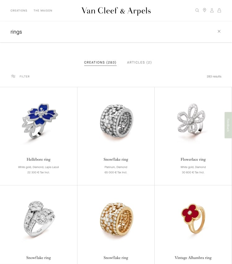
On Van Cleef & Arpels there are good results for the properly spelled query “wedding rings” (first image). However the results are very poor when the query is slightly misspelled as “weding rings” (second image). In fact, they are almost the same as if a user simply queried “rings” (third image), indicating the first misspelled term is simply being ignored by the search engine.
While testing desktop sites, users were repeatedly observed to submit misspelled words in their search queries. On mobile sites, our testing reconfirmed that misspellings continue to be common.
In all cases where misspelled queries are submitted, it’s of course important to suggest an alternate search query with the correct spelling on the search results page.
However, if the correction to the misspelling is obvious and the search engine has a high level of confidence in the suggested alternative, then the fix should be applied automatically by autocorrecting the misspelling.
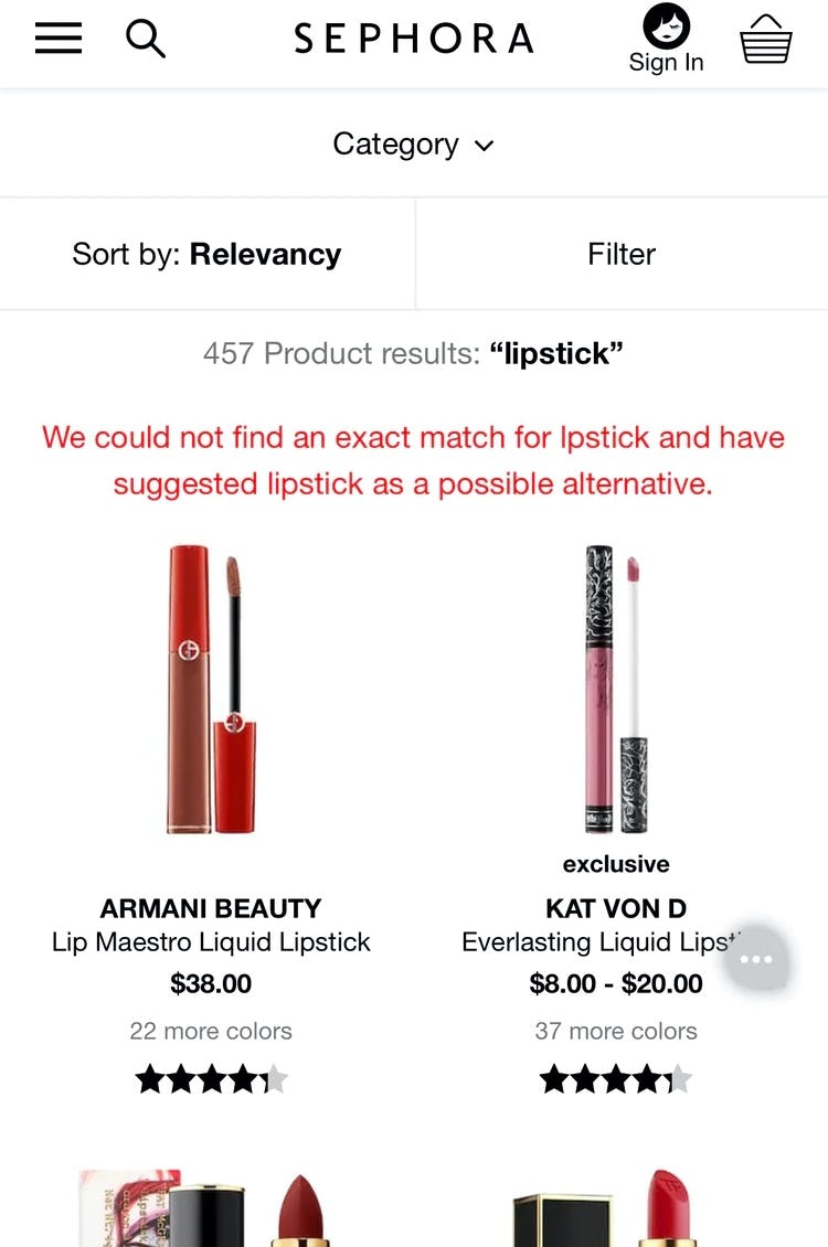
Sephora autocorrects “lpstick” to “lipstick” and alerts the user to this change. No luxury sites in our benchmark autocorrected slightly misspelled queries on the search results page.
Ideally, the autocorrect feature is intelligent, so if there are any search results for the misspelled query the user is given the option to override the autocorrection.
This gives the user a chance to revert faulty autocorrection (in the event the system’s correction is simply wrong) and supports the rare cases where product names have intentionally been named with misspellings (in order to achieve a certain word play or “brand play”).
For inspiration on On-Site Search consider looking closer at Jimmy Choo, where the desktop site performs “Decent” and the mobile site performs “Good” (the best of any Luxury benchmarked sites).
Luxury Product Lists and Filters

Product Lists & Filters is another well-performing area for luxury sites, with the average “Decent” rating stemming from clear thumbnails, consistent styling of information, and additional details and imagery via hover, making for a visually rich browsing experience.
Luxury sites have a tendency to focus on thumbnails rather than product details, likely due to the highly visual nature of their products and the high costs associated with each.
At the same time, often only the most basic filters are offered to users, and many improvements can be introduced here. These shortcomings, alongside a few others, mean that luxury sites still have room to improve in this area.
In particular, there are 3 issues Luxury sites get wrong when it comes to Product Lists and Filters.
8) Not Providing “Thematic” Filters
Users often browse physical retail stores thematically, looking for a “casual dress” or a “spring jacket”, for example.
Gucci only has basic filters available, limiting how much a user can narrow the product list to their specific need; for example, “office shirts”.
However, this is no easy task at most e-commerce sites. While dresses, jackets, and shirts can all be easily located, it is not always easy for users to find products that match their theme-related needs.
In fact, during earlier rounds of testing, a lack of “Thematic” filters often led to site abandonments because some users prematurely concluded that the site either didn’t offer the type of products they wanted or felt that it would be impossible for them to find the relevant items “hidden” in large product lists.
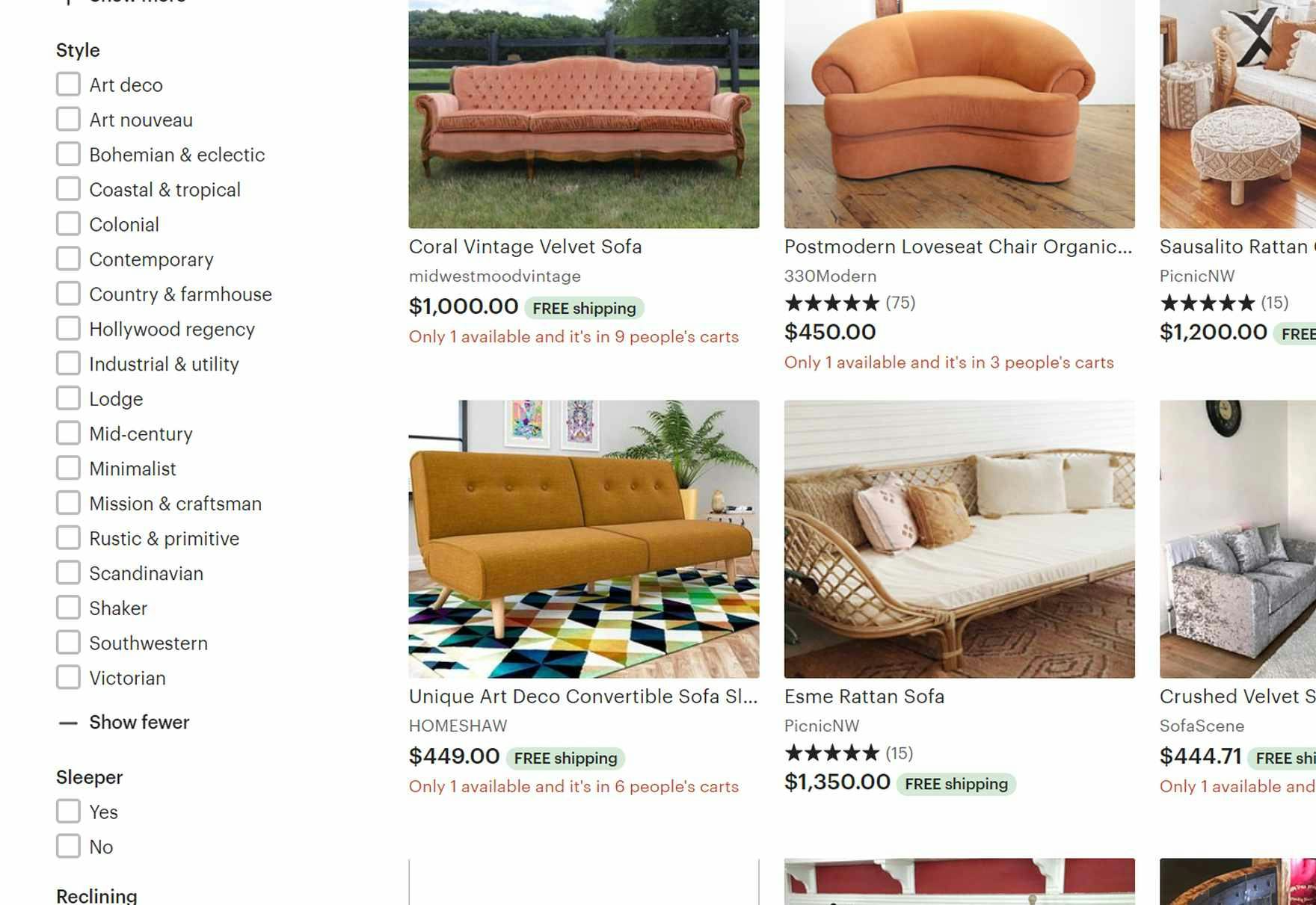
Users on Etsy looking for furniture suited to themes like “Minimalist” or “Rustic & primitive” have many “Thematic” filter options to choose from in the “Style” filter type. These filter options are particularly useful for users who are not experts in interior decor, and are therefore looking for guidance.

L.L. Bean’s “Activity” filter type allows users to tailor the product list to contain only items suitable for specific activities like “Hiking” or “Skiing”. This filter allows users to eliminate irrelevant products and focus only on comparing and assessing suitable products.
For most sites of a reasonable size, a combination of manual tagging and automation will often be the most appropriate way to begin implementing “Thematic” filters.
For example, automated approximations are often the better choice when a meaningful proxy can be established by combining a set of product attributes (e.g., “Value for Money”) or if the site catalog is frequently updated, whereas thematic attributes such as “Season” and “Style” will often be too technically advanced to determine computationally and therefore will often be cheaper to tag manually.
9) Not Showing the Number of Matches for Filter Options
During testing, on sites that didn’t show the number of matches for each filter option, users either wasted time applying filters that didn’t narrow the list enough, or ran into dead ends when the application of filters led to too-few items in the resulting product list.
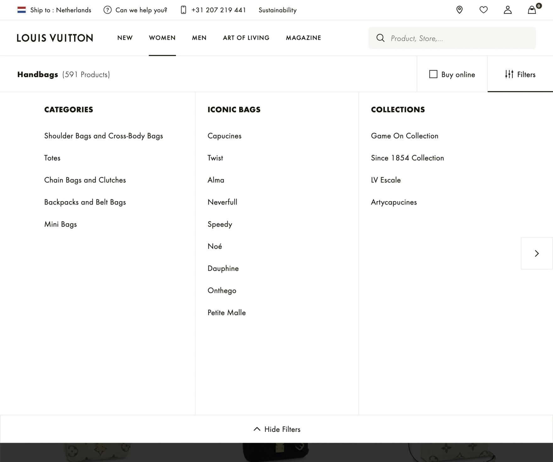
The numbers of matches are not shown for Louis Vuitton’s filter options. As a result users won’t know in advance the impact on the number of items in the product list of choosing particular filter options.
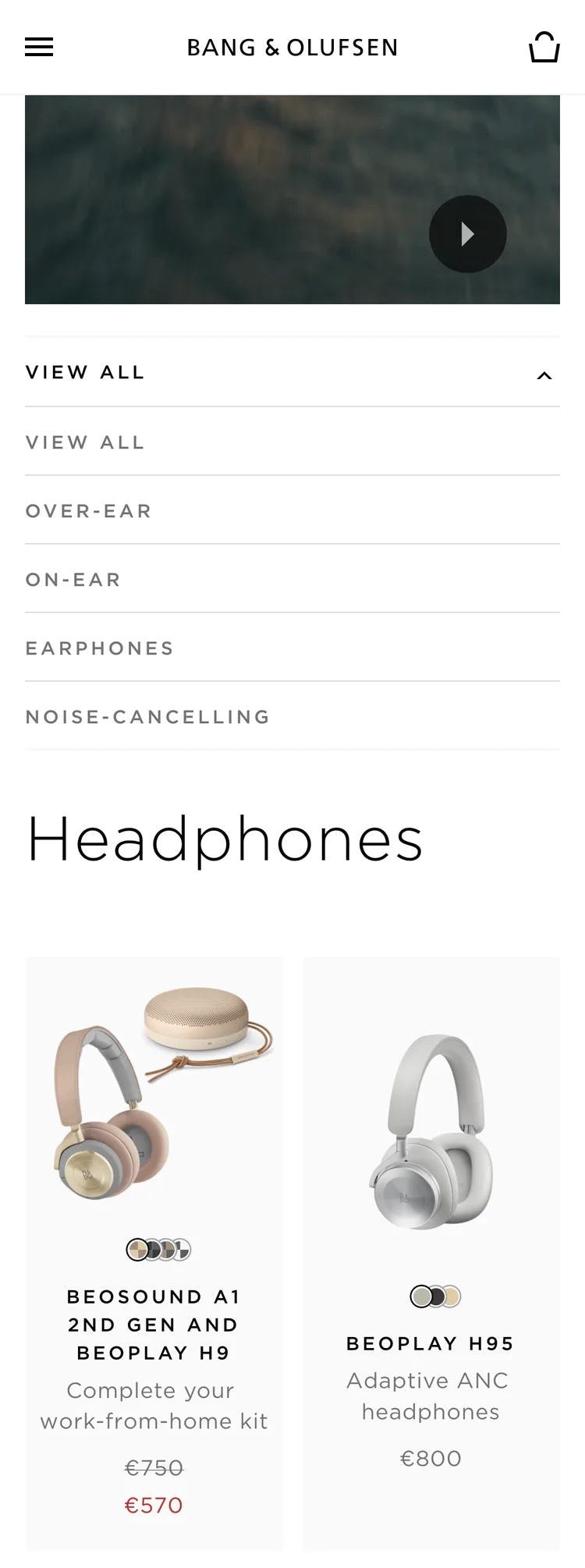
Users on Bang & Olufsen have no idea how many products will be made available after they apply, for example, the “Noise-Cancelling” filter.
On mobile sites, applying more filters will necessitate one or more trips to the filtering interface to apply more filters. And on mobile sites where filters can only be applied one at a time before users are returned to the product list, the process of trial and error to tailor the product list is quite tedious as users pogo-stick between the list and the filtering interface.
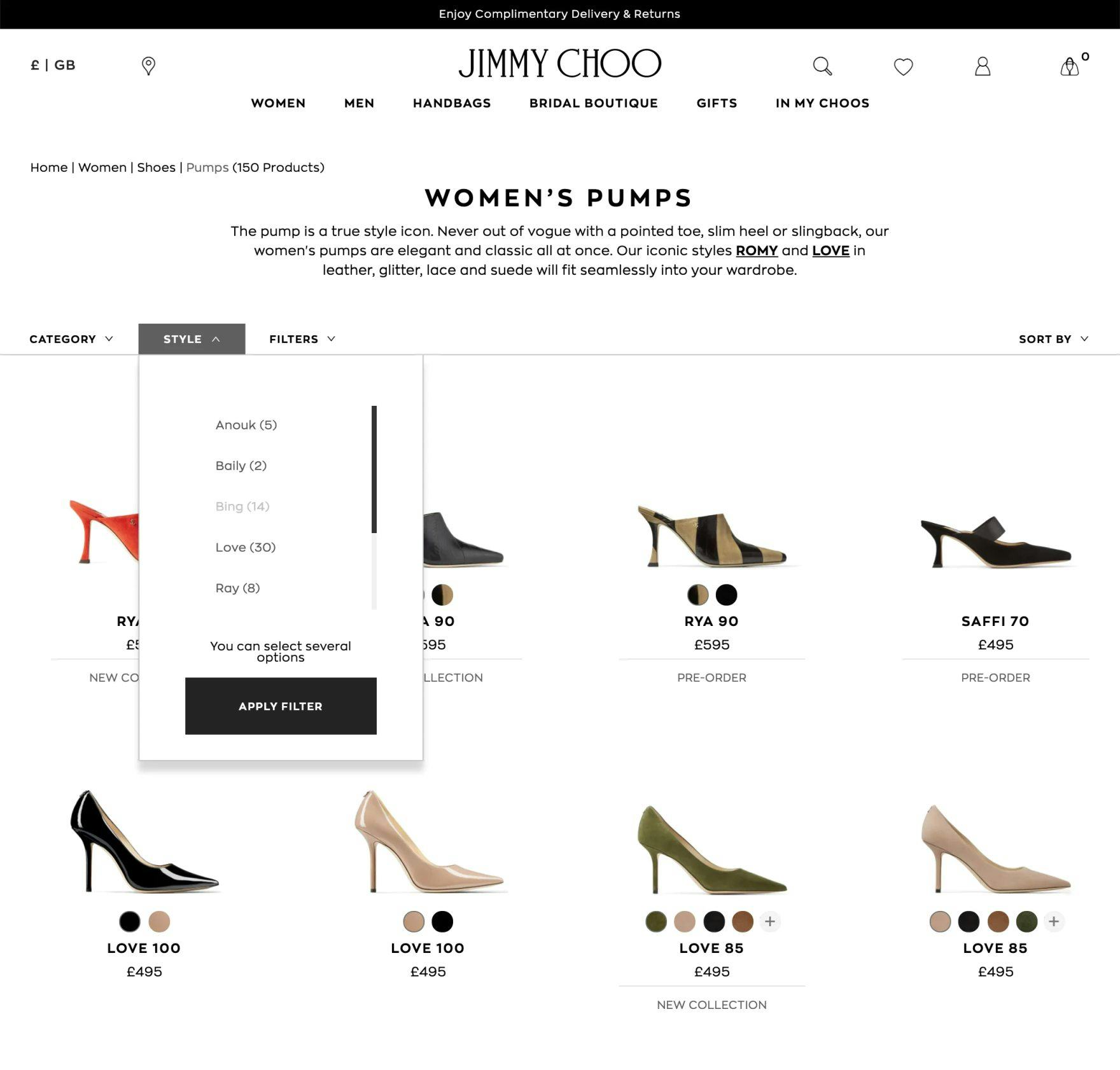
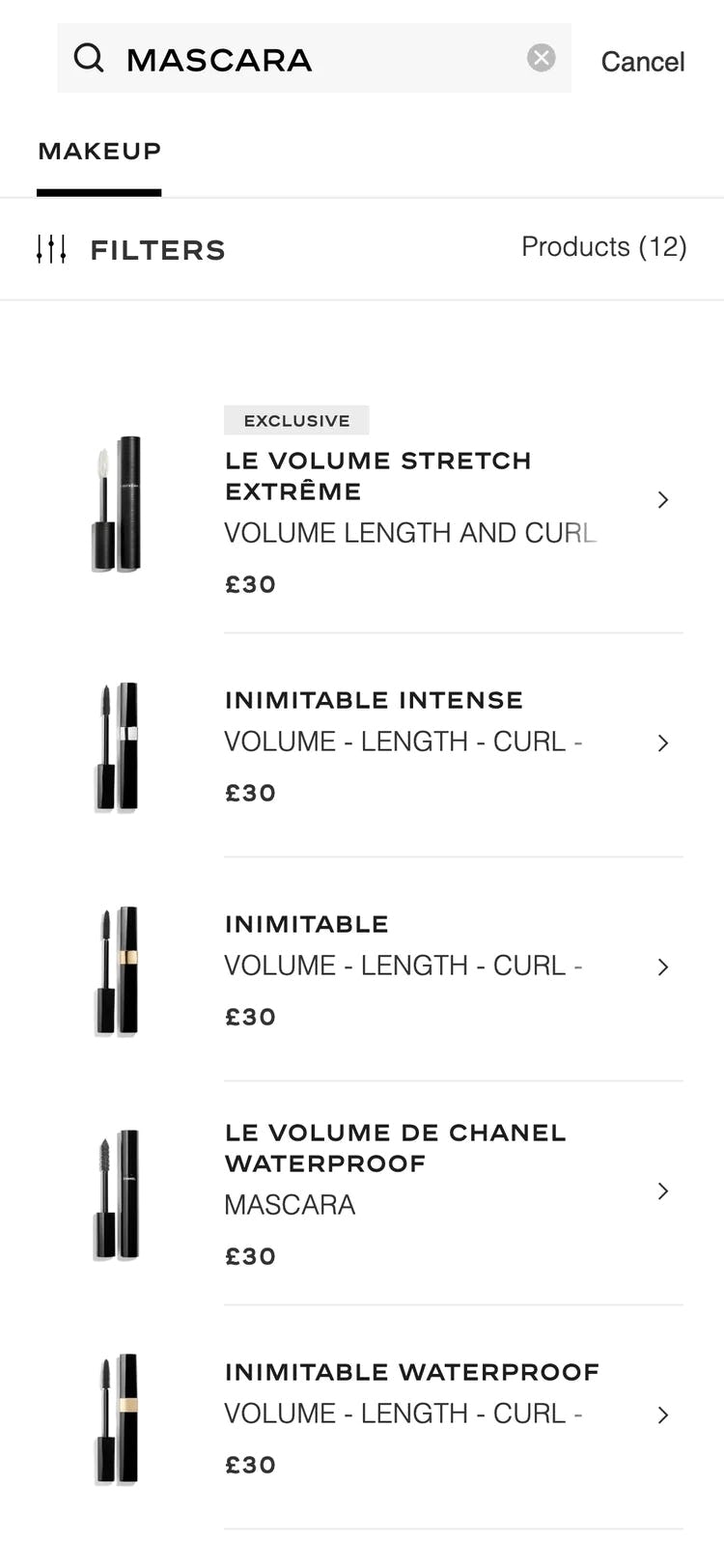
On Jimmy Choo, the number of matching products is displayed for each “Style” filter option. Users can thus make an informed decision if they want to, for example, apply the “Baily” filter to see only 2 results.
On the other hand, seeing the number of matches for each filter option gives users confidence that they will be able to tailor the product list to one that has suitable items, and contains neither too-many nor too-few items.
It’s not enough, however, to simply have numbers of matches besides filter options — they have to be updated each time a filter is chosen. This allows users to constantly gauge how applying filters will impact the product list.
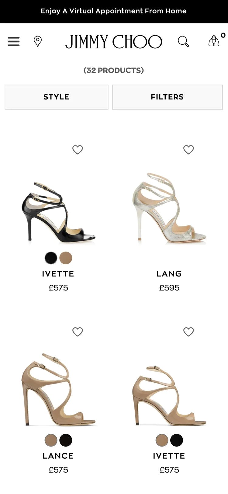
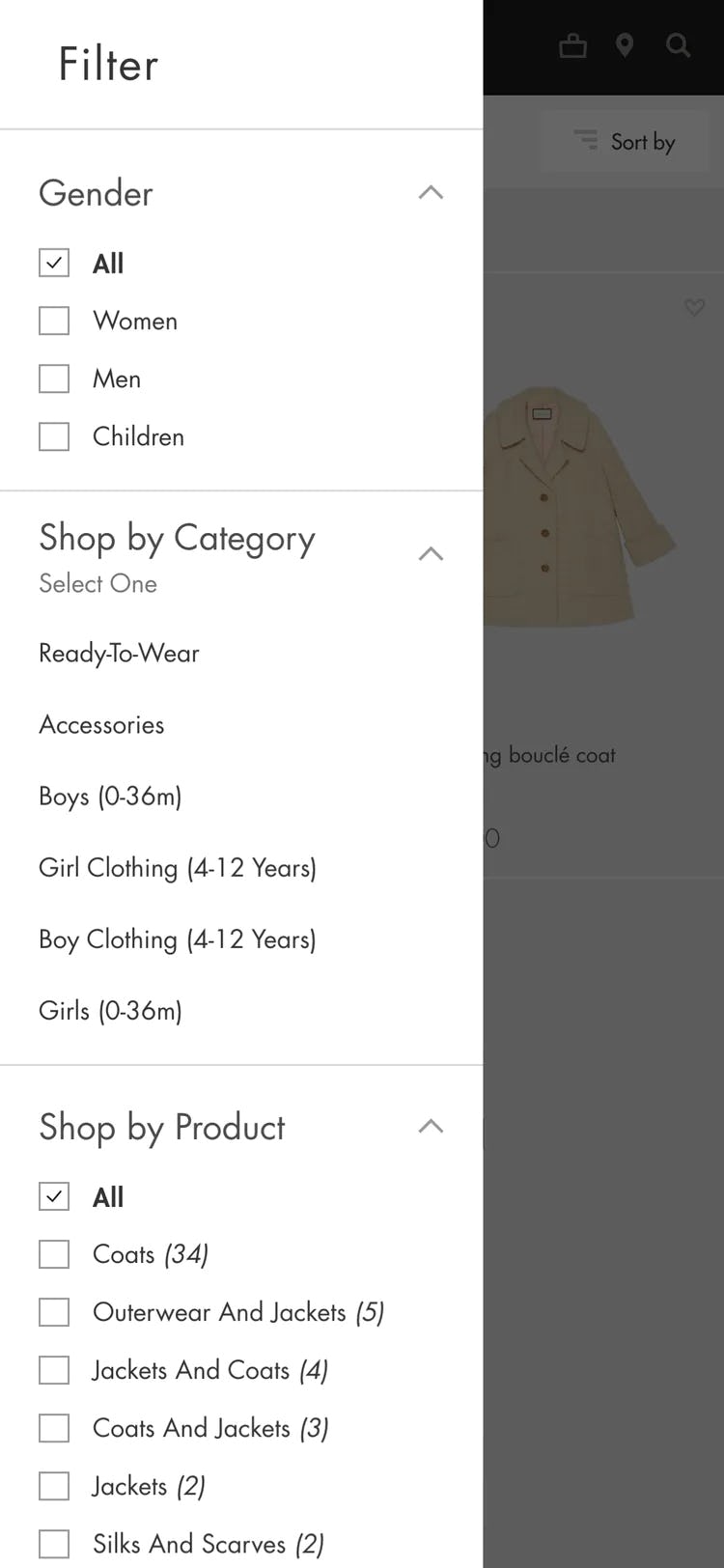
10) Not Showing the Applied Filter Options in an Overview
When users apply filters to product lists, almost all sites confirm the choices where the filter was originally chosen — for example, by adding a tick mark to a filter option checkbox on a desktop site.
However, during both desktop and mobile large-scale UX testing, the lack of an overview of applied filters caused issues such as slowing down the process of tailoring the product list and in some cases causing disorientation.
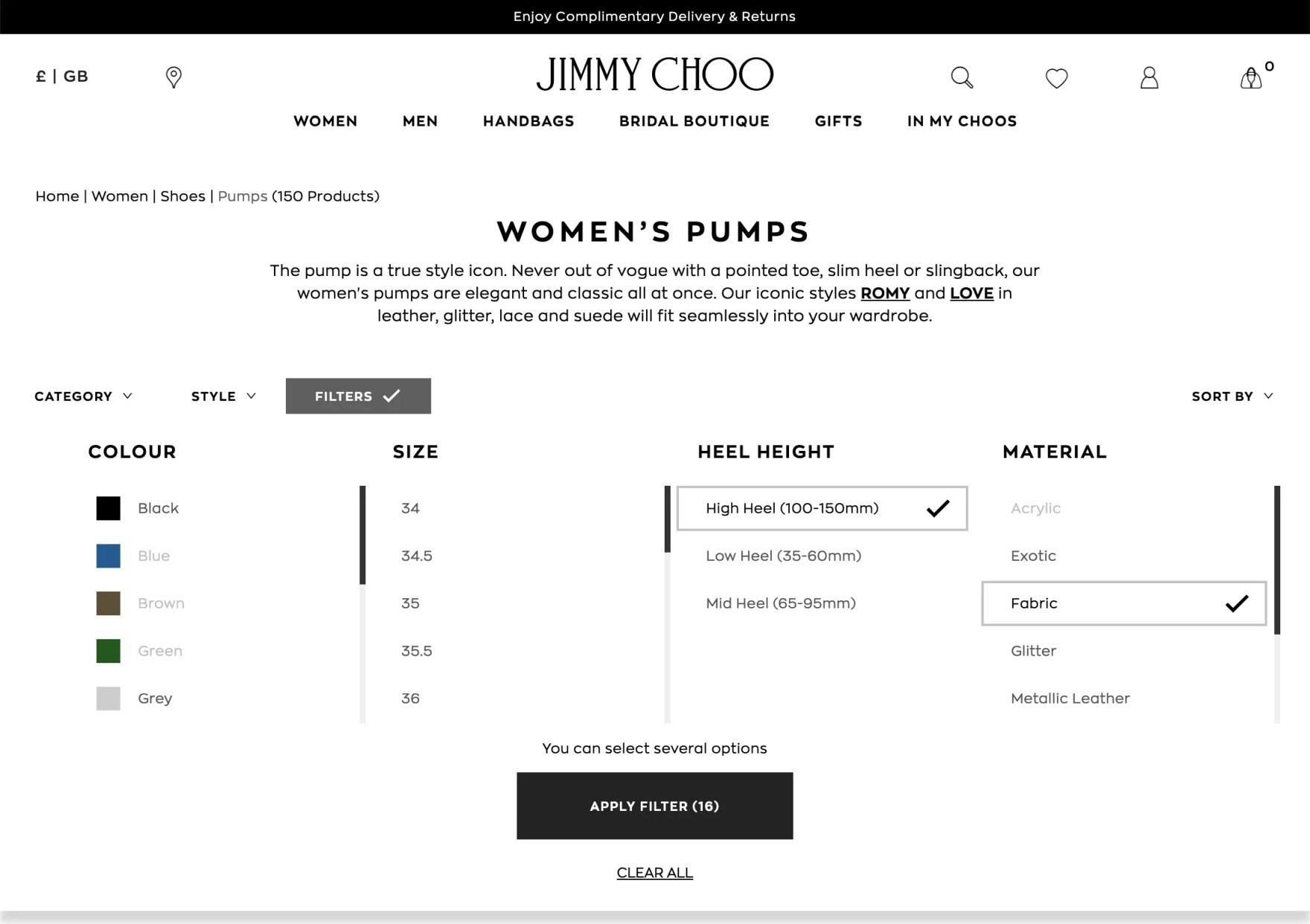
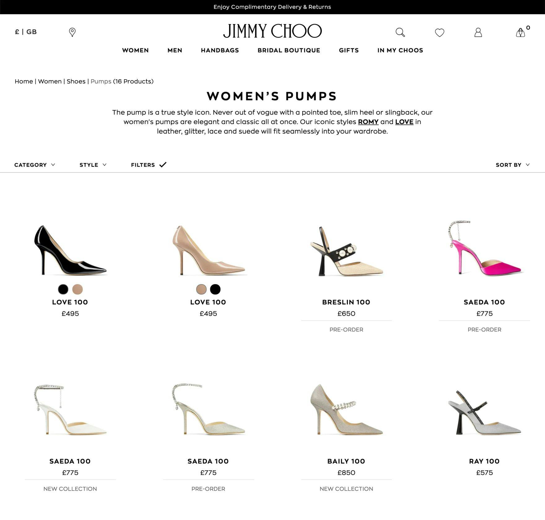
At Jimmy Choo, despite applying filters in the filter interface (first image), there’s no indication of what filter options have been applied in the product list (second image). The absence of an overview of applied filters can be a particular issue for users who are exploring multiple product pages and coming back to the filtered list. If the context of the list isn’t always clear, users could lose track of how the filtered products relate to the broader catalog.
In particular, there were 3 issues observed for both desktop and mobile sites when there was no applied filters overview:
- No obvious and immediate confirmation that filters have been applied
- Not having a quick way to remove filters
- Not having a context for the product list
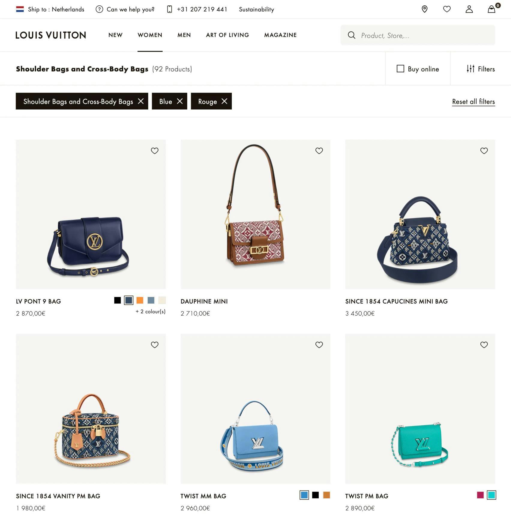
Louis Vuitton displays applied filters in an overview in the product list, making it relatively easy for users to understand the current scope of the list, as well as deselect filters to broaden the list if desired.
Yet the solutions for desktop are relatively straightforward: to provide an overview of applied filters above the product list, above the filtering sidebar, or below a horizontal filtering sidebar.
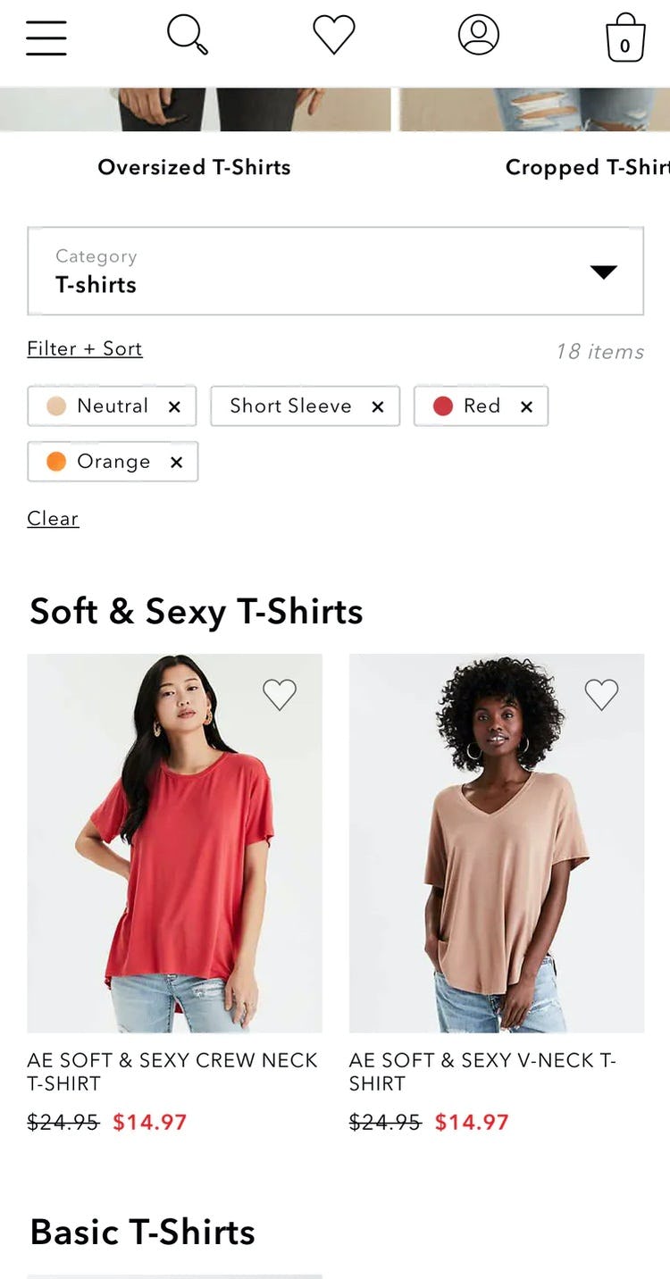
On apparel sites like American Eagle, showing filter types (e.g., “T-Shirts”) in applied filters overviews is often unnecessary. Filter options like “Short Sleeve” and “Red” will make sense to users without the associated filter types displayed. Note also how the absence of filter types means that the applied filters are comparatively narrow, with 3 fitting comfortably on each line.
For mobile, applied filters can be displayed in a horizontally scrolling list or in a stacked list to ensure users are able to quickly and efficiently use filters to produce the optimal product list.
For inspiration on Product Lists and Filtering consider looking closer at Gucci’s desktop site and Chanel’s mobile site, both of which perform “Good” (the best of any Luxury benchmarked sites).
Luxury Product Details Pages

The Product Details Page is one of the greatest strengths of luxury sites and has a “logistical advantage”, in that the low number of products and high price points makes it reasonable to spend a great deal of resources on maximizing and polishing the page content.
Detailed descriptions of all product features, exceptional photography, and highly relevant cross-sell products differentiate luxury sites from other e-commerce sites, and complimentary shipping and returns on every purchase all contribute to their standout “Decent” to “Good” average performance.
Still, there are areas for improvement; in particular, 2 issues observed on Luxury Product Details Pages are likely to lead to lost sales and user confusion.
11) Not Allowing Users to Purchase Temporarily “Out of Stock” Products
During our usability testing of product pages users would sometimes stumble on products that were listed as “out of stock.”
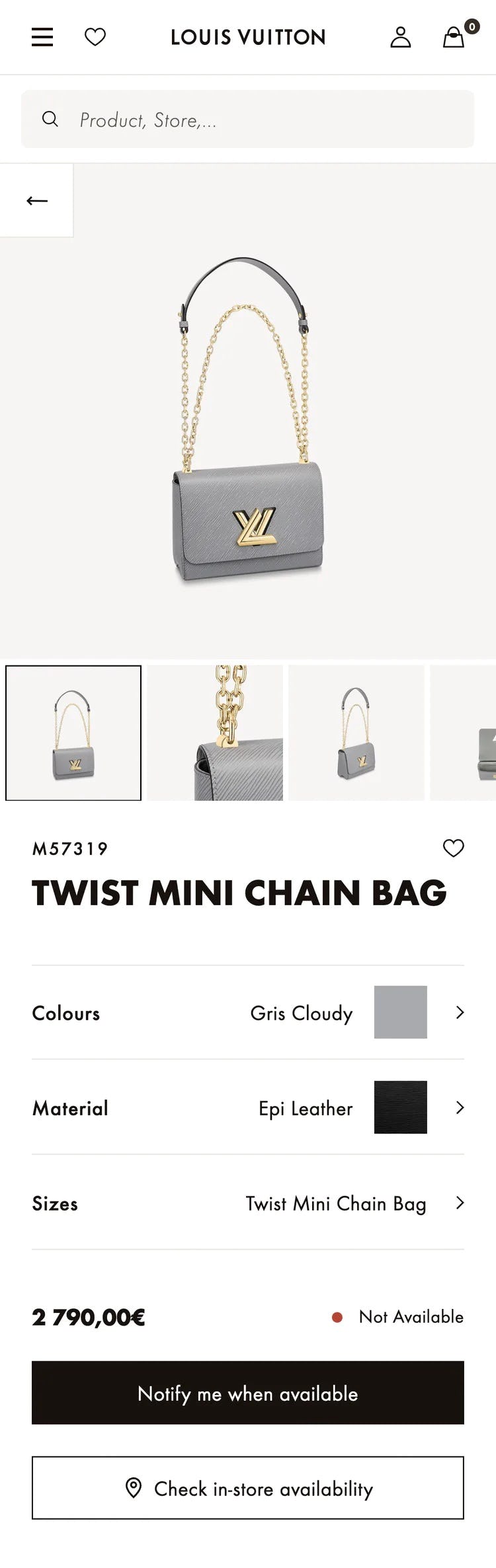
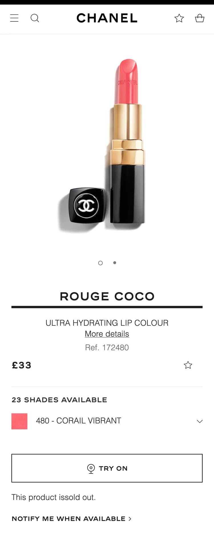
At Louis Vuitton (first image) and Chanel (second image), users are simply told that an item is “Out of stock”. Though users can elect to be notified when the product is available, we’ve found in testing that nearly all users won’t pursue that option, due to forced account creation and other factors.
What’s clear from testing is that, if users are simply told a product or product variation is out of stock, while some will look for alternative products on the site 30% are likely to simply abandon to look for the product elsewhere.
Presenting users with text that simply states a product is “out of stock” is a UX dead end: users can’t go any further on a site if they are truly set on purchasing that particular product.
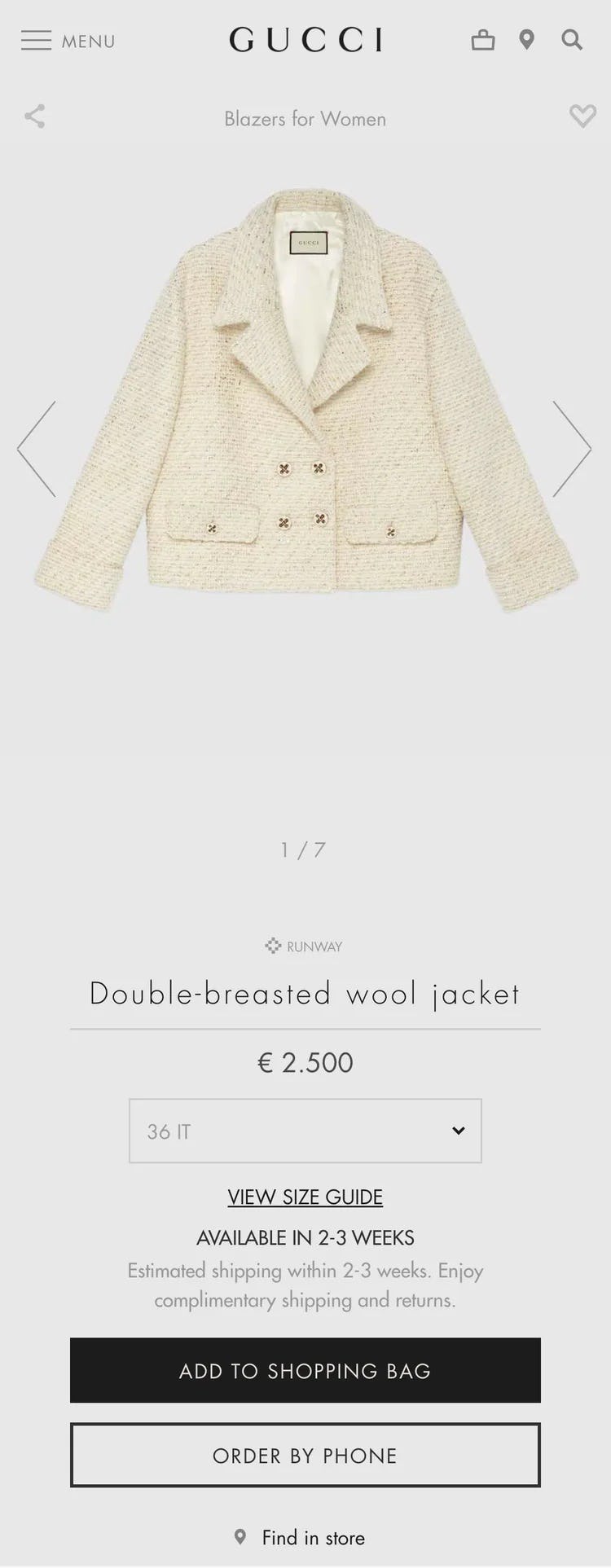
At Gucci, users can still purchase a temporarily out of stock product. Note that users are alerted to the item being available in “2–3 weeks”, which leaves it up to the user to decide if they’re willing to wait to receive the product (rather than presenting them with an “out of stock” UX dead end).
On the other hand, if a product or a product variation is temporarily out of stock at the moment when the user is attempting to purchase it, but is expected to be replenished soon, then sites can leverage users’ expectation that they’ll have to wait to receive the product by allowing users to place an order for the out of stock product and simply increasing its delivery time.
If, however, a product has been discontinued or deprecated, then it is truly unavailable and users should be informed of that fact by clearly marking the product as “discontinued” or “deprecated” — and alternative cross-sells should be heavily promoted instead.
12) Not Providing an Estimated Delivery Date or Range
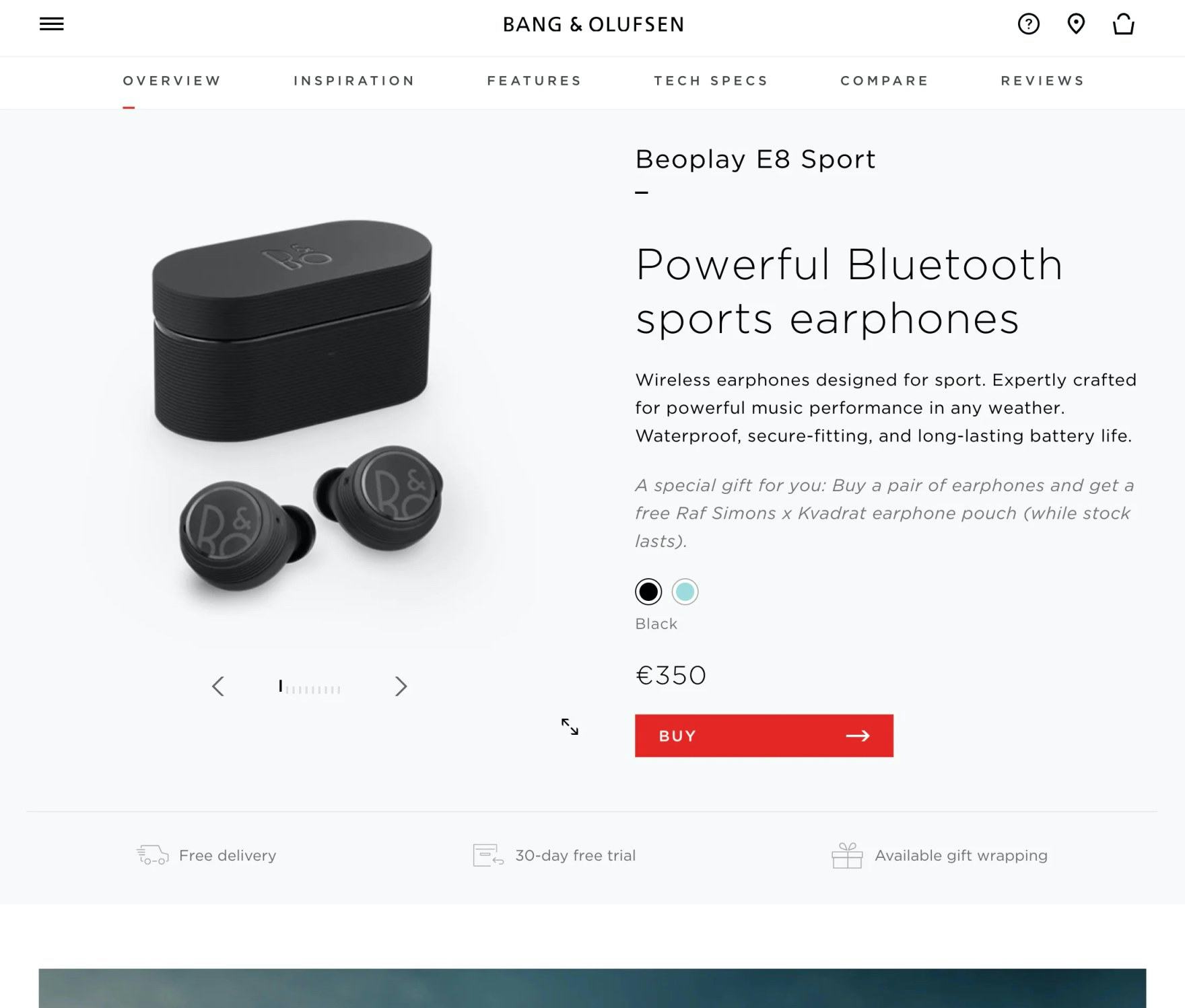
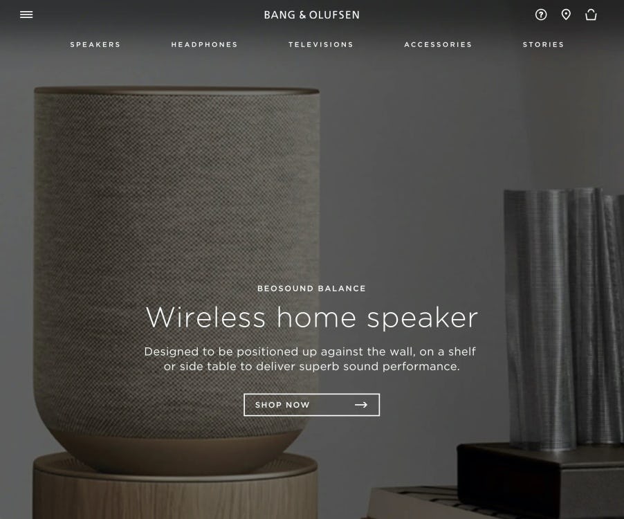
Bang & Olufsen doesn’t provide any indication on the product page of when users can expect to receive the product — thereby failing to meet a crucial information need.
Many sites don’t display shipping information at all on the product page, leaving users wondering when they can actually expect to receive their product — a crucial consideration for some users, and a question that a subgroup has to answer before they enter the checkout.
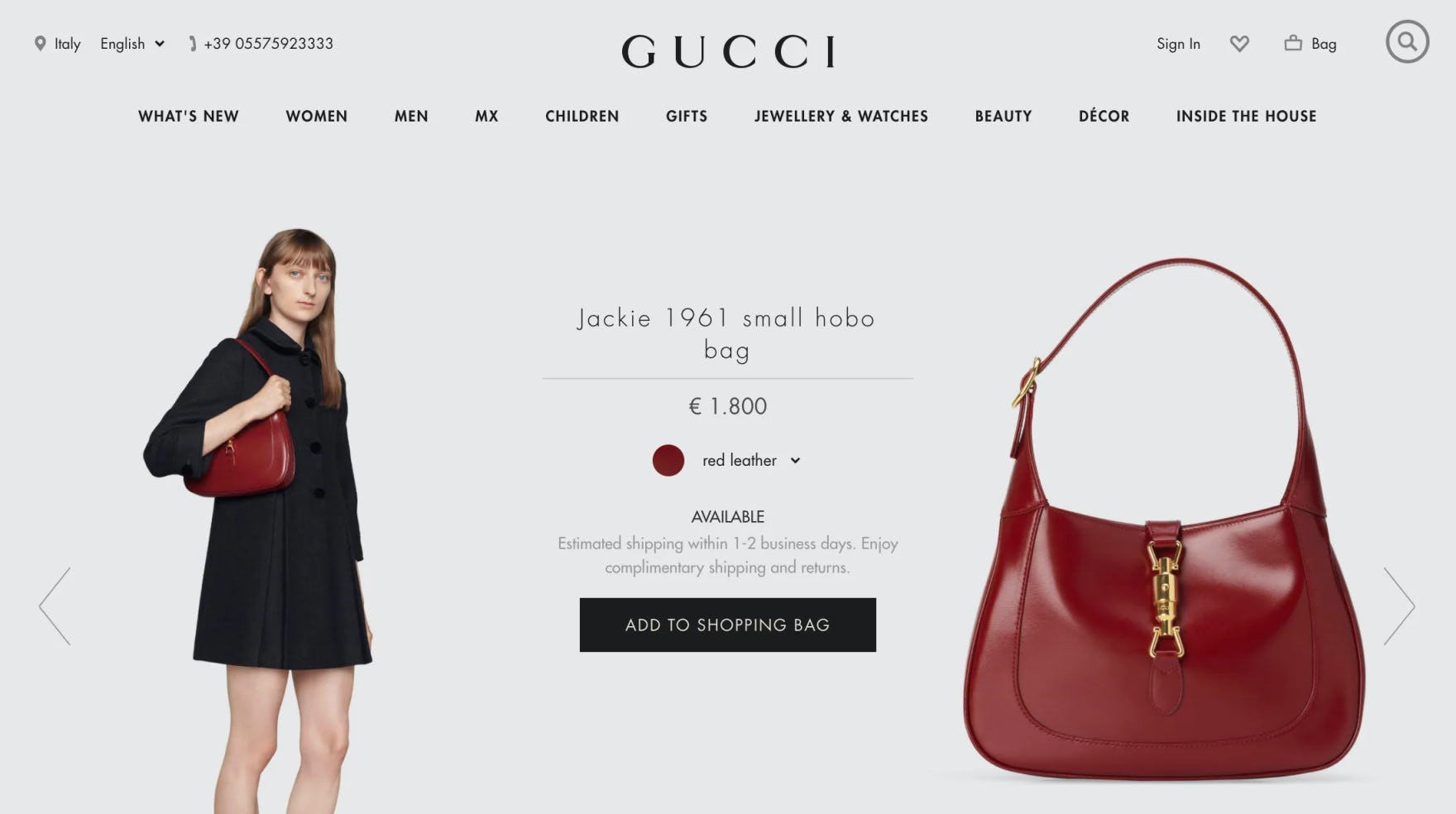
Gucci provides some information regarding delivery date — but uses the business-centric “1–2 business days”, forcing users to calculate for themselves when they can actually expect to receive the product.
Other sites display only the “delivery speed” (e.g., “5–7 business days”), which can be difficult for users to easily understand.
When users are only provided with a “delivery speed” they must calculate for themselves when their products would likely arrive by taking into account multiple factors — for example, at what time of day they are ordering (to calculate likely shipping time cutoffs), and what day of the week it is (to take into account processing in “business days”).
Consequently, during testing, we observed several users stopping their product search to mentally calculate when they could actually expect to receive their product.

At Target, users are provided with the delivery dates for both shipping to their home as well as shipping to the nearest store on the product page. Additionally, the order cutoff time is provided, so users know when they need to complete their order by to get the provided delivery dates. No luxury sites benchmarked provided similar delivery details on the product page.
Therefore, to ensure users have this critical information at their fingertips when they’re considering adding a product to their cart, provide an estimated delivery date, or date range (both performed well in testing), on the product page. Ideally, this info should be provided near the “Buy” section (i.e., somewhere near the “Add to Cart” button) to ensure high visibility.
While most benchmarked Luxury sites do well when it comes to Product Page performance, for inspiration see Louis Vuitton’s desktop and mobile sites.
Luxury Mobile Web

Lastly, when it comes to the mobile experience, nearly all content has been optimized for Luxury sites, with the strong Homepage and Product Pages on desktop translated effectively here as well.
There remain some issues and shortcomings, 3 of which are commonly missed opportunities found on most e-commerce sites.
13) Failing to Include the Full Scope in Homepage Link Text
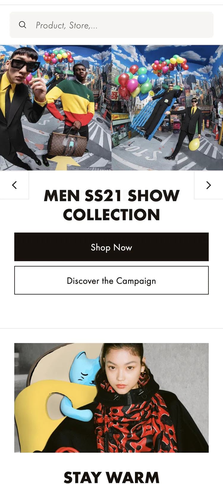
At Louis Vuitton, some users clicking on the “Shop Now” button will assume they’re viewing the entire site product catalog — not a narrow scope of “Men SS21 Show Collection”. Consequently some will abandon due to this misunderstanding.
During testing, some users who tapped on featured paths on the homepage wound up in much narrower scopes than they had intended to — and some never realized they were even in a site scope. (Note: “scope” here refers to a featured subcategory or promoted filter — for example, “Women’s Shirts” or “Women’s New Arrivals”.)
This led directly to their decision to abandon the site, as they assumed the site simply didn’t have a wide selection of products or the specific products they were looking for.
On mobile sites in particular users are at risk of developing tunnel vision, as the small viewport limits their ability to gain an overview of their current location.
While promoting scopes on the homepage can help many users access highly relevant product lists, a subgroup of users will completely lose all context of where they are in the site hierarchy if the scope links are unclear, leading them to severely misinterpret what products are actually available.
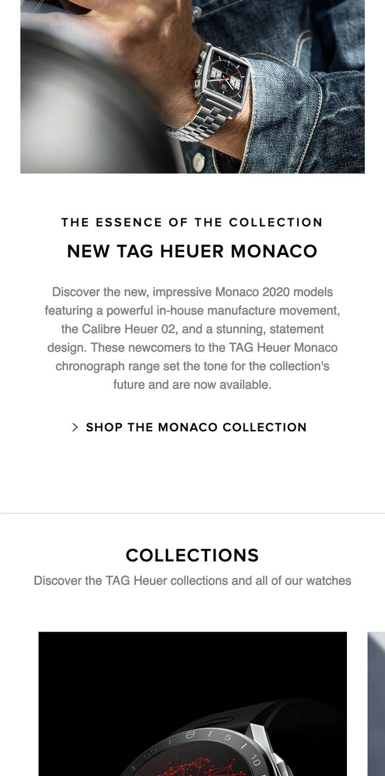
TAG Heuer provides users with the context they need when tapping a link from a homepage, by indicating the full scope in the link text (i.e., “Shop the Monaco Collection” rather than simply “Shop”).
To mitigate this issue, there are two options:
- Display only top-level scopes on the homepage.
- Include the full scope in the link or button itself — for example, both the category and subcategory names. This would mean, for example, having “Women’s New Arrivals” as the button microcopy, rather than having “New Arrivals” as a header and only “Women’s” as the button microcopy.
14) Failing to Highlight the User’s Current Scope
A significant part of external e-commerce traffic doesn’t land directly on your homepage and then navigate linearly downwards through category pages, product listings, and then product pages.
Instead many users land deep into the site’s catalog.
As it is impossible to control exactly where a user is going to enter the website, it’s integral that users can understand where they currently are and where they’re able to go.
Van Cleef & Arpels doesn’t highlight the user’s current scope in the main navigation. Consequently, many users, especially those arriving from off-site, will be disoriented and unsure of where they are in the site hierarchy.
Yet during testing we observe that, when users’ current scope isn’t highlighted in the main navigation, it makes it unnecessarily difficult for users to determine where they are in the site hierarchy, makes it more difficult to learn and internalize the site’s structure, and it makes it more difficult to navigate to a new top-level scope.
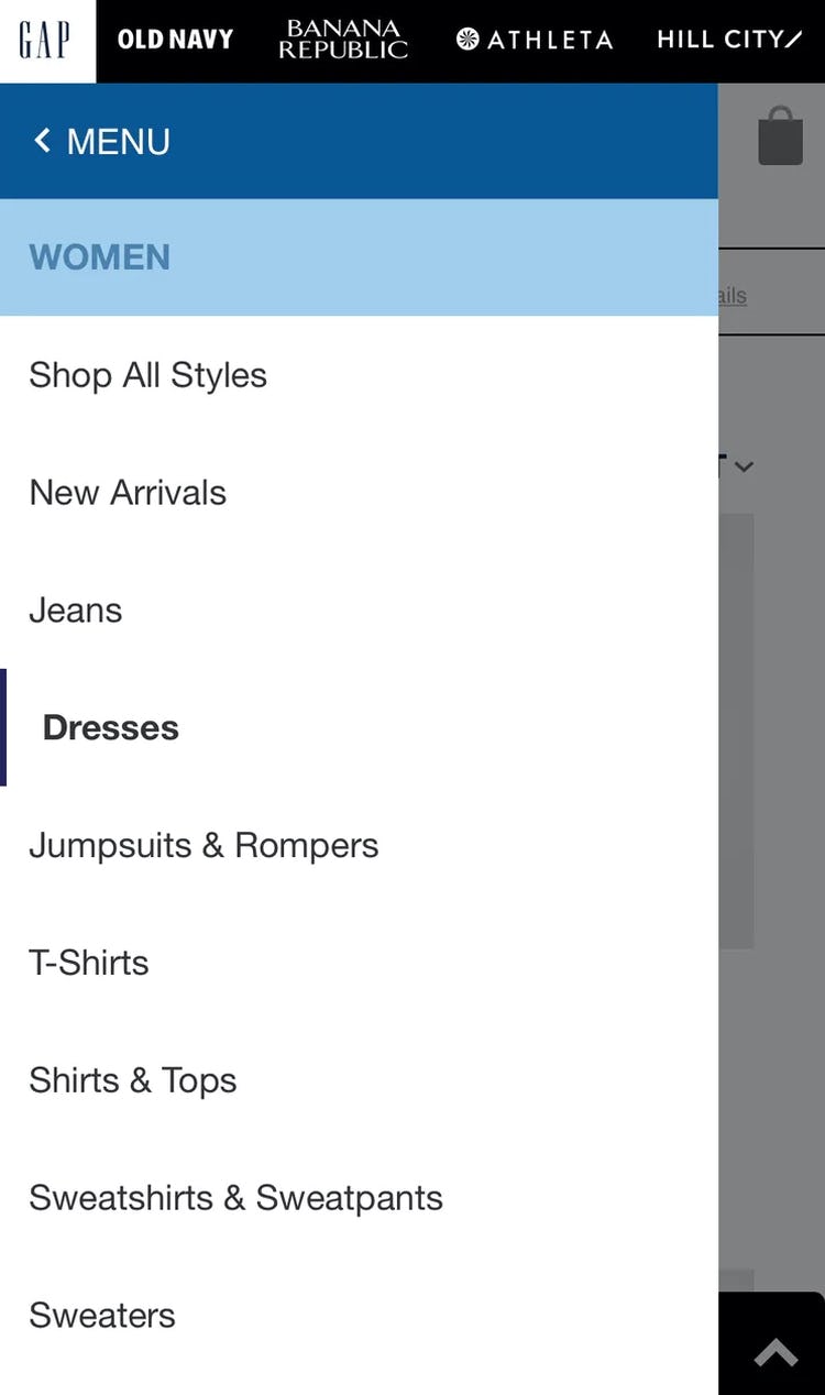
Simply highlighting the user’s current scope in the main navigation, as seen here at the Gap, provides an anchor for mobile users, who are always at risk of becoming disoriented. (No benchmarked luxury sites did this for their mobile sites.)
Fortunately, providing information on where users are in the main navigation has a somewhat “low-cost” solution: simply highlighting their current scope in the main navigation (in addition to providing breadcrumbs, which have special implementation considerations on mobile sites).
On mobile, this also means styling the current scope differently from the other main navigation options, within the main navigation viewport (rather than in the header, as on most desktop sites).
15) Failing to Provide an Adequate Hit Area for Site Elements
Despite hit area sizing being a “basic” for mobile design, we time and again observe sites implementing elements and links with overly small hit areas.
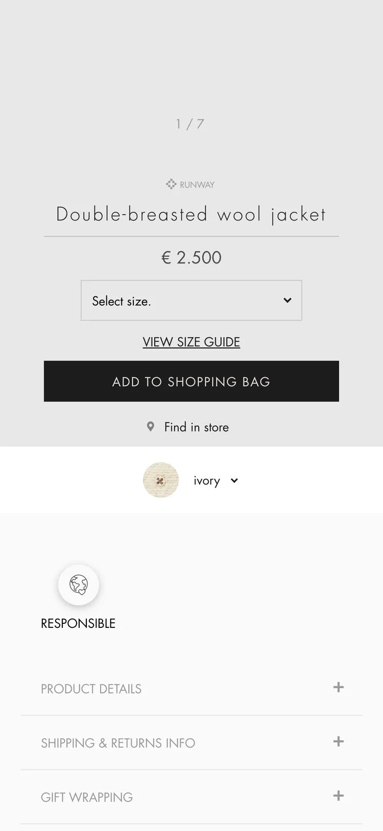
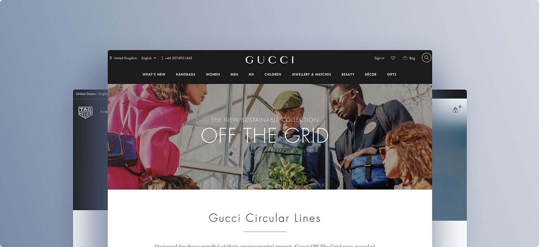
At Gucci, many links have inadequate hit areas; for example, the “Find in store” and color selector links in this example.
When hit areas are too small, the disruption to the user can range from mild annoyance, at having to tap multiple times before they hit the right spot, to severe frustration and abandonment if they mistap and end up in another area of the site or lose data (e.g., during checkout).
During benchmarking Bang & Olufsen generally had adequately sized hit areas for links and elements, as seen here on the homepage.
Yet the solution to these issues is straightforward: have at least a hit area of 7mm x 7mm (measured on the smartphone display).
All benchmarked Luxury site’s performed “Decent” when it comes to Mobile site design, but consider looking closer at Van Cleef & Arpels and Chanel, the two top performers on this platform.
Meet the High Expectations of Luxury Retail Users
This high-level analysis of the Luxury Retail UX focuses on only 4 of the 51 Luxury Retail subtopics (plus Mobile Web) included in our Benchmark Analysis. The 47 other subtopics should be reviewed as well to gain a comprehensive understanding of Luxury Retail UX, and to identify additional site-specific issues not covered here.
Although our benchmark has revealed that no sites have a completely broken Luxury Retail UX, it’s clear that there’s much room for improvement, as no sites perform “Perfect” or even “Good” when it comes to overall desktop and mobile performance.
Avoiding the following 15 pitfalls is the first step toward improving users’ Luxury Retail experience:
- No personalization features
- No direct link to “return policy” and “shipping” in the footer
- Hard to understand return policies
- Poor support for “feature” search
- Poor support for “non-product” search
- Failing to persist the user’s search query on the results page
- Failing to autocorrect or assist with obvious misspellings
- Not providing “thematic” filters
- Not showing the number of matches for filter options
- Not showing the applied filter options in an overview
- Not allowing users to purchase temporarily “out of stock” products
- Not providing an estimated delivery date or range on the product page
- Failing to include the full scope in homepage link text
- Failing to highlight the user’s current scope
- Failing to provide an adequate hit area for site elements
For inspiration on other sites’ implementations and to see how they perform UX-wise, head to the publicly available part of the Luxury Retail benchmark. Here you can browse the Luxury Retail implementations of all 7 benchmarked sites.
Getting access: all 435 Luxury Retail UX guidelines are available today via Baymard Premium access. If you already have an account open the Luxury Retail Study.