Key Takeaways
- Users often instinctively reach for a submit button to the right of the search field — whether it’s there or not — instead of looking towards the touch keyboard.
- Not displaying a search submit button next to the field slows users down, especially during search iterations.
- Without keyboard optimization specific to search, users who do look towards the touch keyboard to submit their query will struggle to identify the default keyboard submit key.
When searching for products on mobile websites, users won’t always look towards the touch keyboard to submit their search queries.
Indeed, during our large-scale mobile usability testing, some users would mainly look to the webpage UI itself at first, therefore failing to notice or recognize the touch keyboards’ search submit button provided by the mobile OS.
These users will often go on a major detour and experience severe frustrations over the seemingly basic action of submitting a typed search query.
Yet, 21% of mobile e-commerce websites in our UX benchmark fail to provide search submission buttons adjacent to the field.
In this article we’ll discuss the test findings from our large-scale mobile usability research study including:
- How the absence of a search submit button in the UI leads to increased friction
- The added risk for mobile sites that hide the search field by default
- Why it’s important to customize the submit search key on the device keyboard as well
The Absence of a Search Submission Button in the UI Causes Hesitation and Introduces Potential Errors
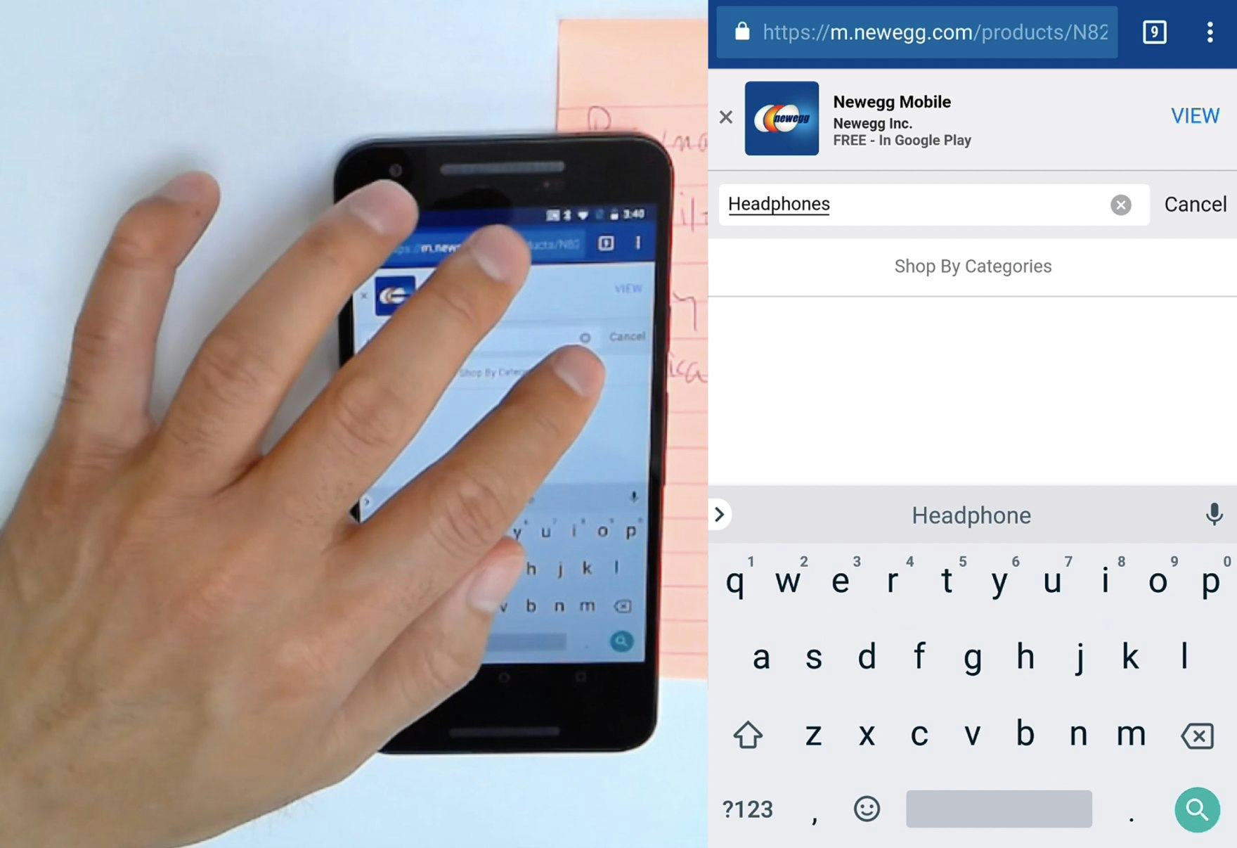
After typing a query at Newegg, a user instinctively reached to the right for the search submit button. Because a submit button was not positioned next to the search field, he nearly tapped the “clear” icon before pausing to scan the screen for another option. He eventually turned to the keyboard magnifying glass icon to submit the query.
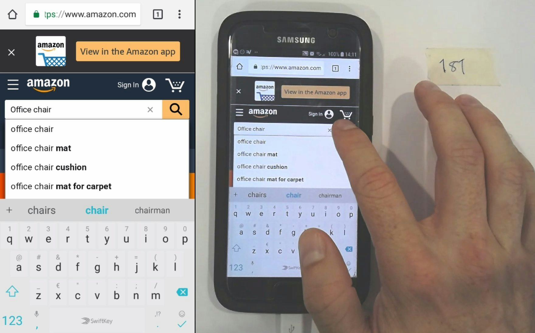
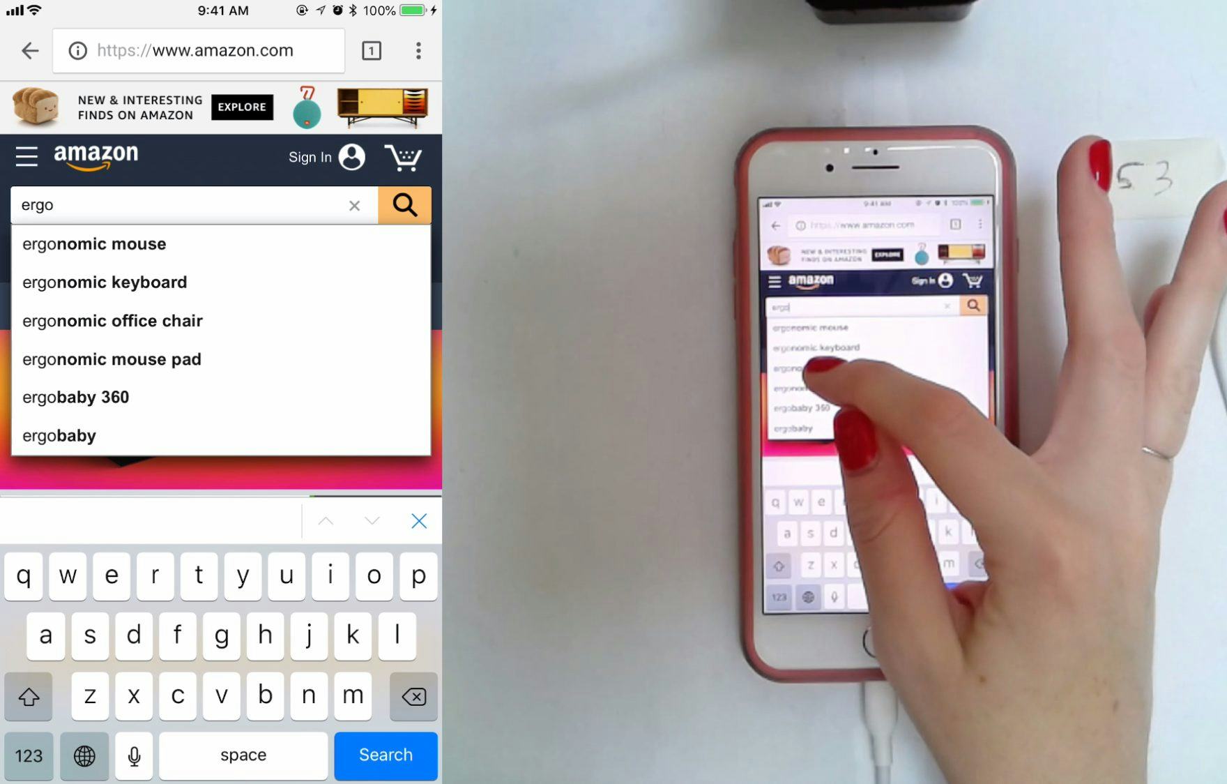
After typing a query for “office chair”, a user at Amazon tapped the search submit button (a magnifying glass icon) adjacent to the search field. The position of the button in the expected location, as well as the use of good visual contrast and a sufficiently sized tap target, helped users expedite their search query submissions.
There are 3 key ways to submit a mobile on-site search query:
- tapping a search submit button that the site has placed in the UI adjacent to the search field,
- using the touch keyboard submit button (provided by the mobile OS), or
- selecting an autocomplete word or phrase.
Of those actively using the search field during testing, some users were observed reaching their finger toward a submit button placed to the right of the search field — whether it was actually present or not.
This behavior likely represents an instinctual habit for many users since desktop sites frequently include a search submit button, typically at the right-hand side of the search field itself.
When a search submit button adjacent to the field is absent on mobile websites, it causes users to make a mental context switch — shifting from a product-exploration mindset to one focused on tracking down an expected UI component.
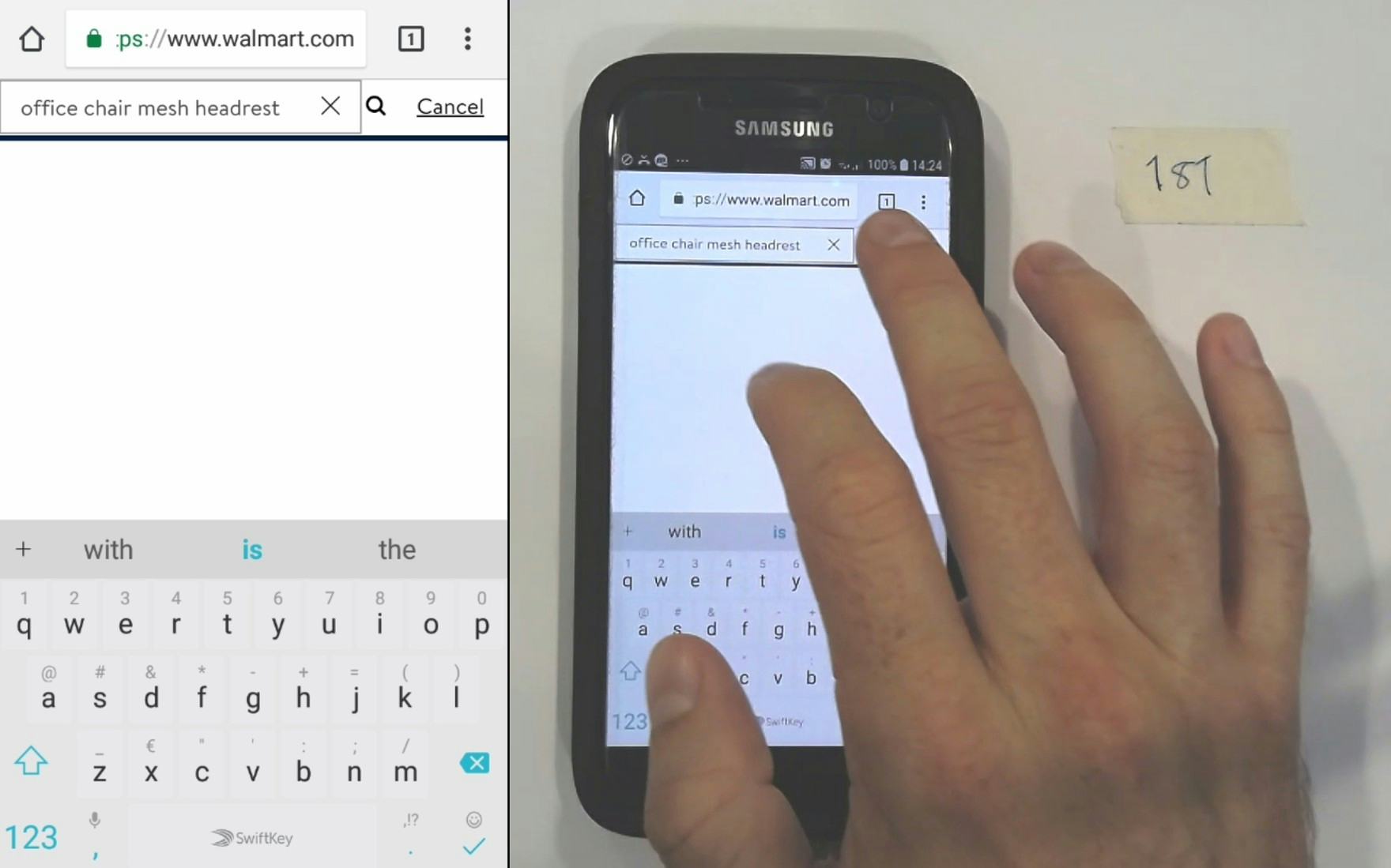
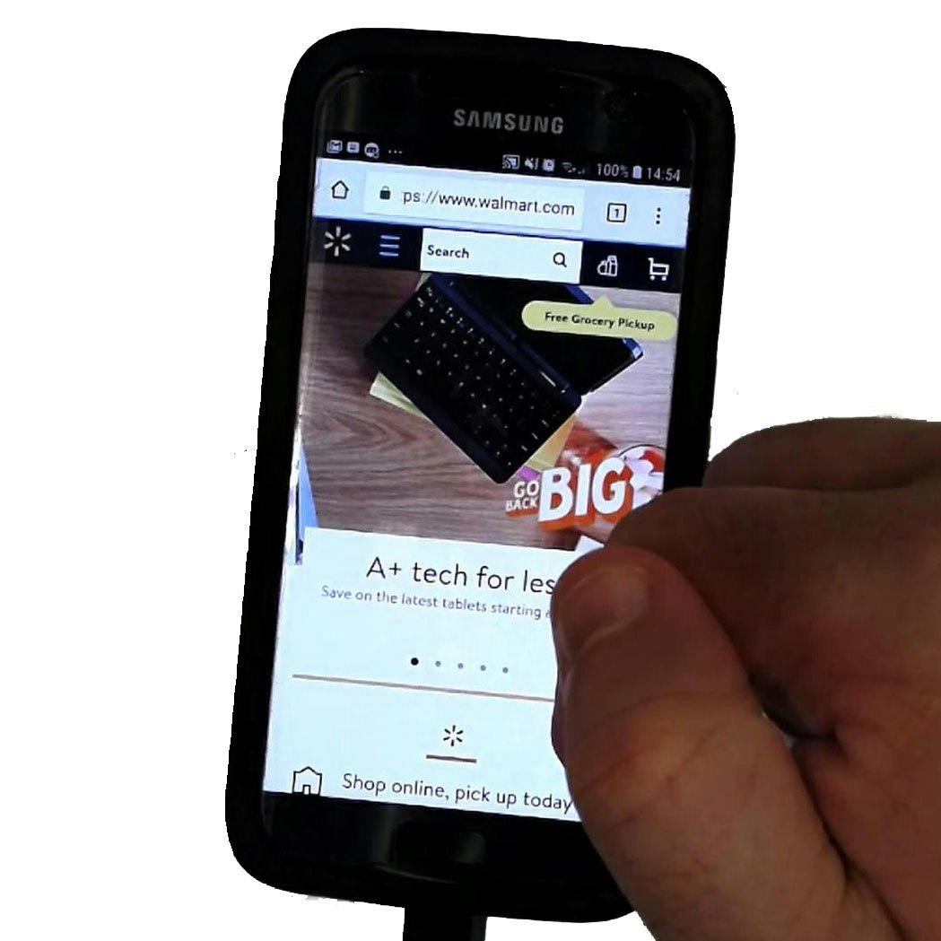
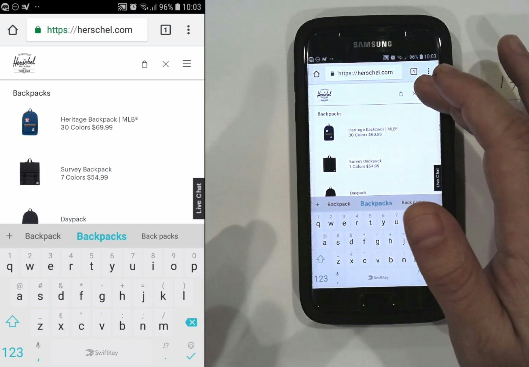
After initially using autocomplete to search for “office chair” at Walmart, a user revised his query to narrow the results — adding “mesh headrest”. He then hovered over the right side of the search field, and quickly found and tapped the magnifying glass icon for the first time.
Additionally, issues with submitting queries on sites without a search submit button positioned adjacent to the field are not only problematic during a user’s first search attempt, but were also observed during search iterations or when users were attempting to “reset” their search by resubmitting the same search query.
Ultimately, the absence of a search submission button often forces users to turn to the keyboard to execute their search query, which is not always a typical first action.
Admittedly, it’s unlikely that the absence of a search submit button next to the field will cause serious issues for most users — during testing, users who looked for a way to submit their search near the field did ultimately find it in the keyboard or through an autocomplete suggestion.
However, in testing the absence of a search submit button adjacent to the field resulted in unnecessary pauses, increased scrolling, visually scanning the screen for other search submit options, and near-mistaken interactions (e.g., clearing queries by mistakenly tapping the “X” in the search field).
Moreover, mobile users typically face more challenges overall than desktop users — meaning seemingly “minor” issues can quickly compound to cause severe friction and can contribute to site abandonment.
On Sites that Hide the Search Field, Users Mistake the Purpose of the Icon
A subissue observed during testing occurred on sites where the search field is hidden (i.e., it’s icon-invoked) and, at the same time, they don’t have a search submit button.
While most sites show an exposed search field on the homepage, 35% of mobile e-commerce websites in our UX benchmark hide the search field by default.
On these sites, search was accessed using a magnifying glass icon in the sitewide menu, and tapping the icon would show or hide the search field.
This “show/hide” interaction is a departure from the icon’s more historic use as a deliberate search submission method — carried over from desktop search field design. Indeed, 68% of mobile e-commerce websites in our UX benchmark use a magnifying glass icon to represent the search field submit button.
The two design patterns combined — 1) a field without an obvious way to submit search and 2) a nearby show/hide-only magnifying glass icon — can result in users not intuitively knowing how to submit their search query.
When the magnifying glass icon is misinterpreted for search submit, it leaves users disoriented and frustrated, and wondering whether their search queries were submitted at all.
Customize the Submit Search Key on the Keyboard (9% Don’t)
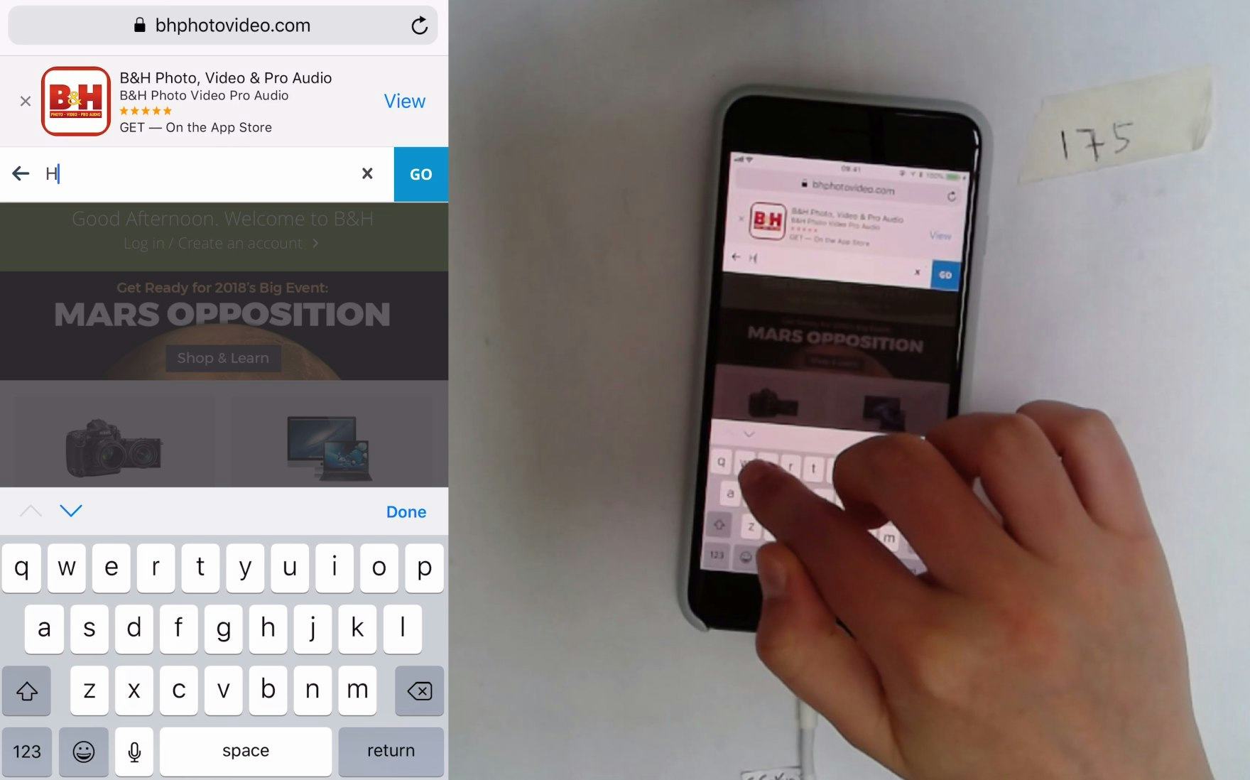
While a prominent “Go” button is provided in the interface adjacent to the search field, the iOS alphanumeric keyboard invoked at B&H remains in its default state, only displaying a gray button reading “return”. While this may not pose a challenge for experienced iOS users, most users would be helped with button text more clearly related to search.
The iOS alphanumeric keyboard invoked at Amazon instead displays a search submit button in blue that reads “search”, which makes its purpose more obvious than the default “return” text. The blue color also provides good contrast, helping the key to stand out.
For the users who do use the keyboard to submit queries, it’s also important to customize the submit search key on the keyboard to display a sufficient call to action.
However, 17% of mobile e-commerce websites in our UX benchmark neglect to modify the default iOS keyboard submit key — instead they only display a gray “return” button design.
While keyboard optimization specific to search submit is lower priority than other mobile touch keyboard customizations, using a custom search submit button does provide a stronger visual call to action and a more polished appearance than the default state.
Note that this keyboard optimization comes in addition to having a search submit button adjacent to the search field.
For example, to optimize the iOS touch keyboard to display a blue “search” button, specify that the related form field is, in fact, a search field by using the attribute input type="search".
Streamline Search Submission on Mobile

At Hayneedle, a “Go” button is provided directly in the UI, and the iOS touch keyboard invoked displays a blue “search” button, ensuring users notice and understand its purpose.
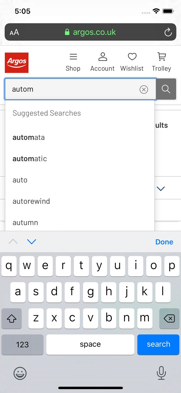
Similarly, at Argos, an explicit magnifying glass icon is positioned adjacent to the search field, and the custom “search” submit button in the keyboard provides a strong visual call to action.
Search submission on mobile websites is already troublesome due to the fact that typing on the mobile keyboard is inherently difficult.
During our large-scale mobile UX testing, we’ve observed that the absence of an explicit search submission button directly in the UI further impedes the search process and increases the potential for errors such as inadvertently clearing a search query.
Moreover, the risk that users will struggle with query submission is higher for sites that hide the search field by default. Some users will mistake the purpose of the magnifying glass icon, resulting in disorientation or severe frustration.
On the other hand, positioning an explicit search submit button directly in the UI adjacent to the search field aligns with users’ expectations and, therefore, streamlines the search process, including initial search query submission as well as iterative search refinements.
Combining the use of a touch keyboard optimized for “search submit” with a search submission button directly in the UI helps to ensure an intuitive and efficient mobile search experience, regardless of the user’s favored method for submitting a search query.
This article presents the research findings from just 1 of the 650+ UX guidelines in Baymard Premium – get full access to learn how to create a “State of the Art” e-commerce user experience.