Key Takeaways
- Our new research has uncovered 1,370+ usability issues specific to small catalog, DTC sites.
- The research has resulted in 413 guidelines that describe the issues, as well as design patterns verified to perform well for users.
- In particular, the research provides insights on the content and features DTC sites need to provide users to ensure they’re able to make a purchase decision — and the content and features they don’t.
At Baymard our research team has just spent 1,440 hours usability testing and researching Small Catalog, Direct-to-Consumer (DTC) website features, layouts, content, and designs — leading to our new research study on DTC UX.
The research is based on more than 217 qualitative user/site usability test sessions following the “Think Aloud” protocol (1:1 remote moderated testing).
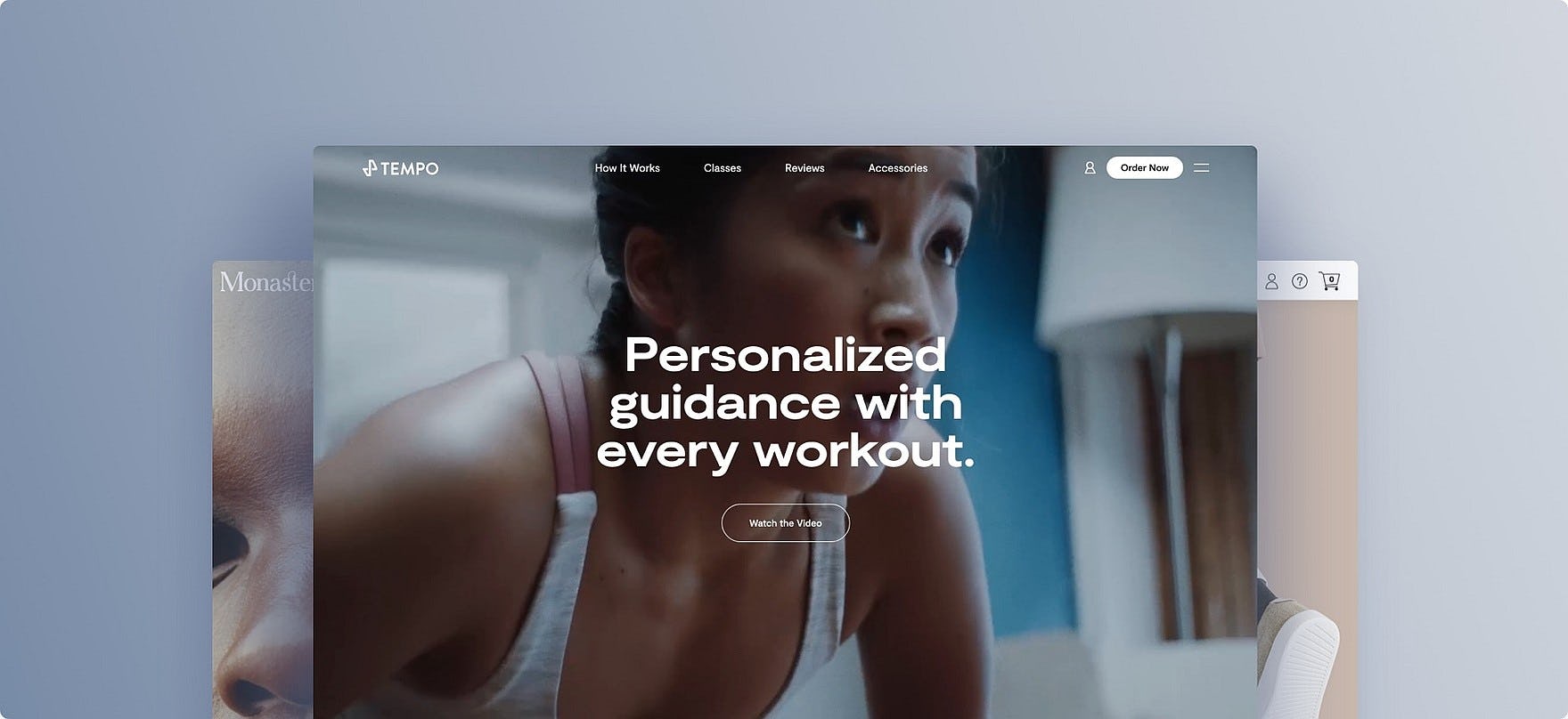
The test sites spanned smaller niche Direct-to-Consumer brands with smaller product catalogs, including beauty (Monastery Made, Mahalo, and Maya Chia), apparel and accessories (Greats, Thousand Fell, Allbirds, MVMT, Daniel Wellington, and Farer), cookware (Milo, Great Jones, Equal Parts, and Caraway), and fitness (Tempo, Mirror, and Tonal). (Our earlier testing included larger brands with DTC sites such as Adidas, Apple, H&M, IKEA, Urban Outfitters, Under Armour, JBL, KitchenAid, L’Occitane, and Patagonia).
Yet despite testing a broad variety of smaller niche DTC sites, throughout the test sessions, the users would repeatedly abandon DTC sites due to issues with the layout, content types, or features.
Indeed, during testing the users encountered 1,370+ medium-to-severe website usability issues on the smaller niche DTC sites.
These issues have subsequently been analyzed and distilled into the 413 guidelines found within this research study. The 413 guidelines cover most aspects of the DTC experience, at both a high level of general user behavior as well as at a more granular level of specific issues users are likely to encounter.
In this article we’ll introduce a few of our high-level findings for DTC sites.
How DTC Sites Differ from General B2C Sites
Throughout our UX testing of large B2C sites (e.g., Amazon, Target, Office Depot, etc.), users are almost always in a product-focused mindset: they’re looking for a particular product that will in the end be suitable for their needs.
While many factors go into this decision making (e.g., the product price, variations, return policy, etc.), users are rarely observed to make decisions based solely on what they think of the brand itself.
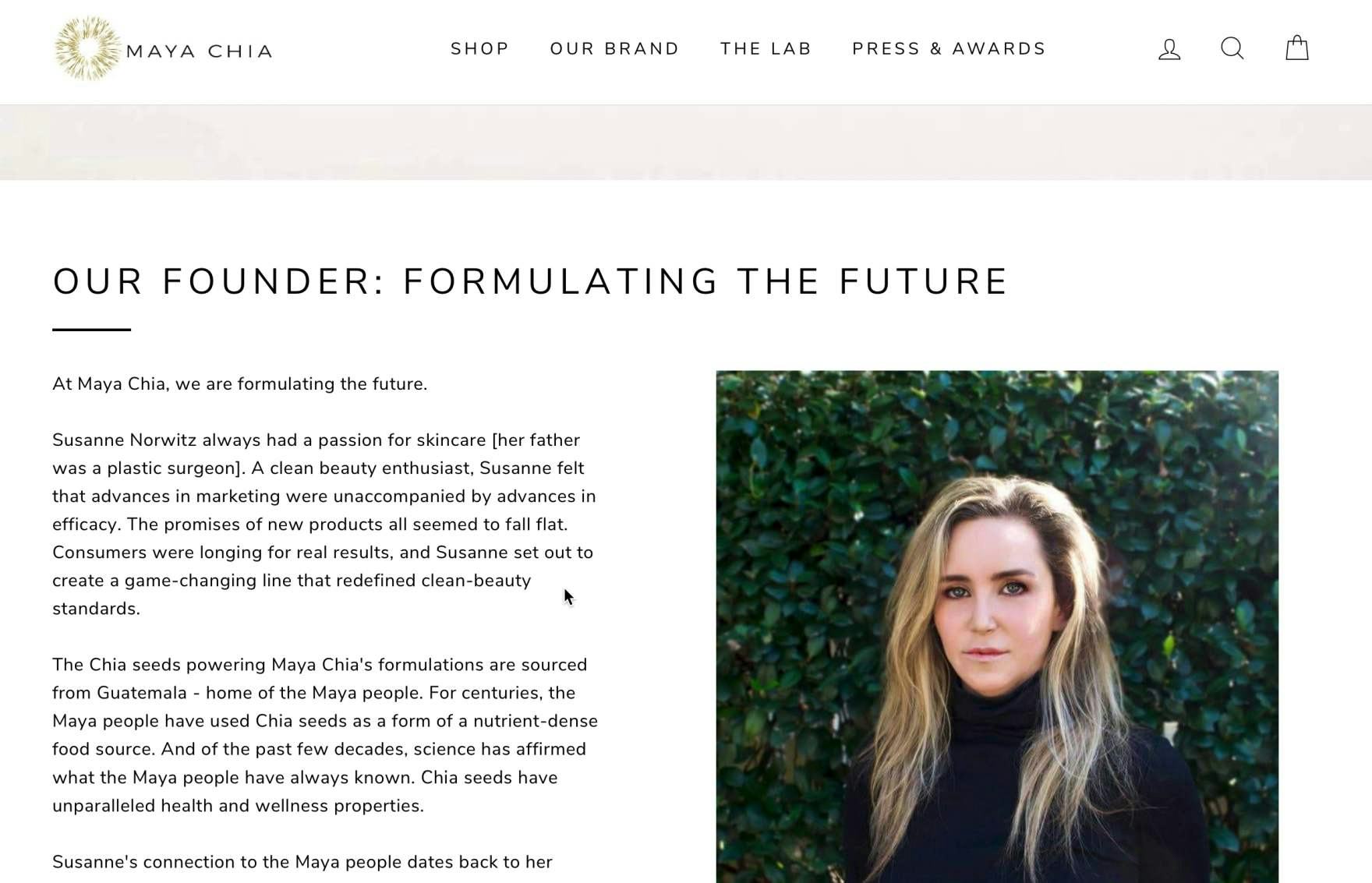
“I would look at the founder…What the founder does for a smaller company really matters, I think…I can tell she was passionate about it.” A user on Maya Chia sought out and read through information about the brand’s founder.
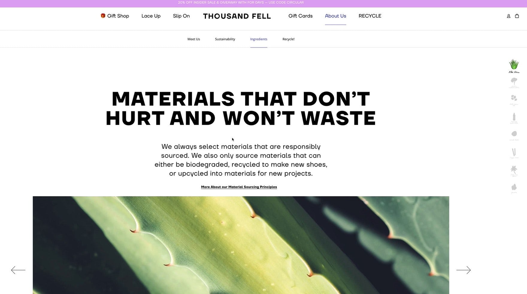
“I like this page. I didn’t know shoes could be made out of all these materials.” A user on Thousand Fell explored information about how the shoes were made and what they were made of. Users on DTC sites often need to learn more about the brand and its products before they feel confident in making a purchase decision.
In contrast, users on DTC sites — somewhat similar to users on digital subscription services sites — typically want to “get to know” the brand and products at a deeper level before they make a purchase decision.
In fact, many users want to feel like the site shares their tastes, values, and goals.
This has implications for what kind of information DTC sites need to provide, beyond “the basics” that are expected by users on almost all e-commerce sites (e.g., product titles, images of the products, etc.), as well as where and how the information is presented.
“I do want to look at the homepage, just to see…the way they show these off…To me this is an introduction to the brand, so I want to see what they’re all about.” This user, like many during DTC testing, scrolled the homepage in an attempt to get to know the brand before looking at specific products.
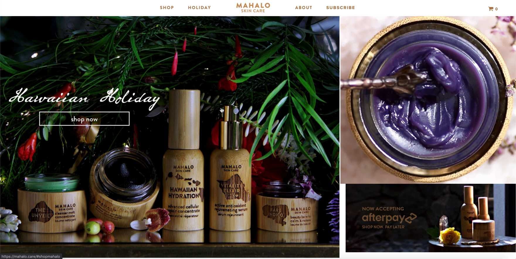
“Nothing is written that these are natural products, that they are paraben-free or sulfate-free. I think I would just have to go to each and every product to see what ingredients they have.” This user was concerned about particular ingredients in skincare and lamented the amount of research she would need to do to figure out if the products on Mahalo contained these ingredients. In fact, the products perfectly met her criteria — but this key value proposition was not clearly communicated by the brand’s homepage.
In particular, the homepage is likely to be much more important to DTC users.
During testing, most users either had never explored the brands under consideration before, or had only passing knowledge of them.
In order to acquaint themselves with the brand, a commonly observed first step for users was to spend more time exploring the homepage than what’s typically observed for users during general B2C testing.
For example, users on a more traditional B2C site (e.g., Crate & Barrel) often start by going directly to the search bar or the main navigation, with the goal of quickly drilling down into the site to begin finding product lists of interest.
During DTC testing, on the other hand, users tended to first scroll through the homepage, considering the highlighted content, in an effort to determine if they should spend any more time on the site.
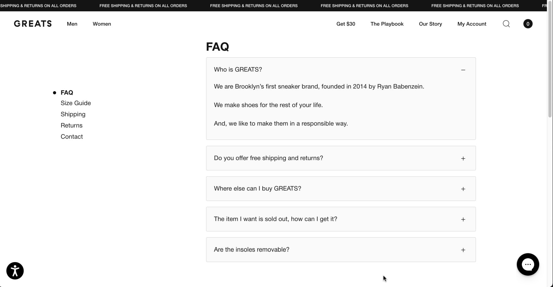
“They’re clearly leather, and I’d want to know how to clean it.” This user on Greats sought the site’s FAQs to learn more about product care, but the brief list of questions did not cover her concern, leaving her without answers. “Well, that is very disappointing”, she continued. FAQs that fail to address important topics can leave users without recourse for getting key questions answered.
Additionally, many users will dig deeper and begin looking for links to “About” pages and the FAQs, both in an attempt to answer basic questions (e.g., “What is this site, and what does it sell?”) as well as more specific ones (“Are the products paraben free?”).
Thus, in addition to making sure to provide this information, it’s also important to ensure it’s easily accessible — as some users will be enticed to stay longer if some particular piece of information regarding the brand or its products piques their interest or answers a critical question.
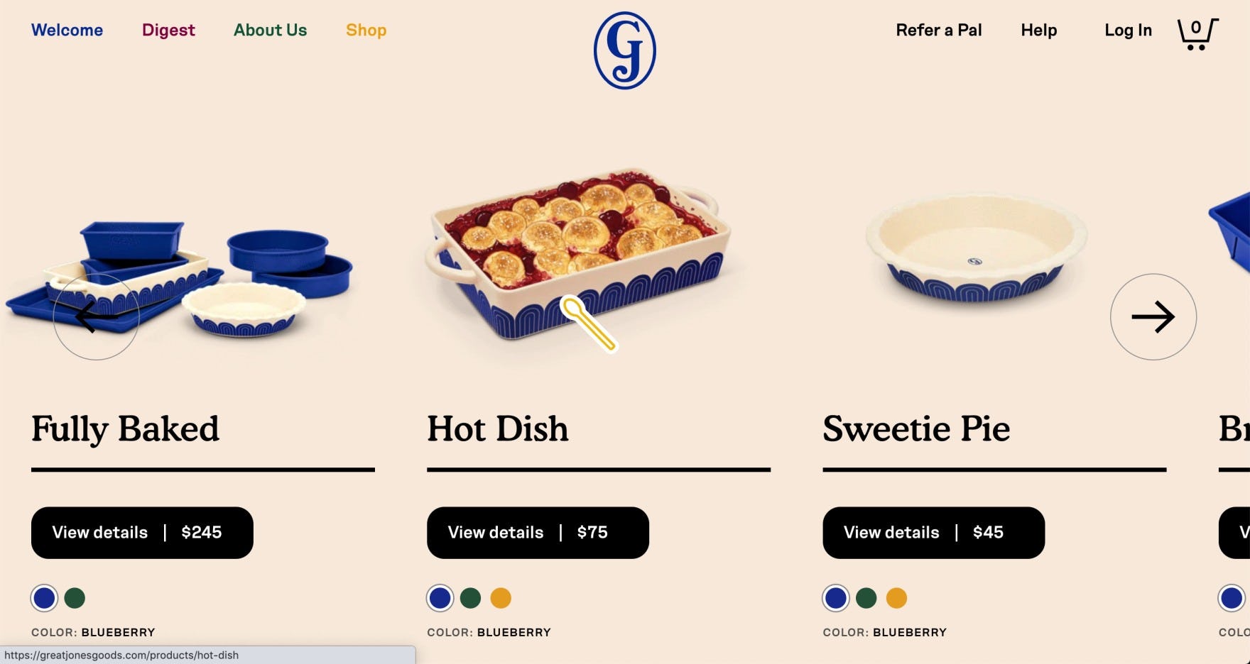
“It’s way too gaudy and kitschy…like the spoon cursor thing? I don’t even know what’s going on…I’m not the target audience for this website.” A user on Great Jones abandoned the site, solely based on the fact that she found the design aesthetics extremely unappealing. Despite this user’s reaction, other users may find the design creative and fun. “Creative” designs that broke typical e-commerce principles were abundant during DTC testing — with widely varying results for end users.
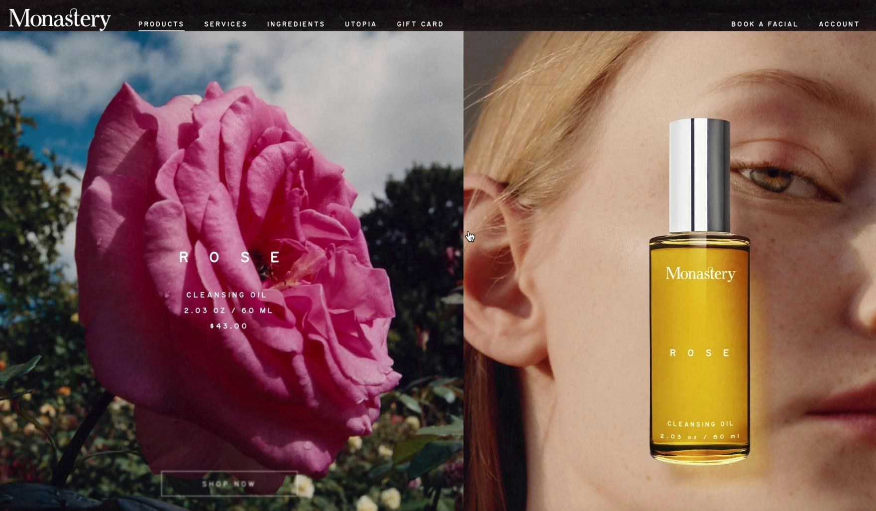
“It’s very beautiful, I must say.” This user on Monastery initially found the site’s aesthetics very appealing, which improved her appreciation for the brand and enticed her to stay and explore the products. However, she eventually found that the gigantic images, while visually appealing, made it more difficult to navigate to products of interest and get an overview of the site (as did many other users).
Moreover, during testing users were observed to pay much more attention to design aesthetics on DTC sites, compared to larger e-commerce sites.
Typically, despite there being obvious substantial differences in UX designs for sites like Walmart and Target to “industry insiders”, to the end user larger e-commerce site designs are experienced as, more or less, variations on a theme. While some aspects of design differ, for most users the design aesthetics of larger e-commerce sites rarely has much impact on their decision whether or not to purchase from the site.
In contrast, DTC users tend to want to feel like a site is representative of their own individual taste, or at least that the site’s design aesthetics aren’t offensive to them.
Indeed, some users during testing were observed to abandon sites solely due to their dislike of the design aesthetics — not even venturing off the homepage to make their determination.
That said, catering to every individual user’s personal design-aesthetic preferences is an impossible task.
Yet reigning in some of the more eccentric design decisions, in favor of a more simple — but still bespoke — design was observed to perform well for most users.
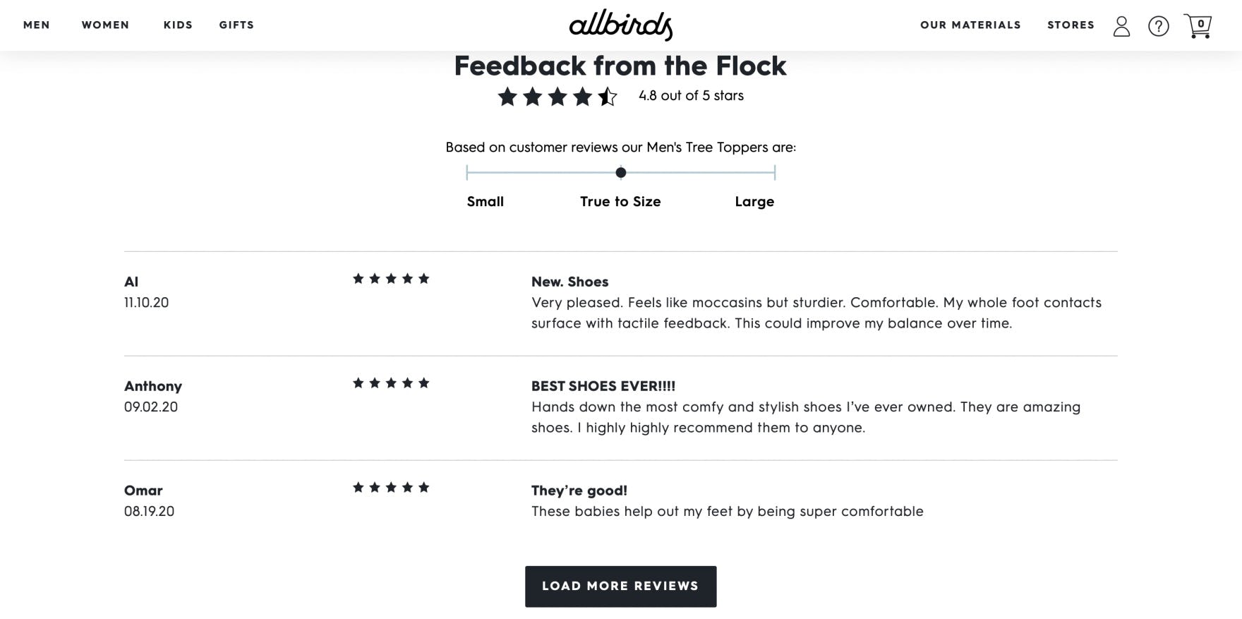
“I just saw that there’s also reviews…but I usually wouldn’t trust reviews on such a website because it can obviously be easily rigged, so they would probably not show any negative reviews. I would only trust reviews on Amazon.” A user on Allbirds expressed the difference in trust she has for DTC/manufacturer sites and larger retailers (who are primarily resellers of other brands). In practice, users are more trusting of reviews on reseller sites versus the brand’s own.
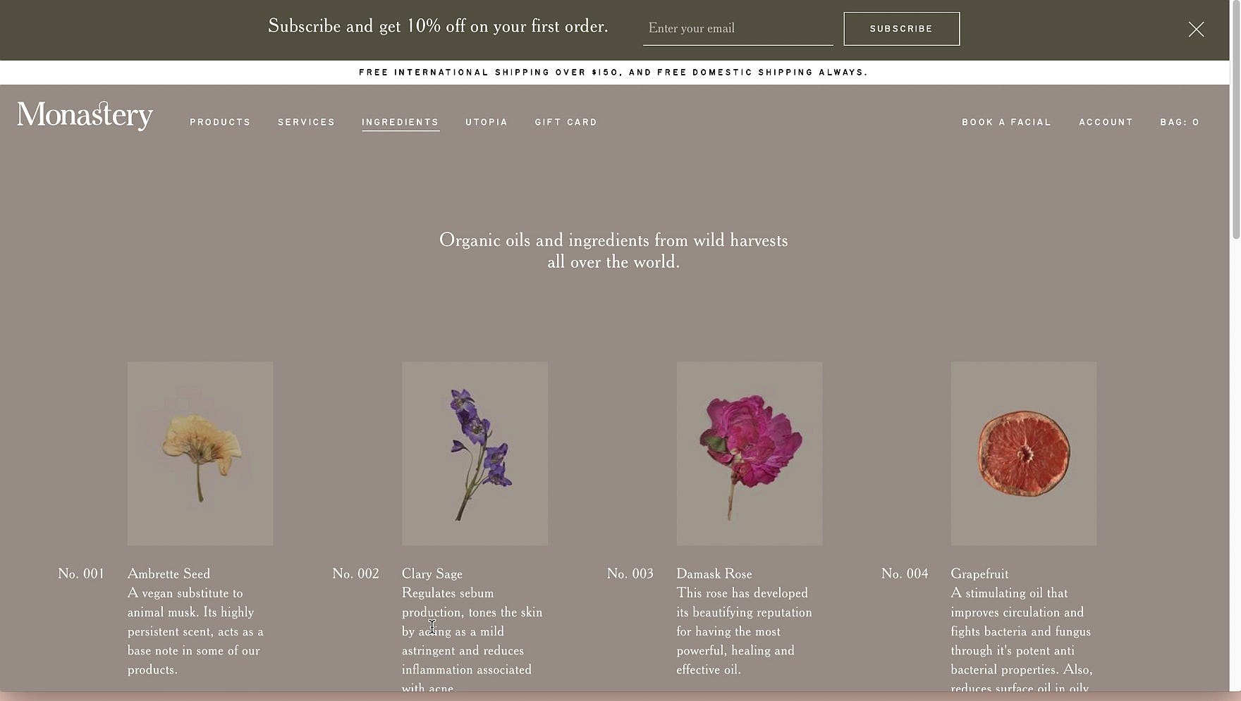
“I might search maybe ‘retinol’? I don’t see the search.” After scanning the product list and “Ingredients” page in an attempt to find if any of Monastery’s products contain retinol, her favored ingredient, this user attempted to turn to search as an alternative product-finding tool. In practice, the lack of search on DTC sites only becomes detrimental when information scent or product information is insufficient.
Finally, just as noticeable as what DTC need to provide users, relative to general B2C sites, is what they don’t need to provide.
For example, search, user reviews, and intermediary category pages were all observed to be barely used, or in some cases even a hindrance to usability.
Thus, keeping in mind what users on DTC sites actually need to find products and make purchase decisions — versus what they don’t — ensures that resources are properly allocated to the most impactful design patterns, features, and elements.
(For the fundamentals of usability testing and other research methods, read What Is UX Research?)
Help Your DTC Site Resonate with End Users
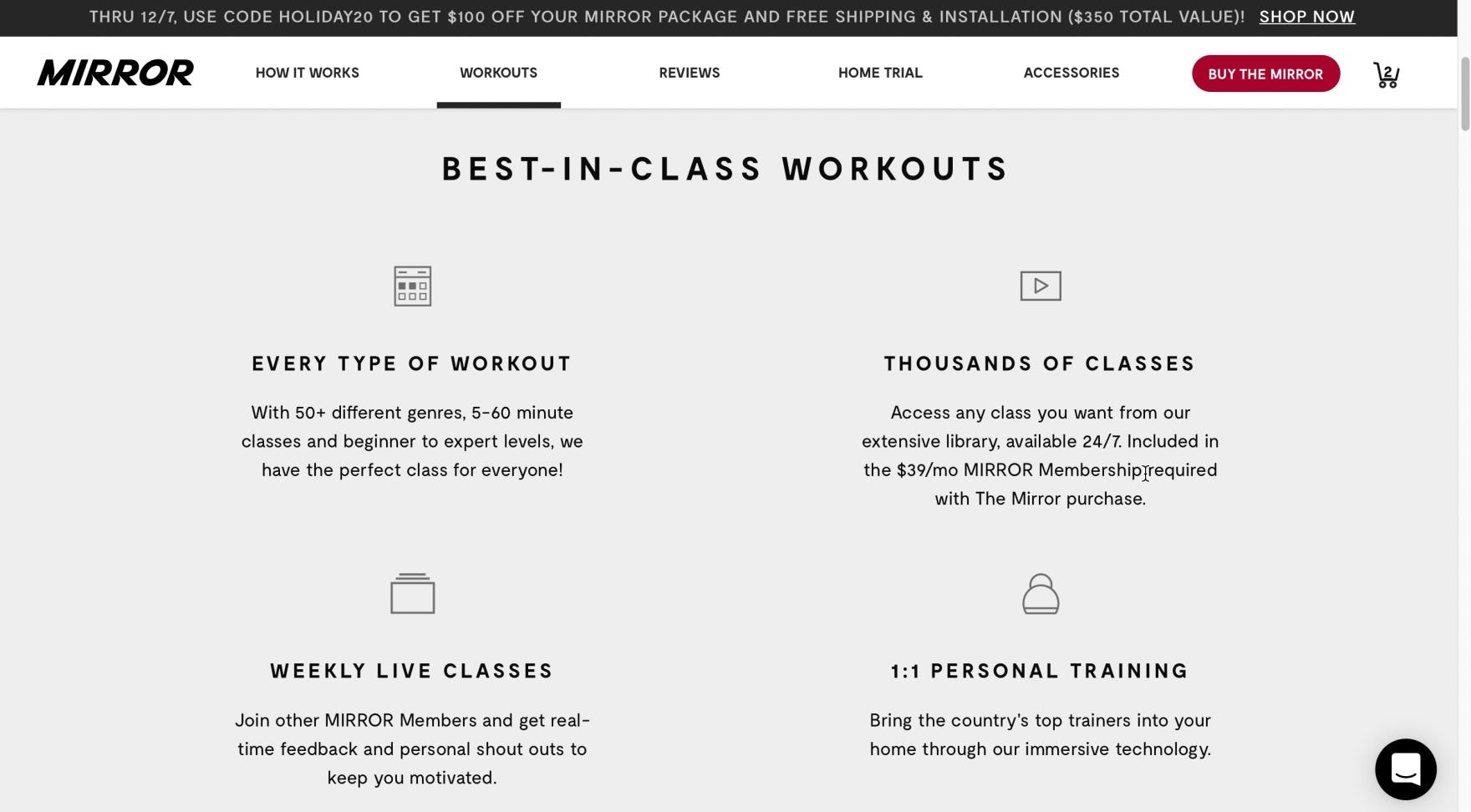
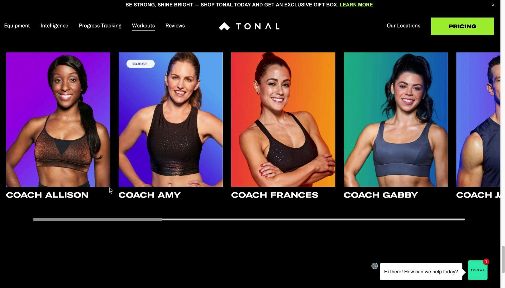
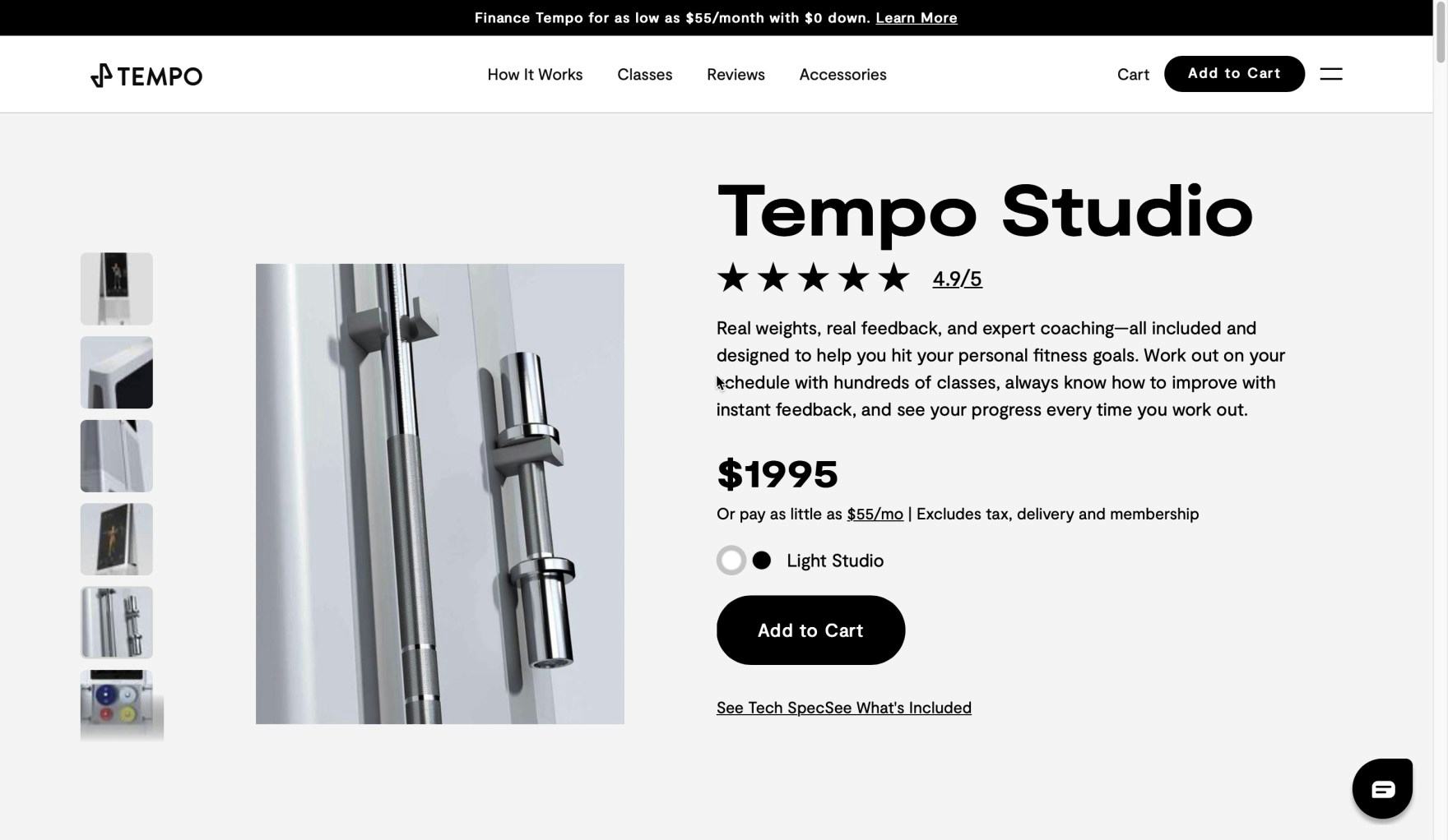
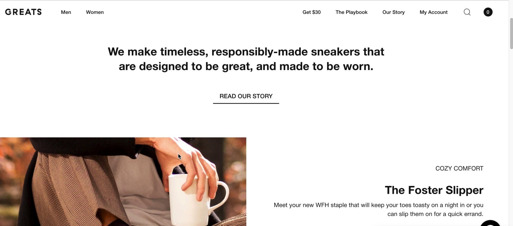
“I think it’s head and shoulders above what I would find at big box online retailers. It’s very valuable information, and you don’t get all of the explanation, but if you’re looking at something for the first time…I would look at these sites first before I would order Mirror from Amazon, for example…[the information] is very helpful…These are all fairly similar among themselves…the websites for the three systems. Videos, pictures of real coaches, pricing, how the system works, I was able to find everything I wanted on all three.” A user was impressed with the ease of navigation and the quality of information provided on all three fitness sites tested. DTC sites can often set themselves apart from larger retailers by offering a richer user experience tailored to the limited number of products they sell.
DTC sites have many challenging tasks facing them when it comes to perfecting UX design.
Indeed, they must introduce the brand to users, place the brand and products in as an appealing light as possible, avoid alienating users, and provide them with substantial brand and product information — all without overwhelming users with too much content.
Yet this large-scale study — focused on small catalog, DTC sites — has revealed the design patterns that are most likely to help users find the information they need to make purchase decisions, and help DTC sites meet the unique needs of their users.
Getting access: all 413 DTC UX guidelines are available today via Baymard Premium access. (If you already have an account open the DTC Study.)